
PHOTOSHOP - ILLUSTRATOR
Concept Development | Branding | Social Media | Advertising
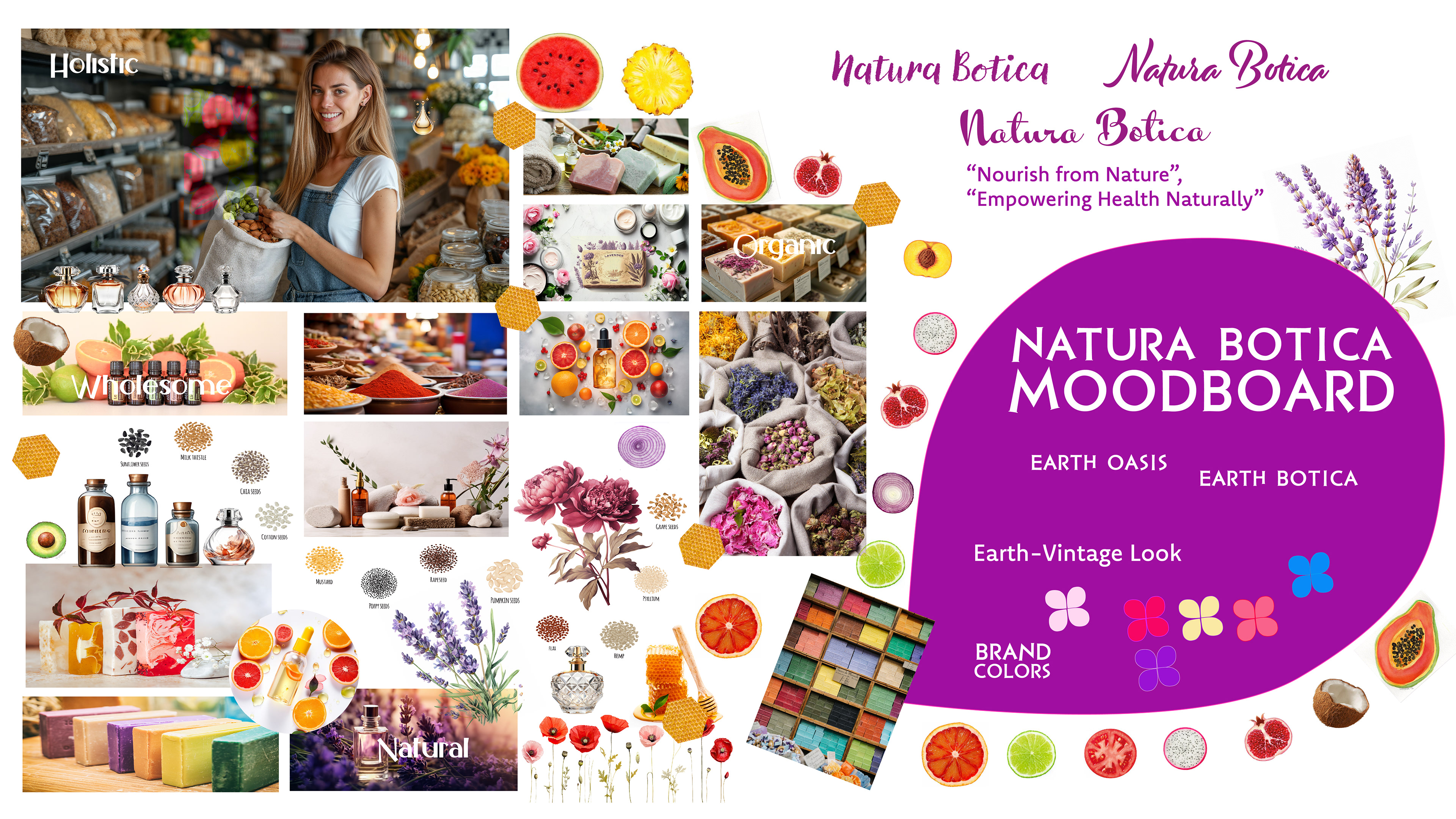
Moodboard
The moodboard for Natura Botica offers a visual journey into the essence of the brand, showcasing lush images and serene settings that evoke tranquility and harmony with nature. Through soft lighting, natural textures, and earthy tones, it captures the welcoming ambiance of the store, inviting customers to immerse themselves in the abundance of natural wellness.
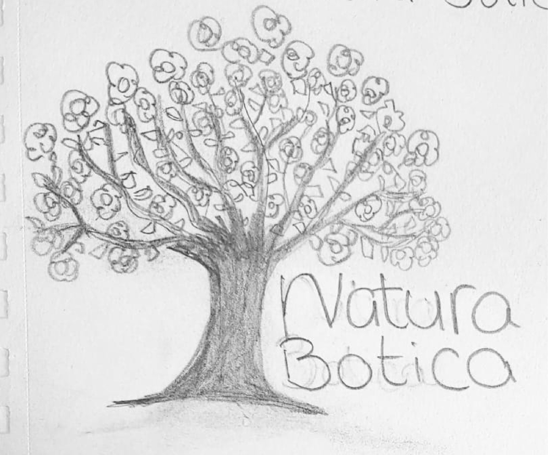
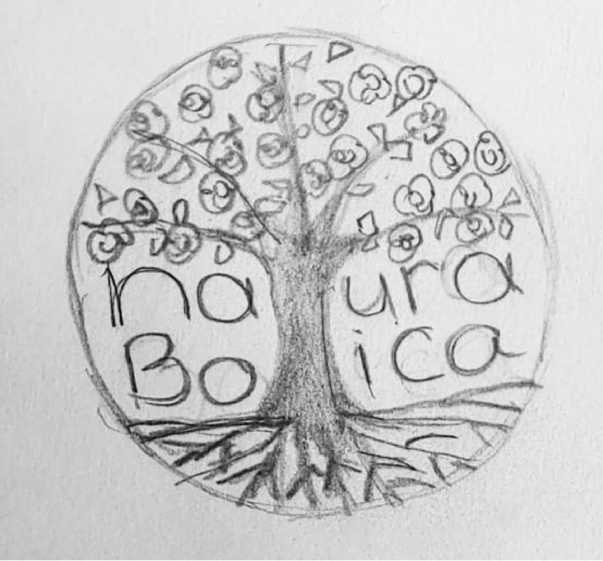
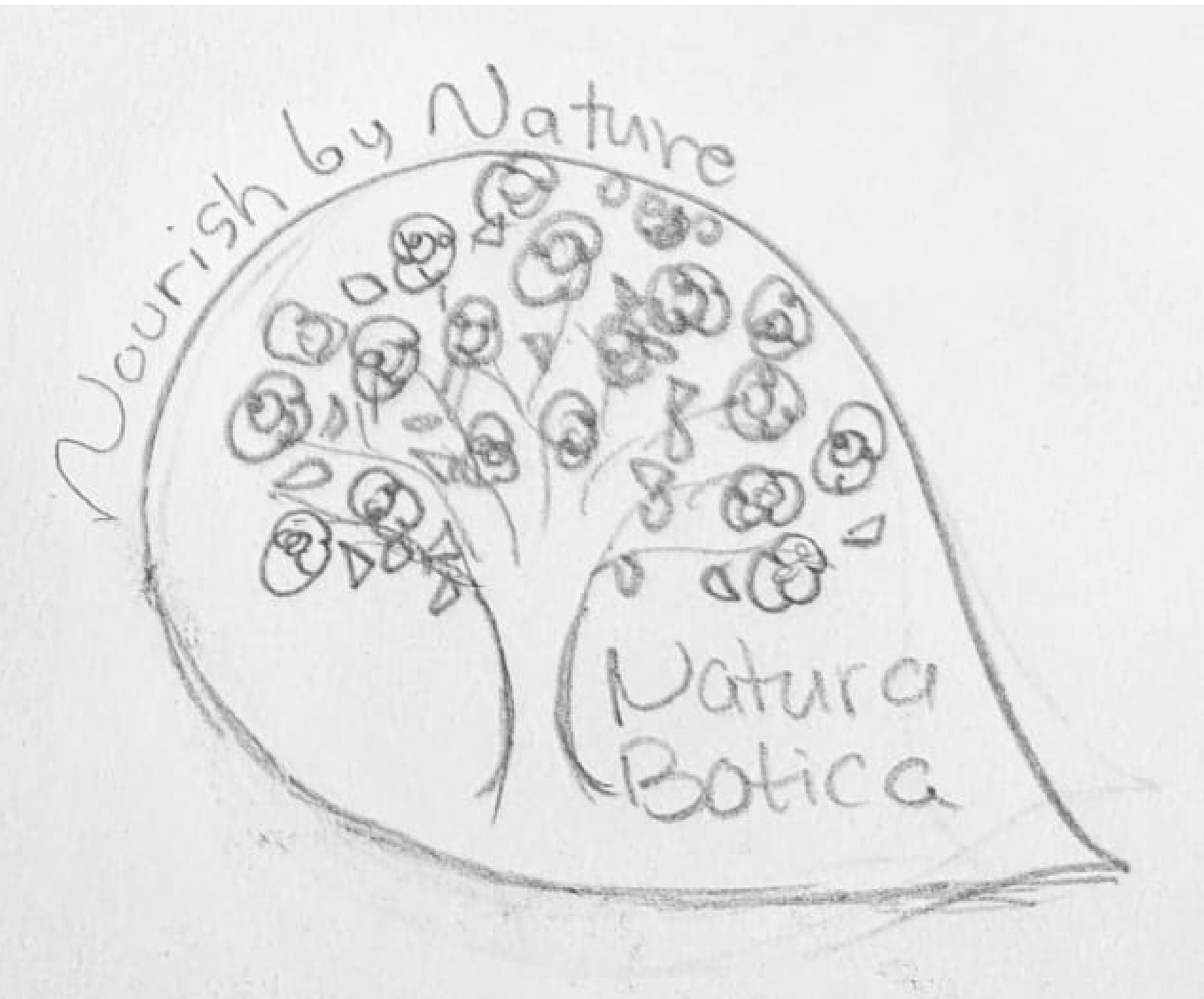
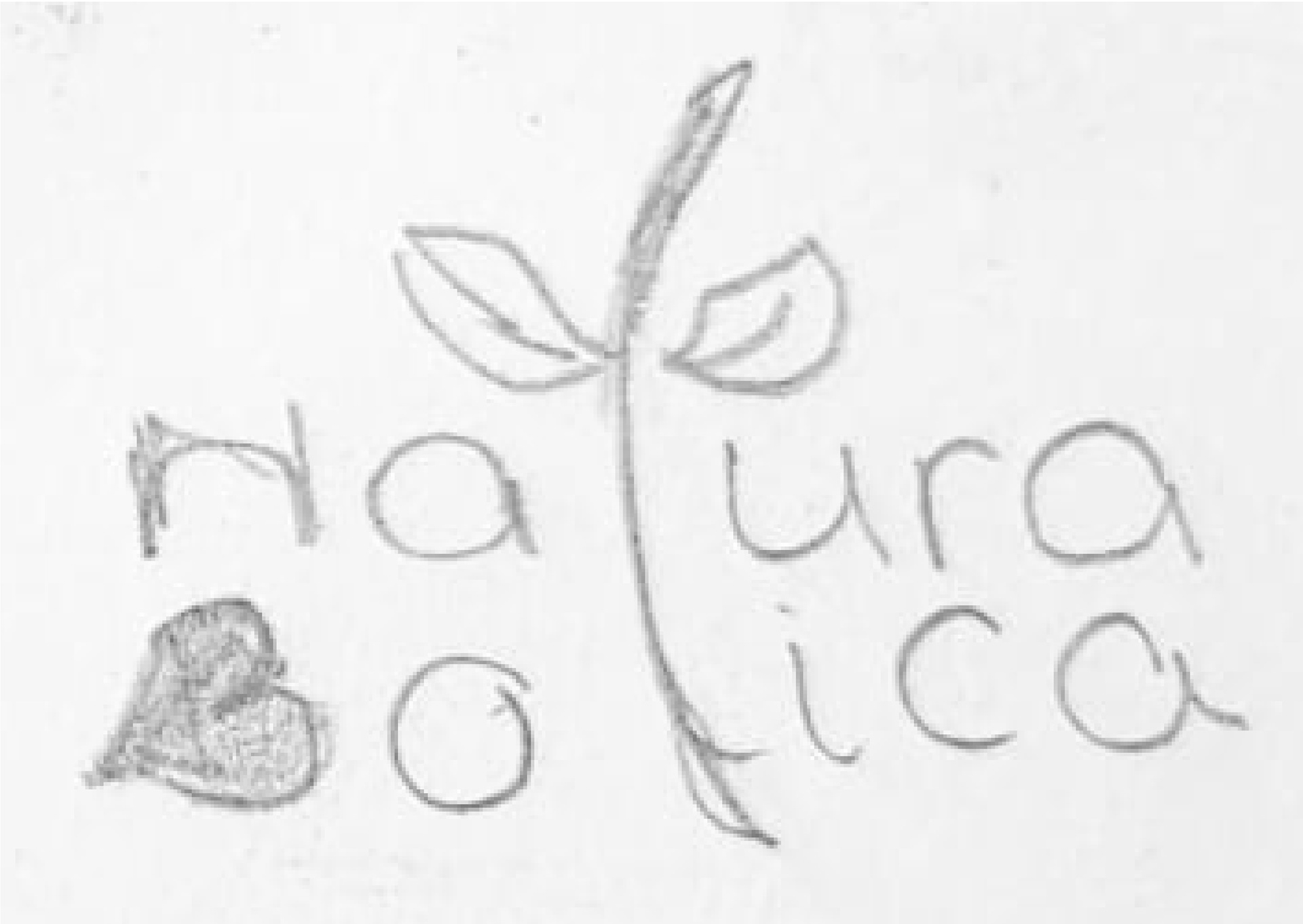
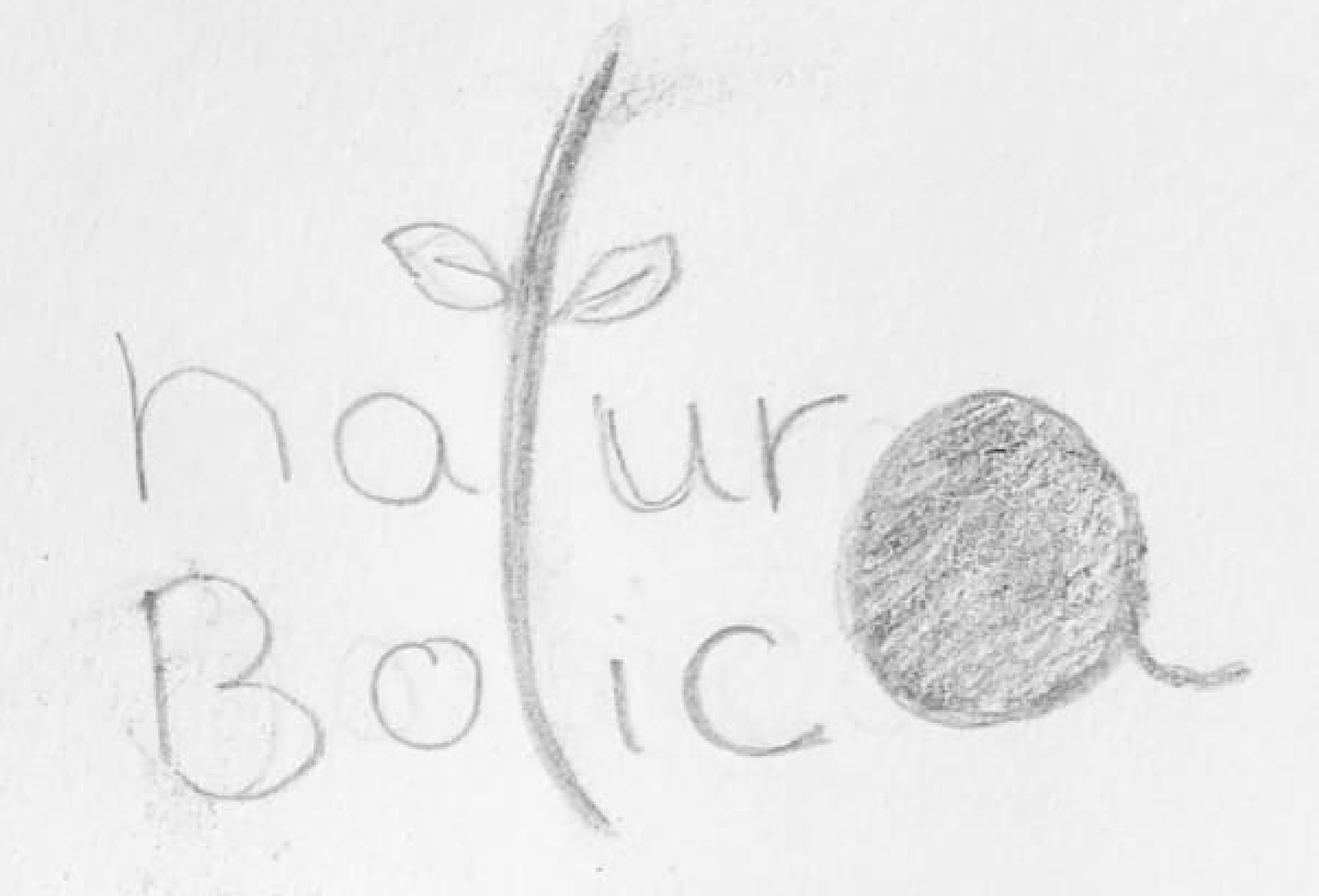
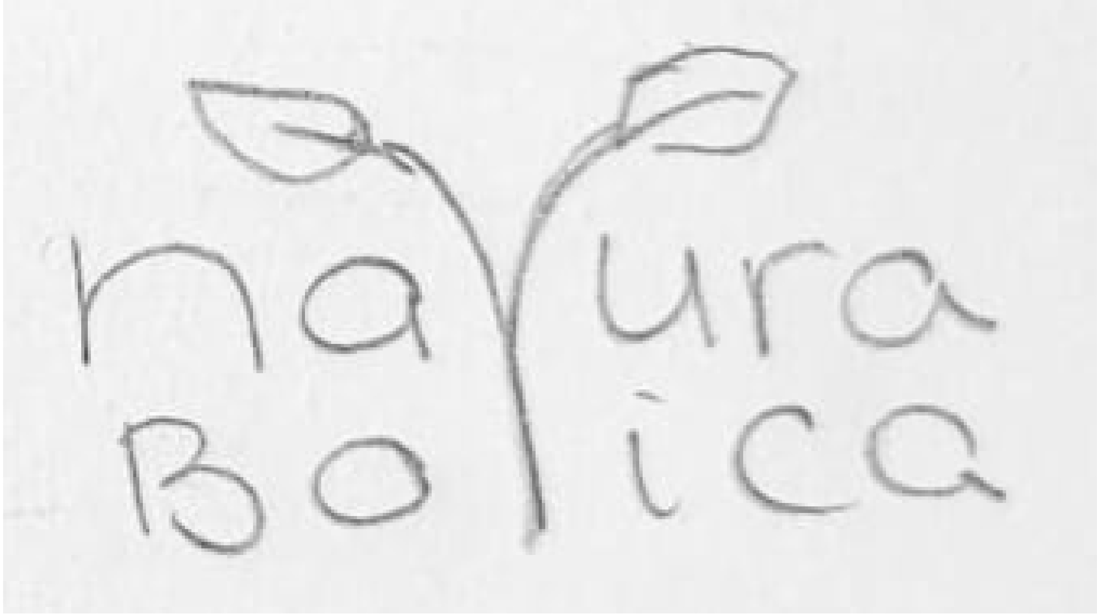
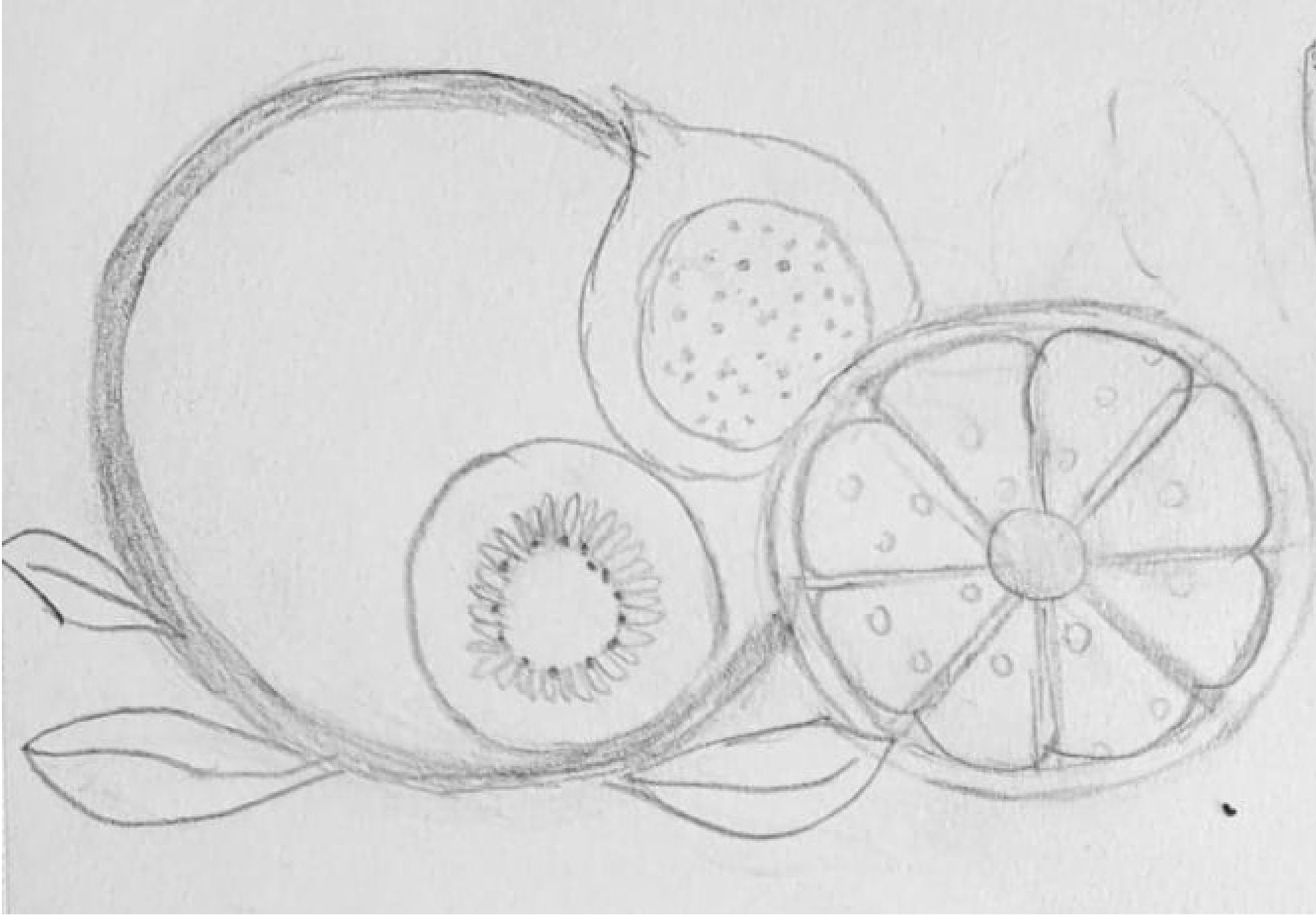
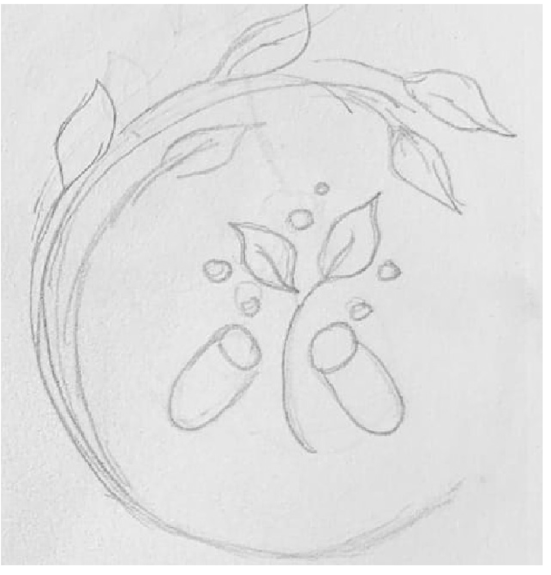
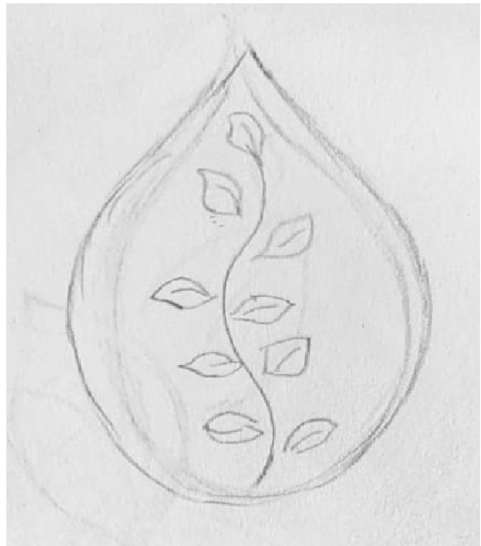
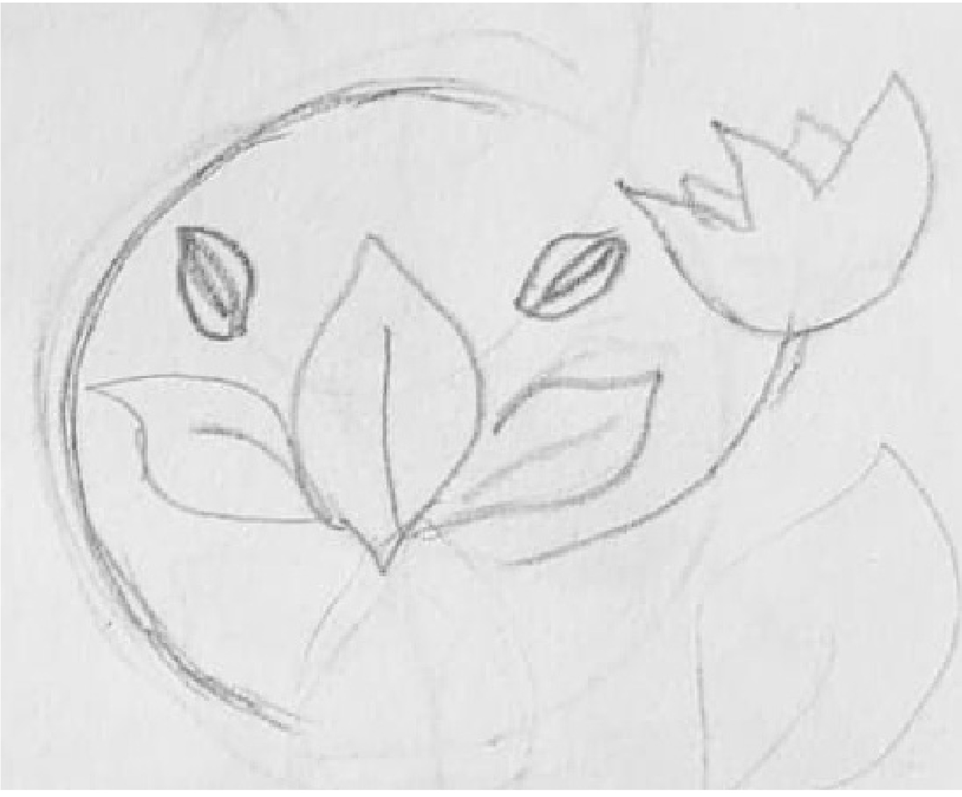
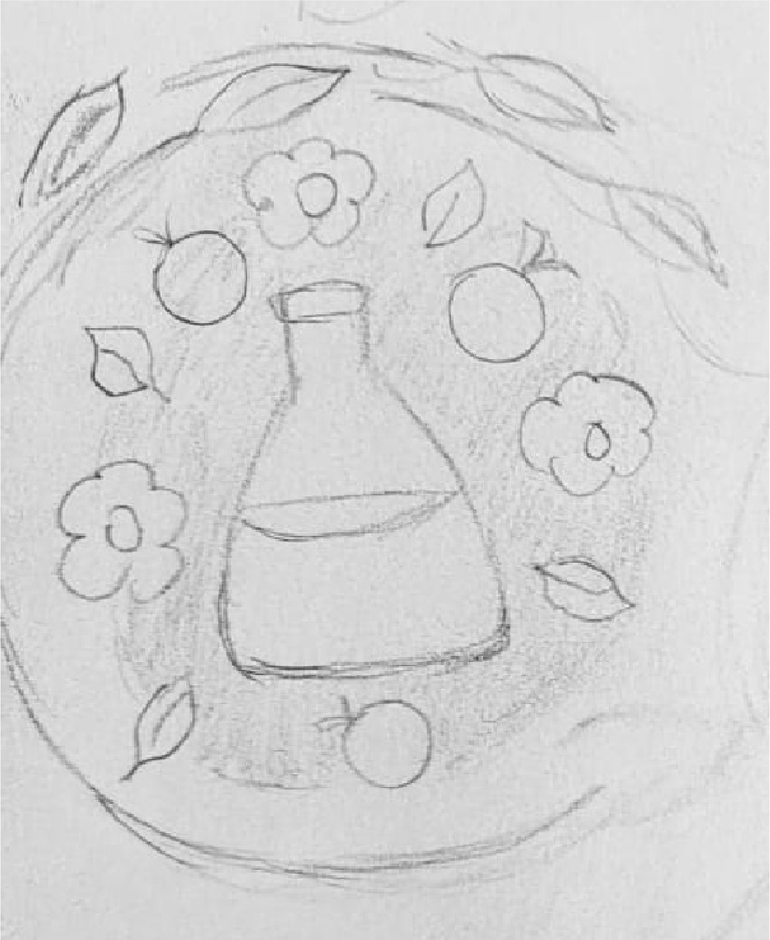
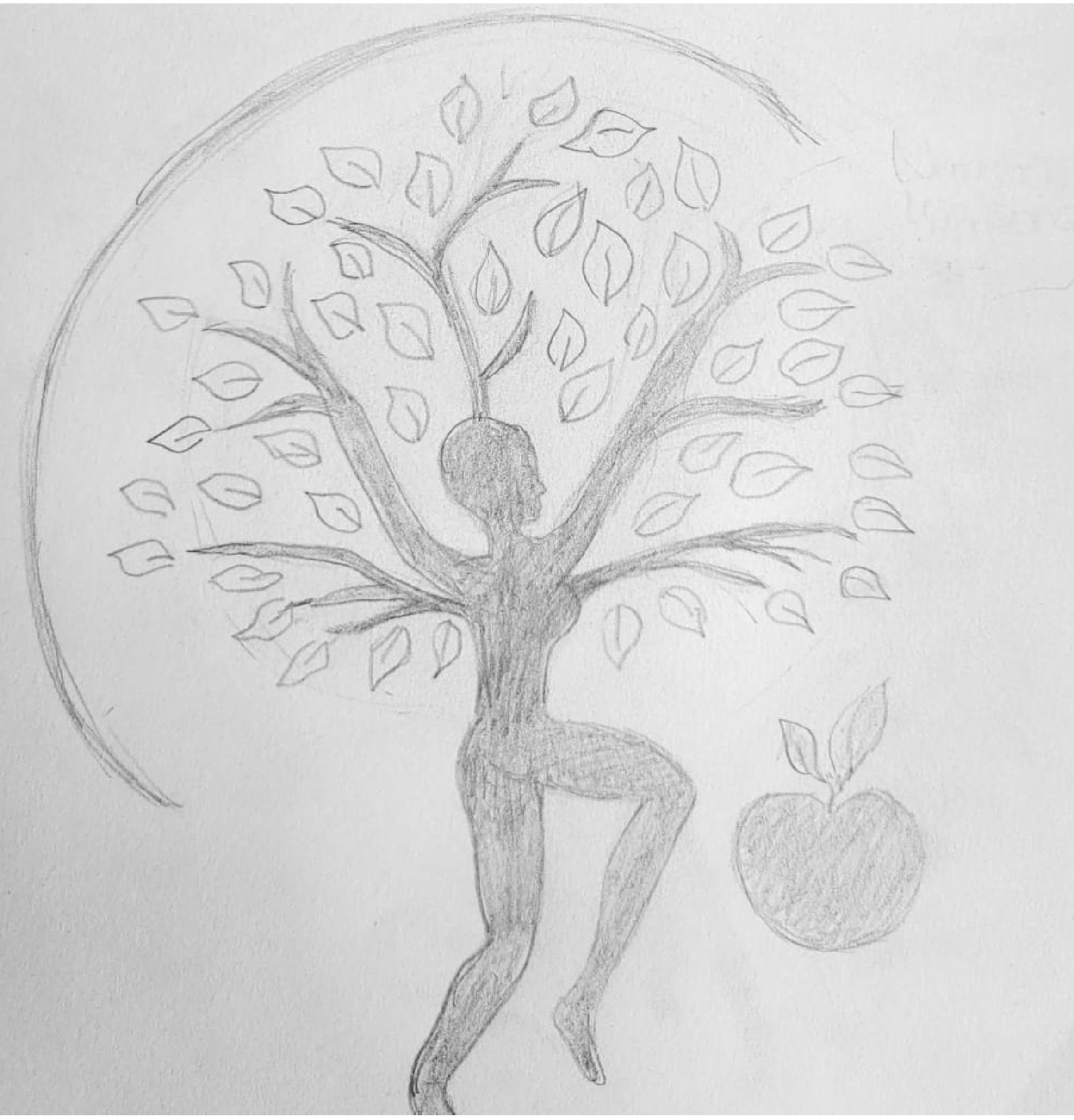
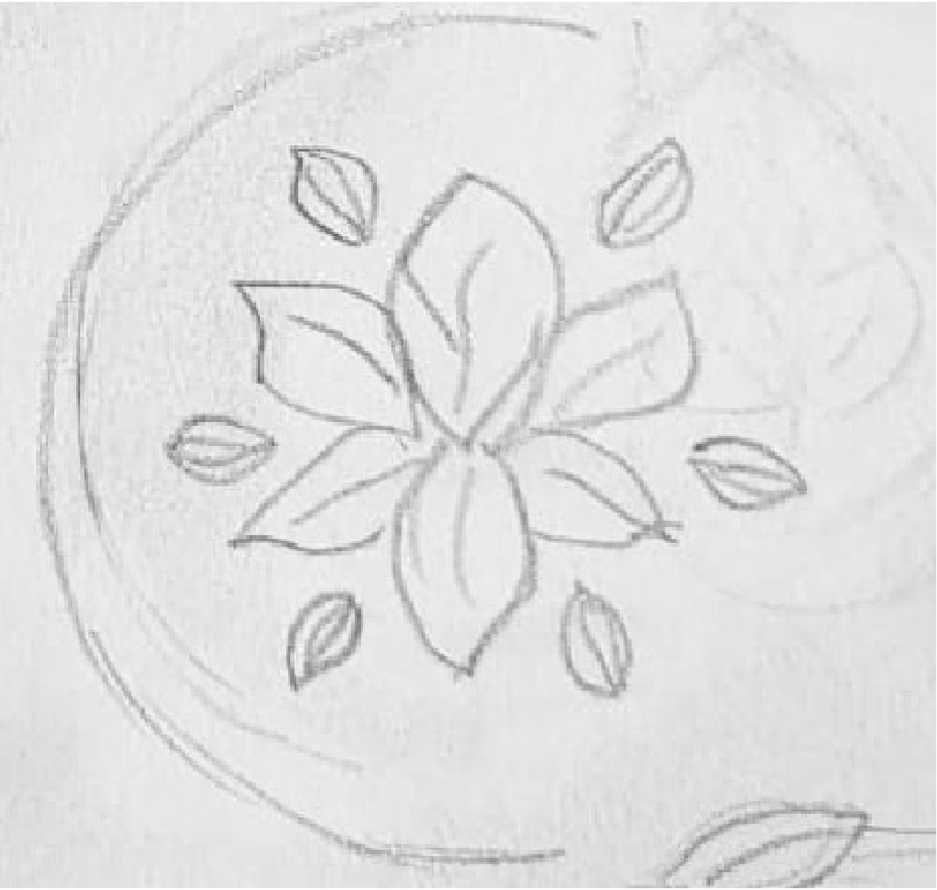
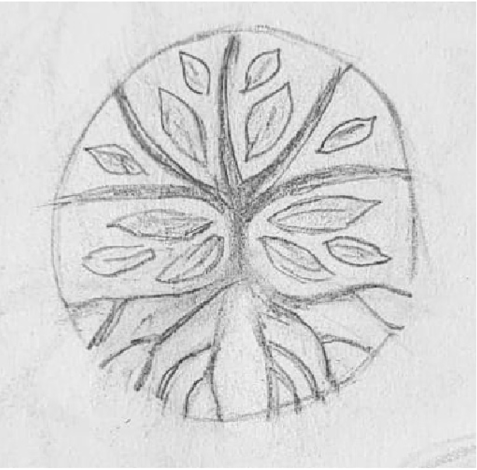
Logo Sketches
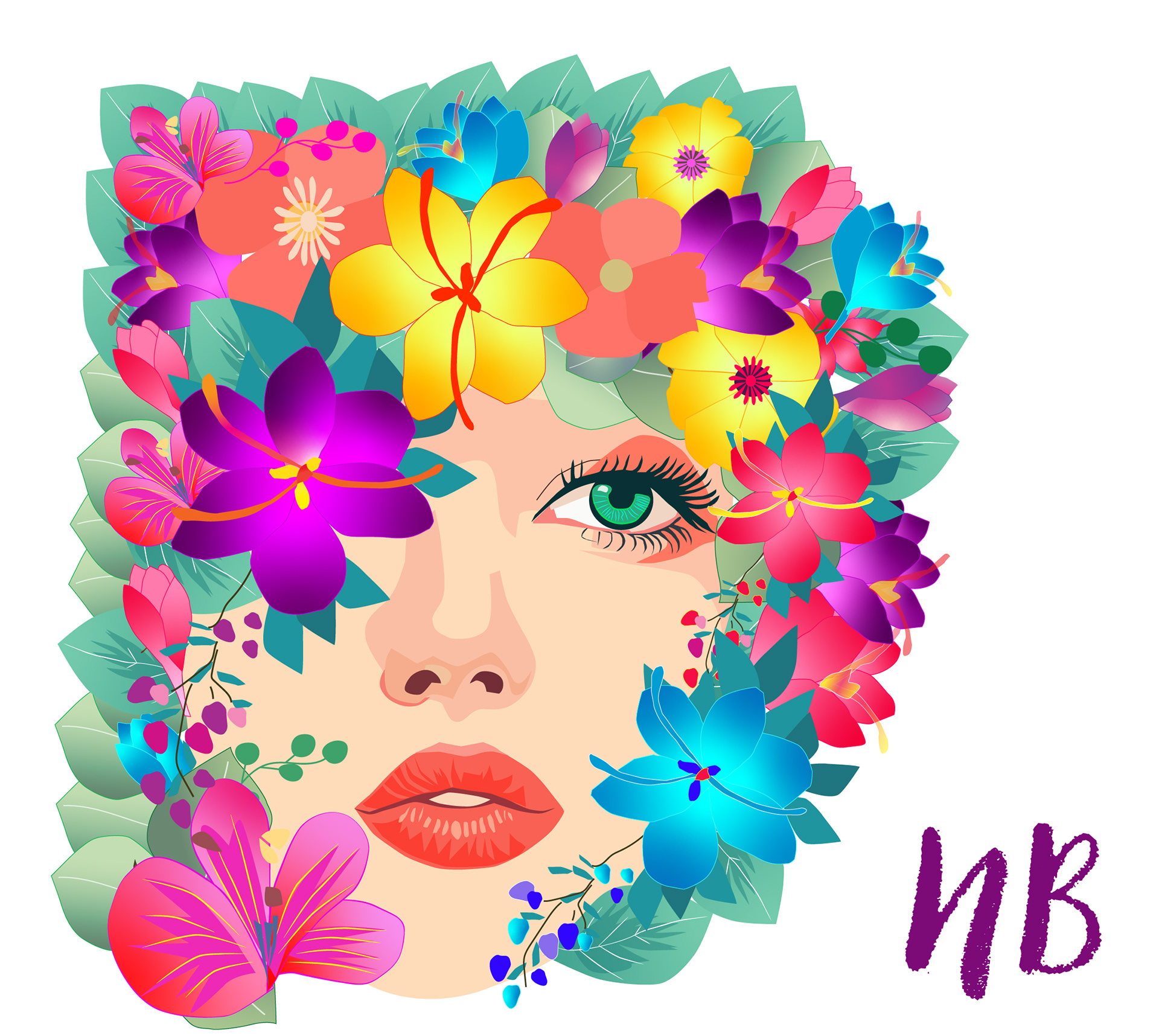
The sketches I created for Natura Botica reflect a harmonious blend of nature's elements, with trees, leaves, and flowers taking center stage. Each sketch embodies the brand's connection to the natural world, capturing the beauty and vitality of organic forms. From intricate leaf patterns to graceful tree silhouettes, the sketches convey a sense of serenity and rejuvenation, inviting viewers to immerse themselves in the tranquility of nature. As a visual representation of Natura Botica's ethos, these sketches serve as a testament to our commitment to harnessing the power of nature for holistic well-being.

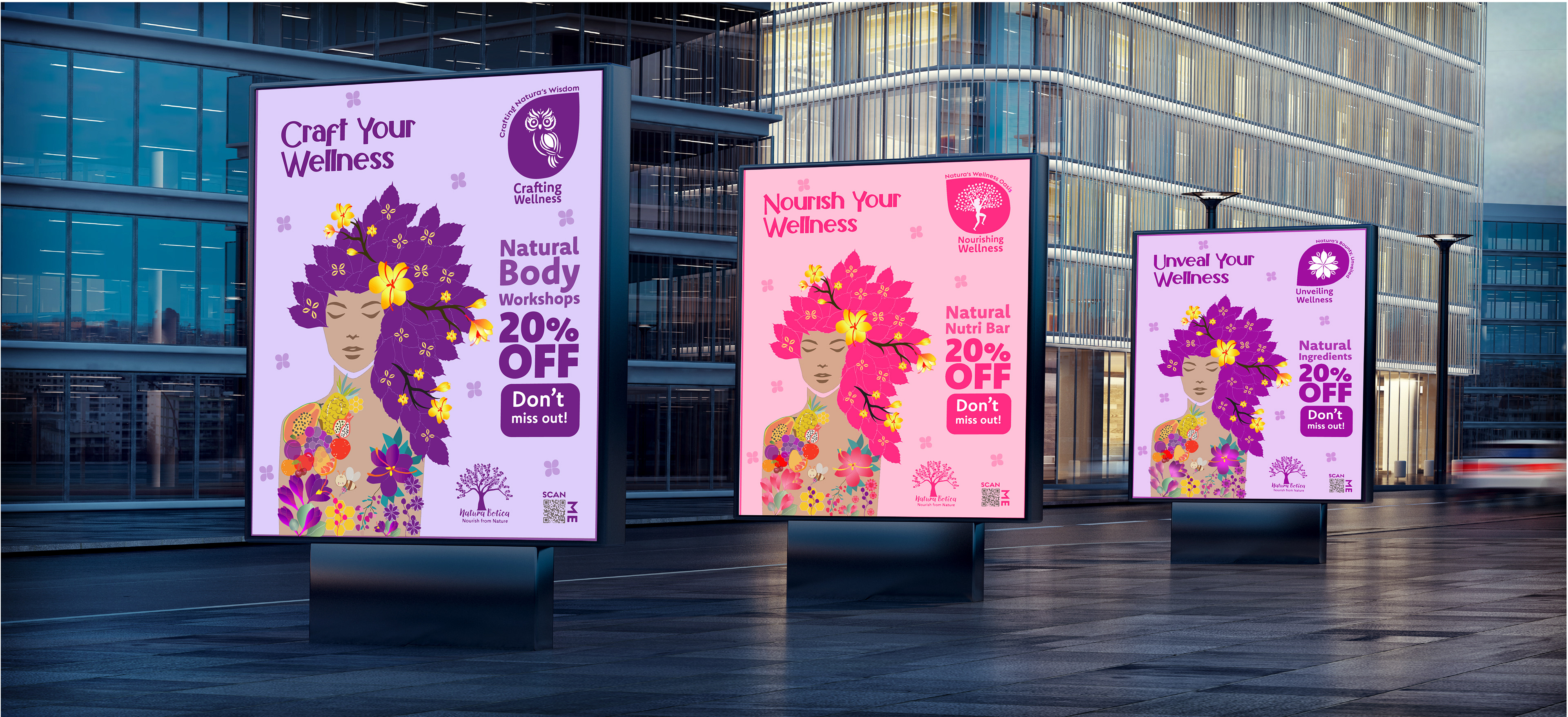
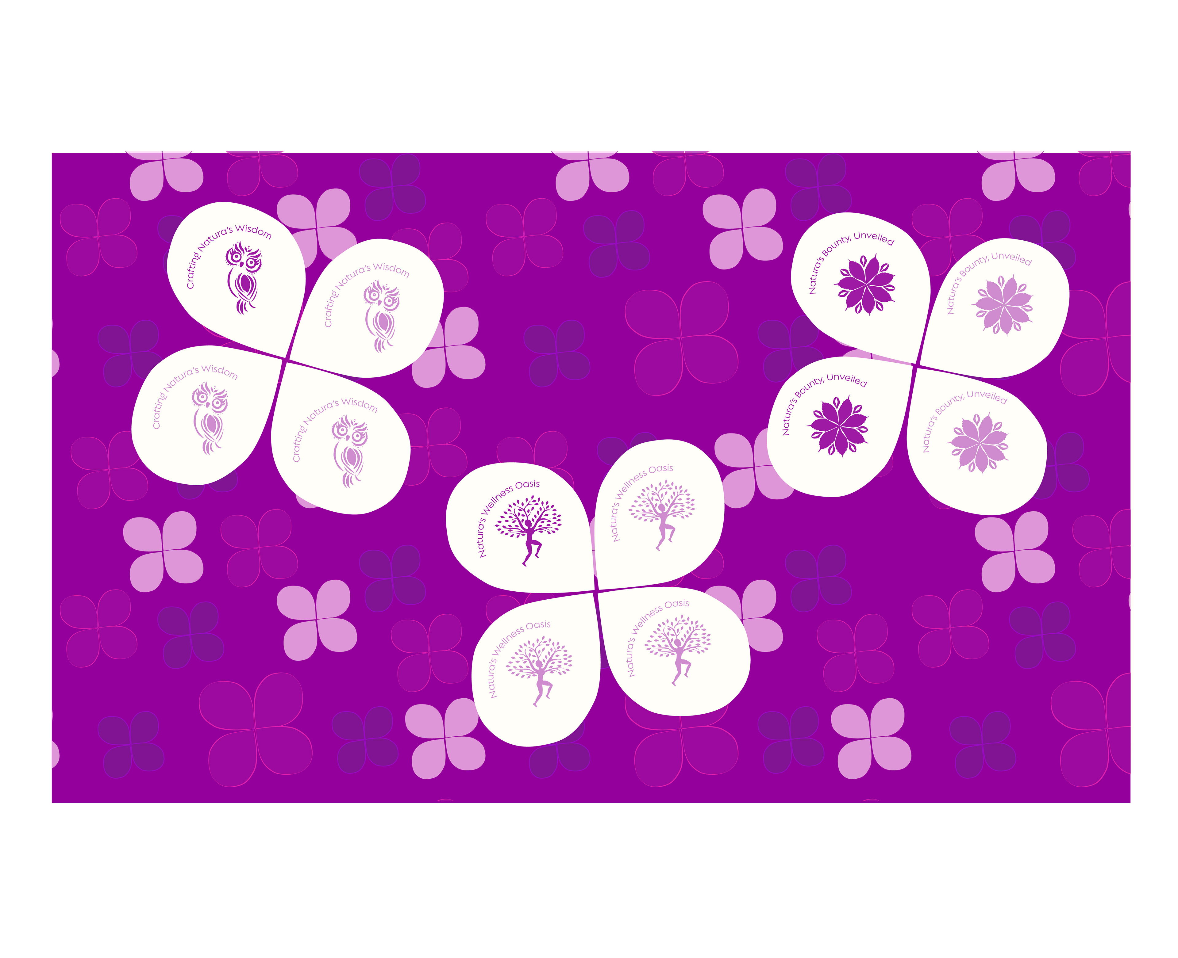
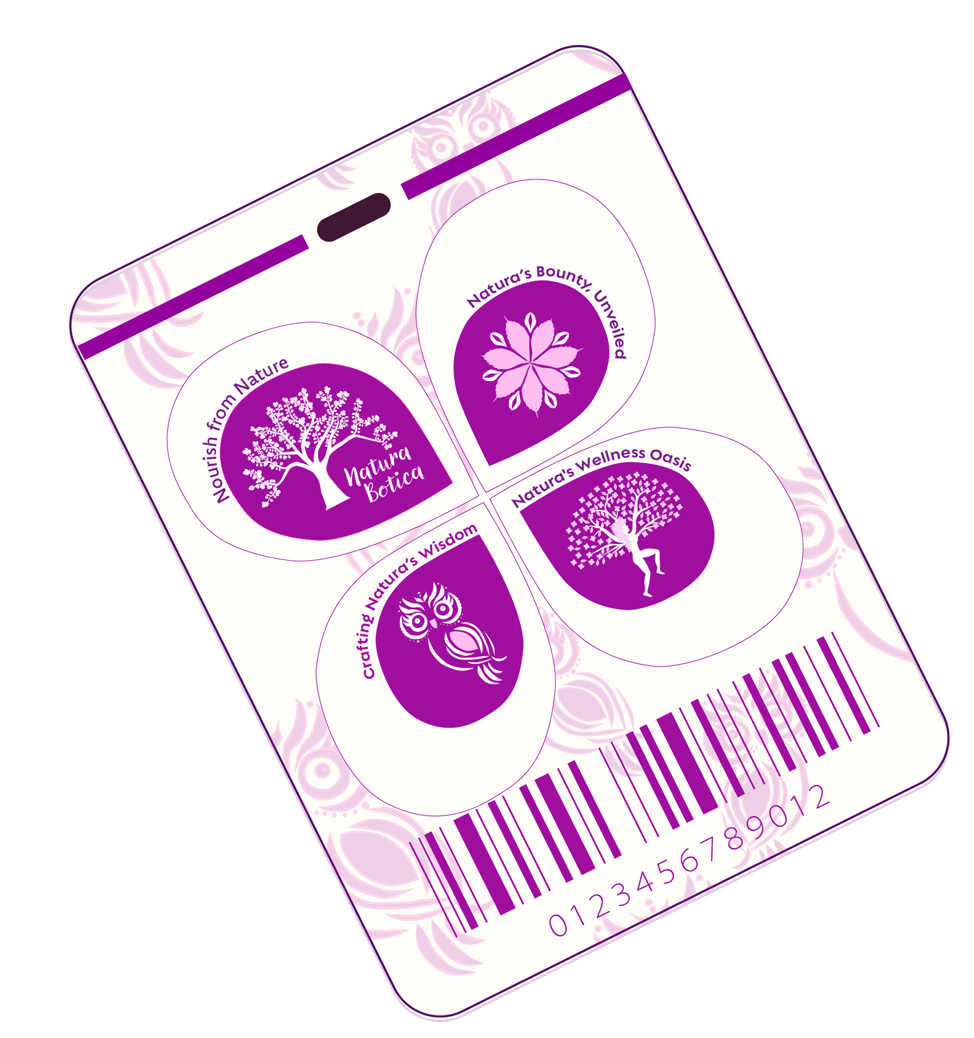
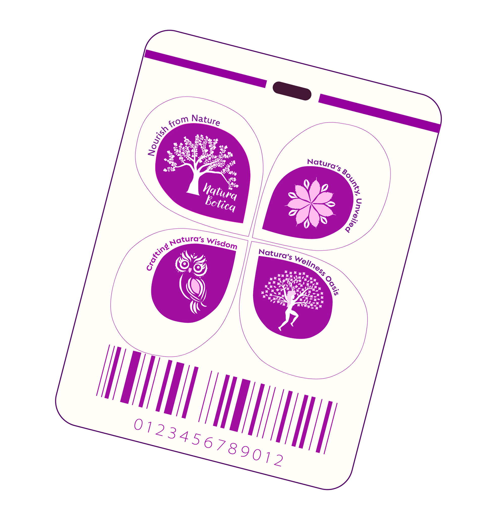
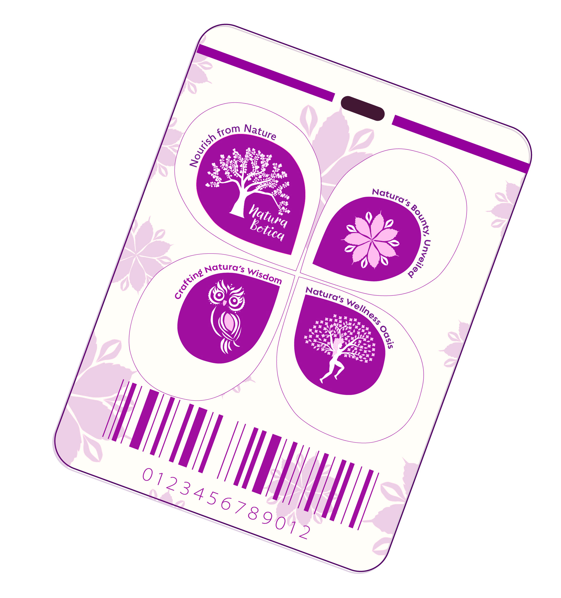
Natura Botica has three divisions
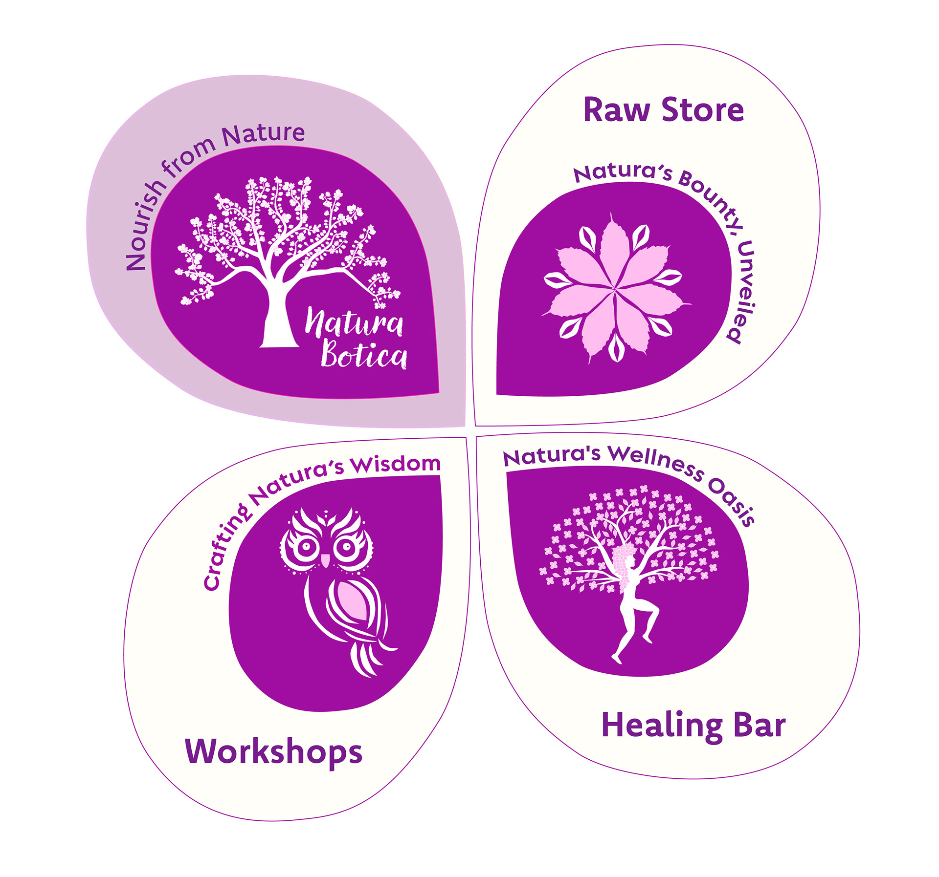
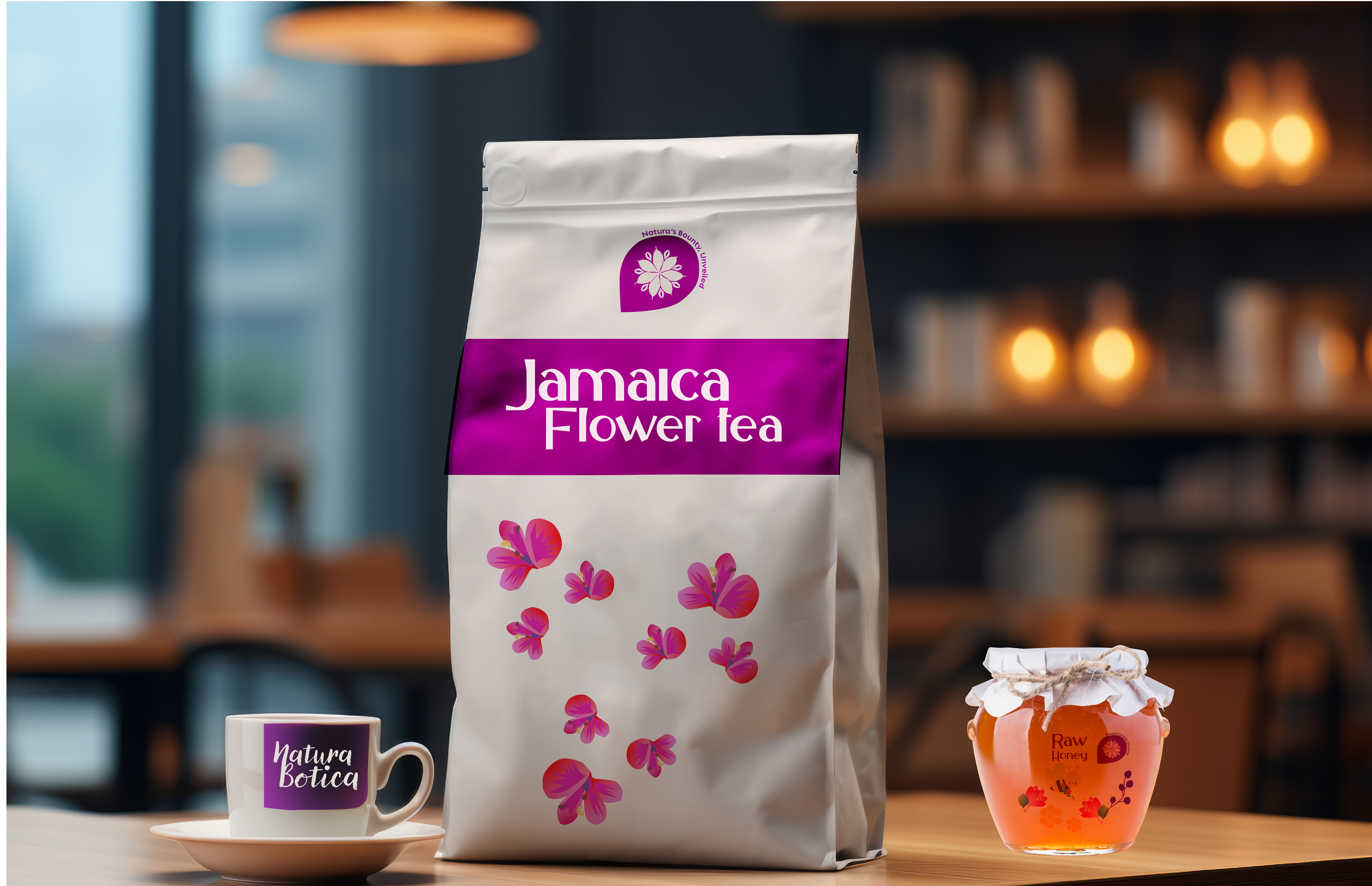
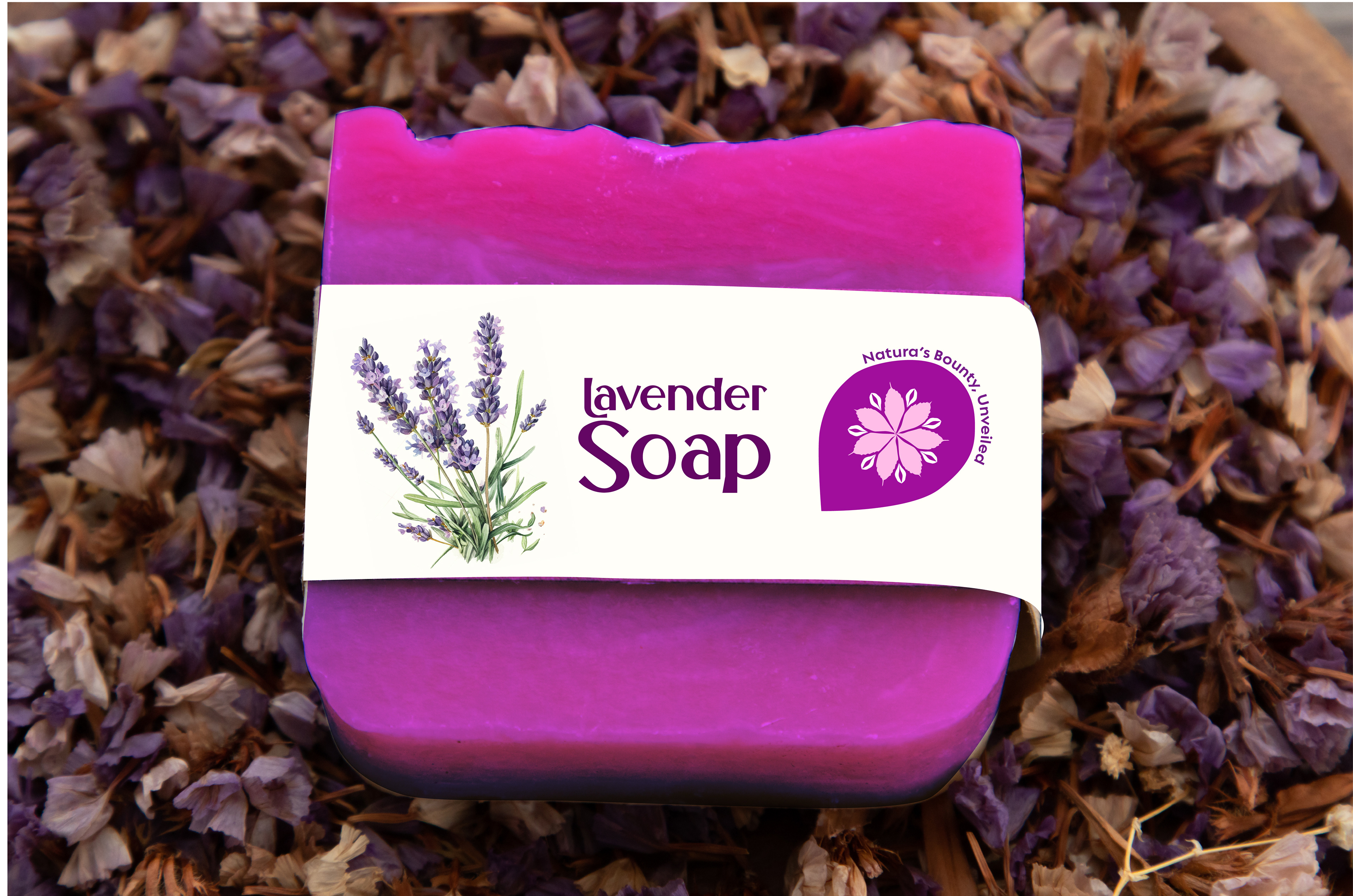
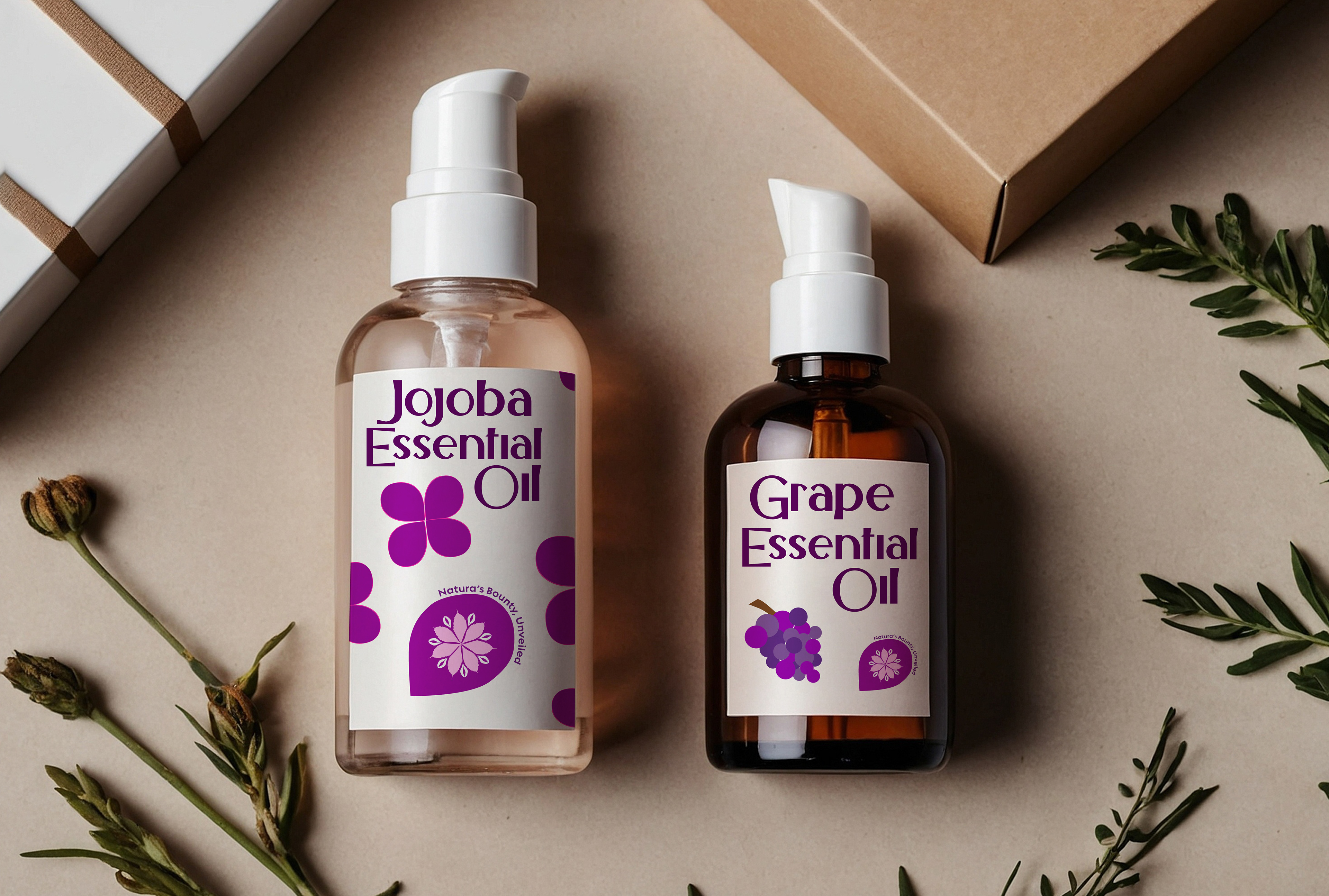
Raw Store Division: Sells natural raw ingredients / Tagline: "Natura's Bounty Unveiled."
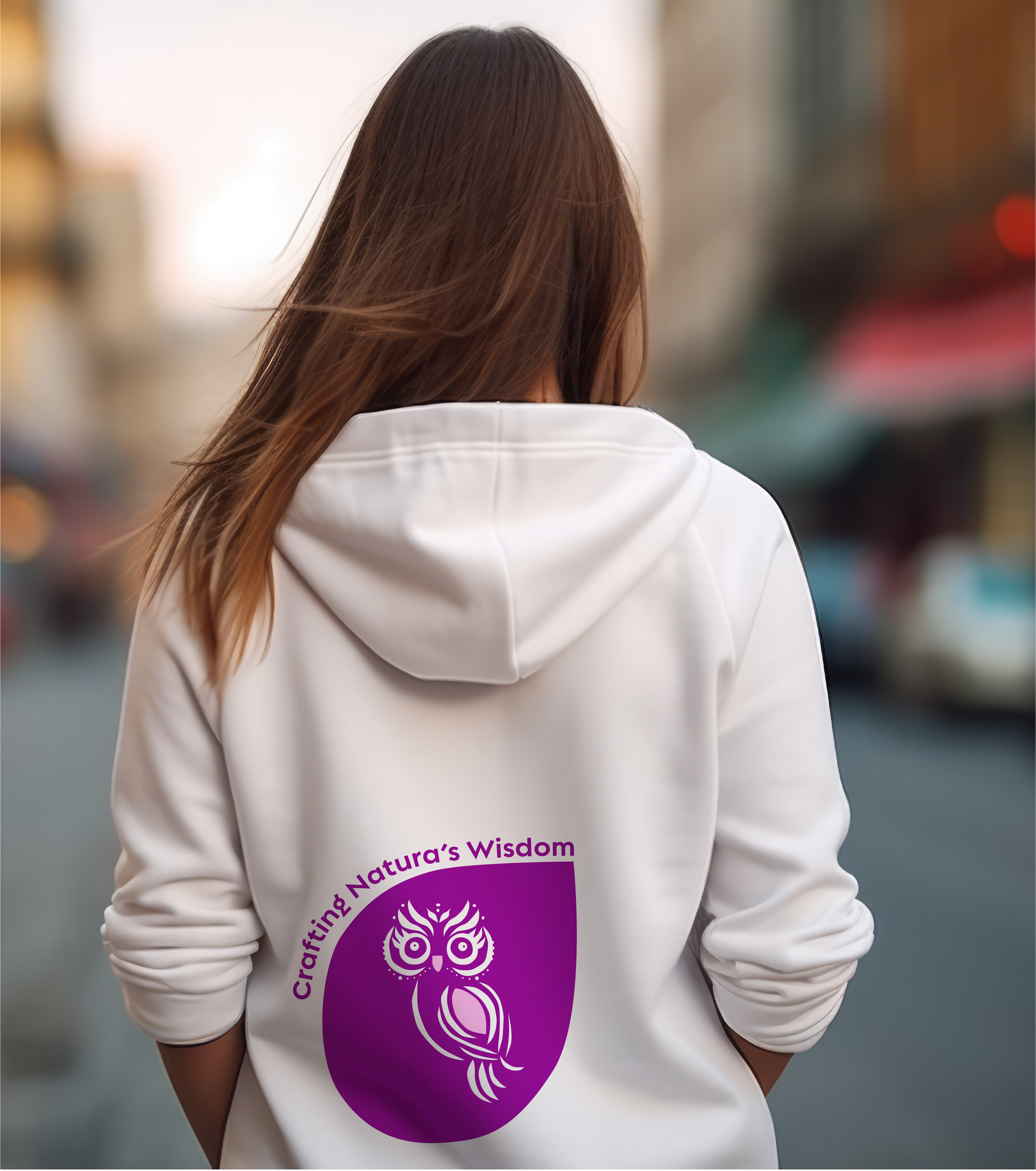
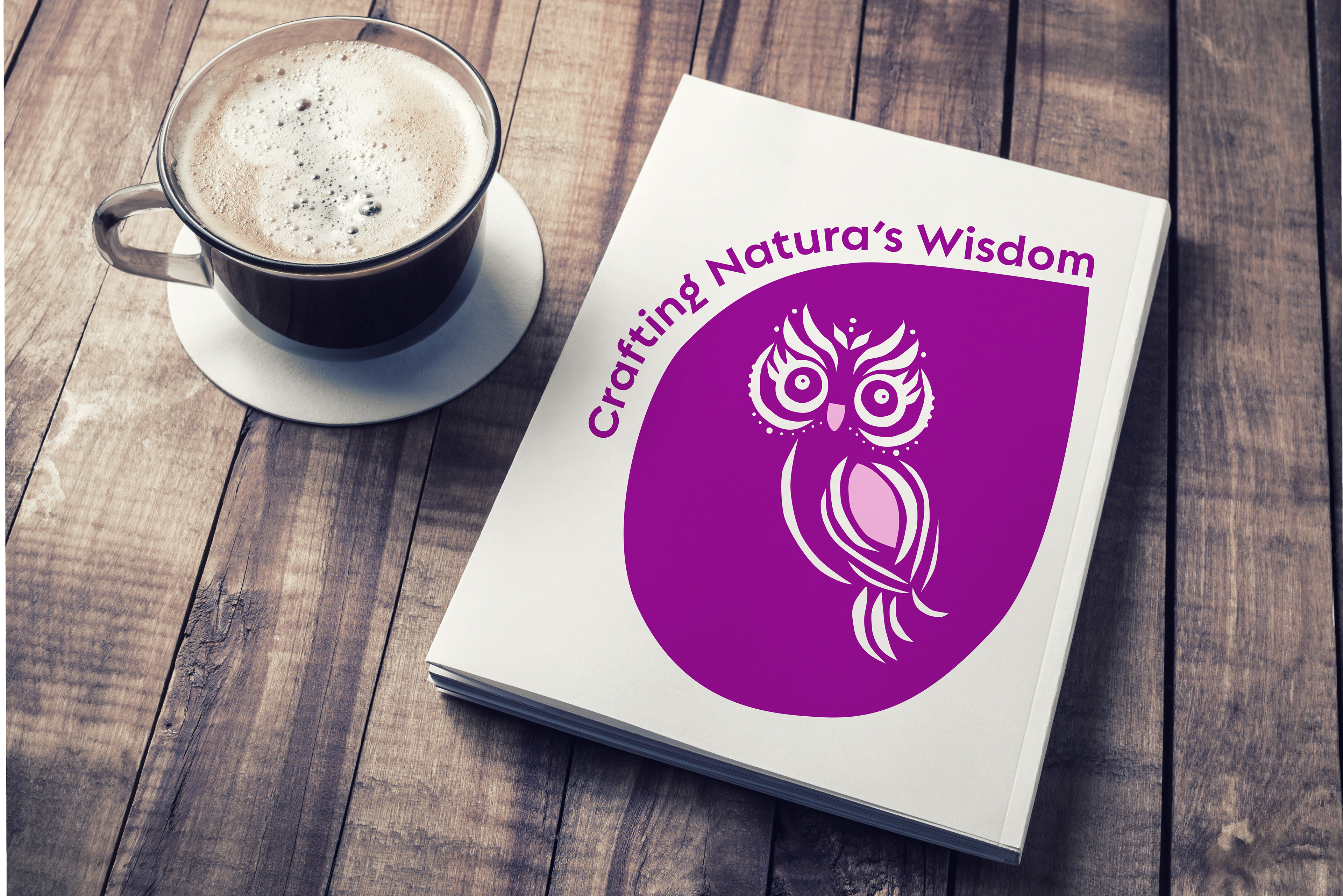
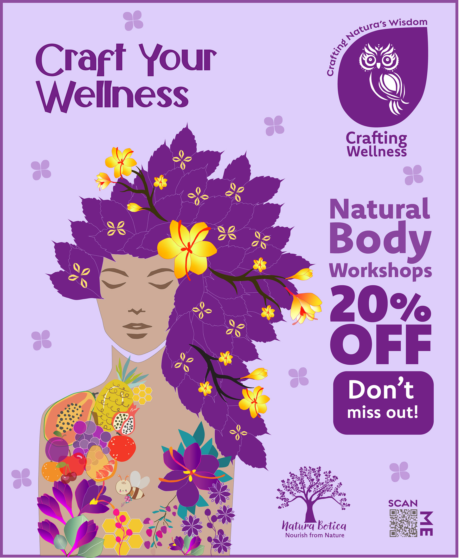
Workshop Division: Customers craft natural products / Tagline: "Crafting Natura's Wisdom"
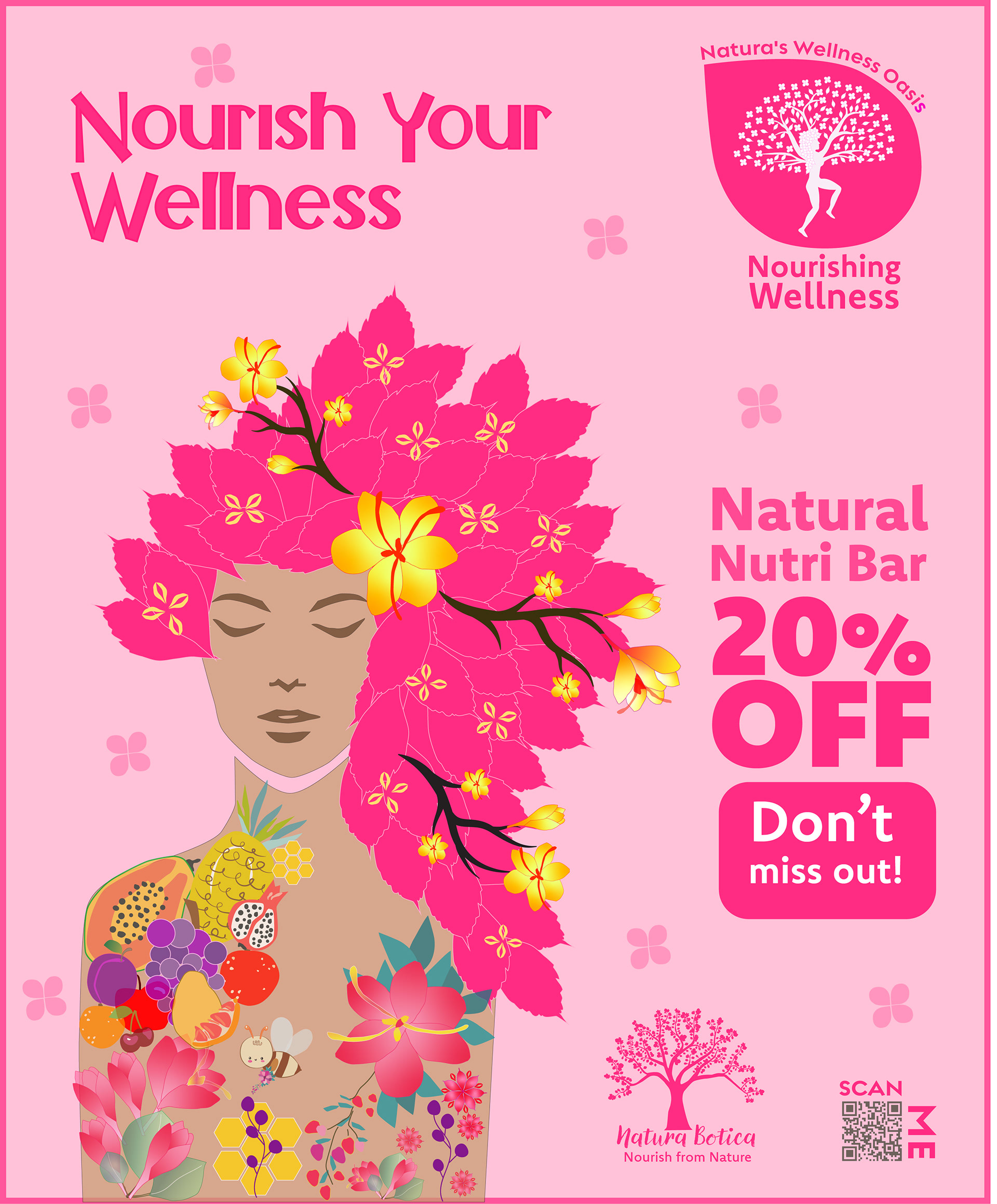
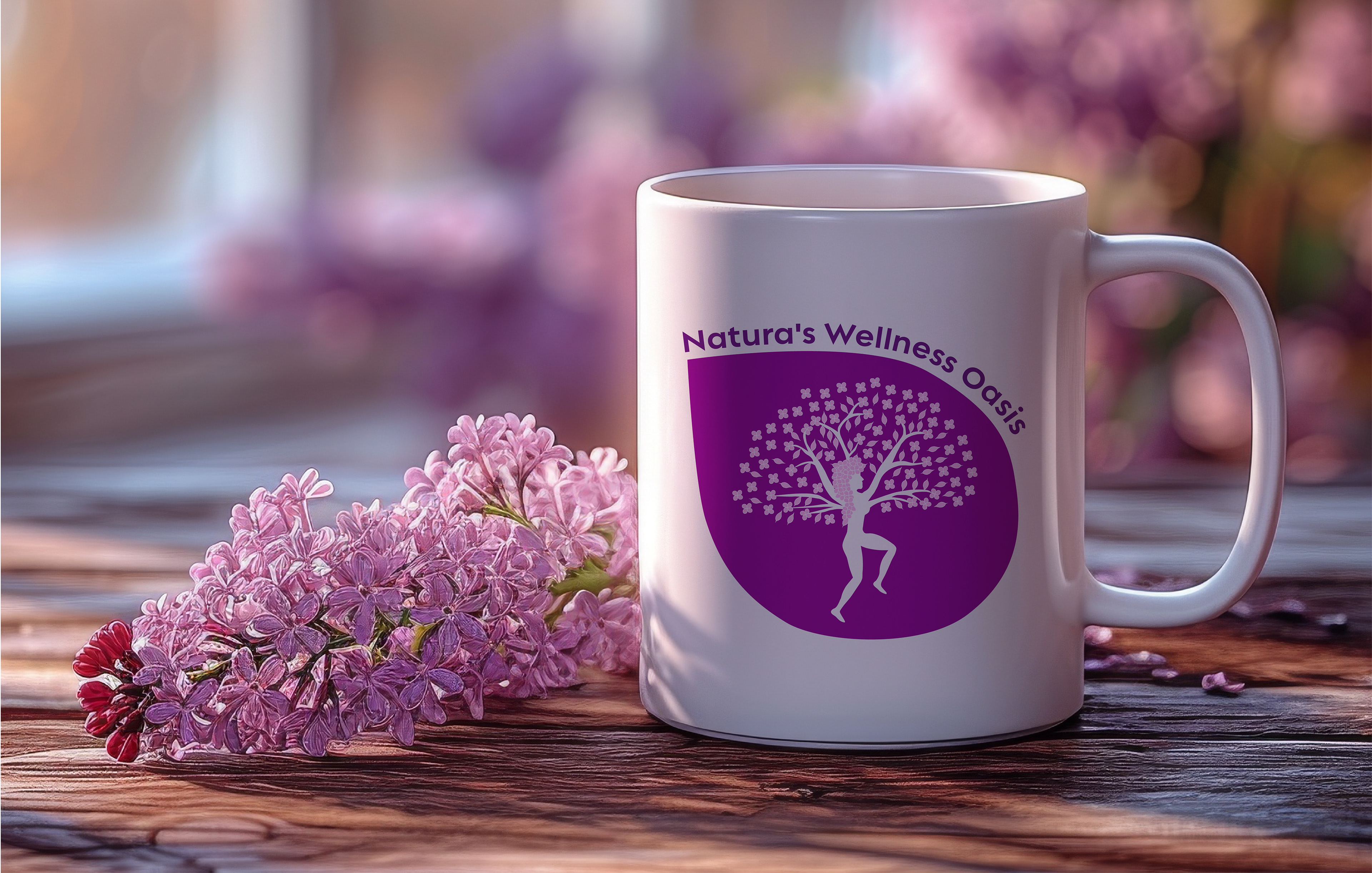
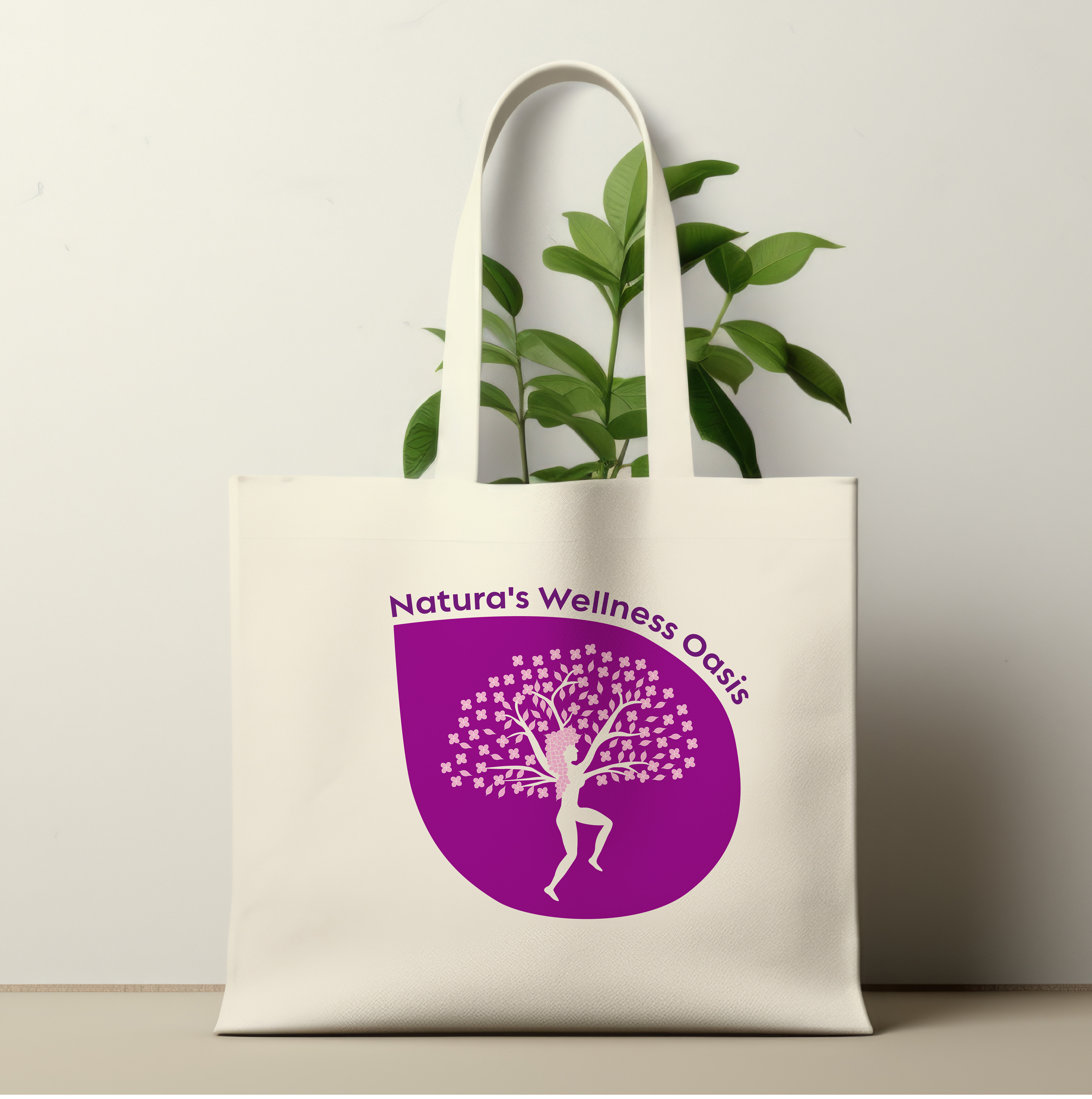
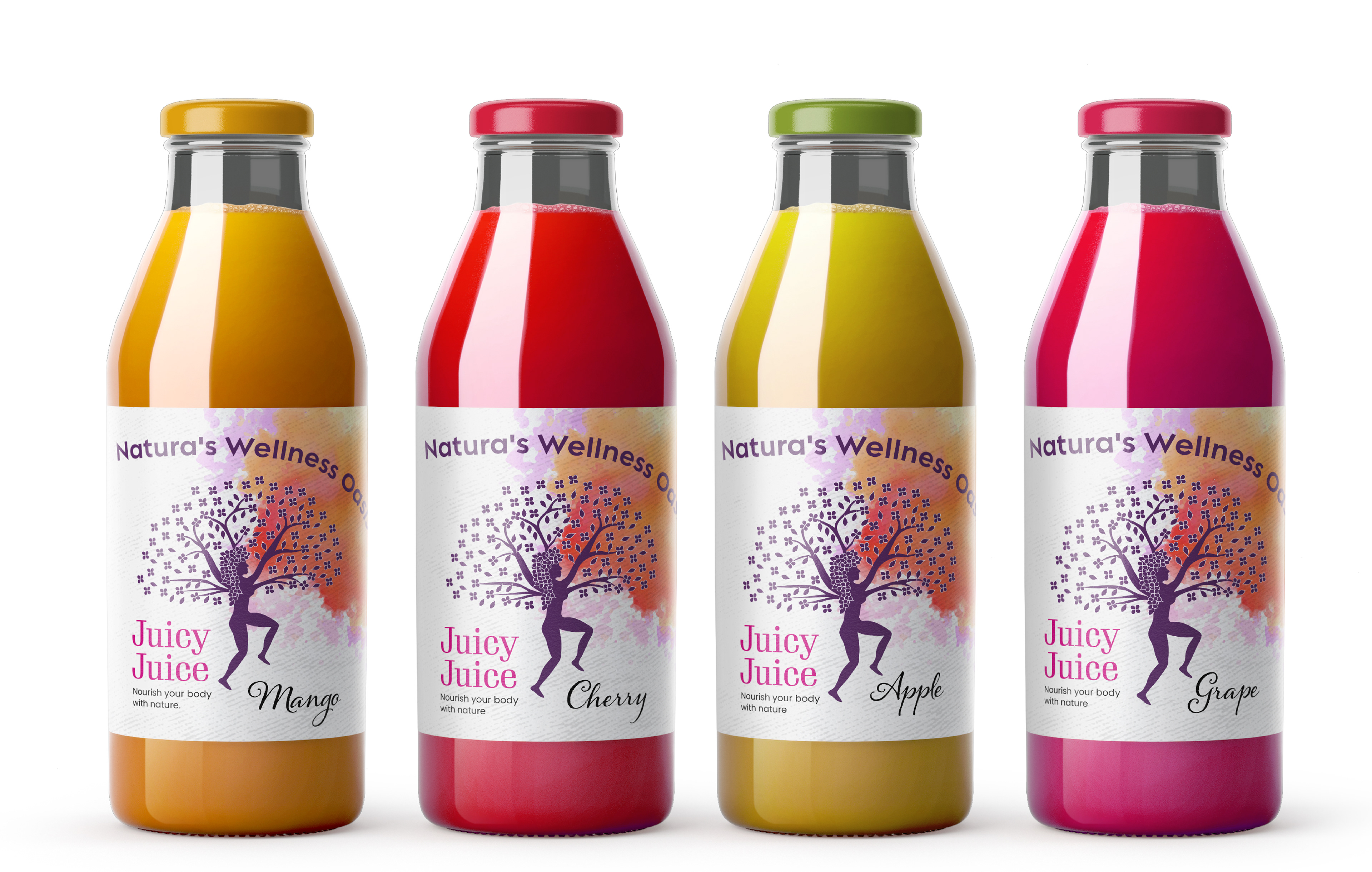
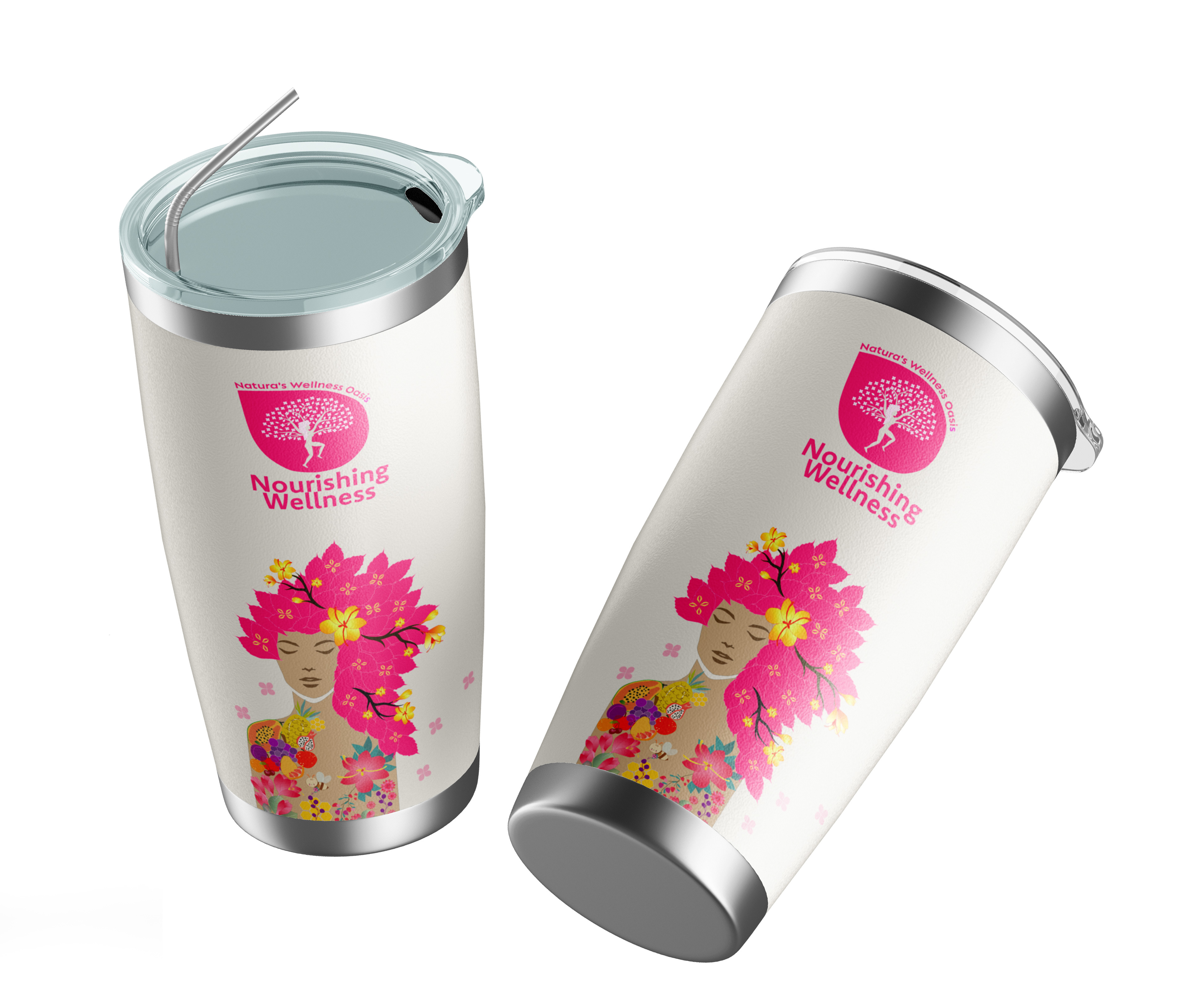
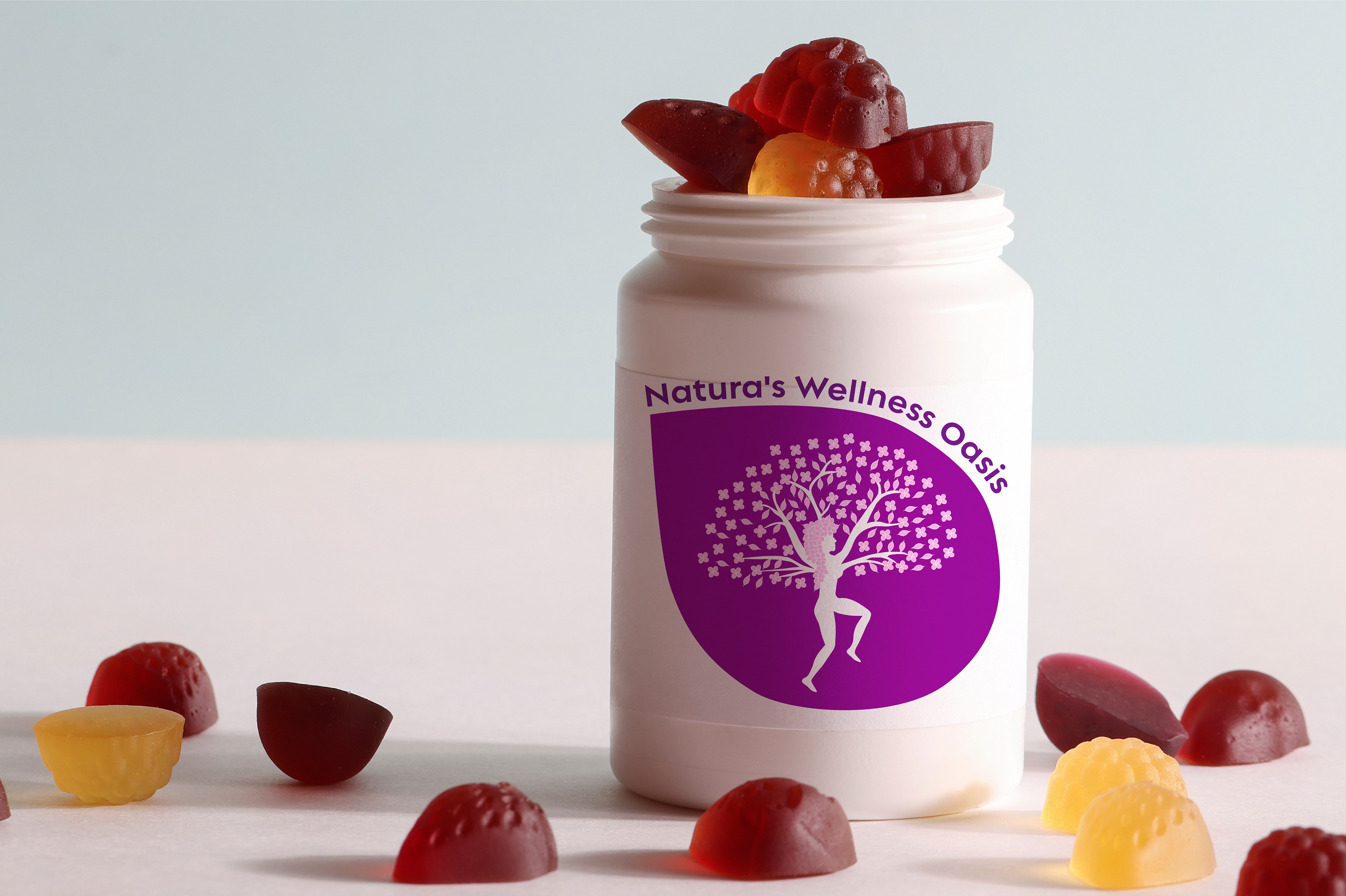
NutriBar Division: Offers nourishing smoothies, juices, teas / Tagline: "Natura's Wellness Oasis."
Color Run
In crafting the color palette for the Color Run project, I drew inspiration from the vibrant hues found in nature. Shades of purple, ranging from deep royal tones to soft lilacs, formed the foundation, symbolizing both regality and tranquility. Complementary colors such as pinks, blues, and yellows were introduced to evoke the diversity of the natural world. The decision to feature the pink purple color in the logo, representing the Tree of Life within a petal shape, was a seamless reflection of the harmony between nature and the Color Run brand. This palette celebrates life, growth, and the interconnectedness found in the beauty of the world around us.


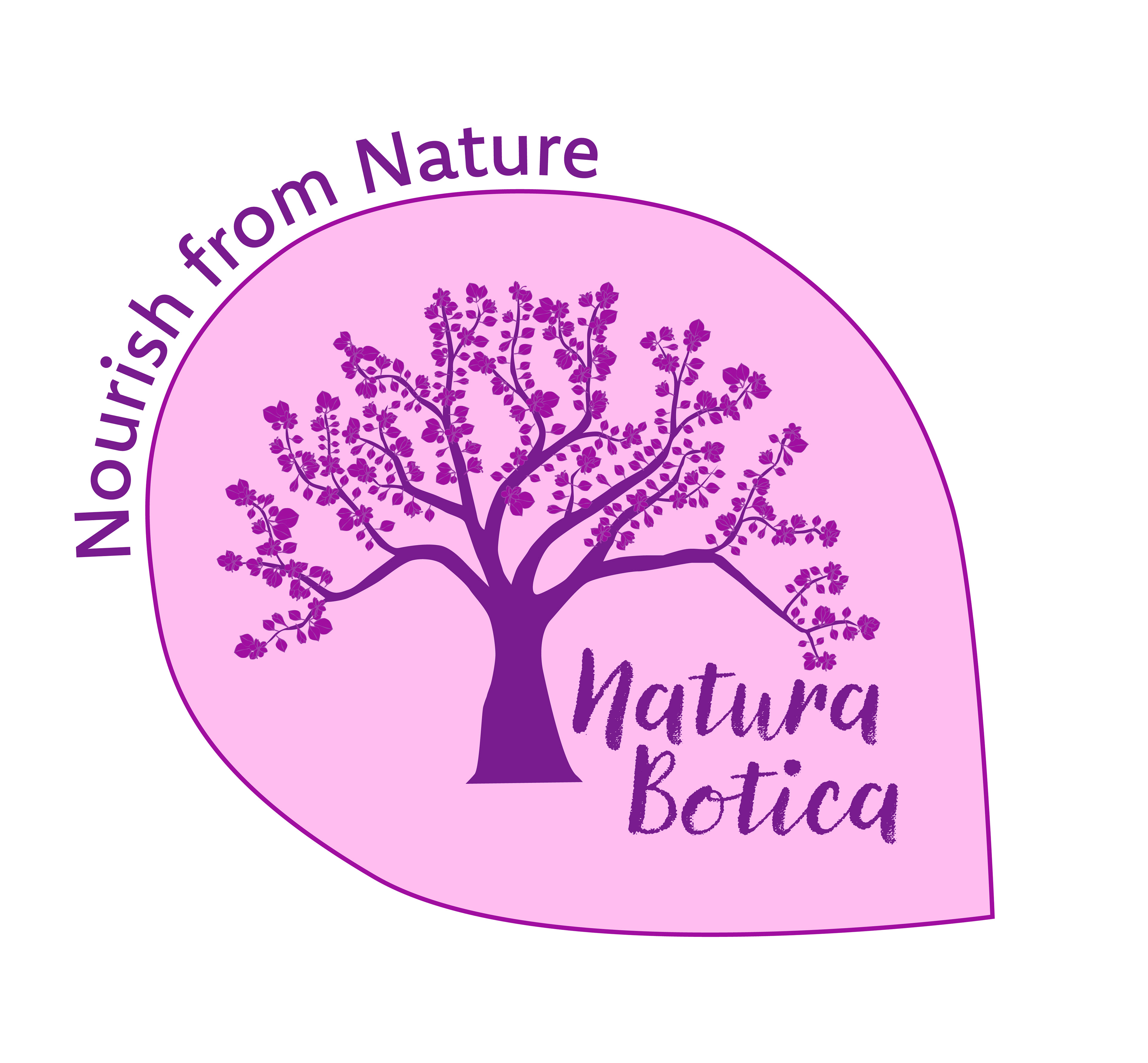

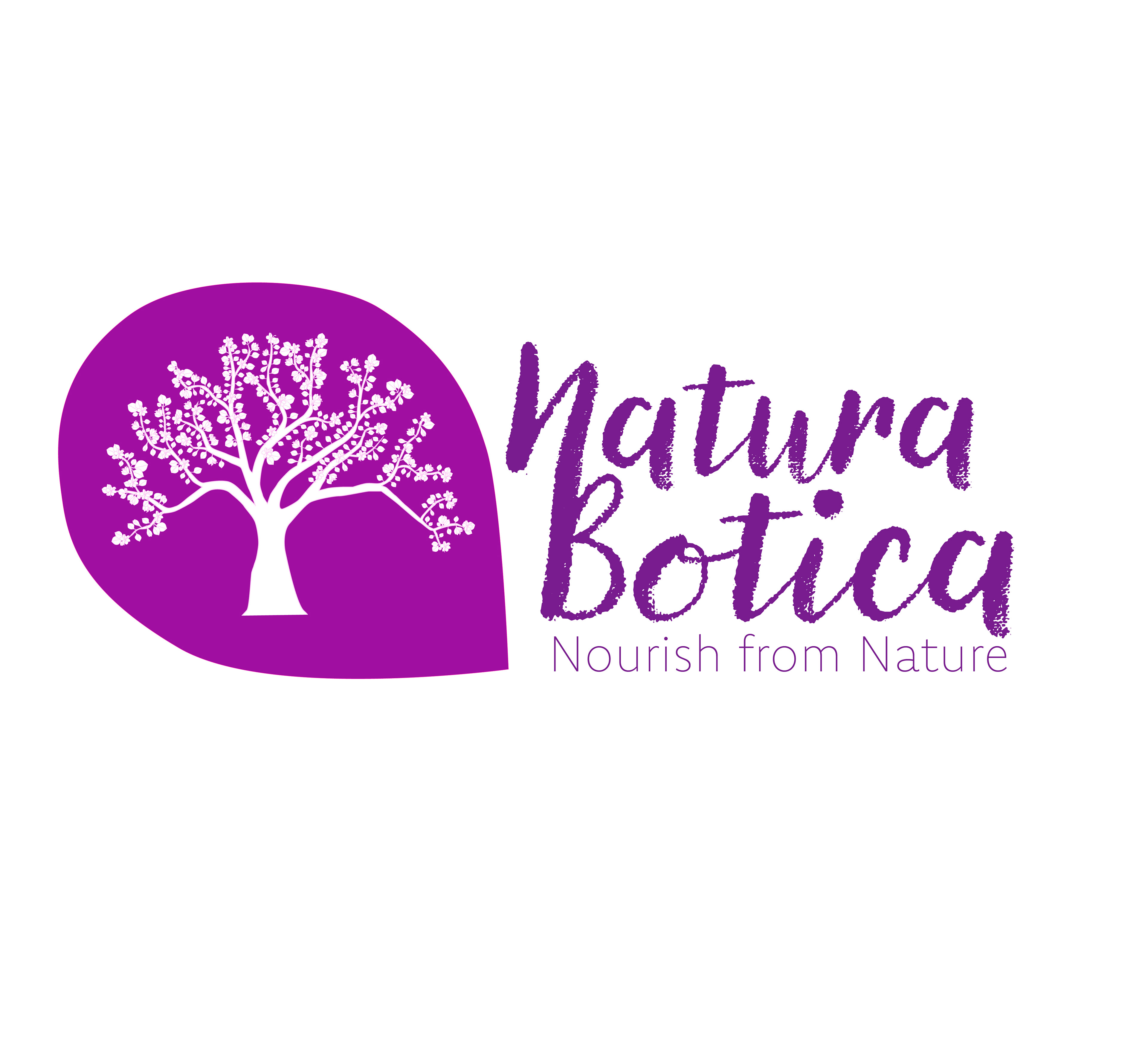
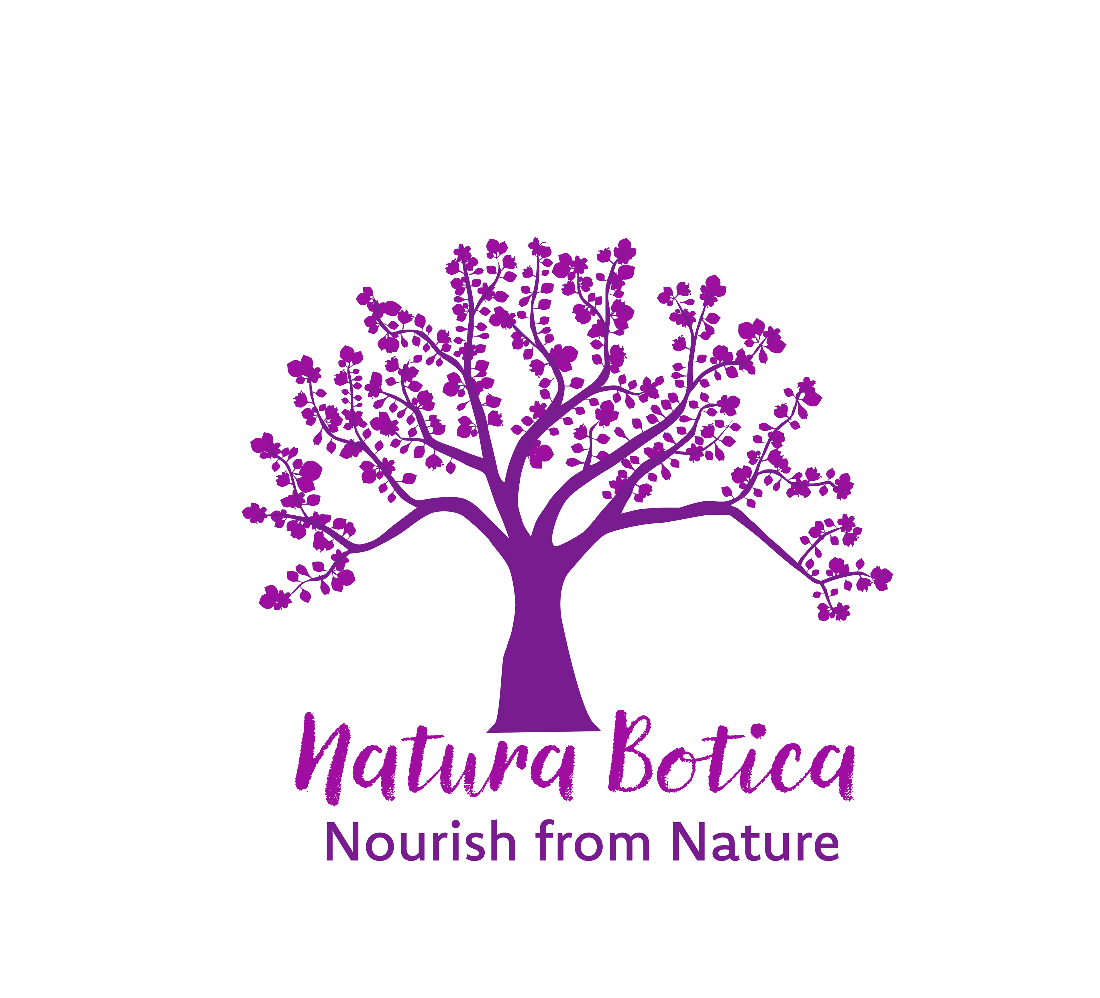
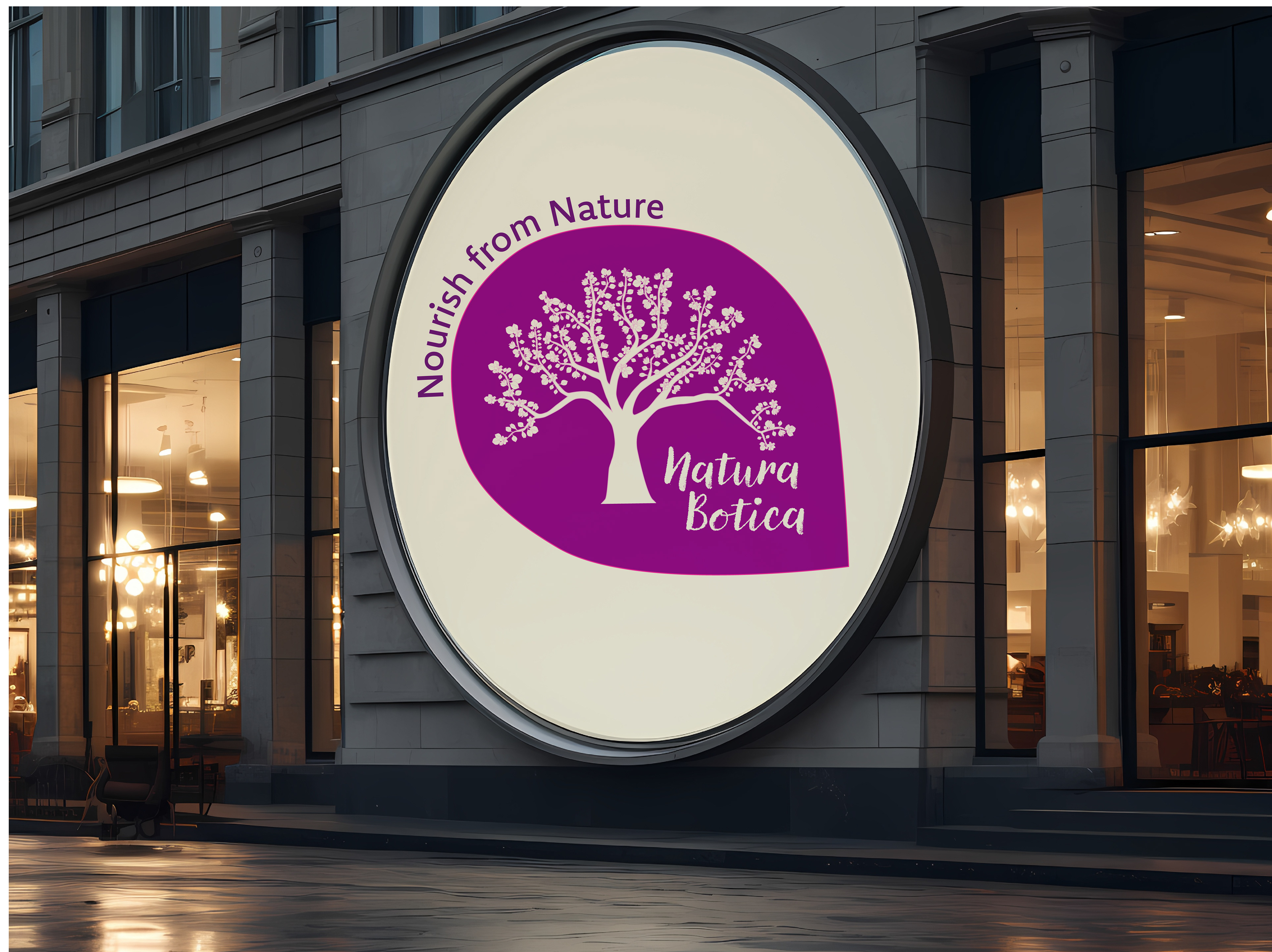
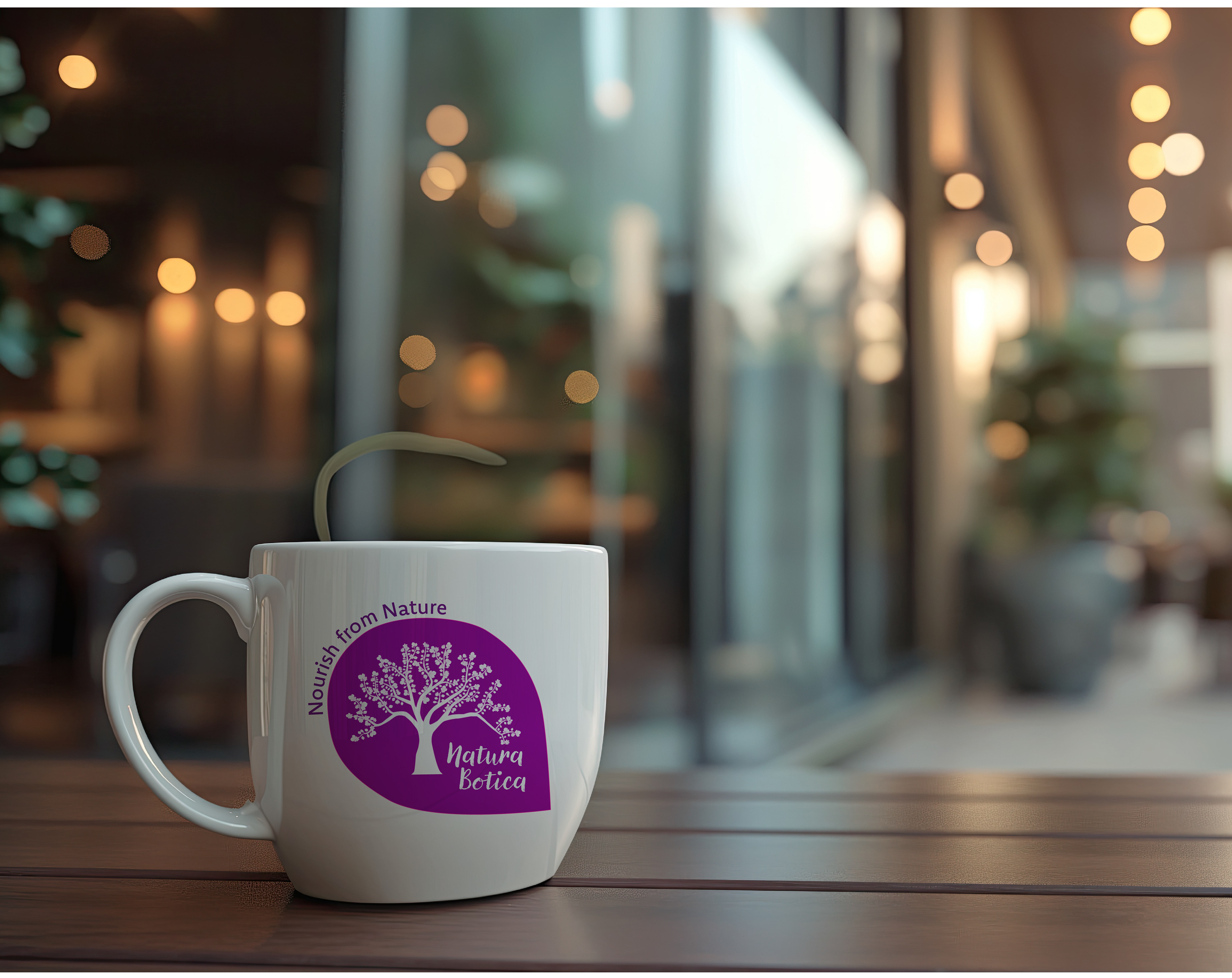
Final Logo
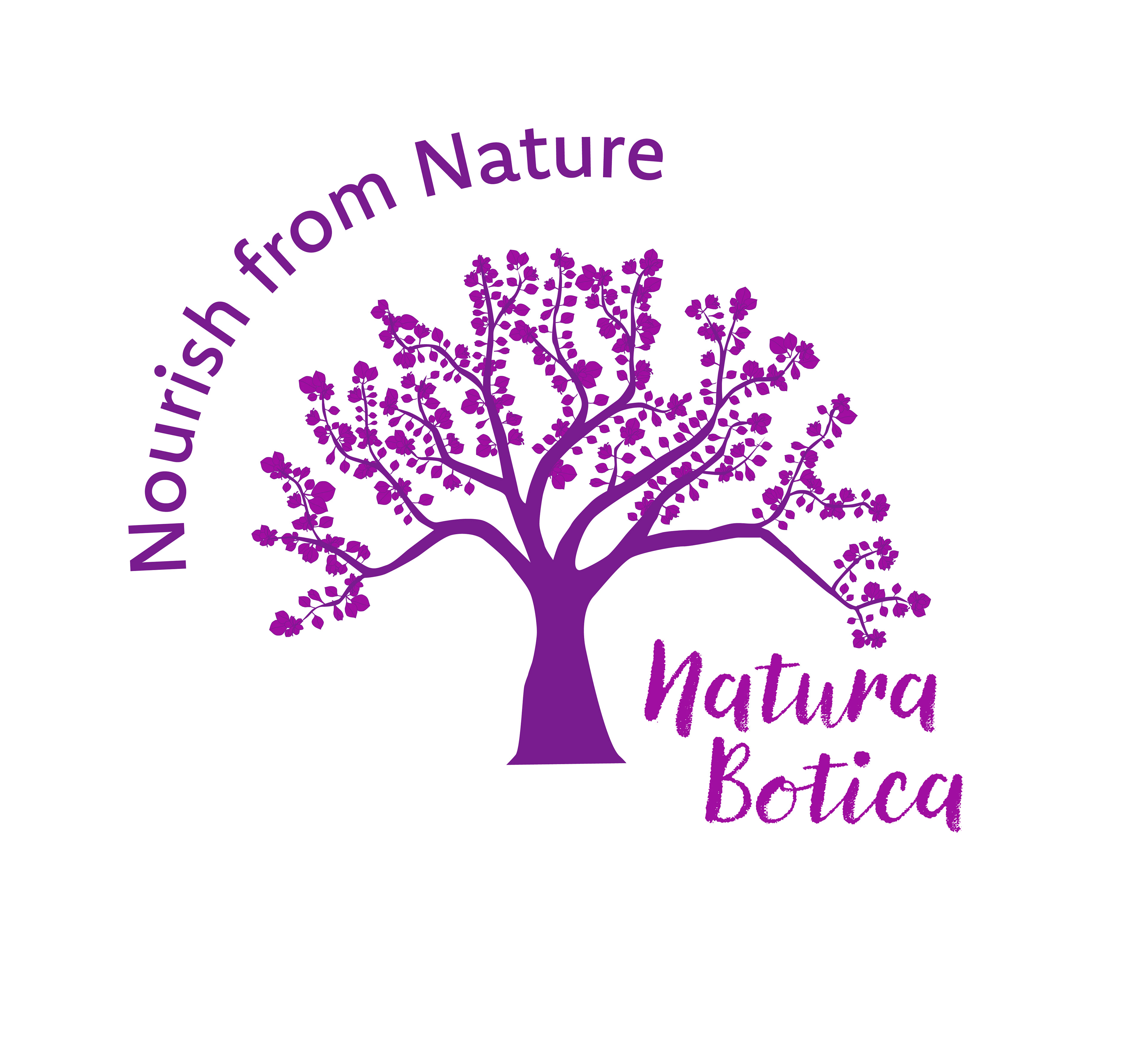
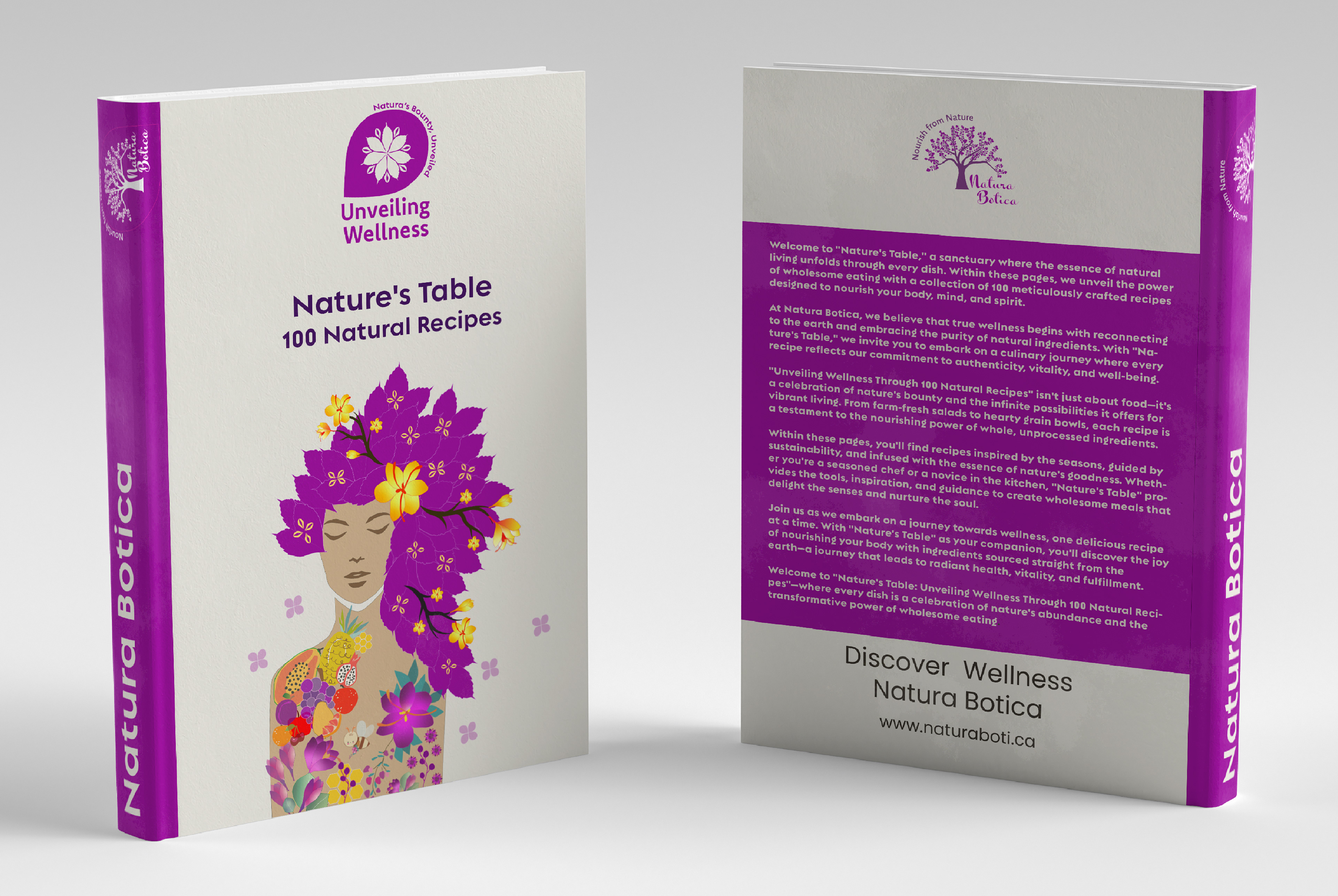
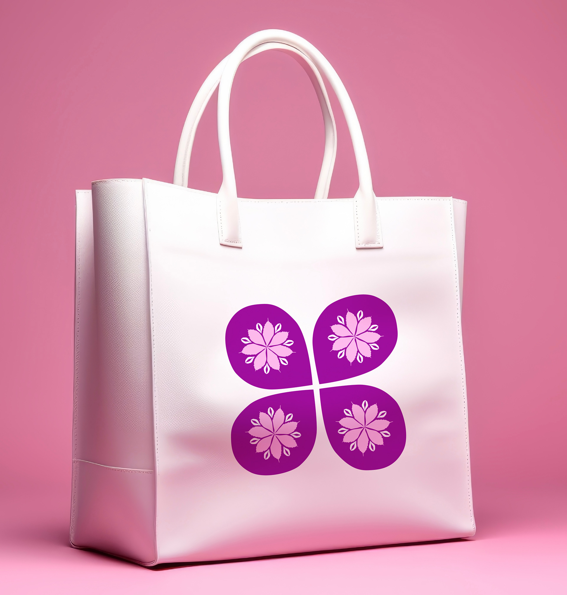
The logo of Natura Botica is meticulously crafted to encapsulate the essence of natural wellness. At its core lies the symbol of the Tree of Life, signifying health, vitality, and interconnectedness with nature. It is ensconced within a delicate petal, symbolizing the nurturing embrace of nature. The tagline "Nourish from Nature" succinctly conveys the brand's commitment to harnessing the power of natural ingredients for holistic well-being. The colors chosen—lilac, purple, and white—evoke a sense of purity, tranquility, and sophistication, mirroring the brand's ethos of organic purity and elegance.
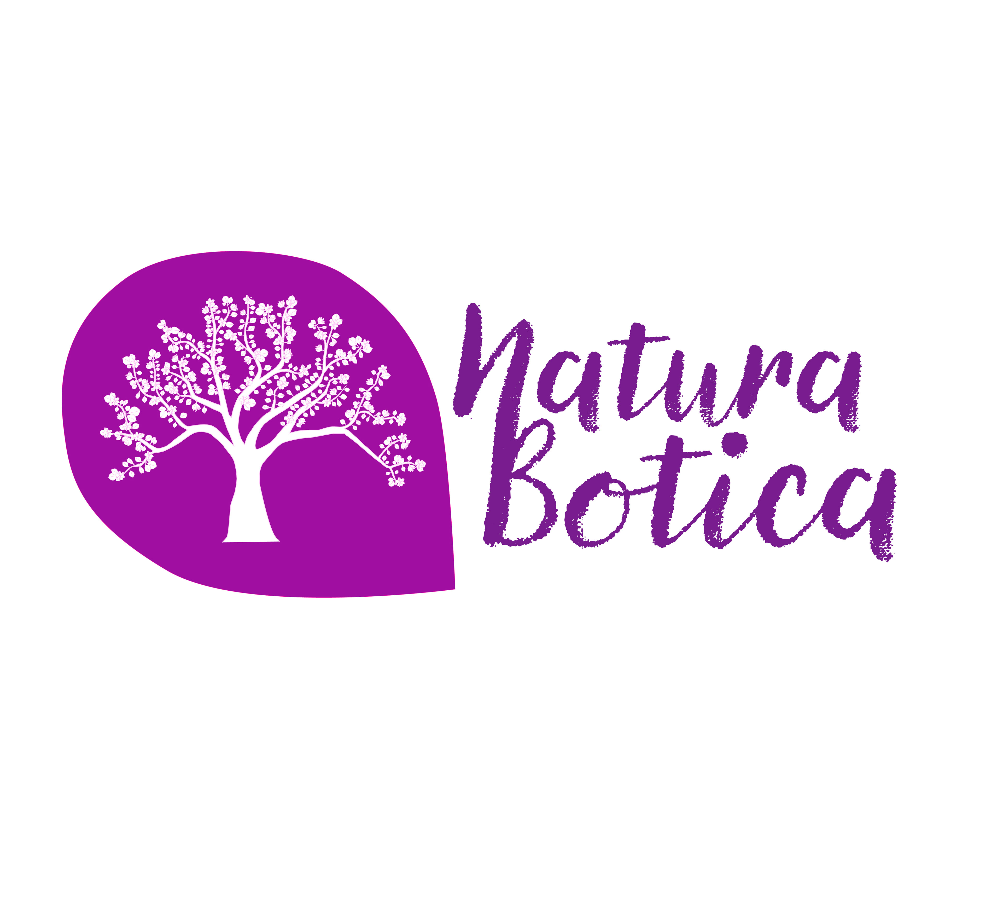
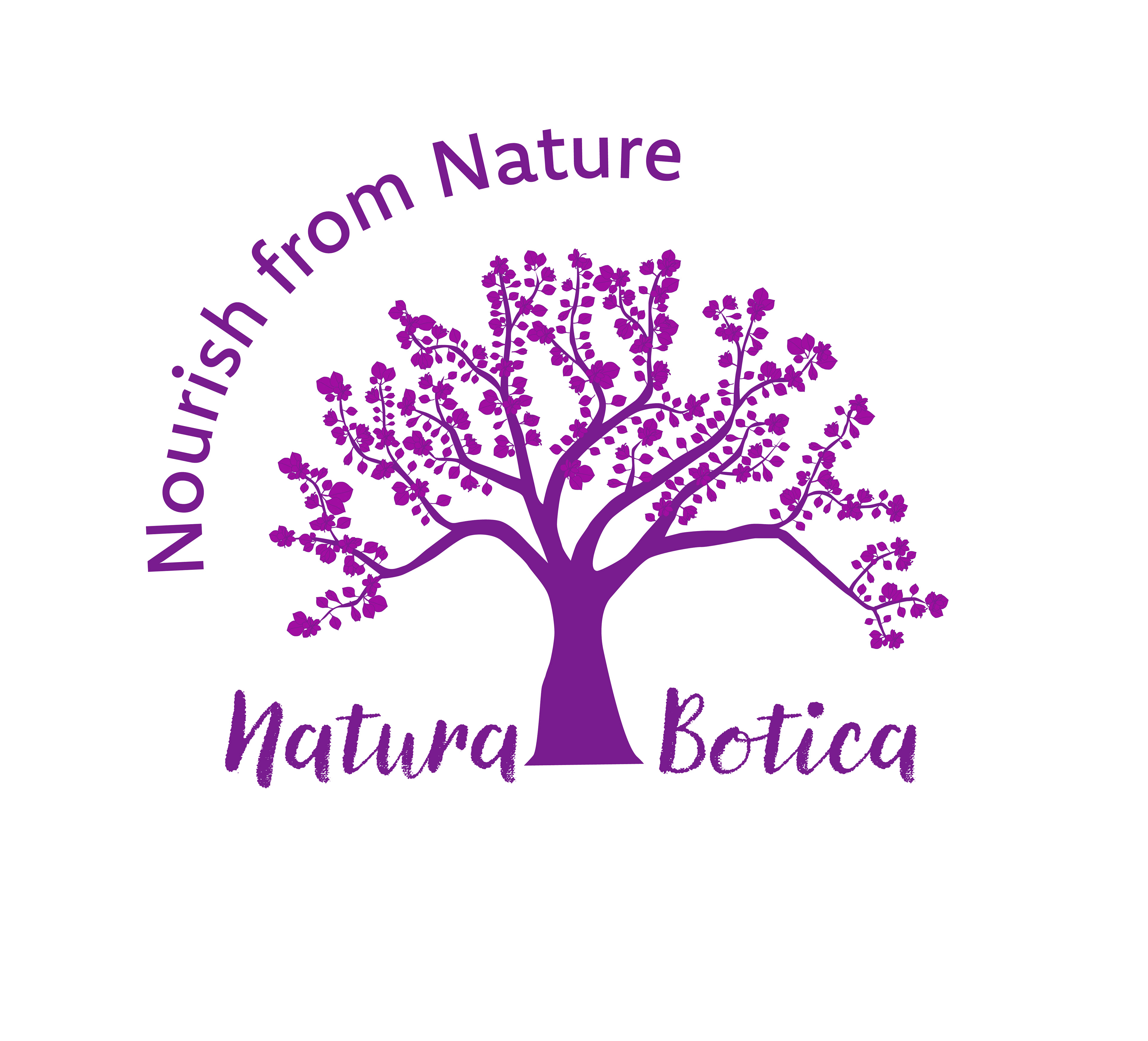
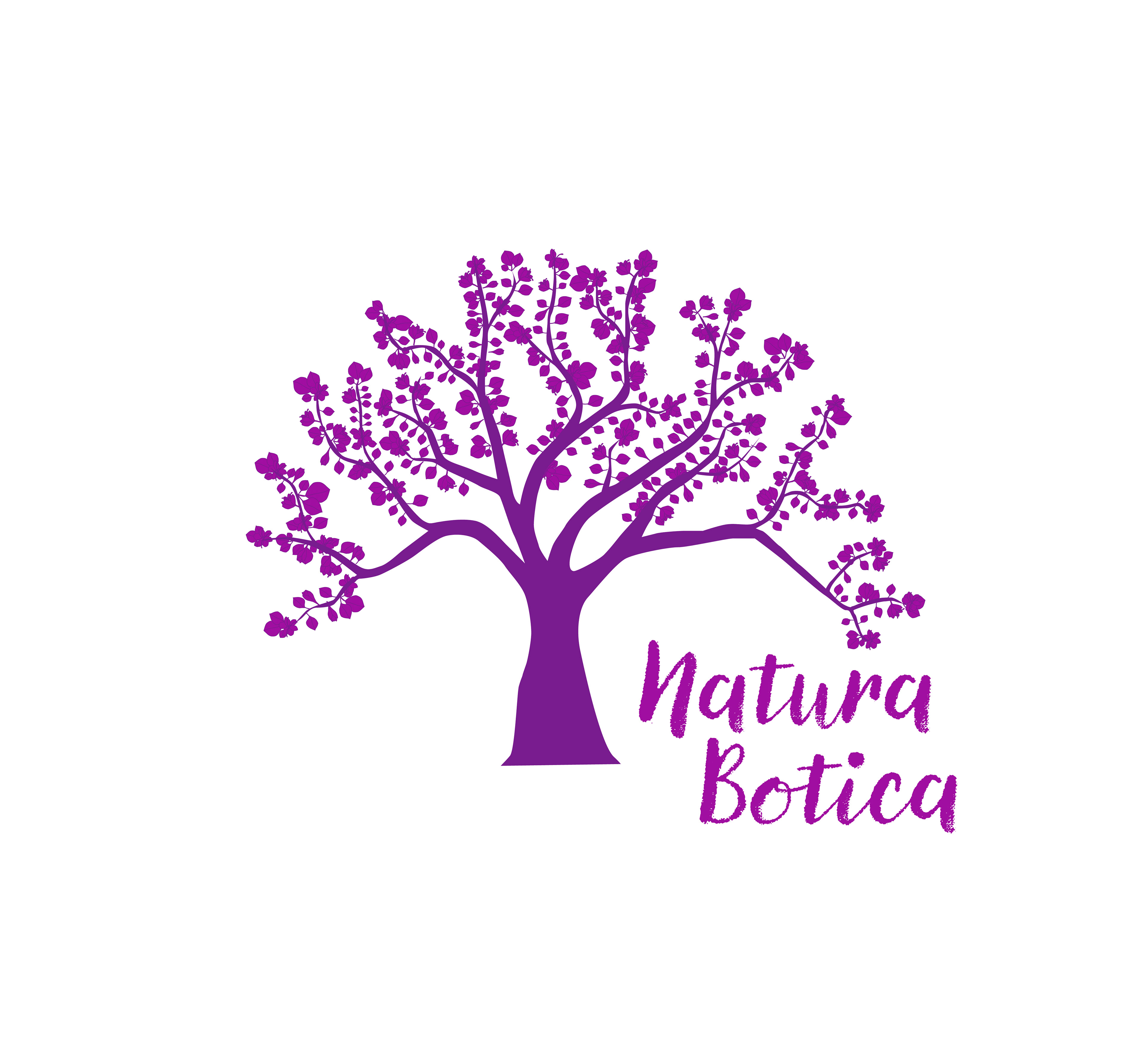
Logo Lock-ups
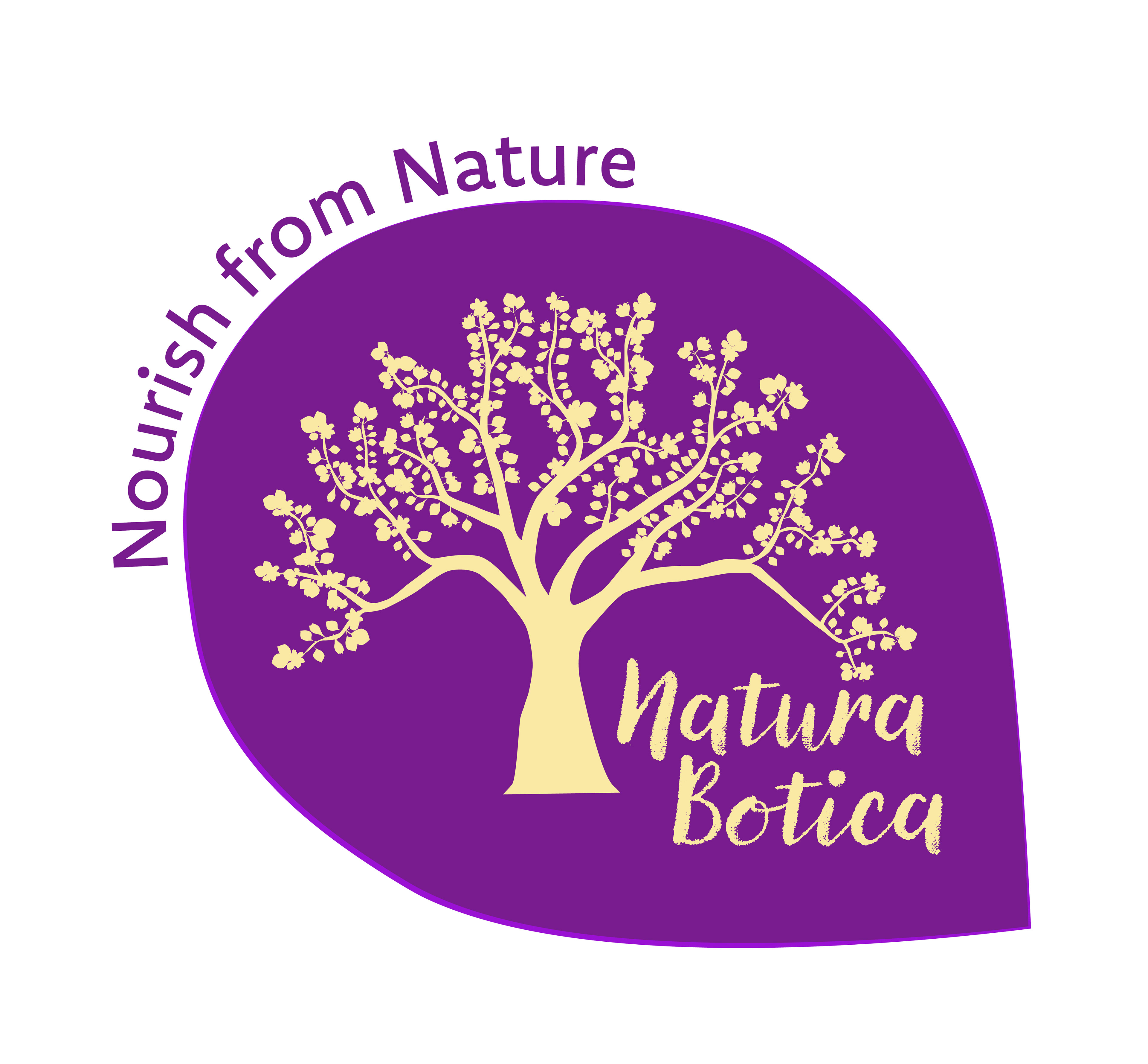
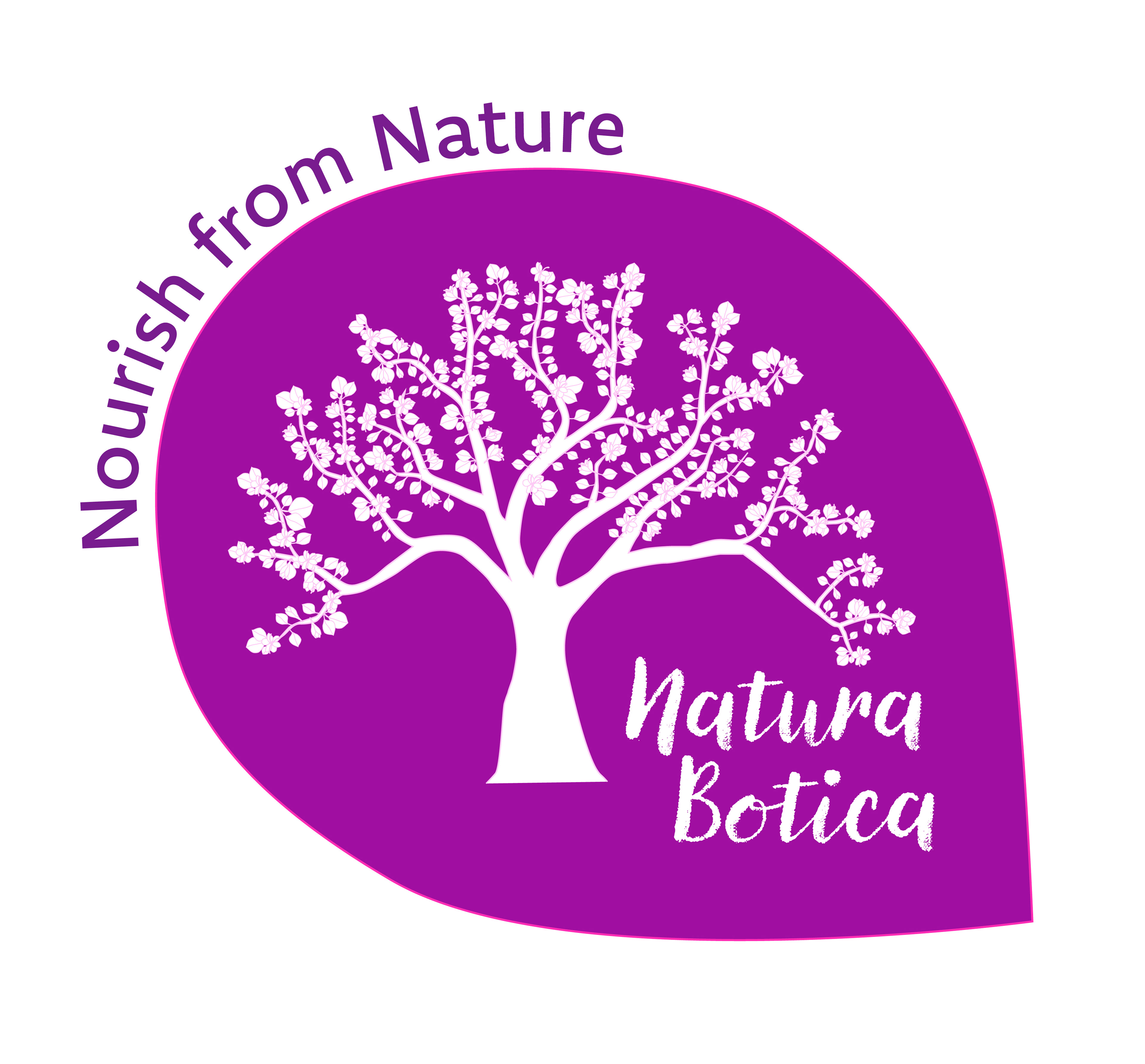
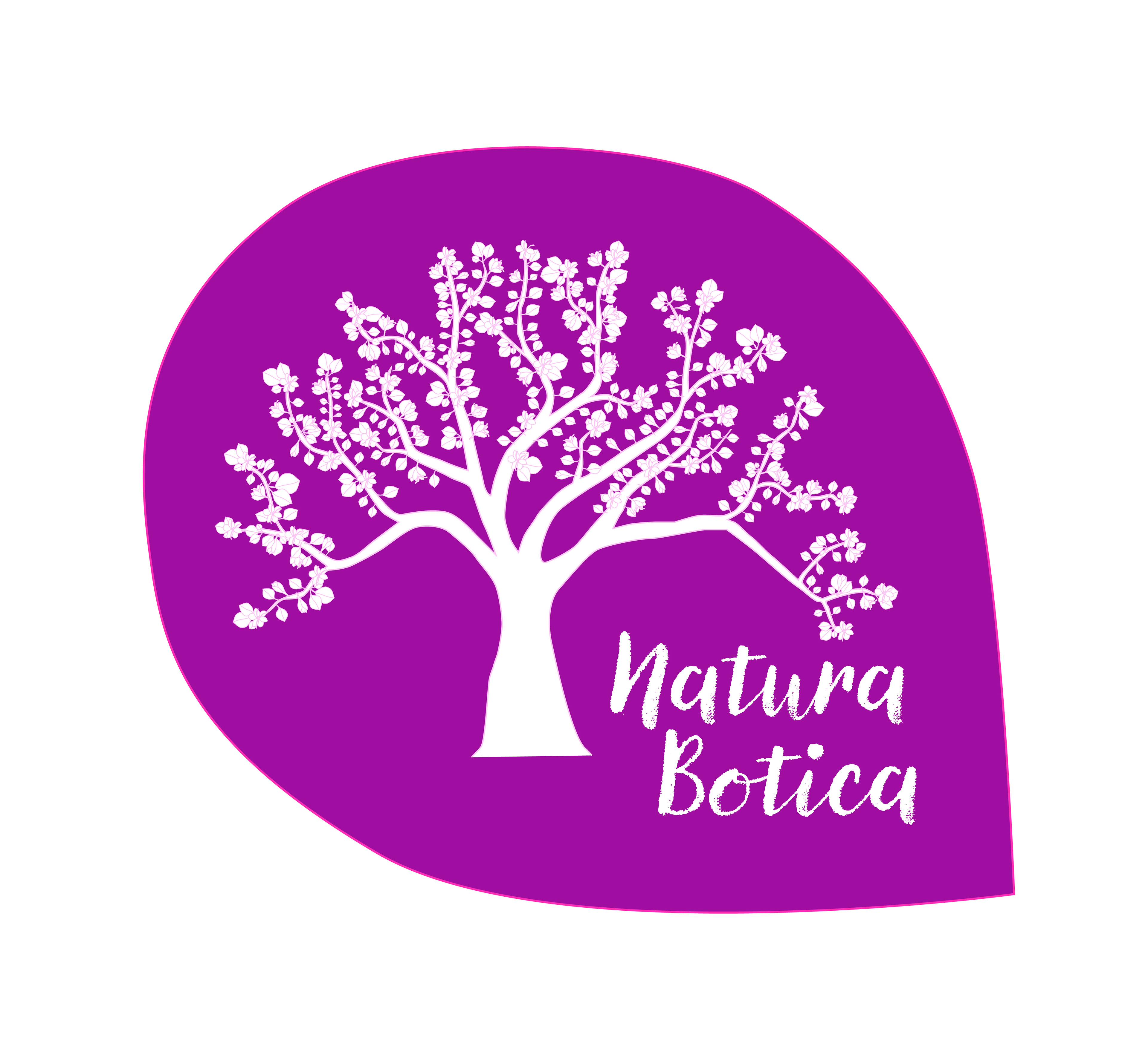
In developing the lockups for the Color Run project, I explored variations of the Tree of Life logo without the surrounding petal, focusing solely on its majestic imagery. These lockups were paired with different arrangements of text, showcasing versatility in design while maintaining the brand's essence. Additionally, a smaller version of the logo was created with the text positioned on the right, allowing for greater flexibility in placement and layout.
Furthermore, I experimented with two additional color variations while adhering to the same color scheme. By subtly altering the arrangement of colors within the logo, I created unique iterations that offered a fresh perspective while retaining the brand's identity. These variations provided flexibility in usage across different contexts while ensuring consistency and coherence in visual representation.
Primary

Secondary
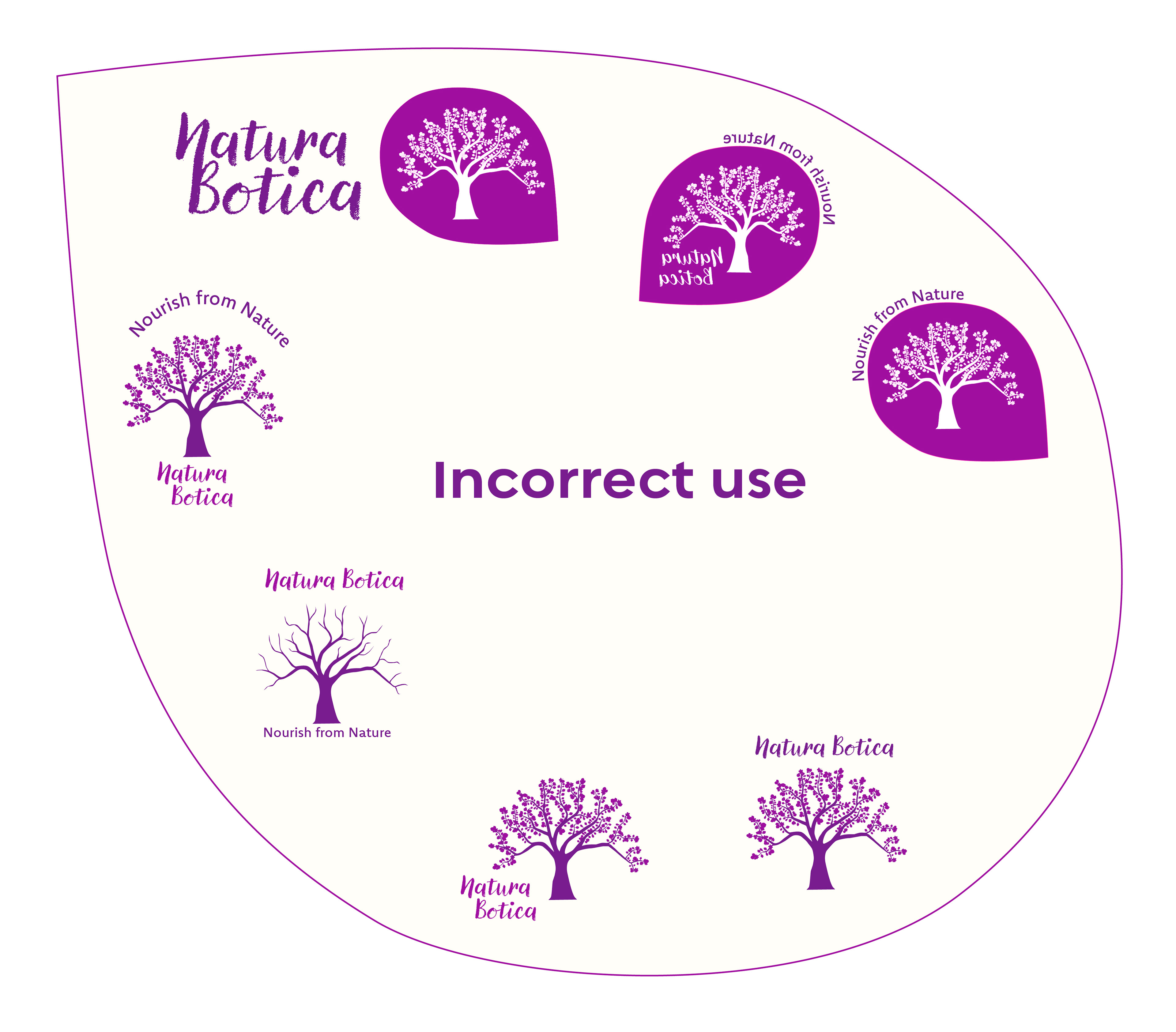
Logo Use
This is an important aspect of the brand guidelines. During the design process, I intentionally created scenarios to illustrate incorrect uses of the logo. These examples were crafted to highlight potential pitfalls and emphasize the importance of adhering to the established guidelines. It's crucial to note that these incorrect uses are not to be employed but rather serve as cautionary reminders to maintain consistency and integrity in visual representation.
Rest assured, the brand guidelines provide clear instructions on the proper usage of the logo to ensure that it is always presented in a manner that reflects the essence of Natura Botica's identity. By adhering closely to these guidelines, we can preserve the integrity of the brand and reinforce its message of natural wellness and sustainability.
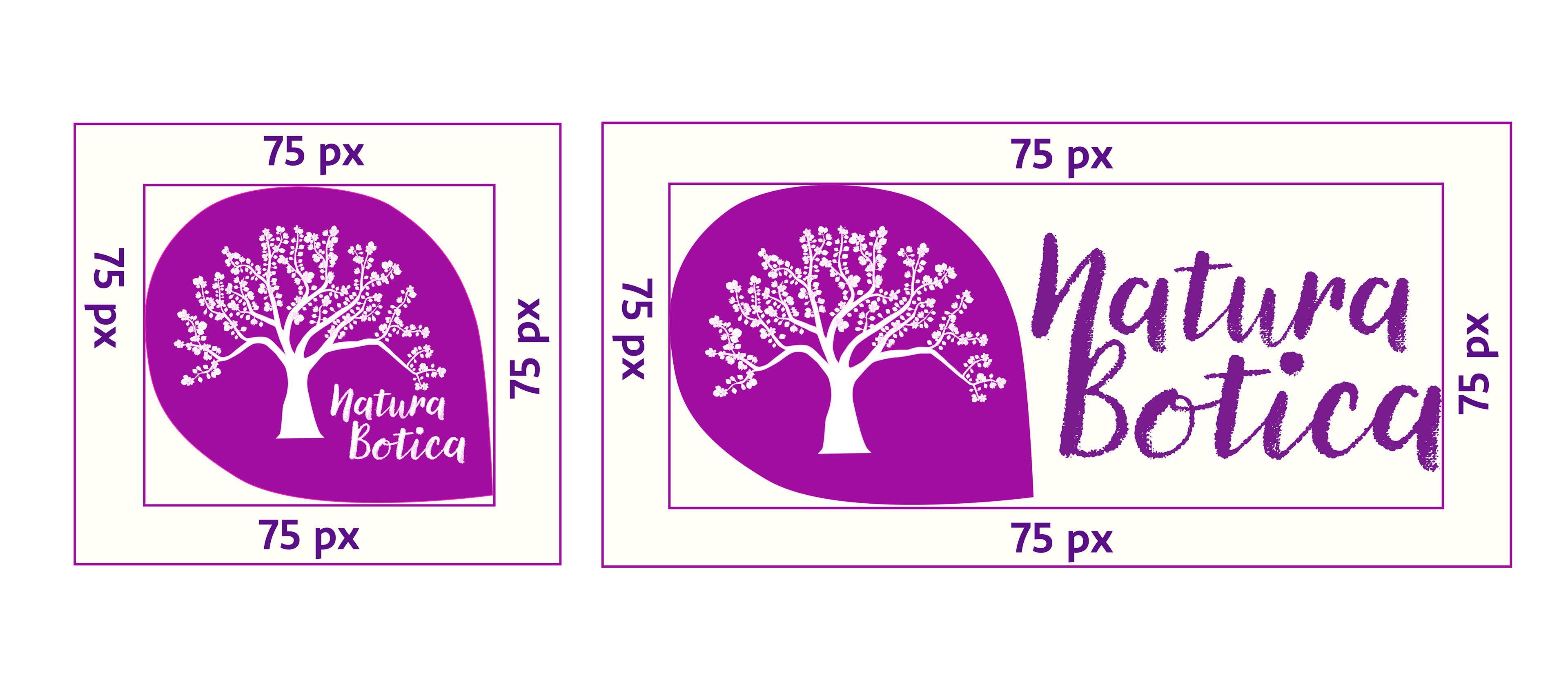
Minimum Logo Size
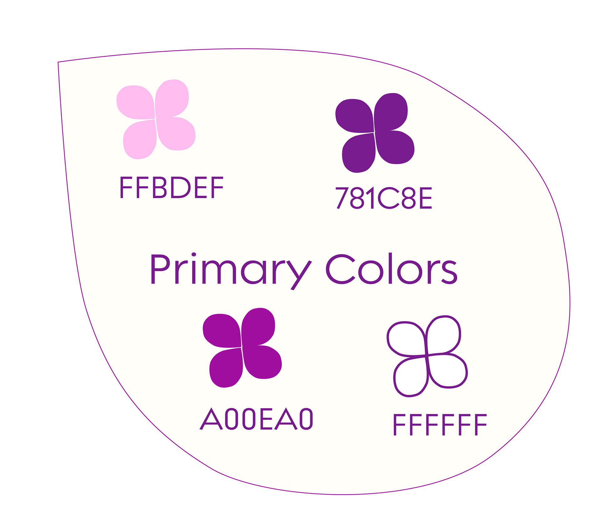
Color Palette
In crafting the color palette for the Natura Botica project, I sought to capture the essence of natural beauty and purity. The primary colors, consisting of soothing purple tones, delicate pink, and crisp white, evoke a sense of tranquility and elegance. These hues reflect the brand's commitment to organic ingredients and holistic wellness, inviting customers to indulge in a world of natural luxury.
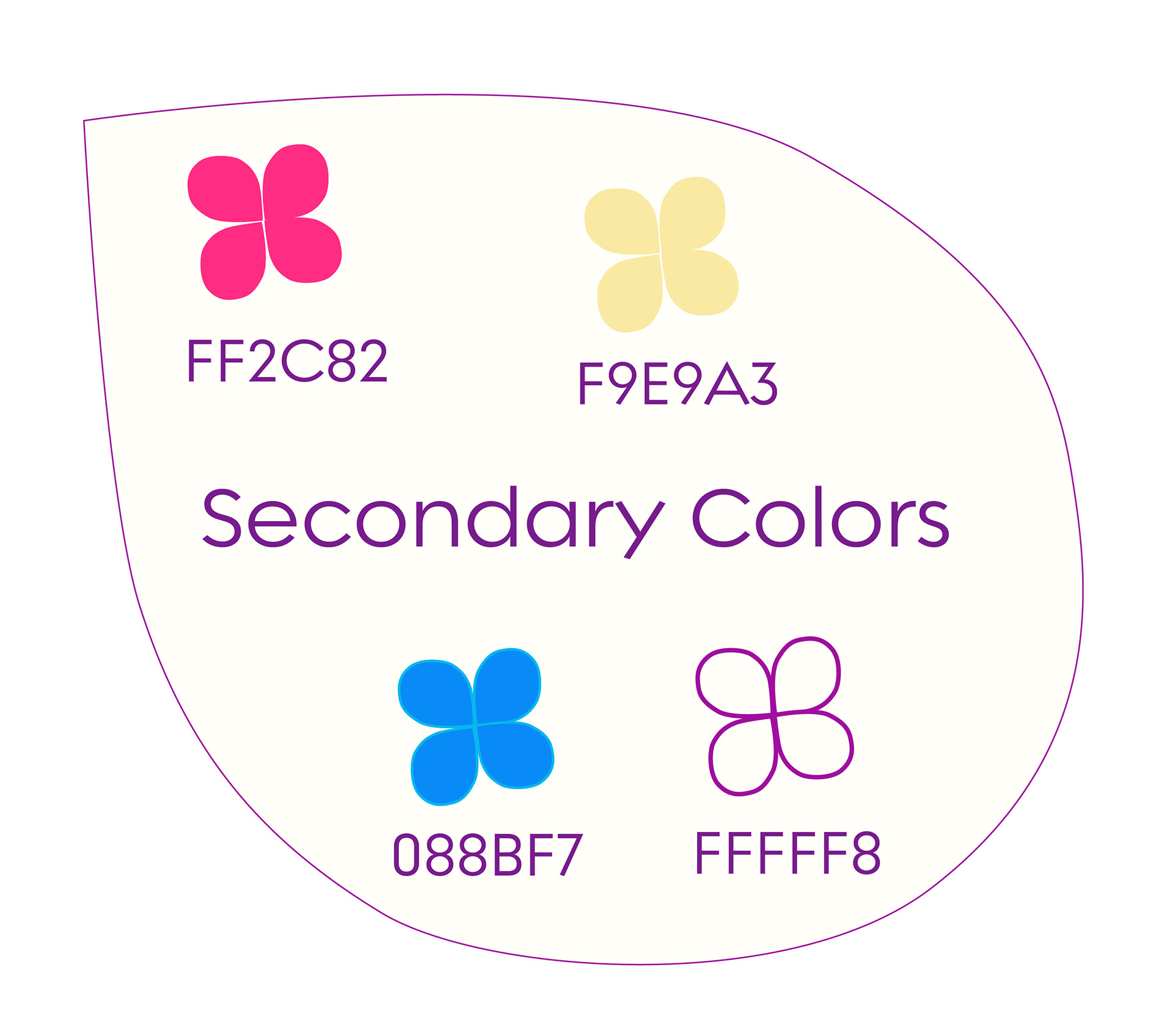
Complementing the primary palette are the secondary colors, which add depth and vibrancy to the overall scheme. Light blue hues evoke the calming presence of clear skies and pristine waters, while shades of orange and yellow infuse energy and warmth reminiscent of golden sunsets and lush citrus groves. Light beige tones provide a neutral backdrop, enhancing the palette's versatility and ensuring harmony across all brand elements.
Together, these carefully curated colors form a cohesive and inviting palette that embodies the spirit of Natura Botica—where nature meets luxury, and every product is a celebration of organic beauty and well-being.
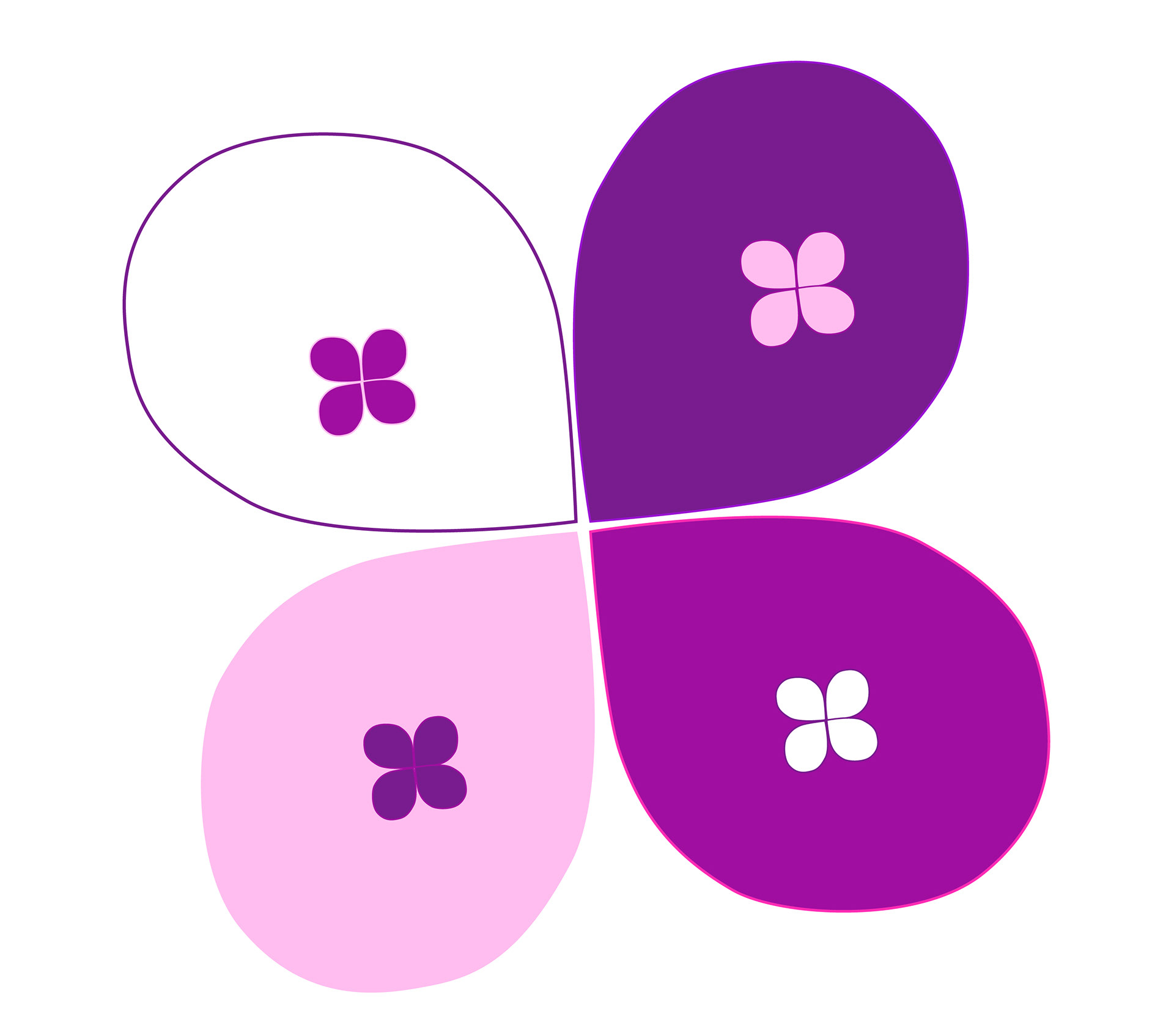
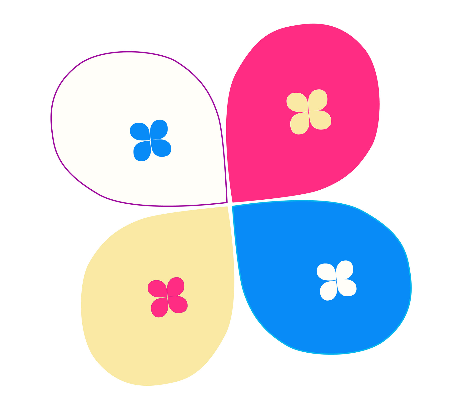
Brand Colors
Brand Colors Combinations
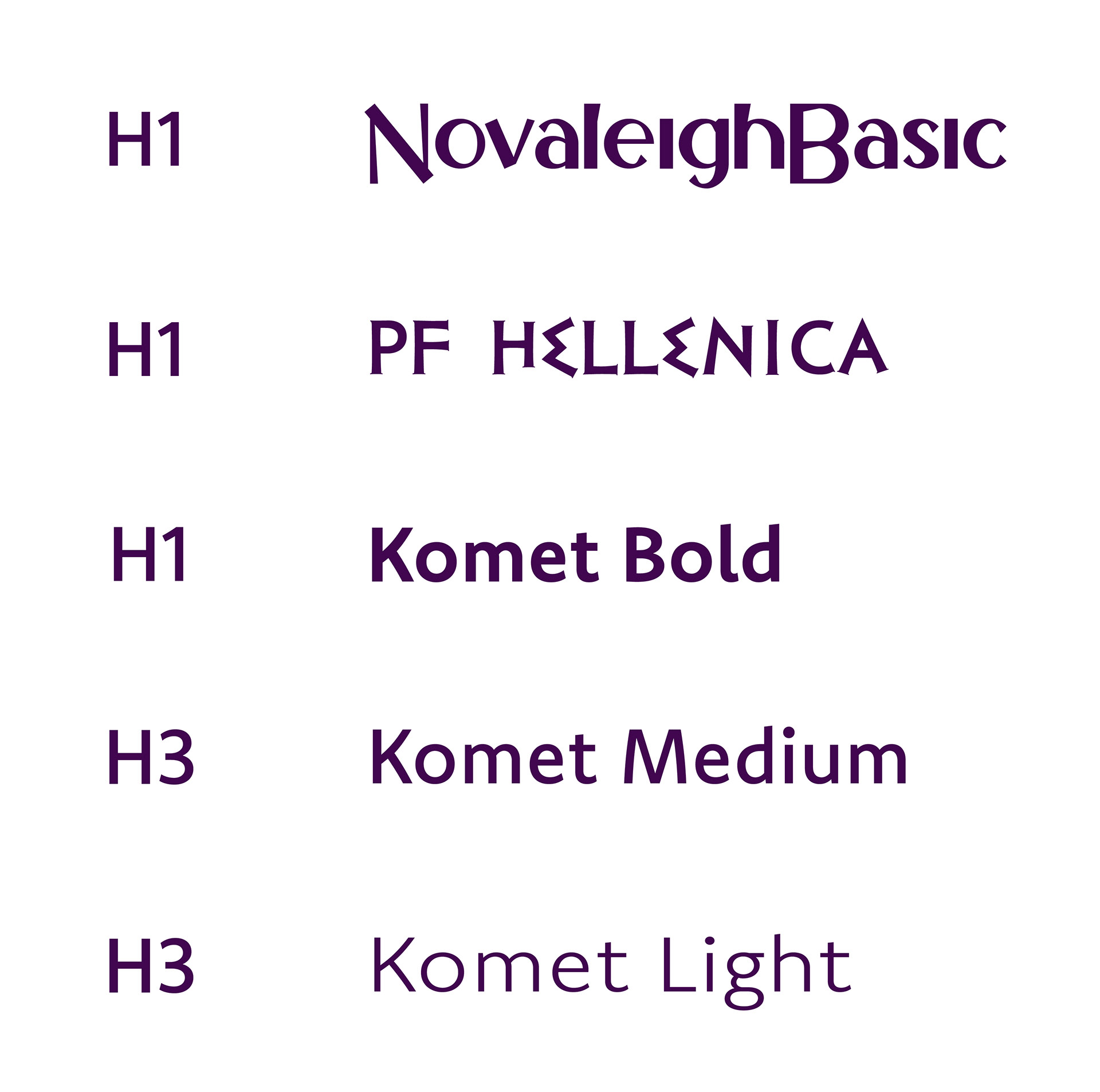
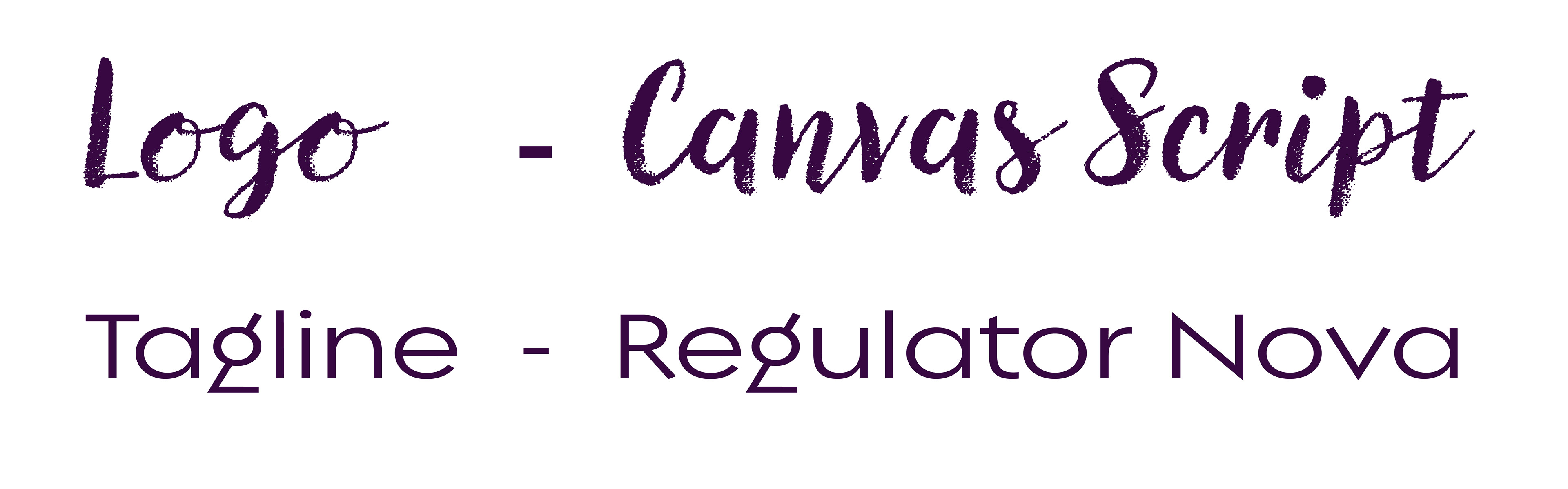
Typography
The typography chosen for Natura Botica strikes a balance between elegance and playfulness. The Canvas Script font exudes elegance and sophistication, complementing the brand's refined aesthetic. In contrast, the Regulator Nova font adds a touch of whimsy and modernity, ensuring a dynamic visual identity that appeals to a diverse audience.
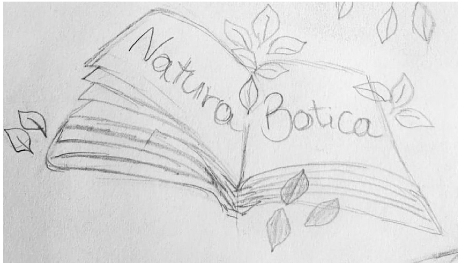
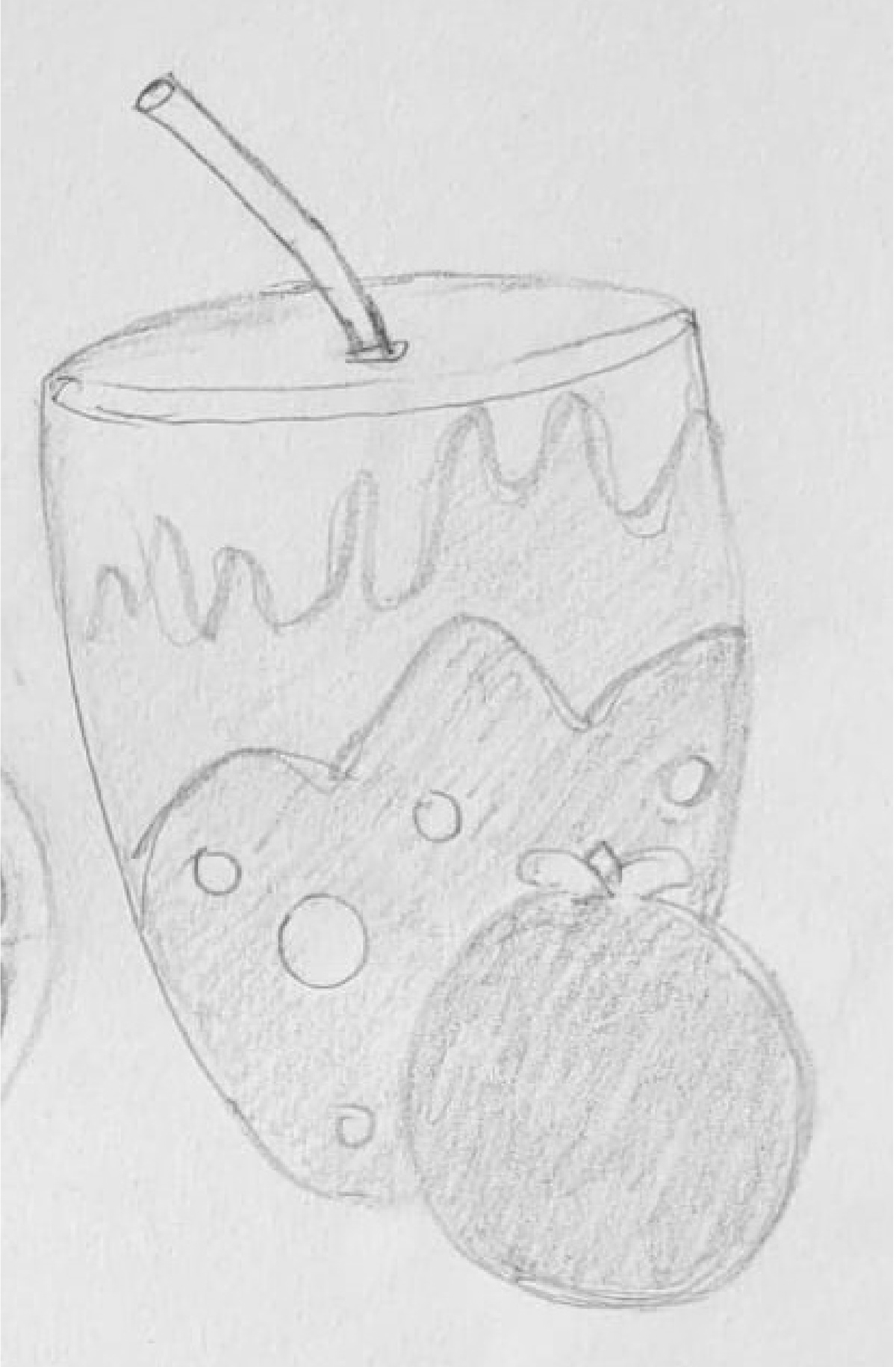
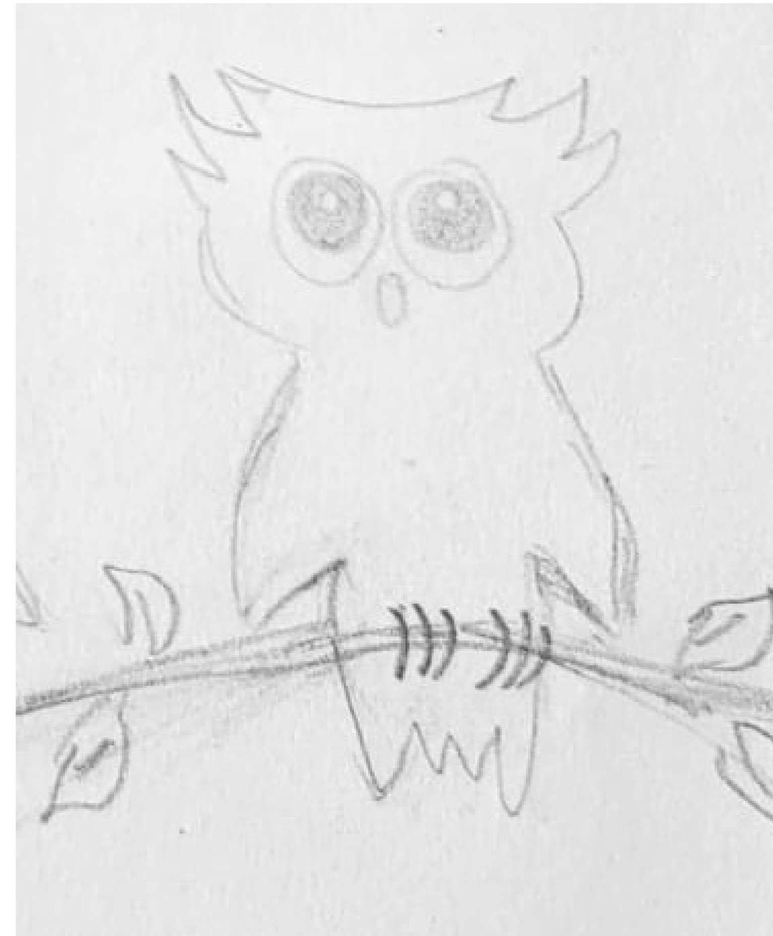
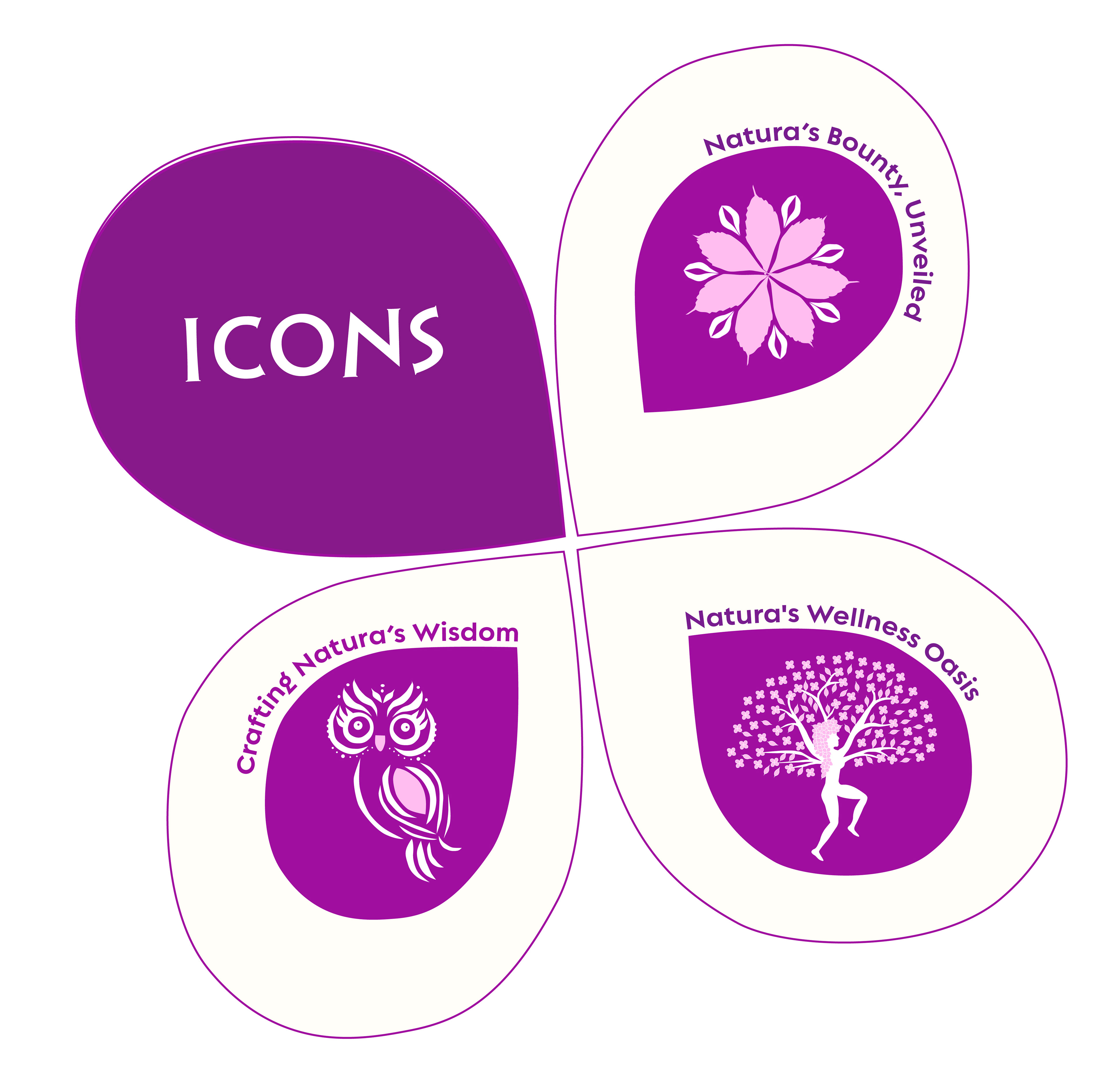
Icons Sketches
In the development of Natura Botica's division icons, I aimed to create visual elements that seamlessly integrated with the main logo while embodying the essence of each division's focus on natural wellness.
Various options were explored, including books, flowers, trees, owls, and fruits. These options represented different aspects of the brand's focus on natural wellness.
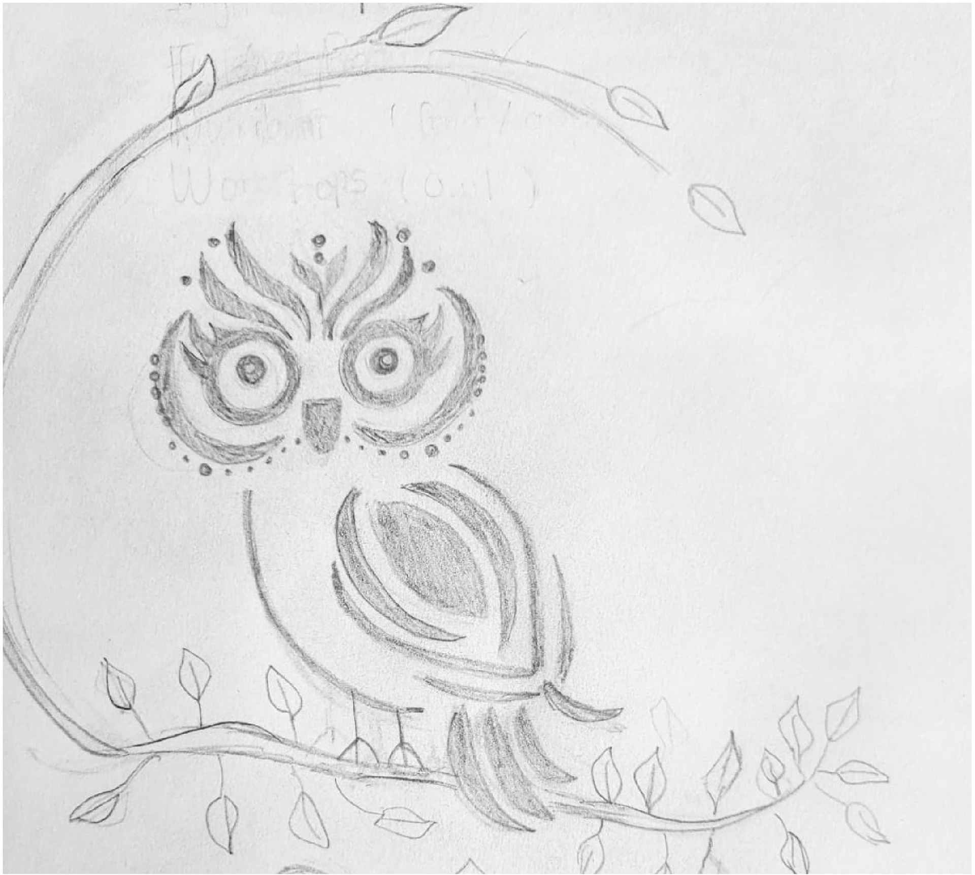
Final Icons
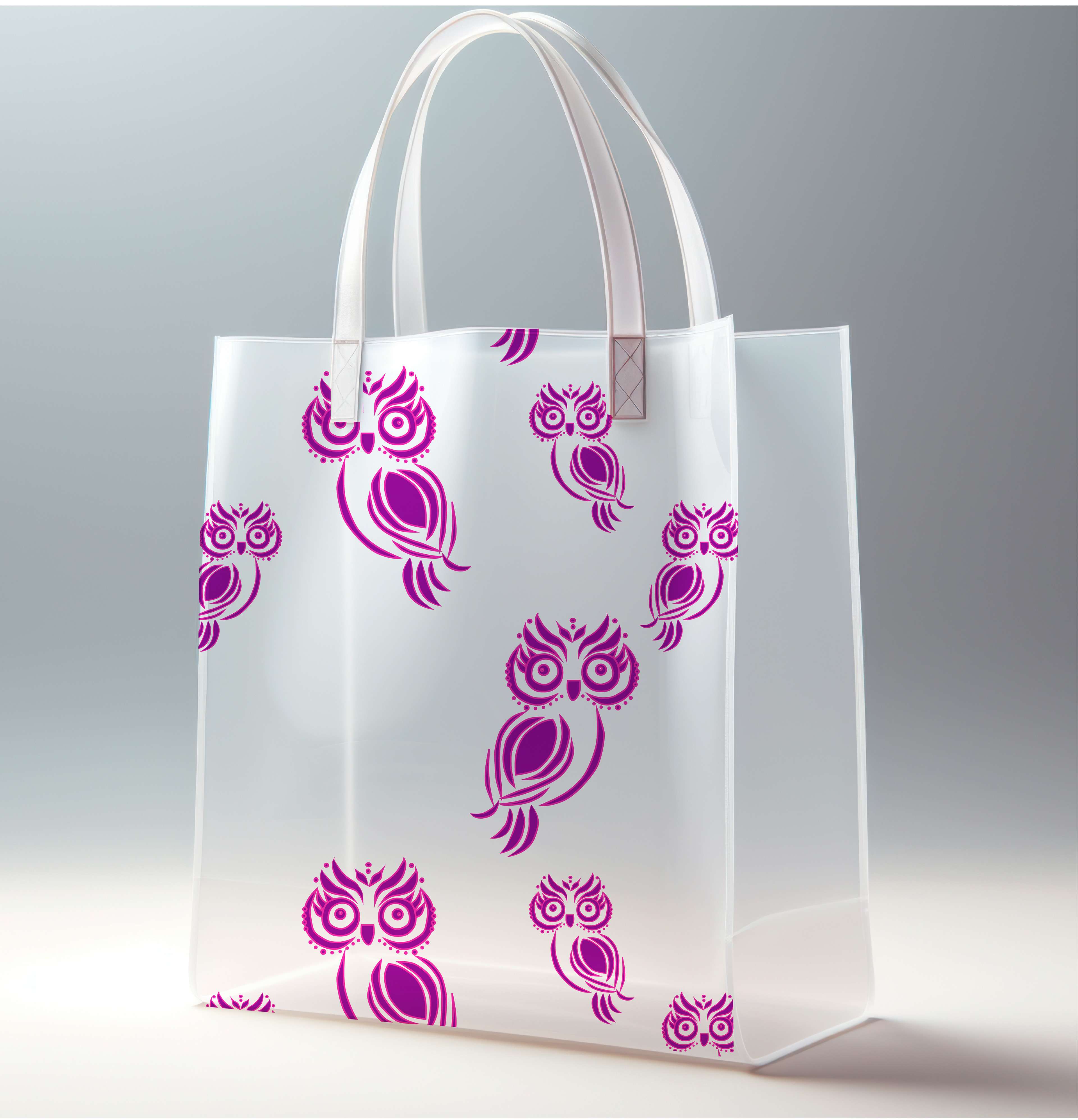
In the final selection of icons for Natura Botica's divisions, each icon has been meticulously chosen for its representation of the division's focus and seamless integration with the main logo. The owl, symbolizing knowledge and wisdom, seamlessly aligns with the Workshop Division's ethos. Meanwhile, the delicate flower of the Raw Ingredients Division, crafted from leaves and seeds, accentuates nature's purity and abundance. Lastly, the tree icon representing the Nutribar Division, formed by a woman with arms up resembling branches, embodies vitality and growth. These meticulously refined icons perfectly complement the main logo and are placed inside the petal, forming a complete flower. Together, they symbolize the holistic harmony of Natura Botica's offerings with nature's beauty and wellness, reinforcing the brand's dedication to harnessing the power of nature for holistic well-being and inviting customers to embark on a journey of natural wellness and vitality.
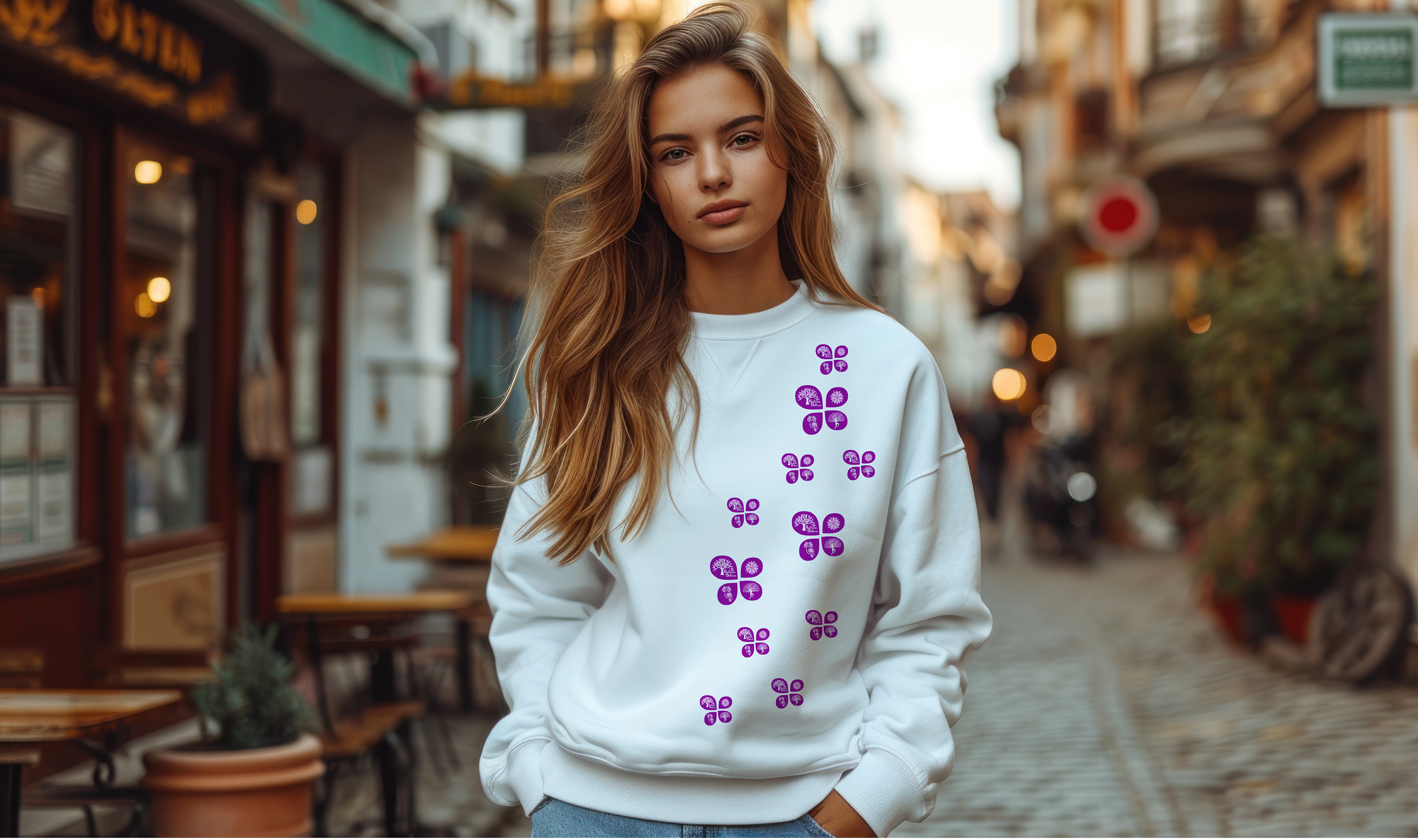
Brand Artwork
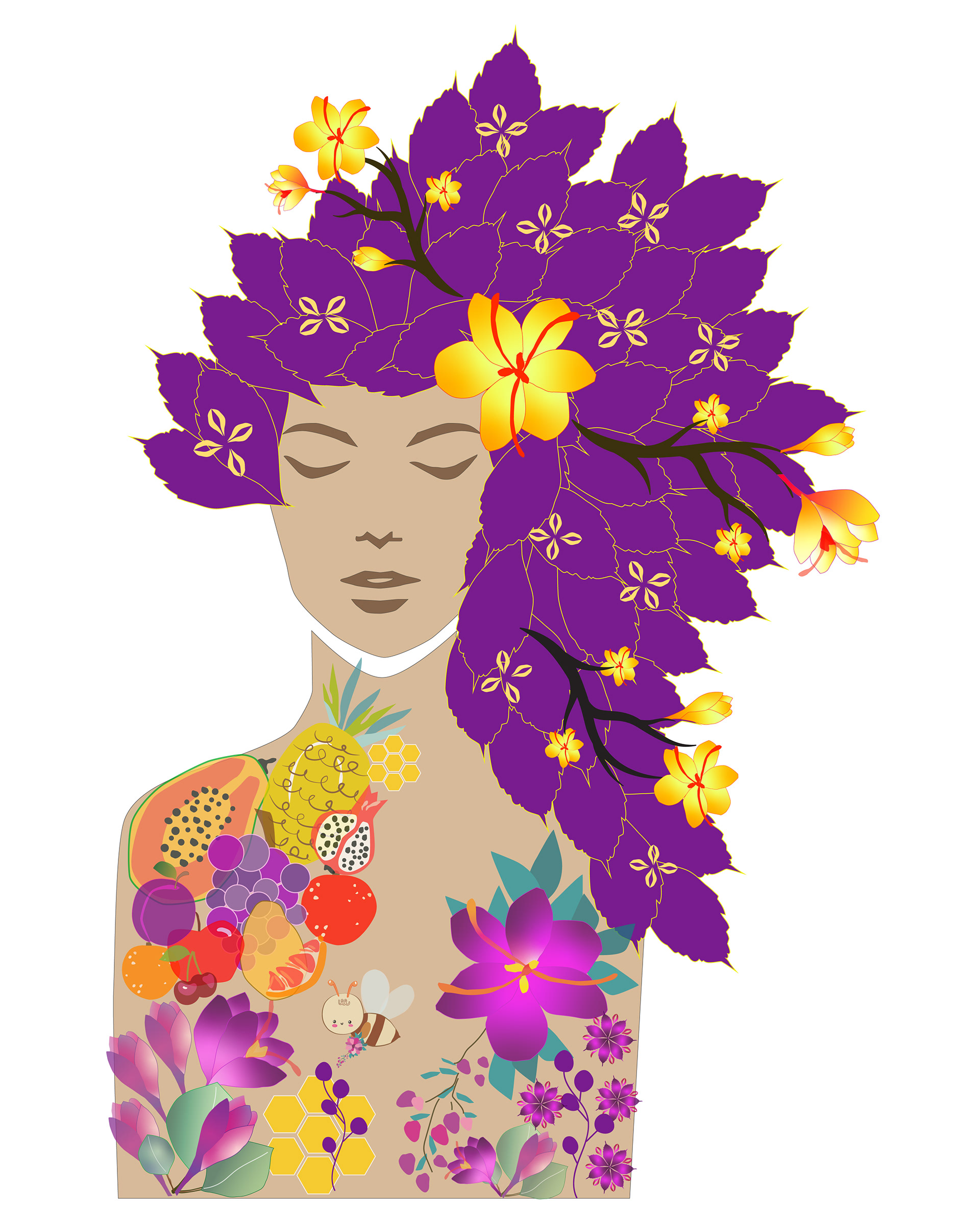
Artwork and Patterns: The artwork and patterns designed for Natura Botica serve to reinforce the brand's connection to nature and its celebration of organic beauty. The depiction of a woman with hair composed of leaves and a body filled with natural fruits and flowers symbolizes the inherent harmony between humans and the natural world. These elements are seamlessly integrated into the brand's visual identity, creating a cohesive and captivating aesthetic.
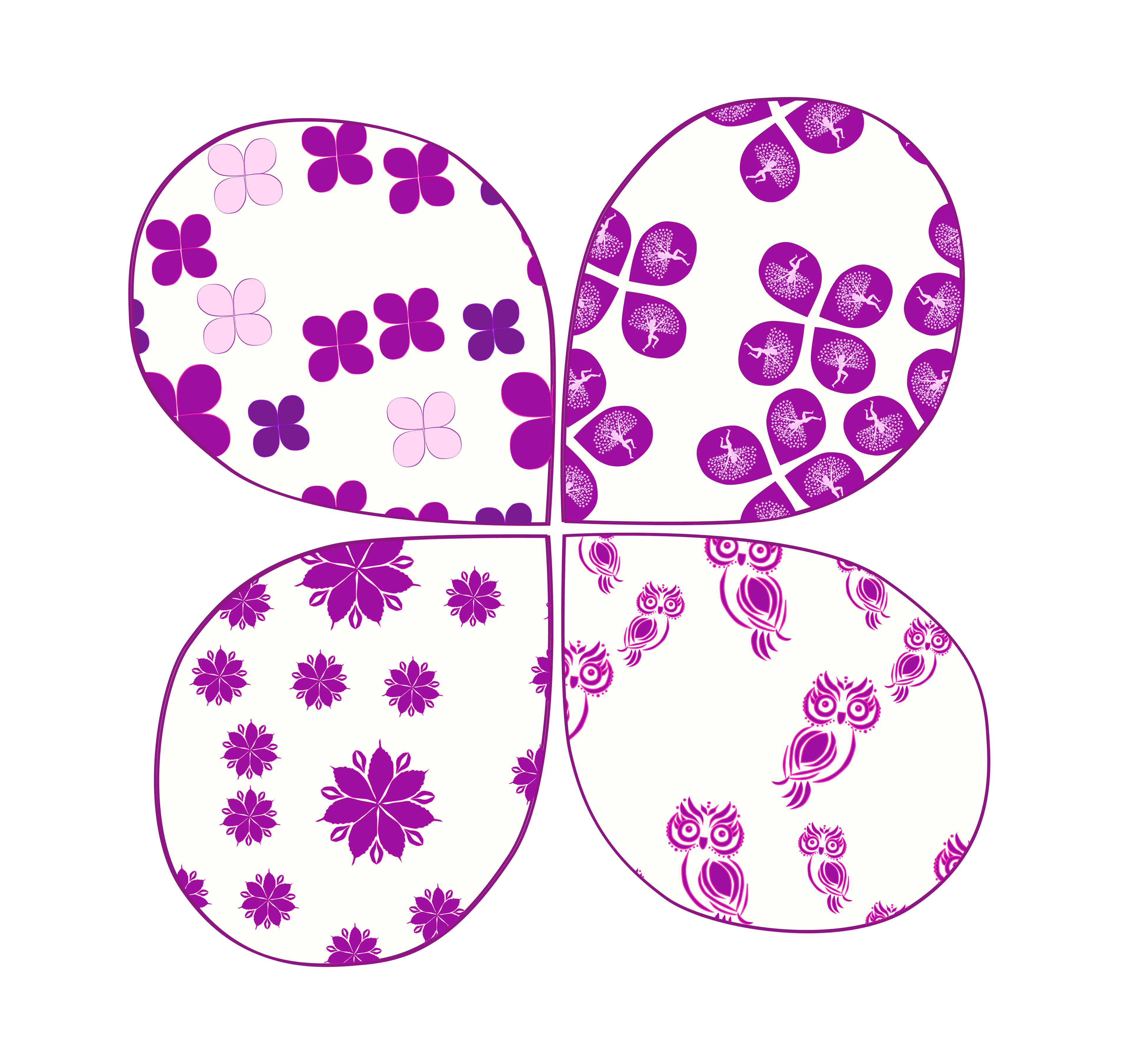
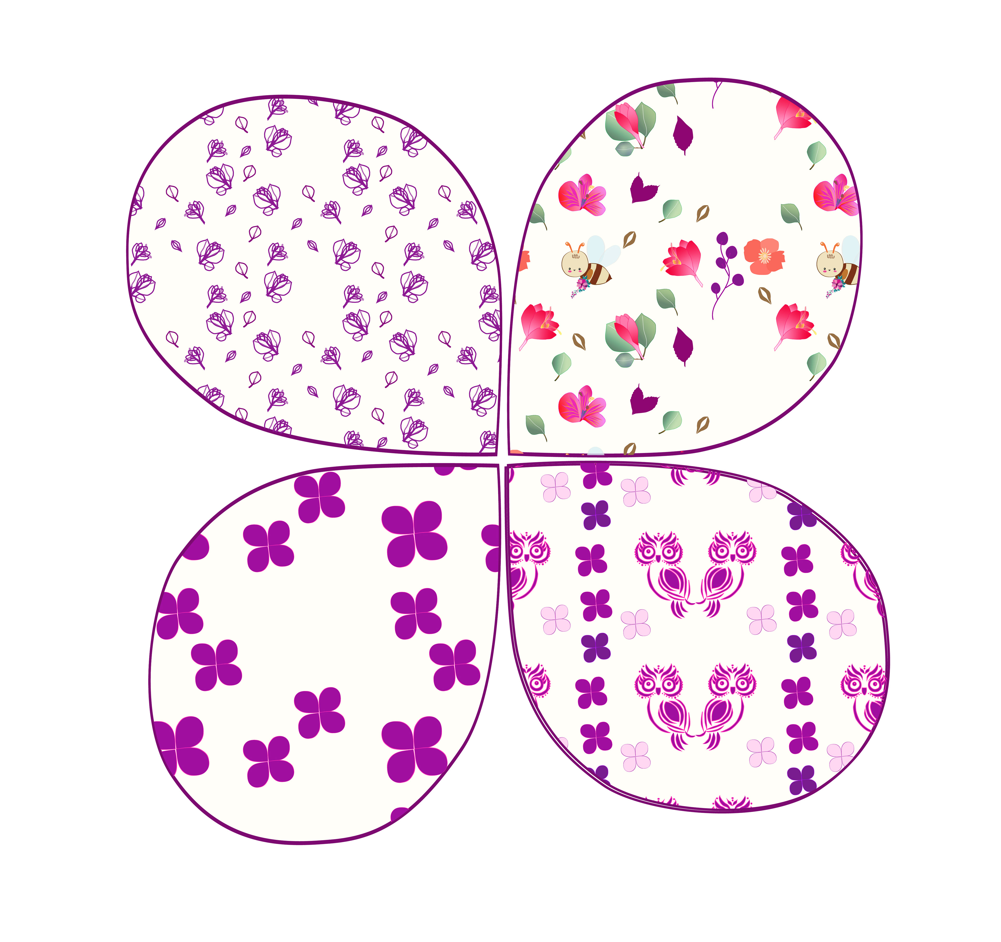
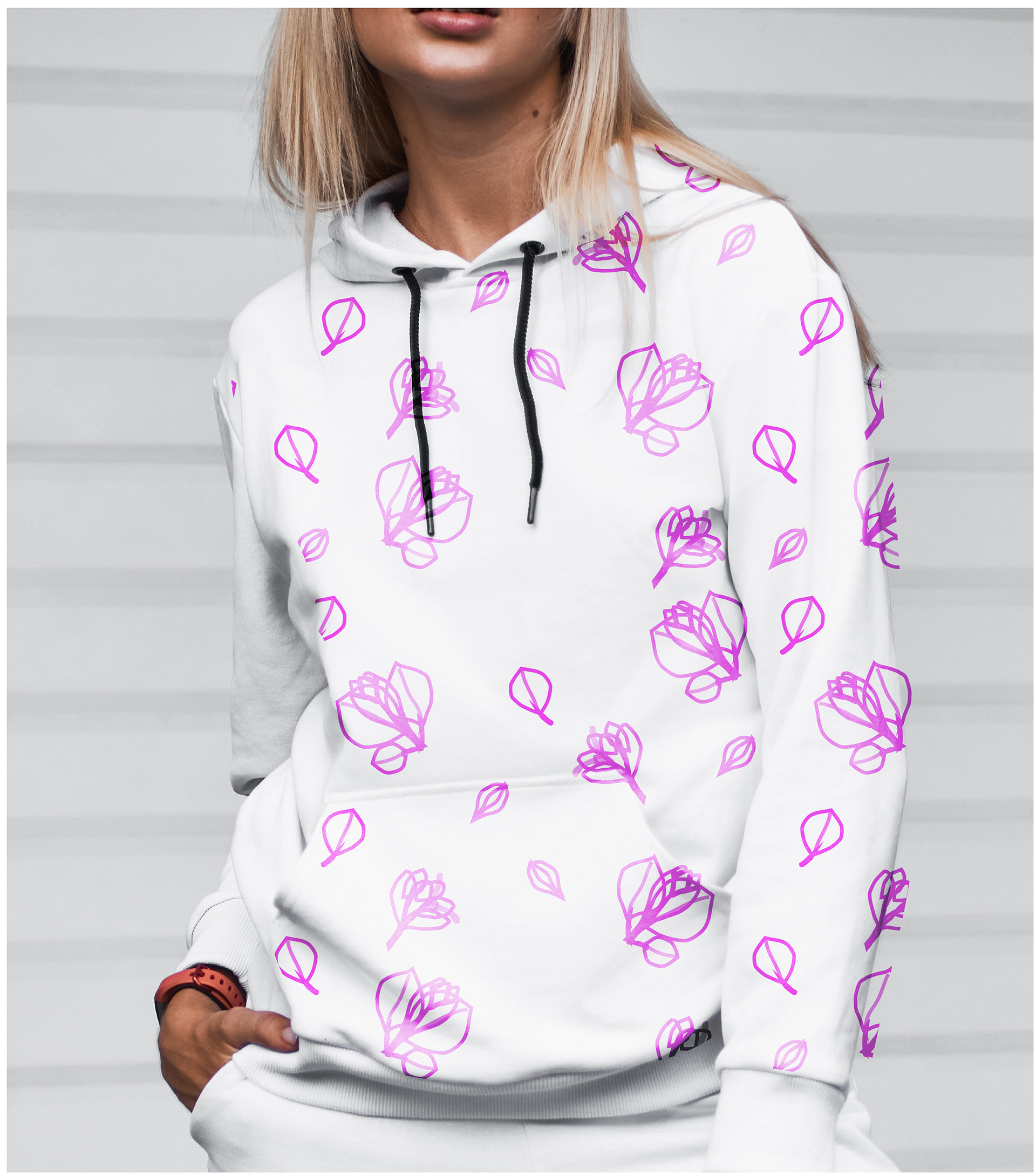
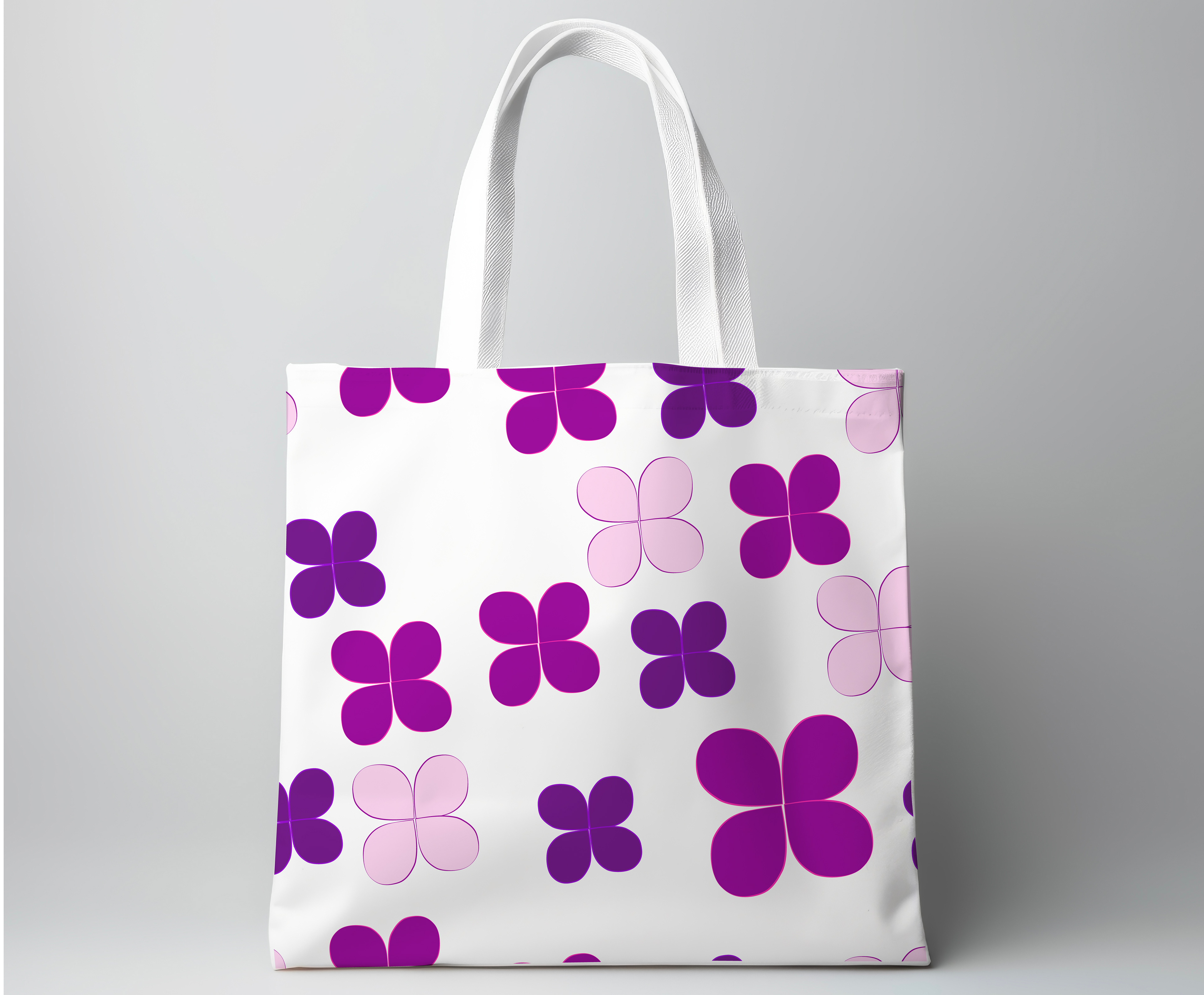
Patterns
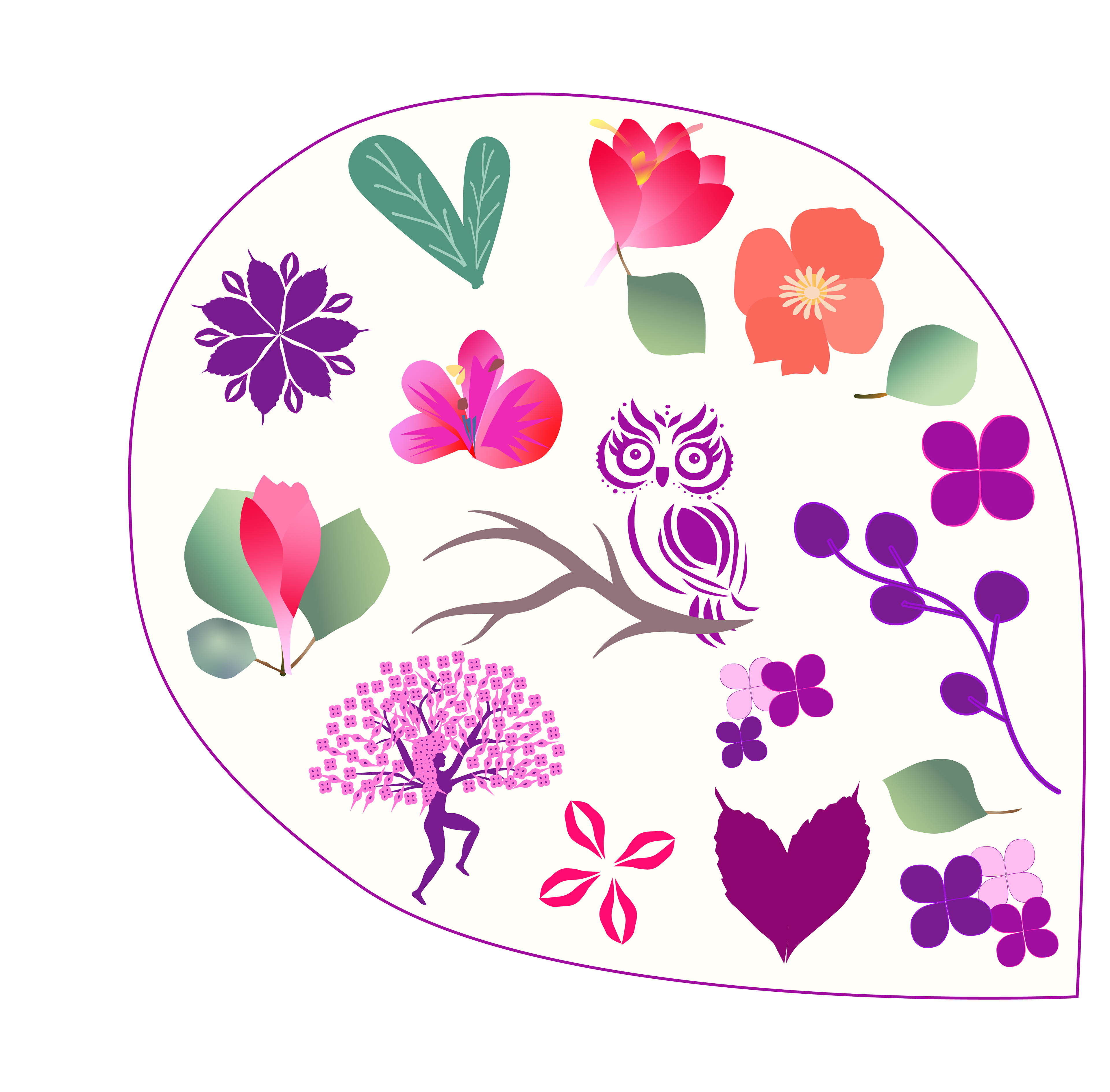
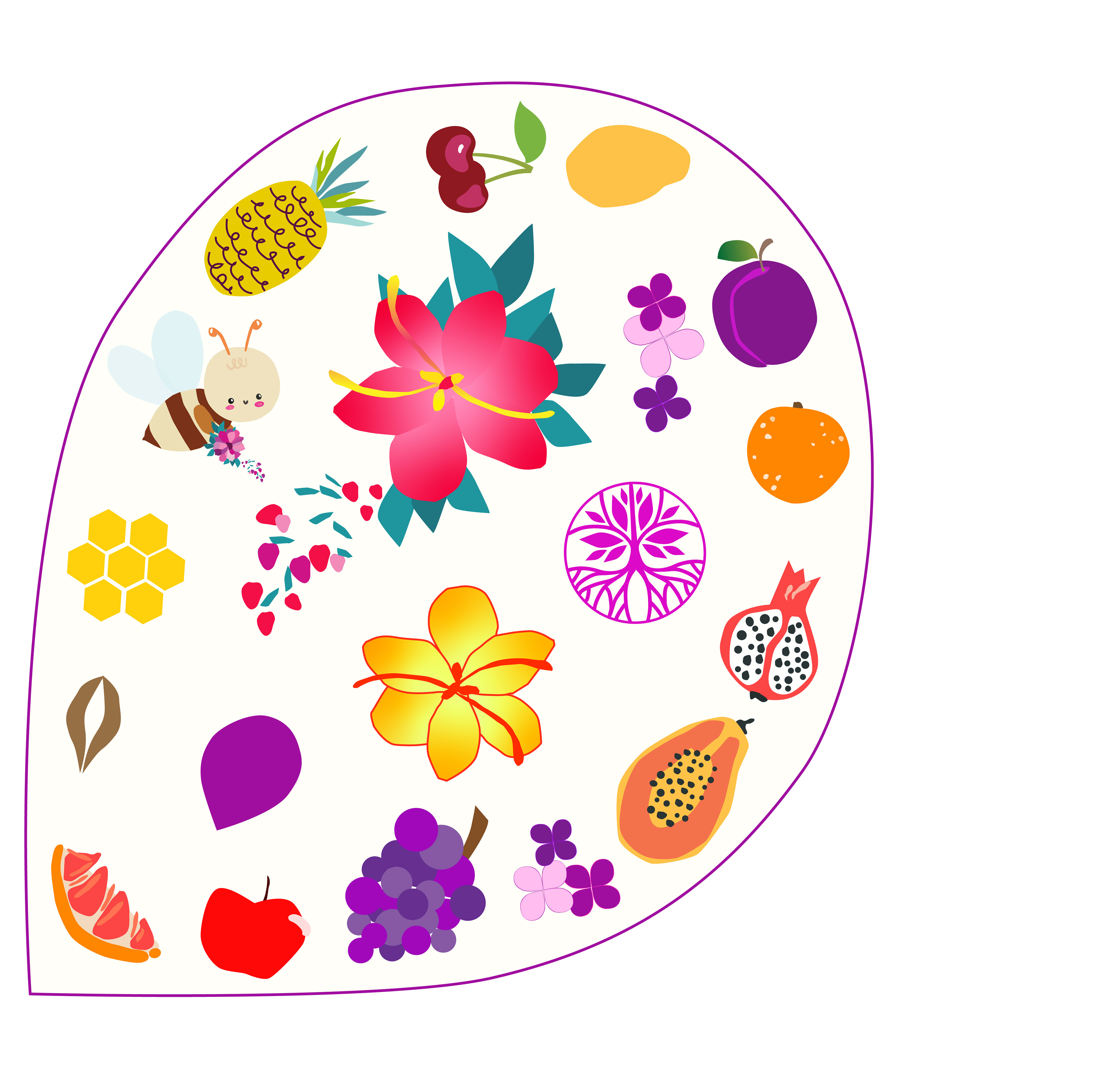
The patterns for Natura Botica were meticulously crafted from the artwork, featuring elements such as flowers, fruits, and icons, all emblematic of the brand's commitment to natural wellness. Each pattern was thoughtfully designed to evoke a sense of harmony and vitality, mirroring the beauty of nature itself. These patterns will be strategically utilized in various scenarios, enhancing the brand's visual identity across different platforms. Whether adorning packaging, digital assets, or in-store displays, these patterns will create a cohesive and inviting atmosphere, inviting customers to immerse themselves in the world of Natura Botica.
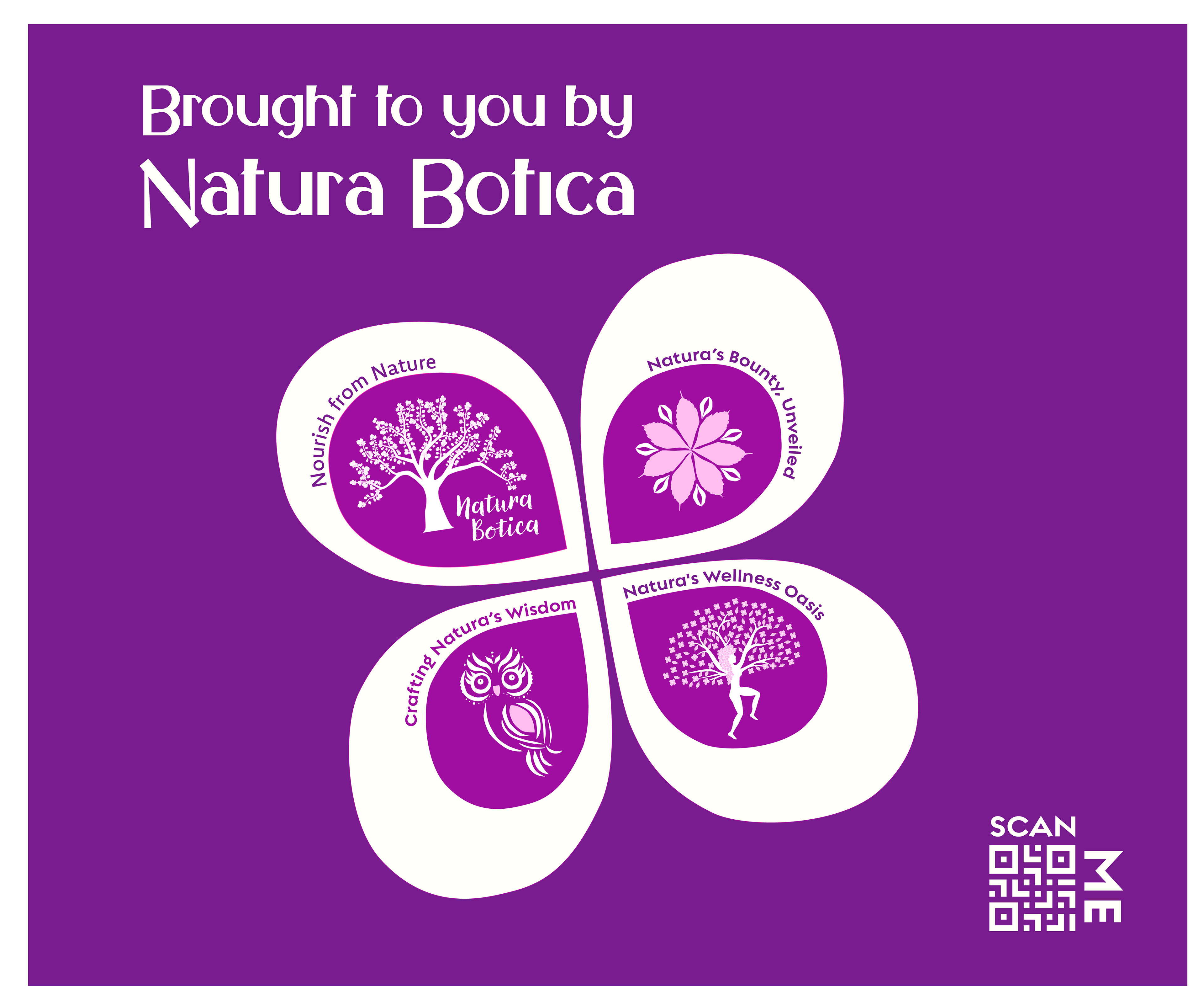
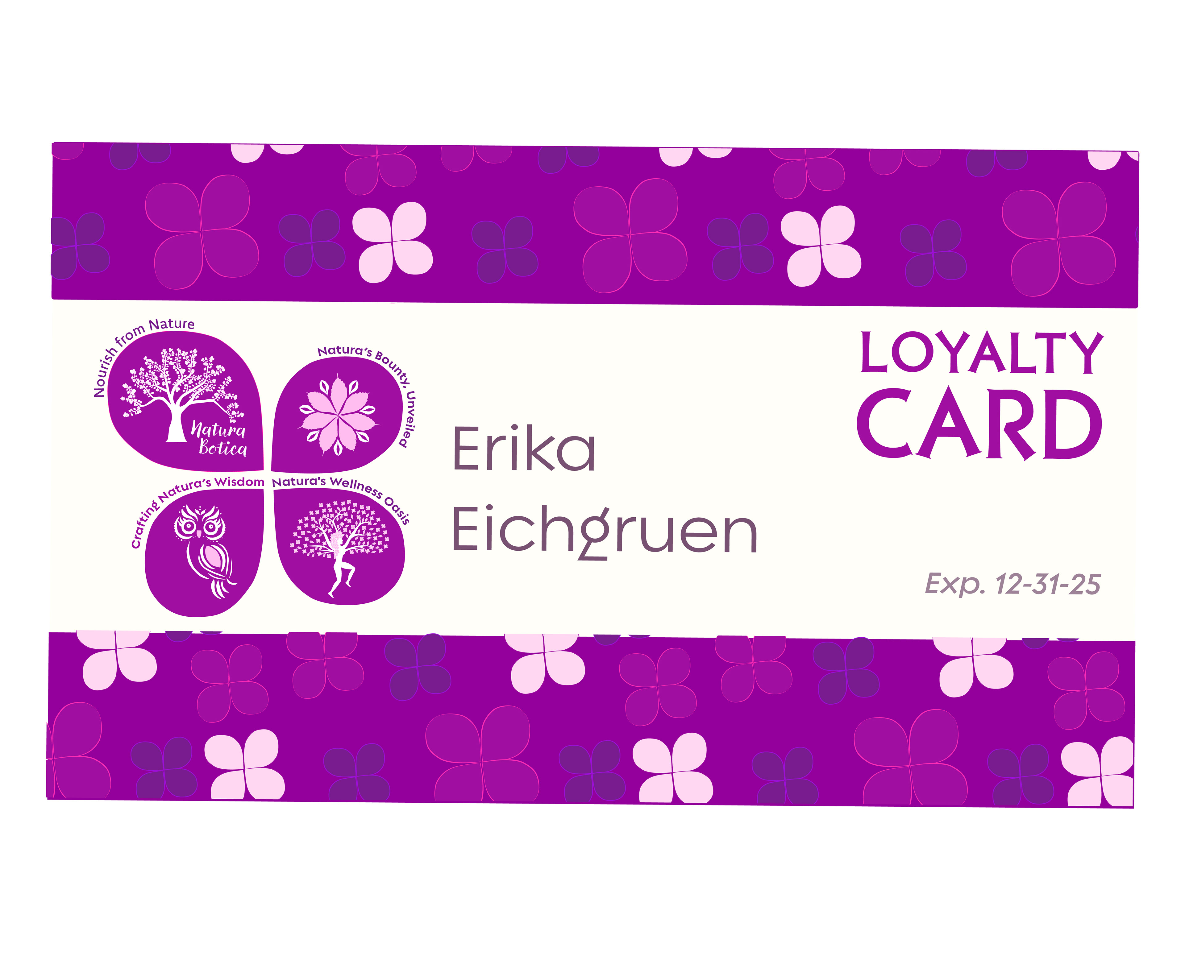
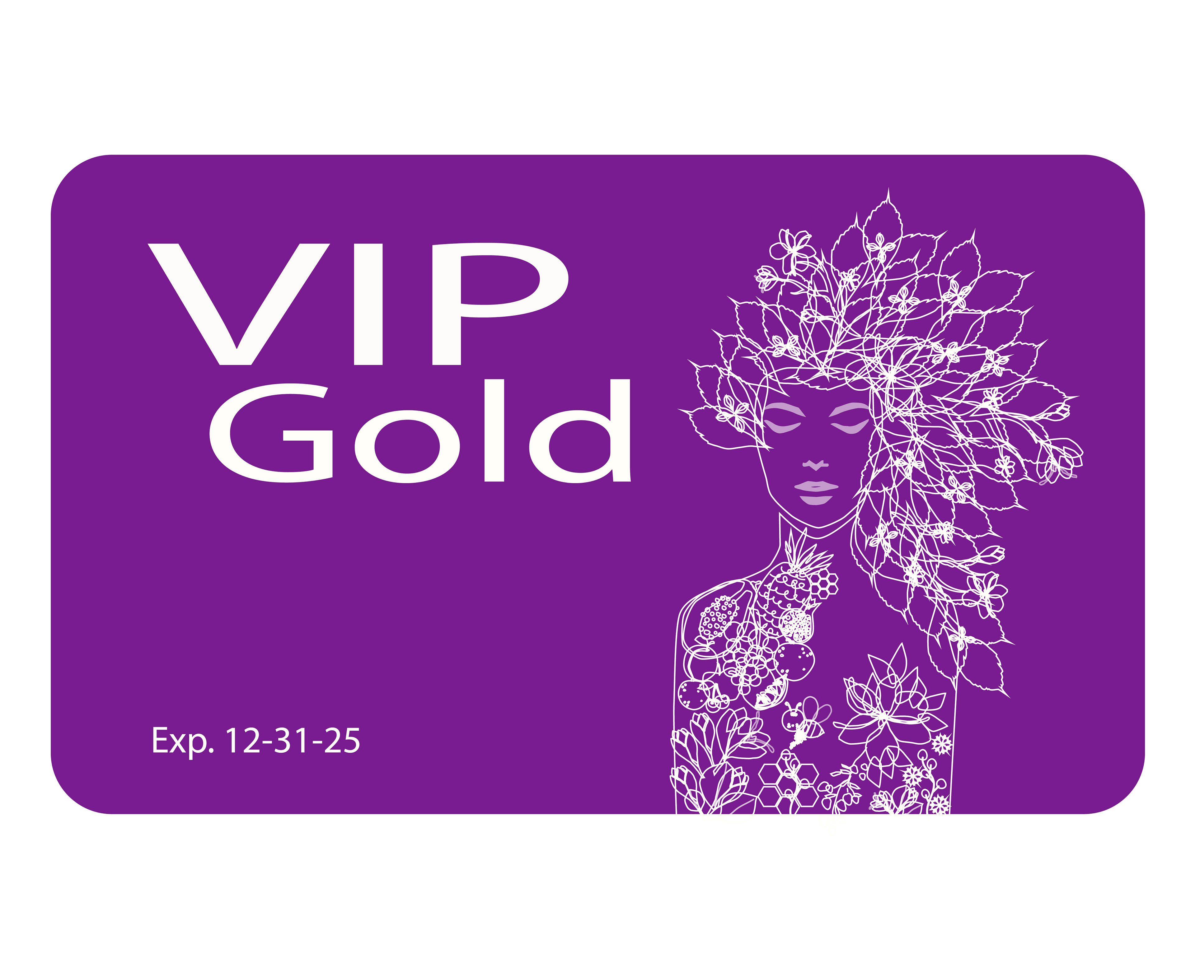
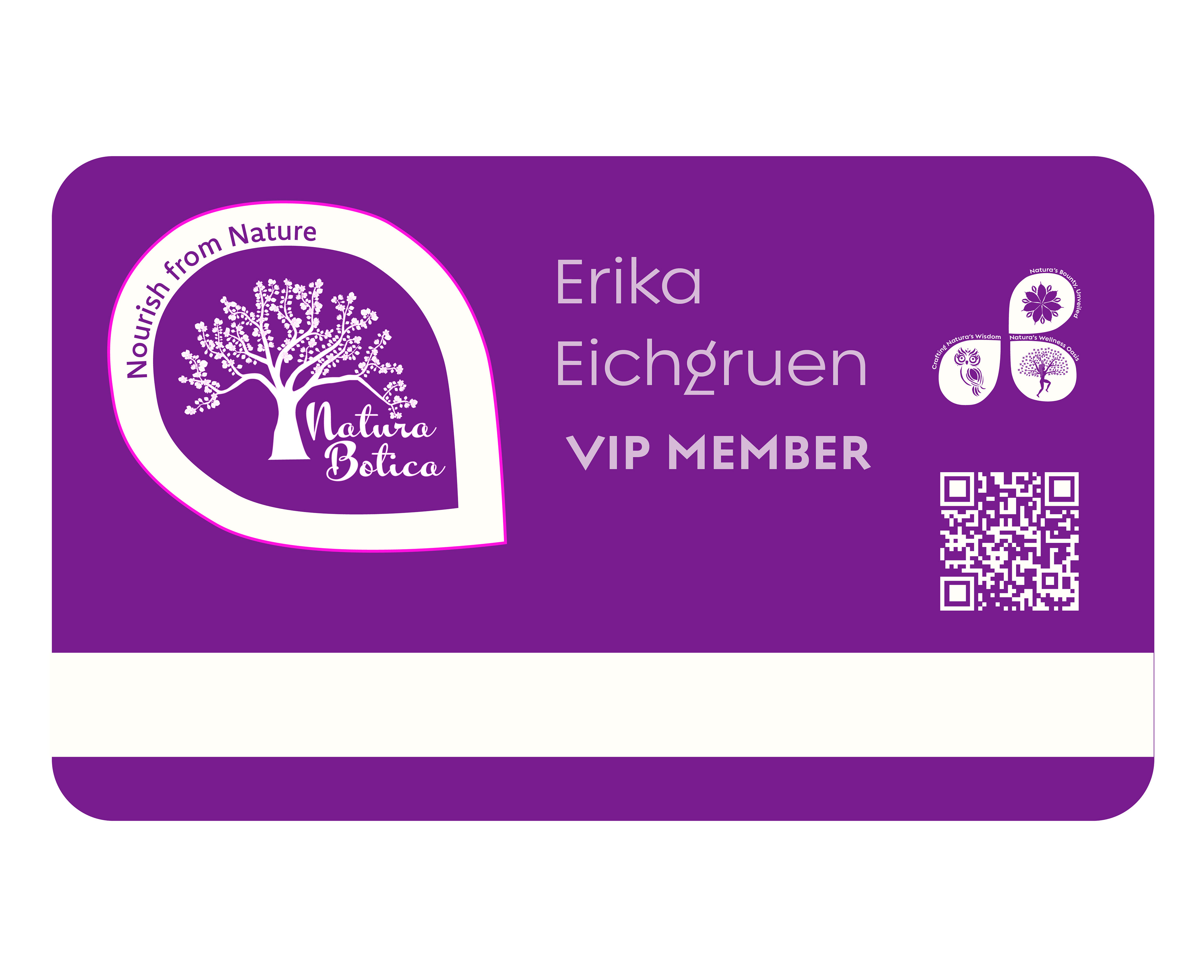
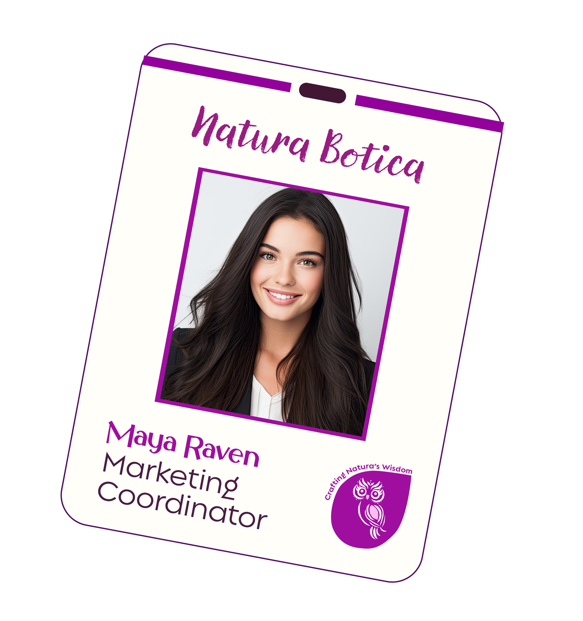
Brand Collateral
The brand collateral, including grand opening cards, employee ID cards, loyalty cards, and VIP cards, maintains consistency in theme, colors, and design elements. Each piece exudes a sense of fun, vibrancy, and professionalism, reflecting the brand's ethos of blending art with nature to create an immersive and appealing experience for customers.
Poster Flats

City Banners
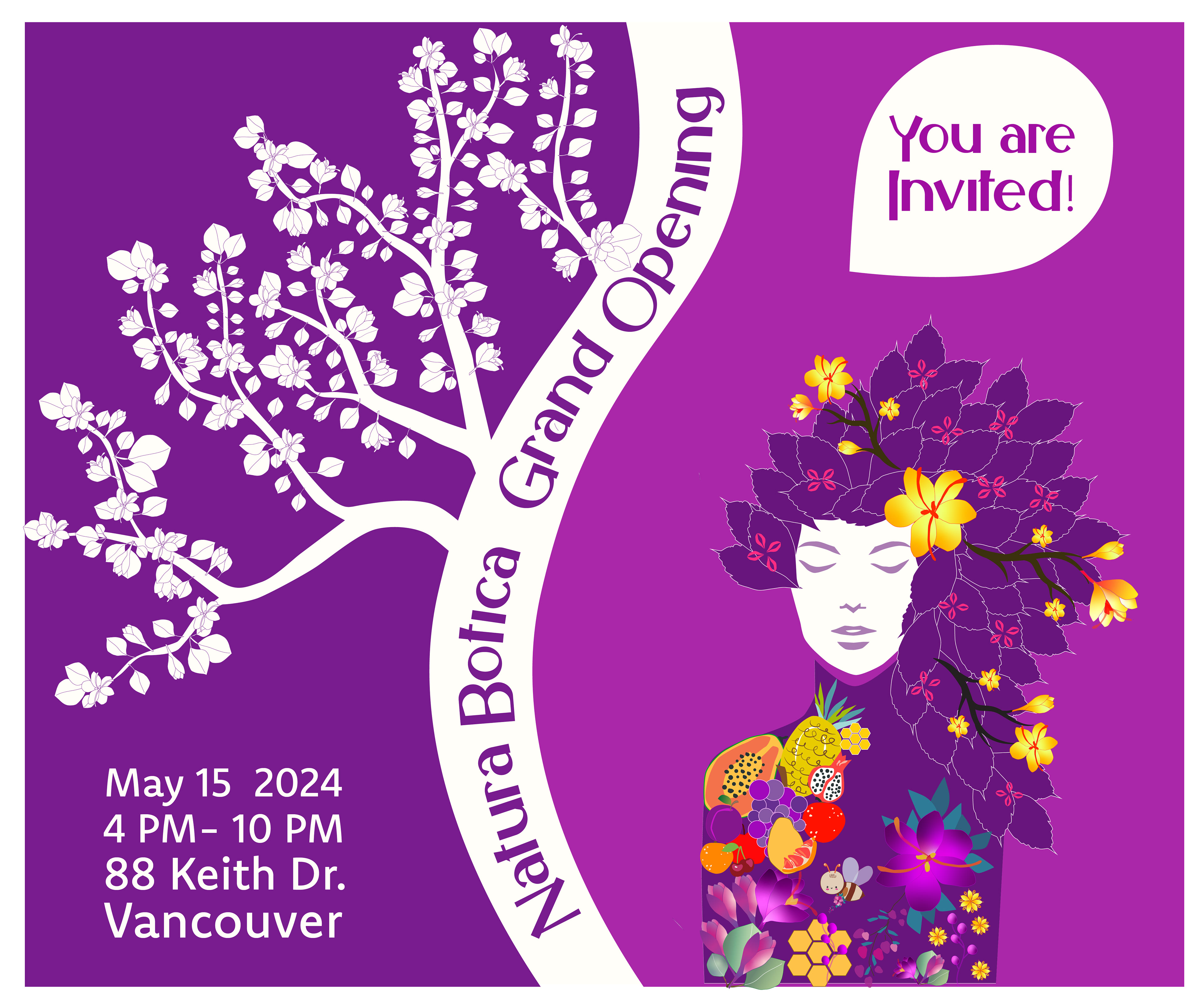
Grand Opening
Invitation Card
Loyalty Card
VIP
Gold Card
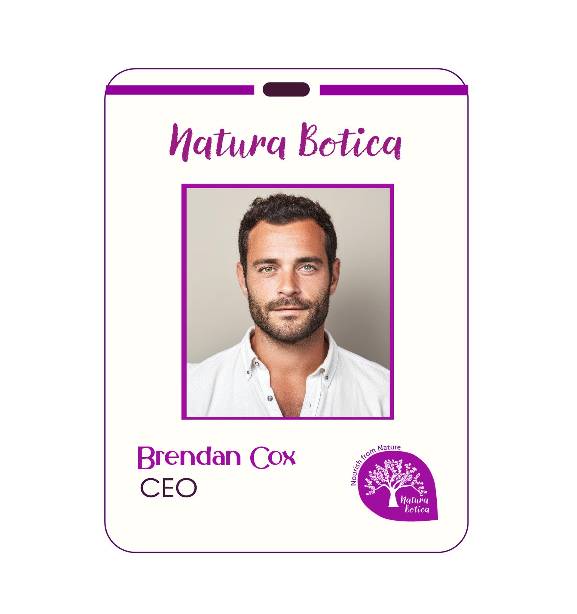
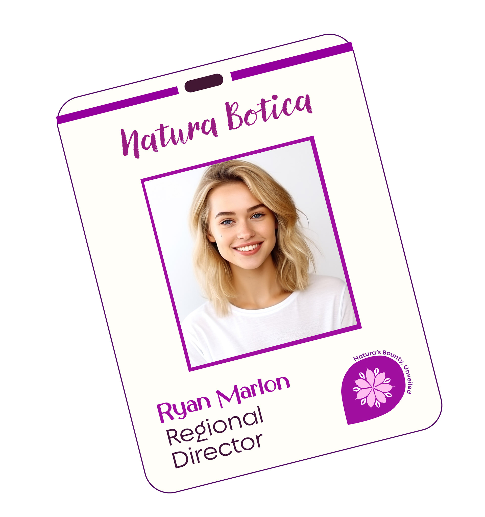
Employee
ID Cards
Main Store
Applications
Nutri-Bar
Applications
Raw Store
Applications
Worshops
Applications