PHOTOSHOP - ILLUSTRATOR
Concept Development | Branding | Social Media | Advertising
Brand Development

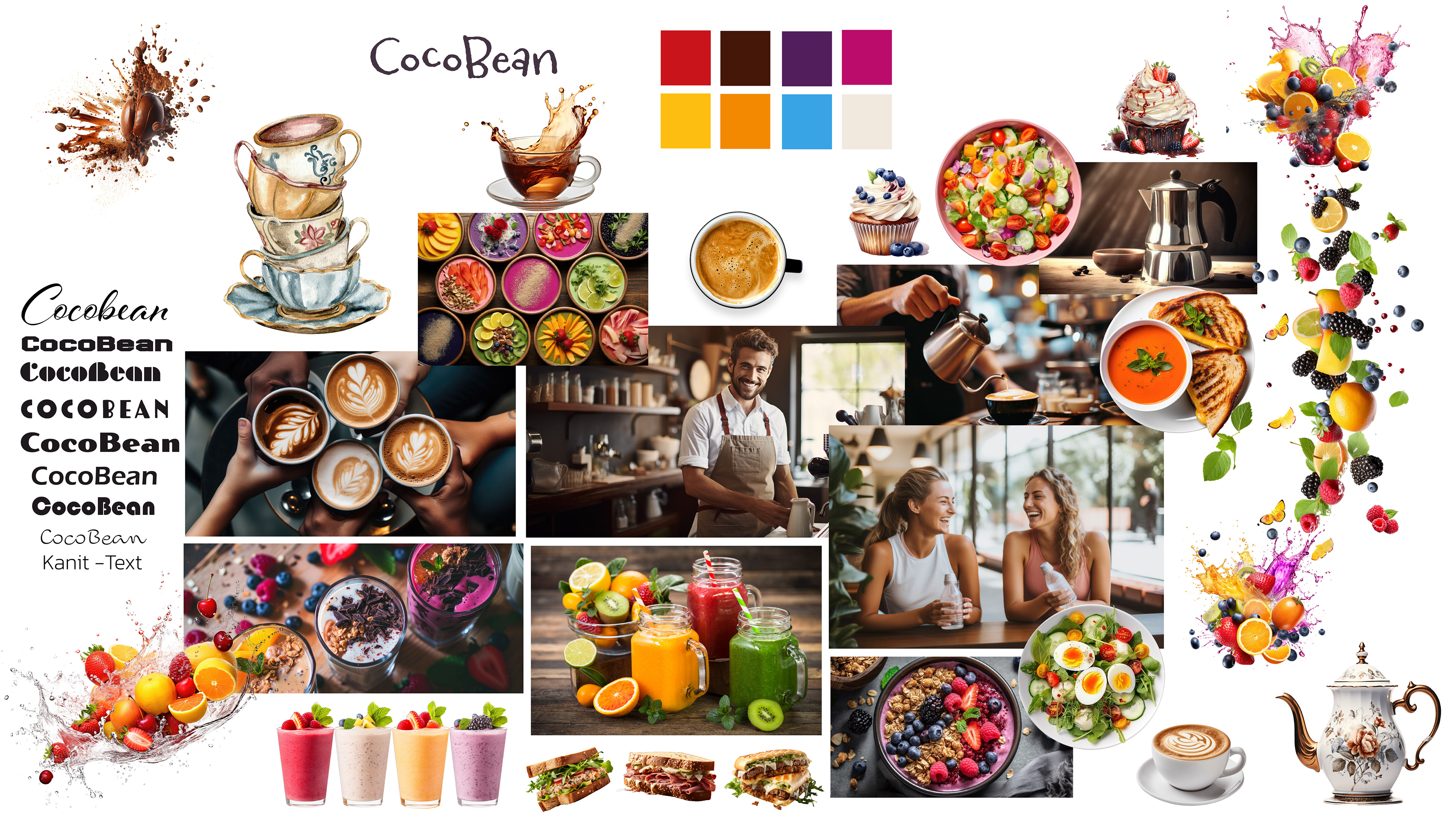
The moodboard I created for the CocoBean brand not only captures the essence of sophistication and luxury but also showcases their commitment to healthy living and sustainability. Through a carefully curated color palette of deep browns, velvety creams, and touches of gold and brass, the moodboard embodies the indulgent yet mindful atmosphere of CocoBean. The interior design elements depicted, such as luxurious velvet upholstery, sleek marble countertops, and ornate chandeliers, evoke a sense of timeless elegance and refinement. Additionally, the moodboard highlights our dedication to offering 100% organic, healthy food options, including vegan milk for our coffee and innovative coffee blends made from roots or mushrooms. It's a space where every detail, from the plush armchairs to the delicate floral arrangements, reflects our commitment to providing an unparalleled experience that nourishes both body and soul.

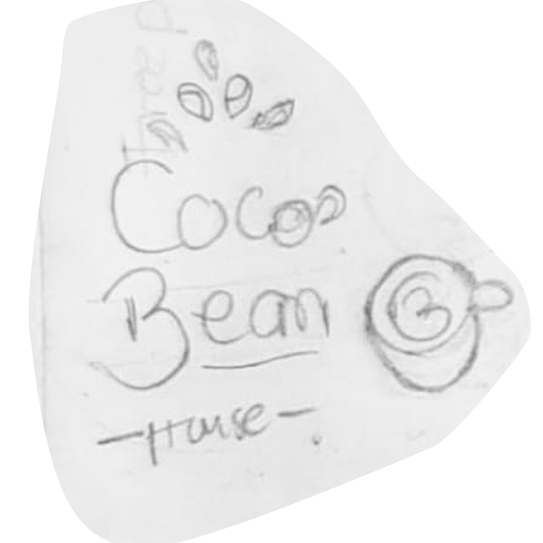
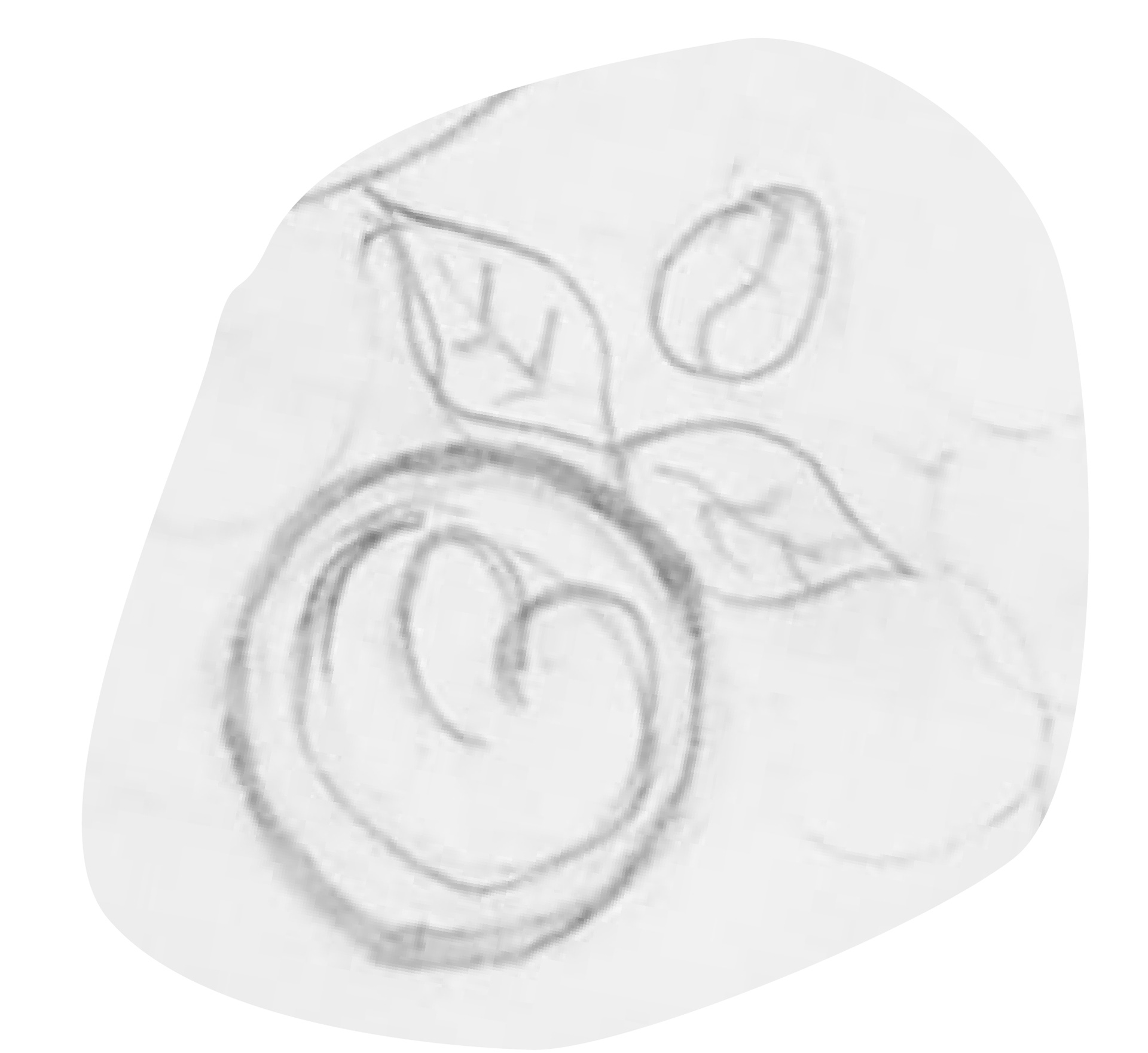
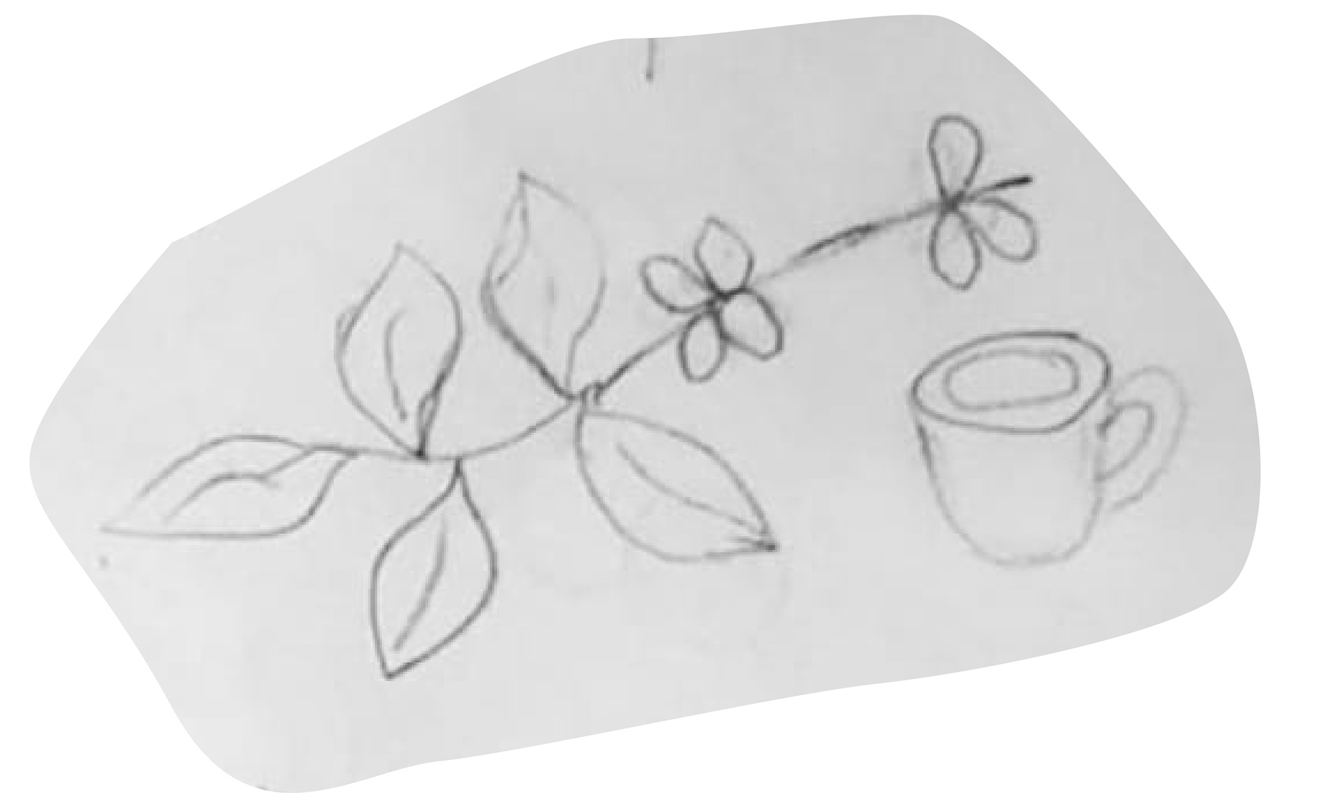
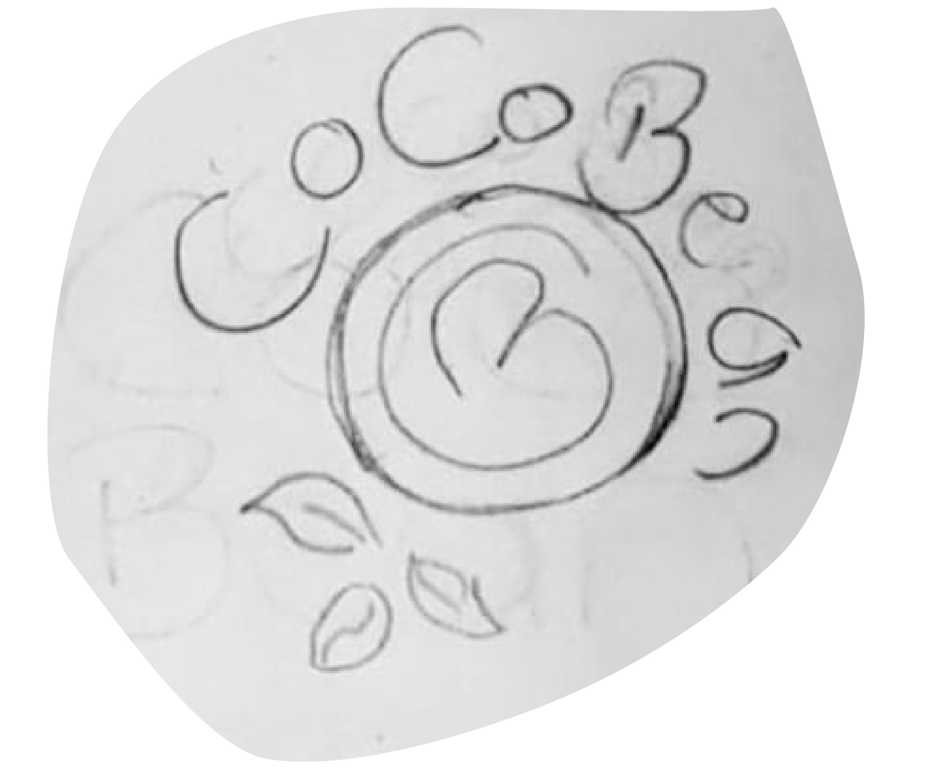
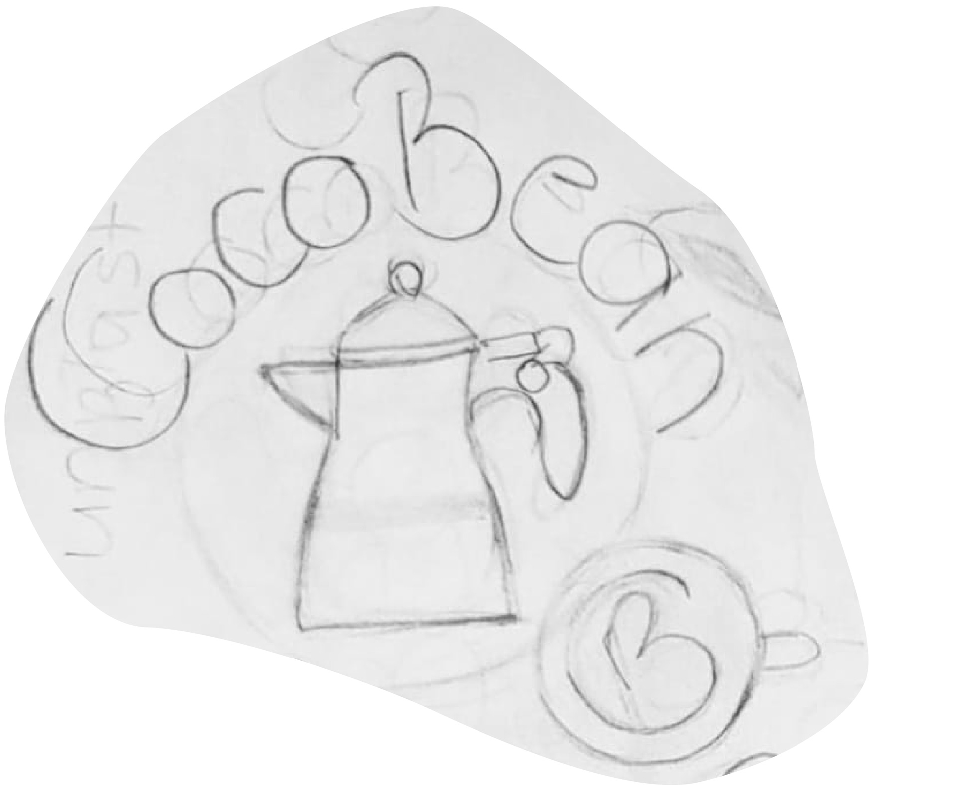
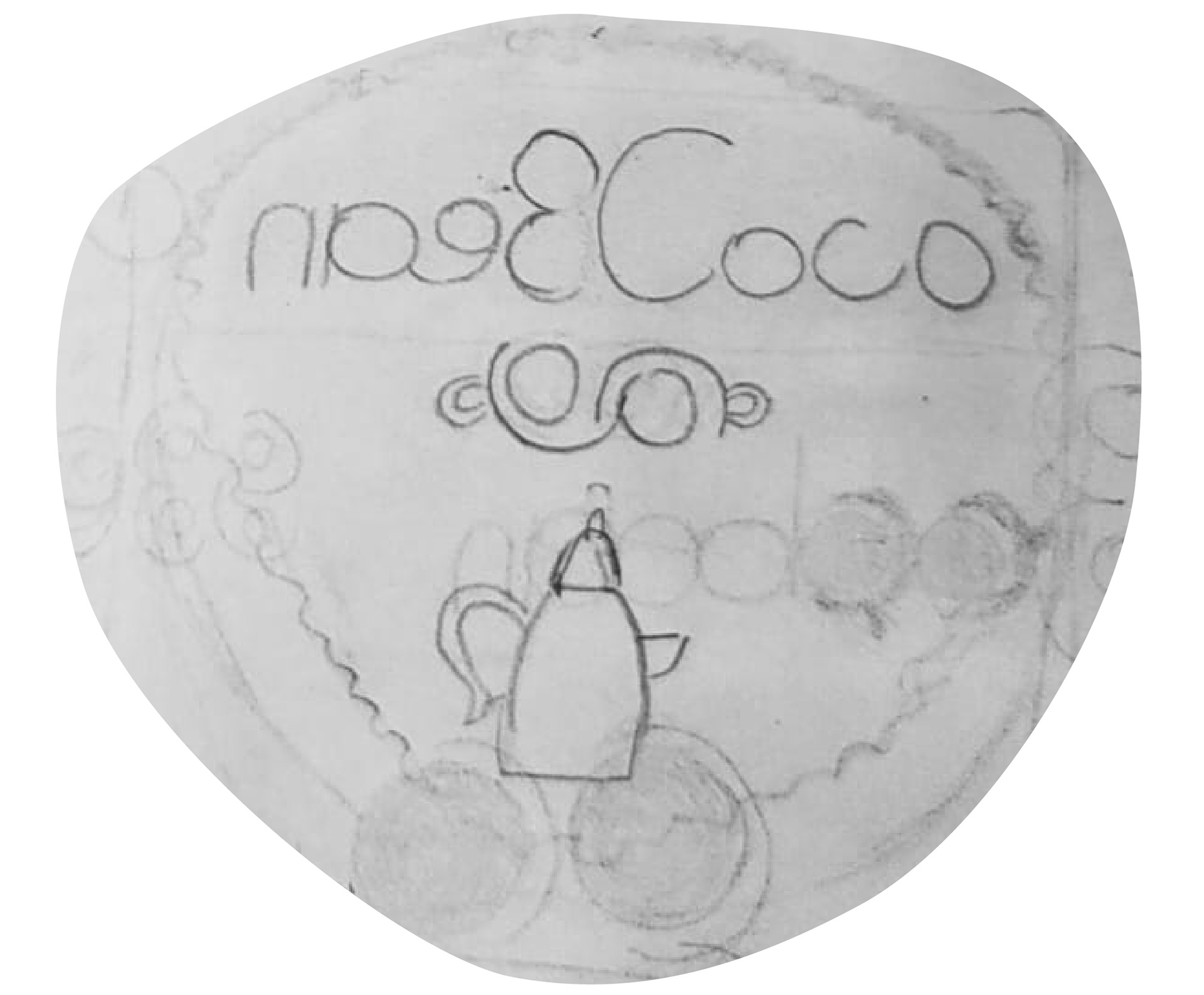
In my graphic design portfolio, the sketches I've created for the CocoBean brand encapsulate the essence of our identity with artistic finesse. Through intricate drawings of coffee cups, coffee pots, and the iconic coco beans, each sketch tells a story of indulgence and craftsmanship. The delicate lines and subtle shading evoke a sense of warmth and familiarity, inviting viewers to immerse themselves in the rich world of CocoBean. These sketches not only celebrate the artistry of coffee culture but also reflect our commitment to quality and sustainability. With each stroke of the pen, we honor the journey of the coffee bean from farm to cup, ensuring that every sip is a testament to our dedication to excellence. Whether it's the simplicity of a single coffee cup or the intricacy of a coffee pot adorned with coco beans, each sketch serves as a visual ode to the timeless allure of CocoBean.

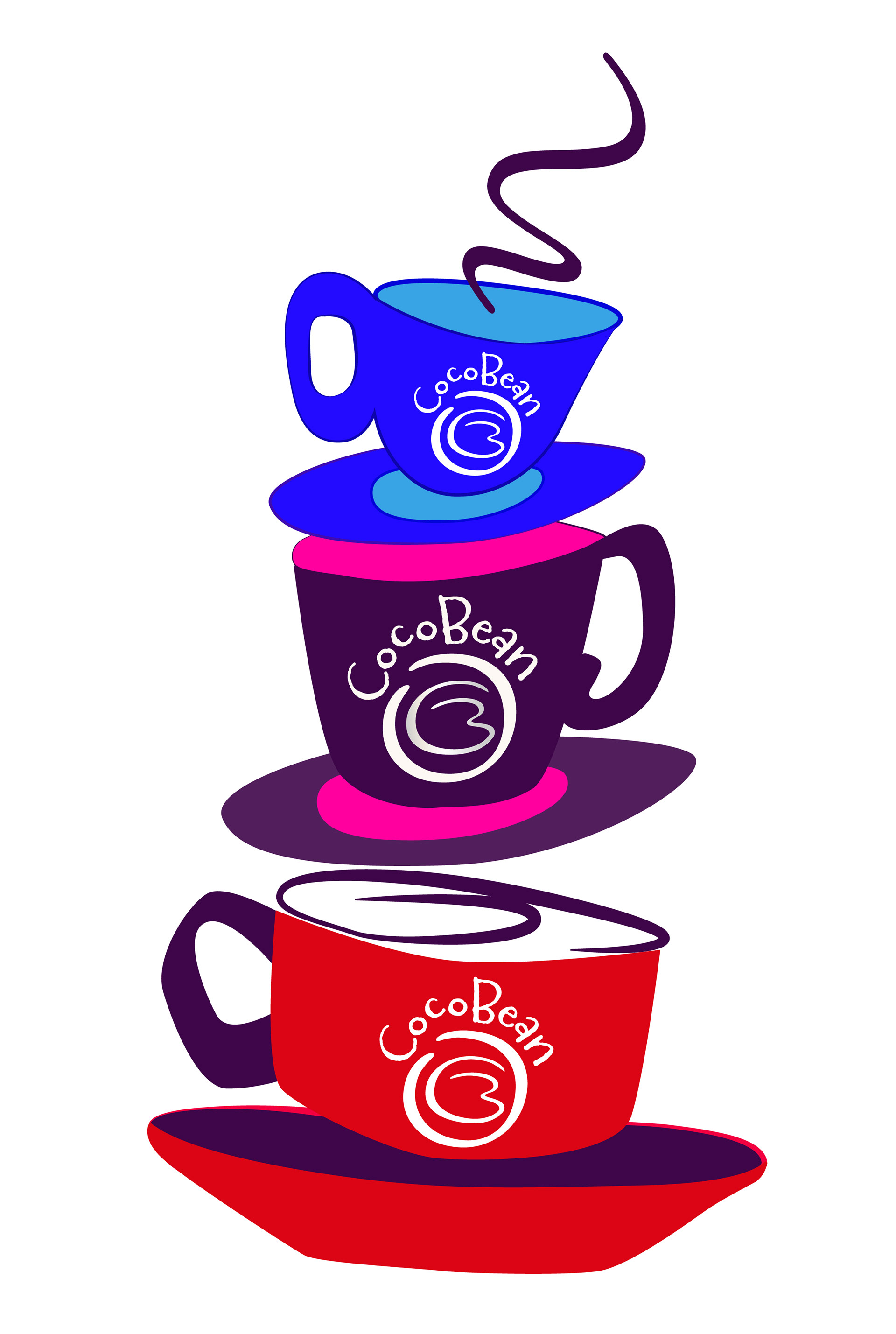
I've crafted a color run that's a visual symphony of rich hues, each carefully selected to evoke a specific mood and atmosphere. Dark browns serve as the foundation, grounding the composition with warmth and earthiness, while purples add depth and regal sophistication, infusing the scene with a sense of luxury. The inclusion of silver brings a modern touch, shimmering like moonlight against the deep tones. Then, there's the vibrant pop of pink-orange, injecting energy and vitality into the mix, igniting passion and creativity. Finally, whites provide a crisp contrast, enhancing brightness and purity while ensuring balance and harmony throughout the palette.

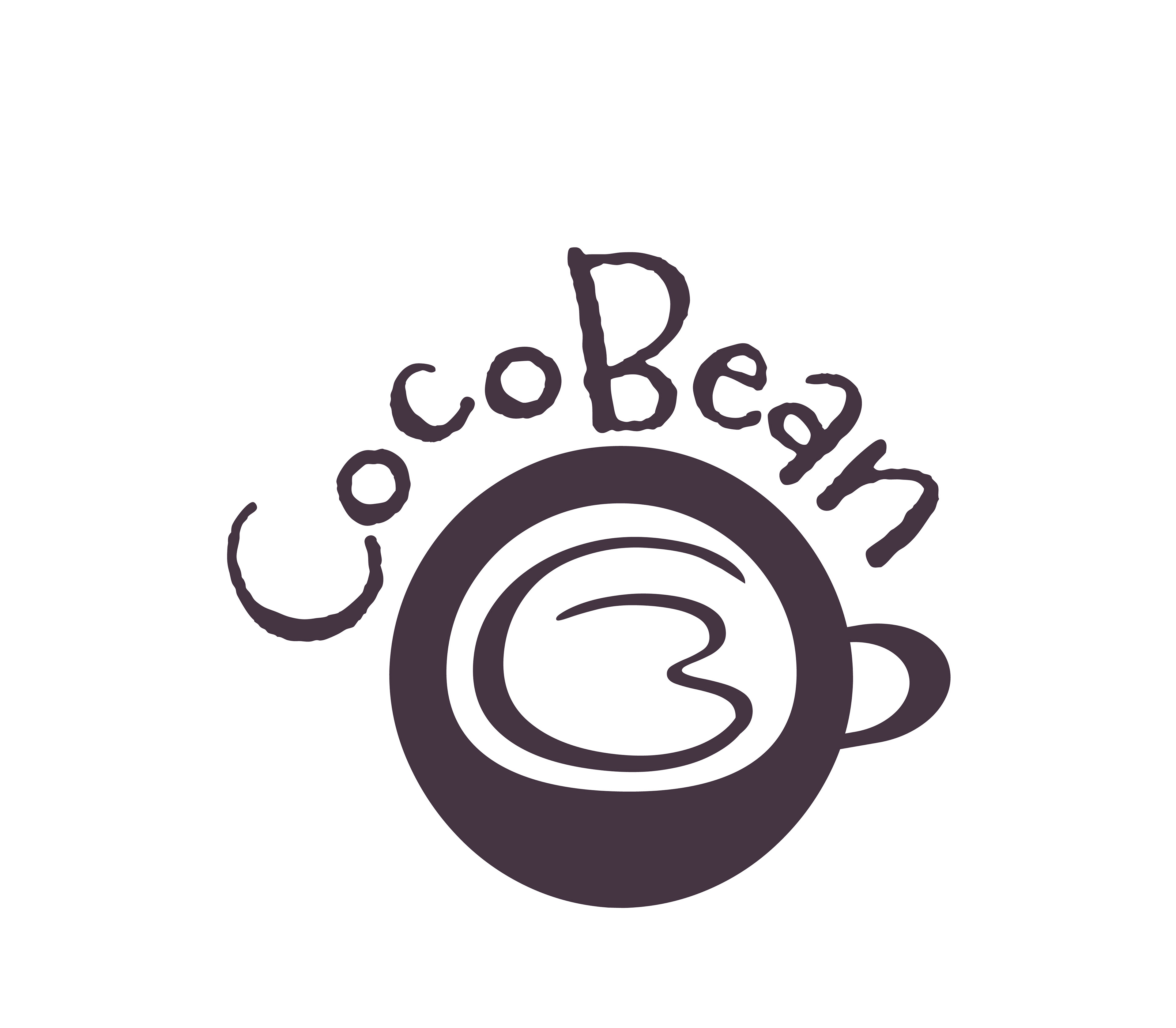
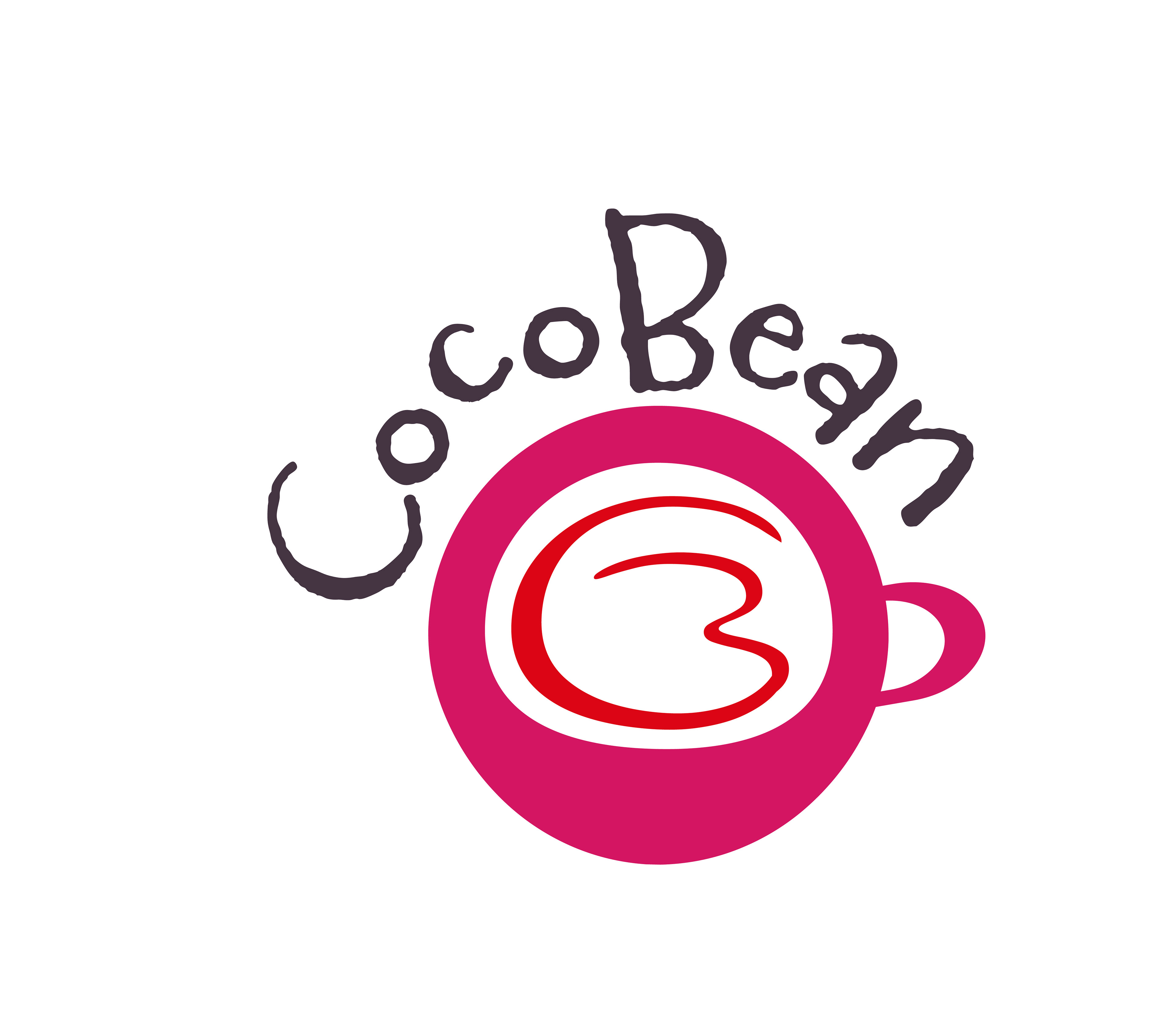

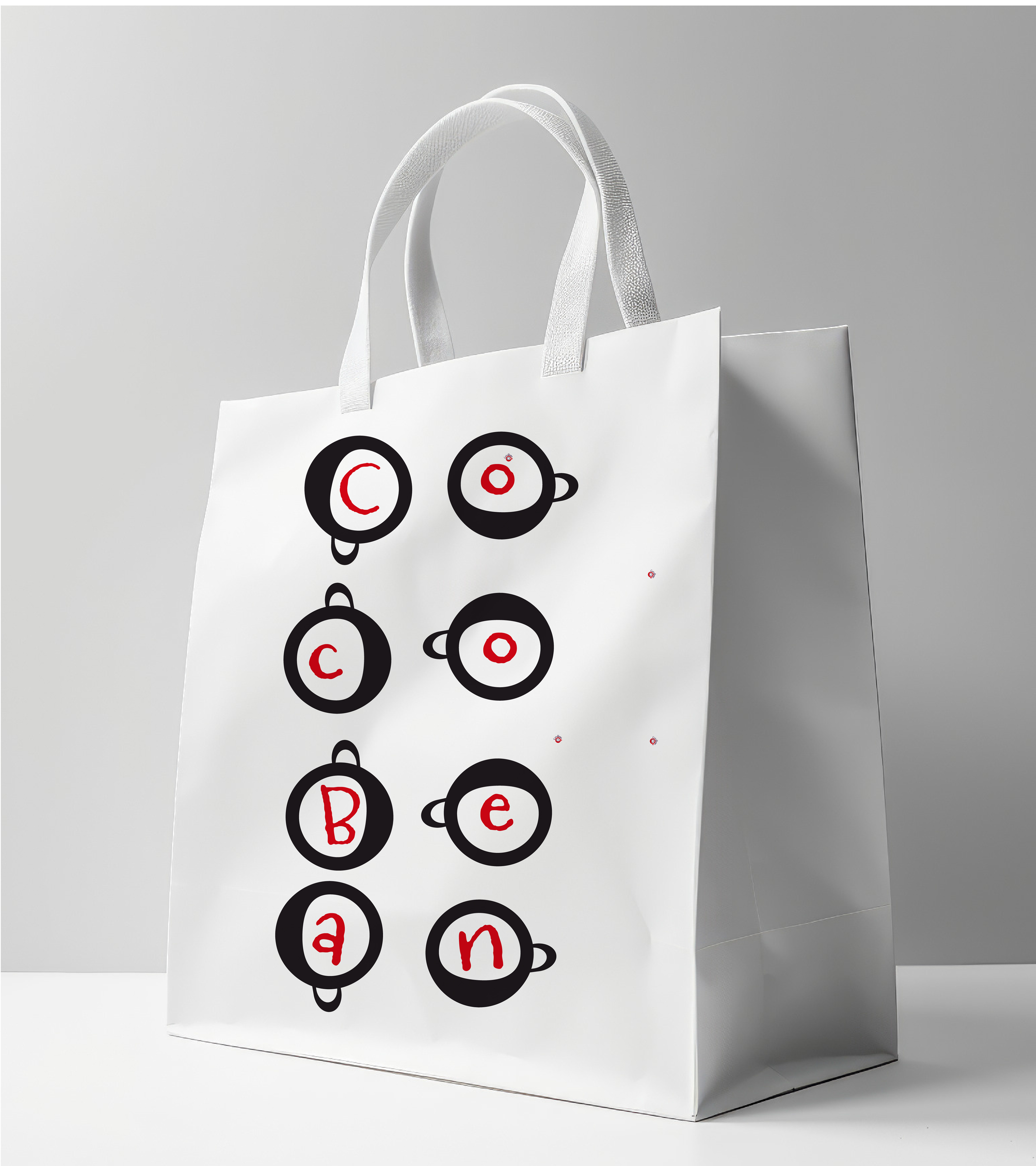
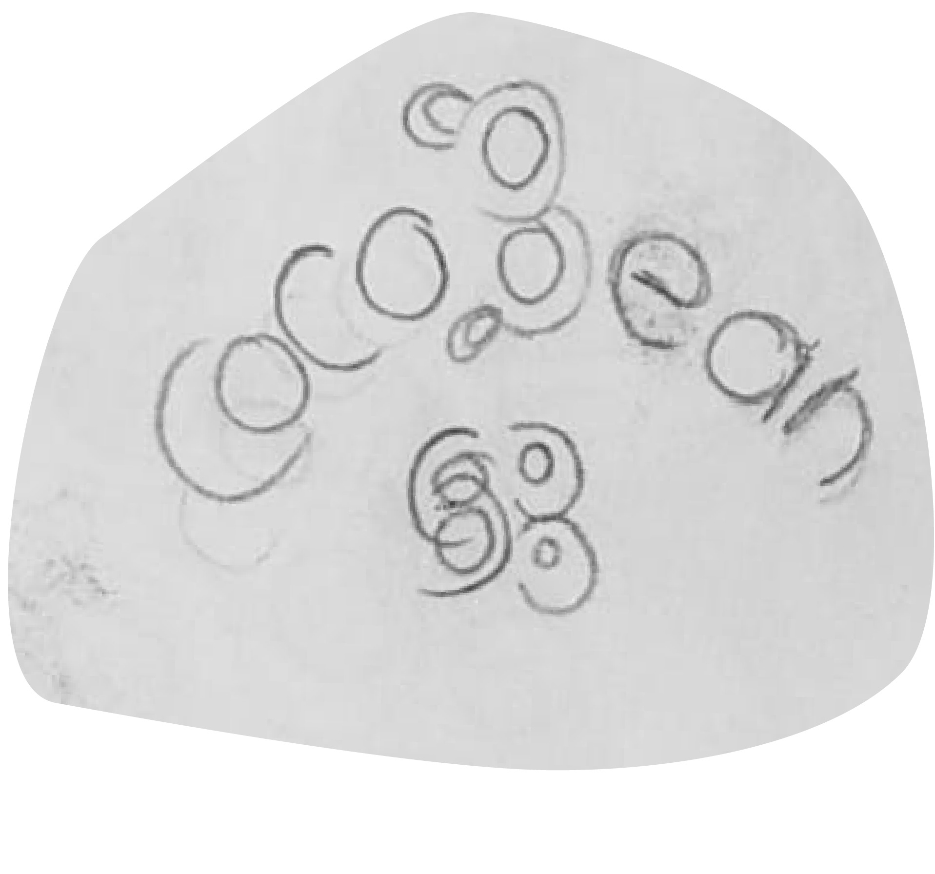
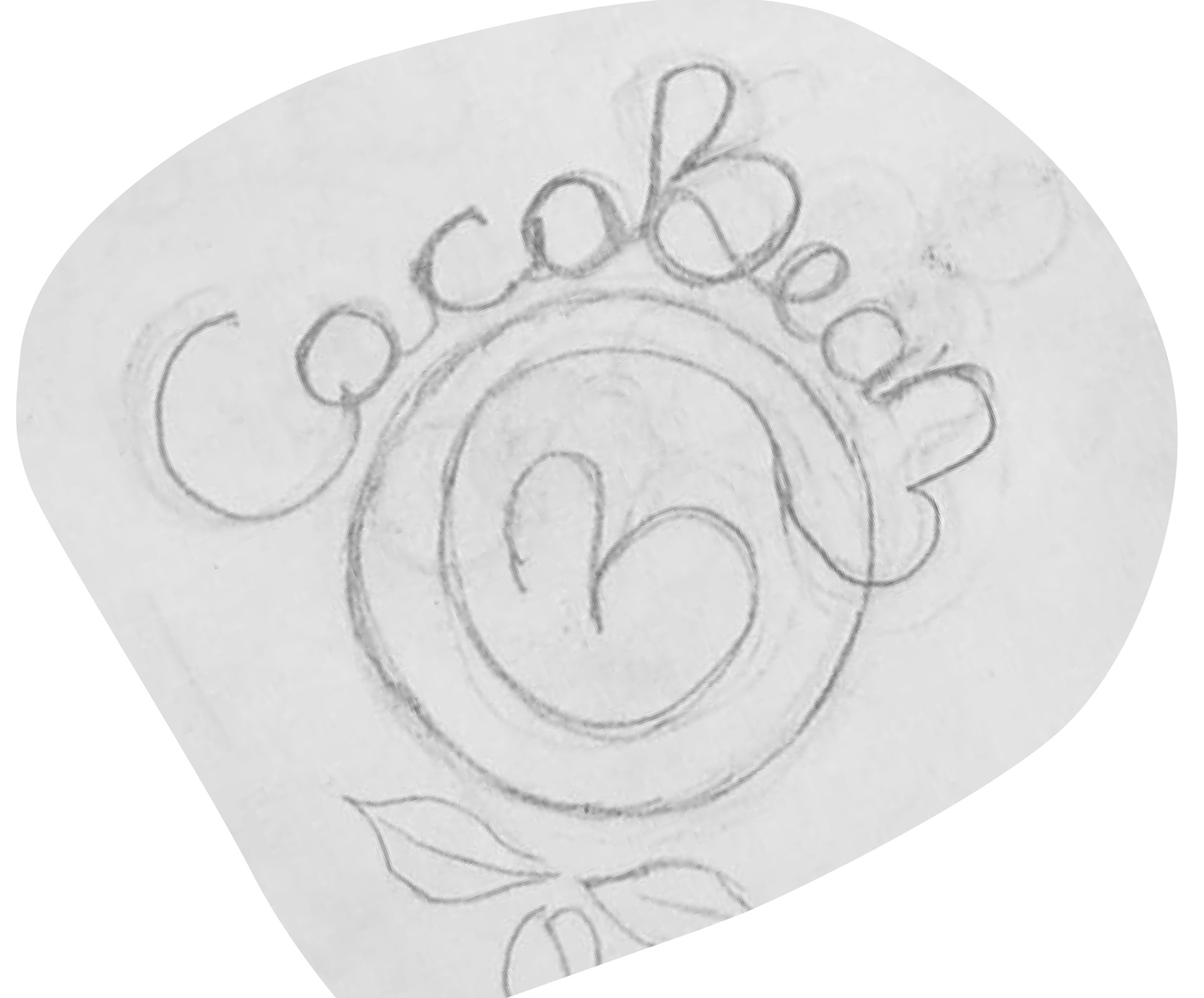
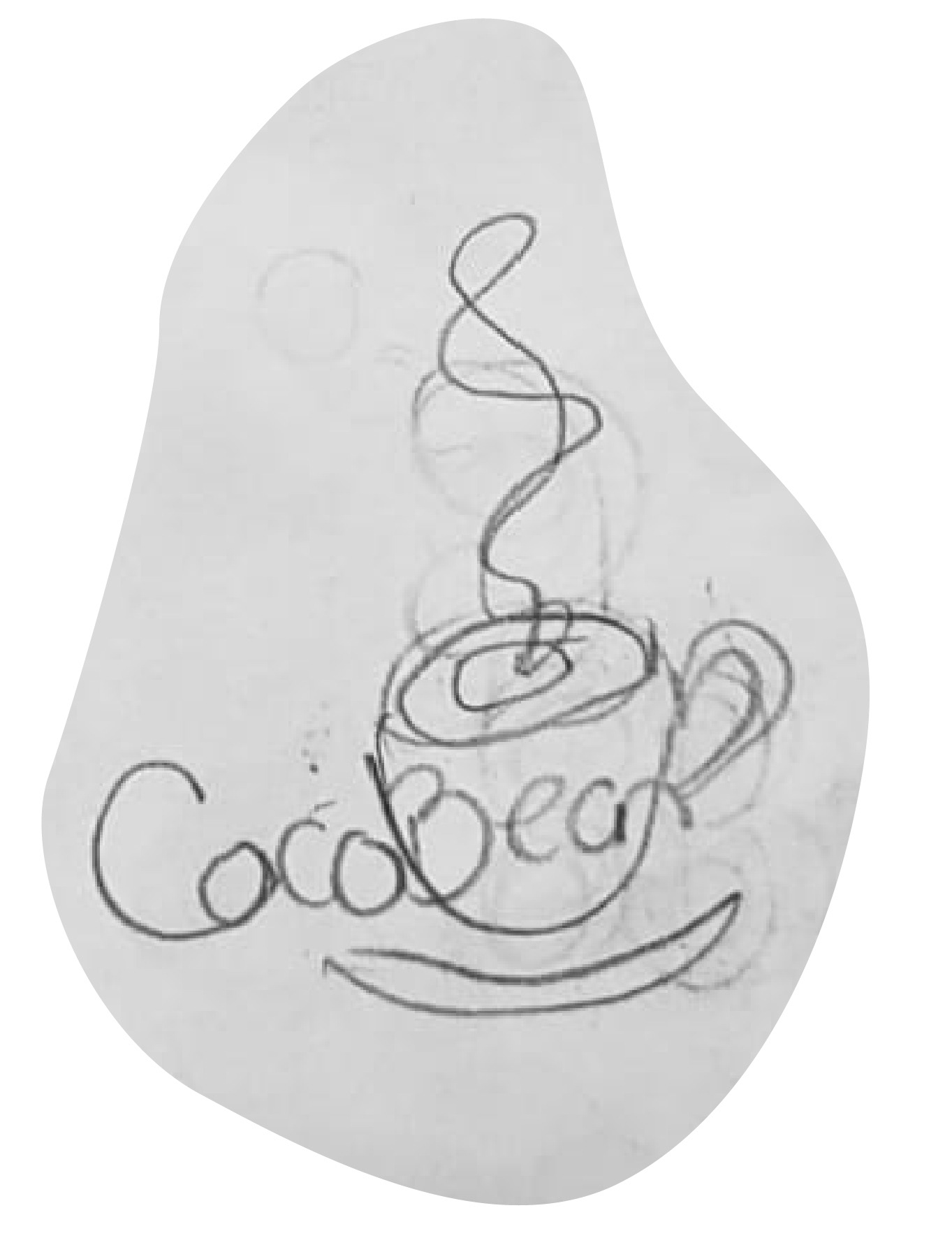
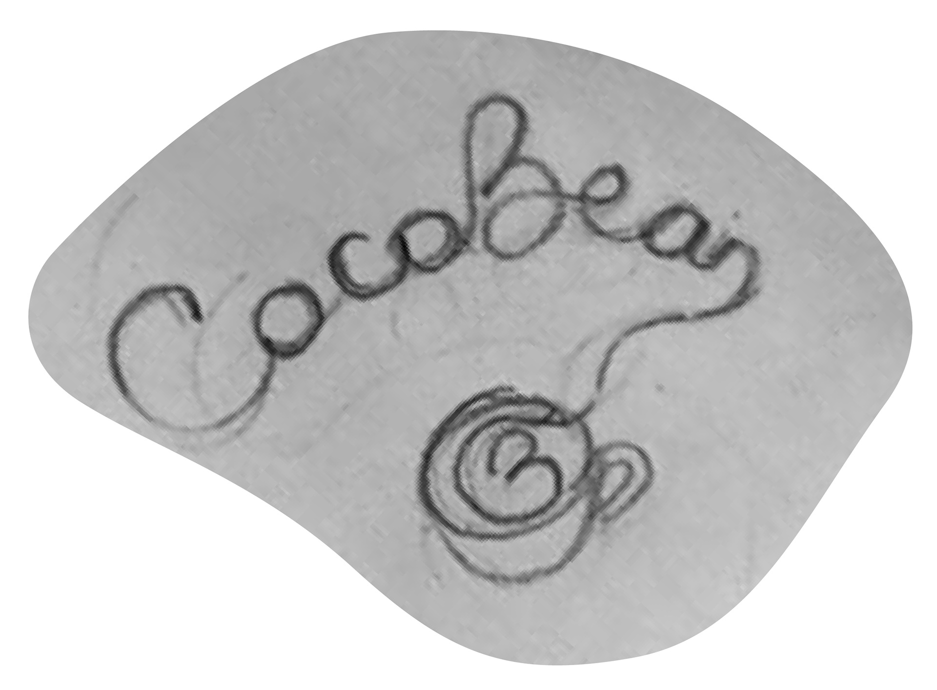
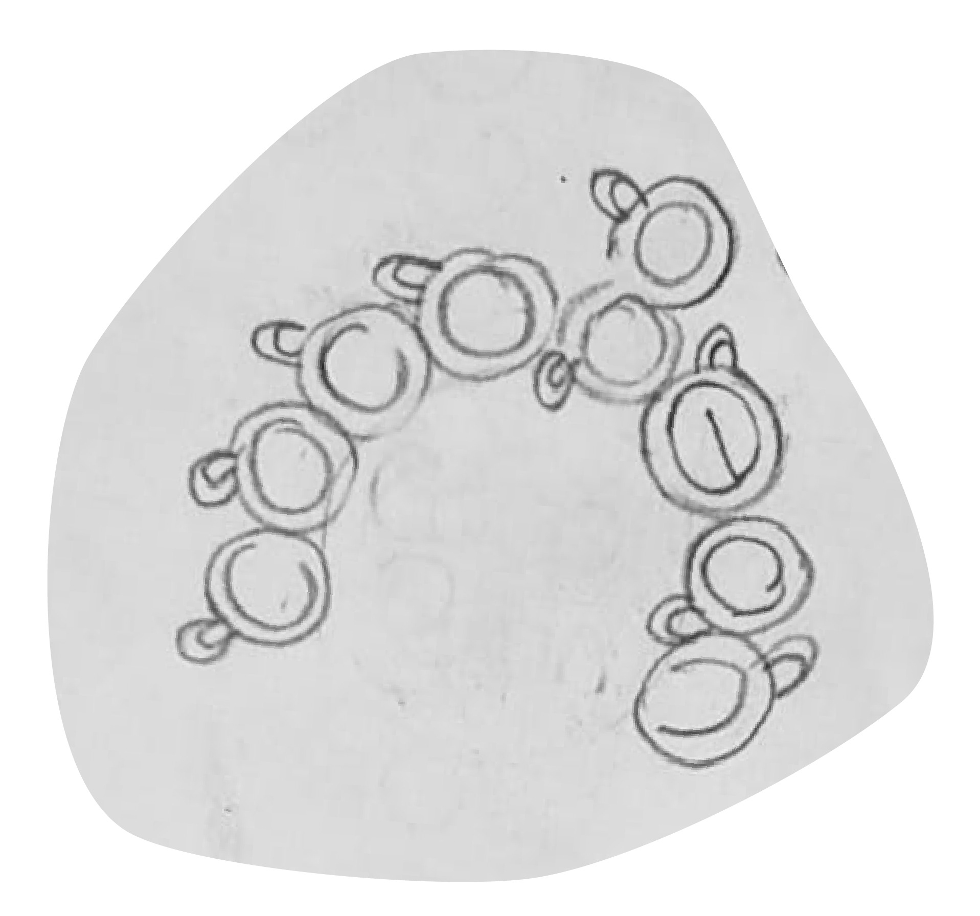
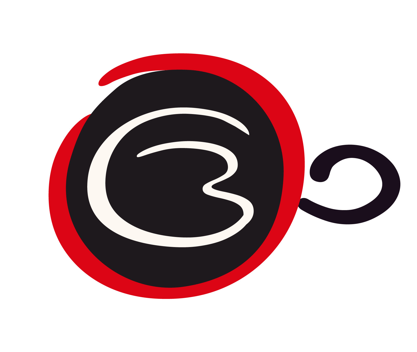
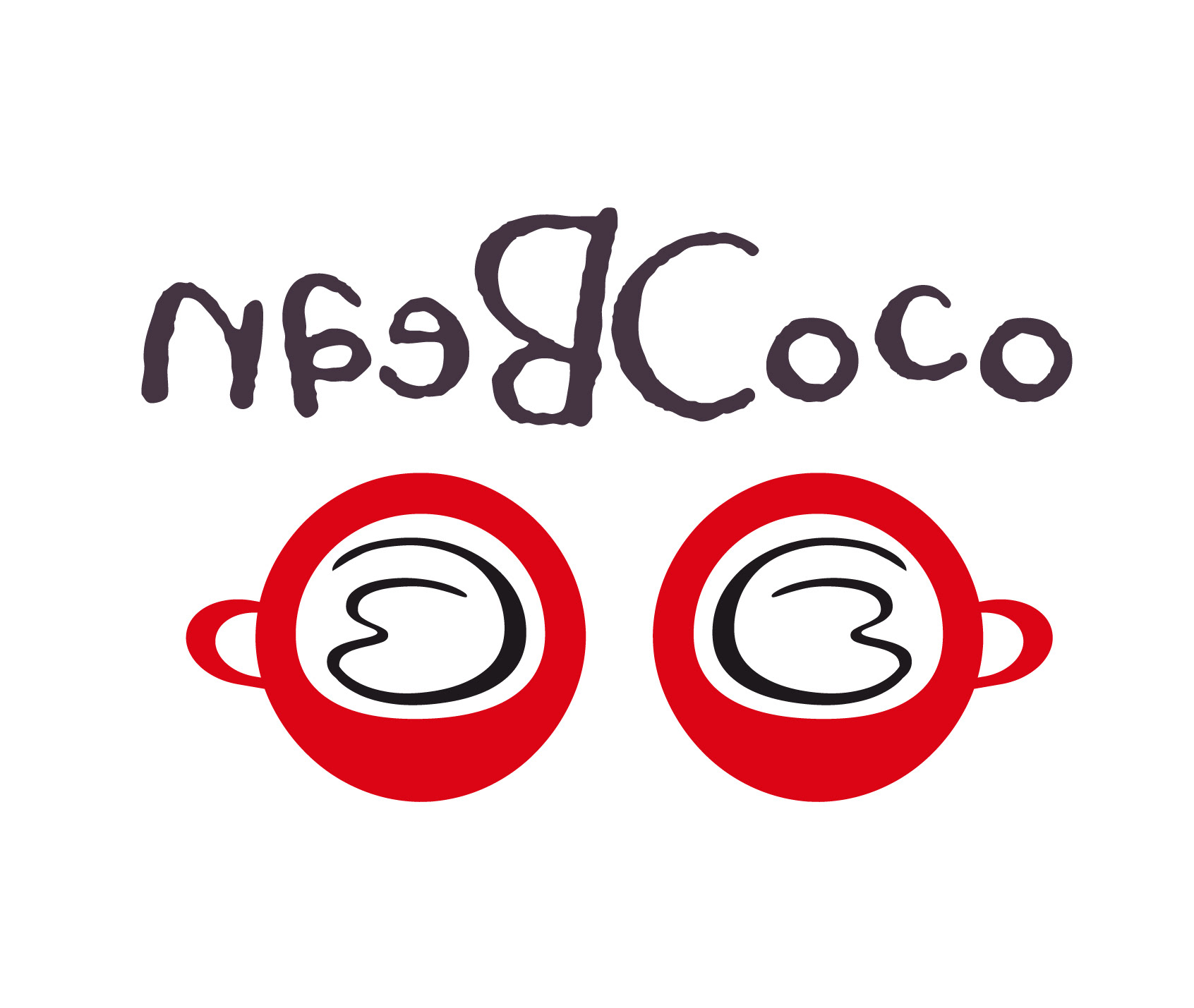
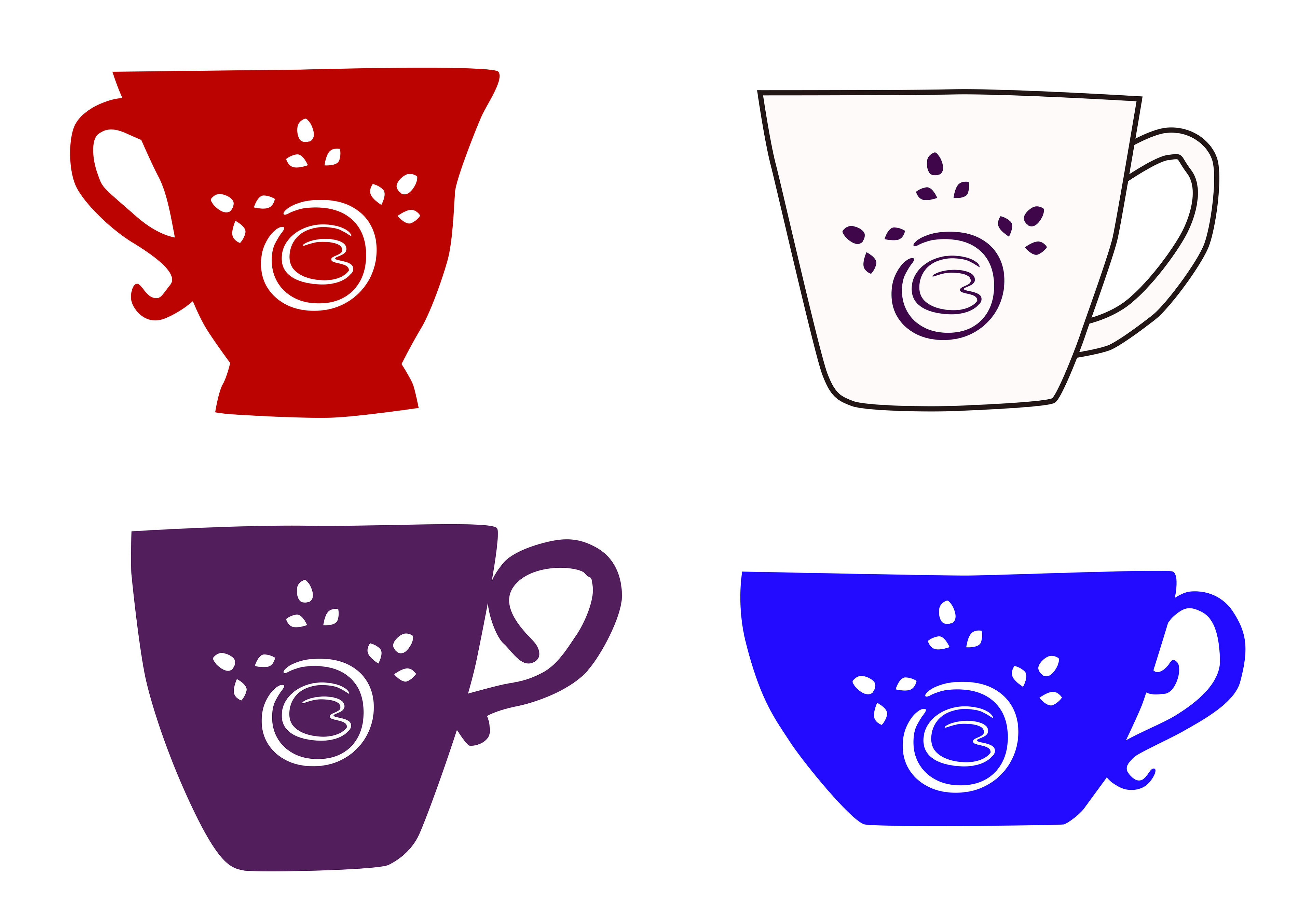
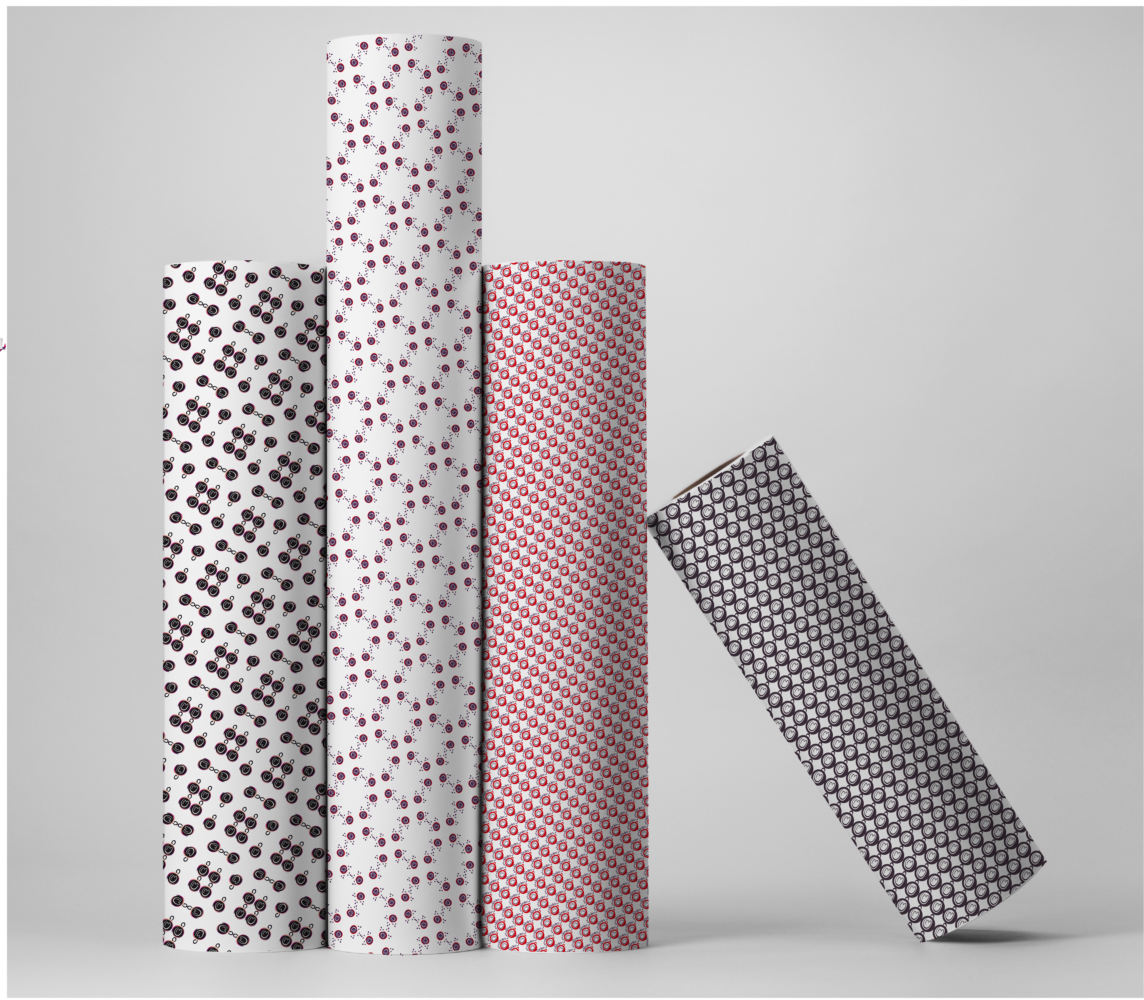
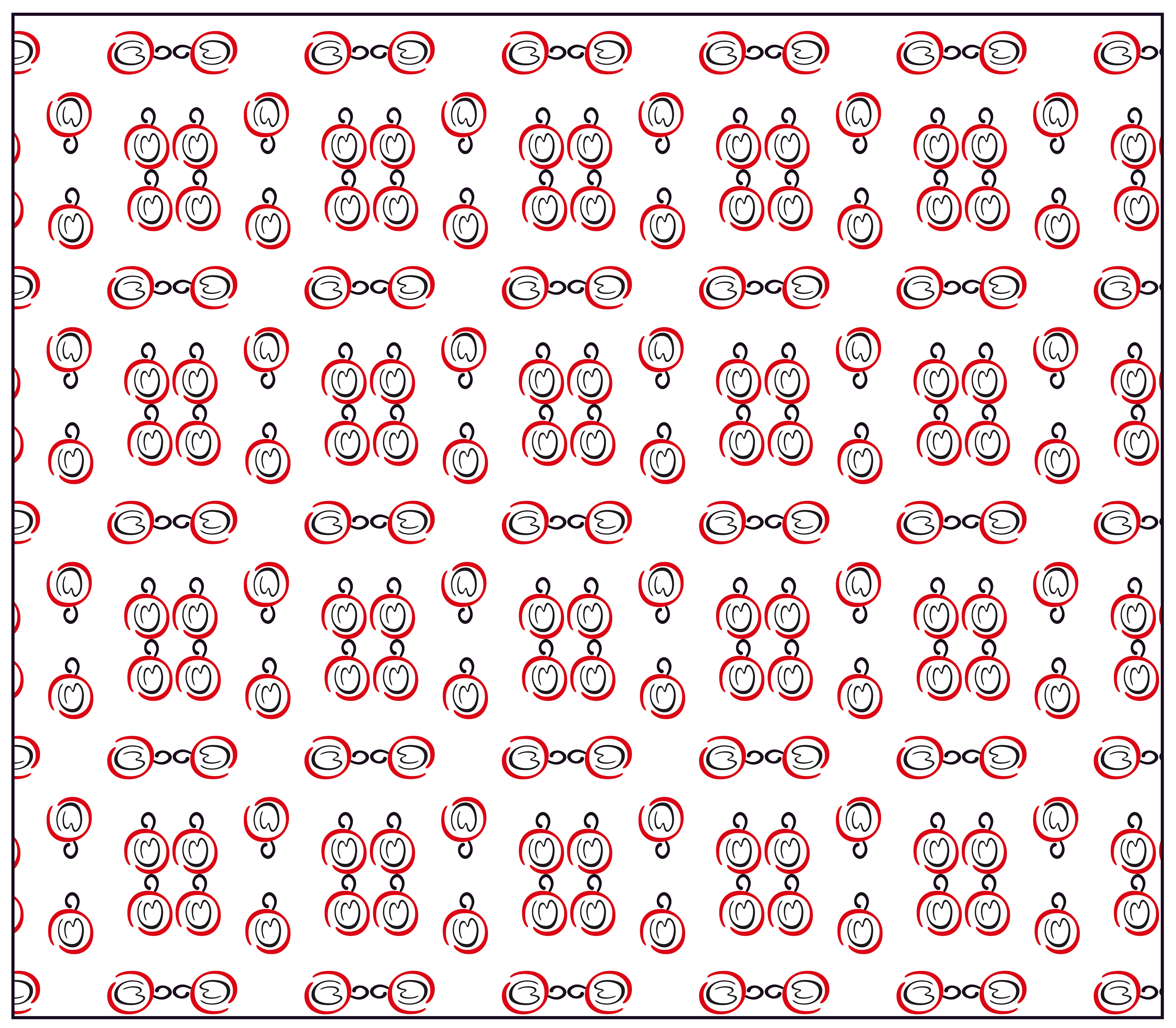
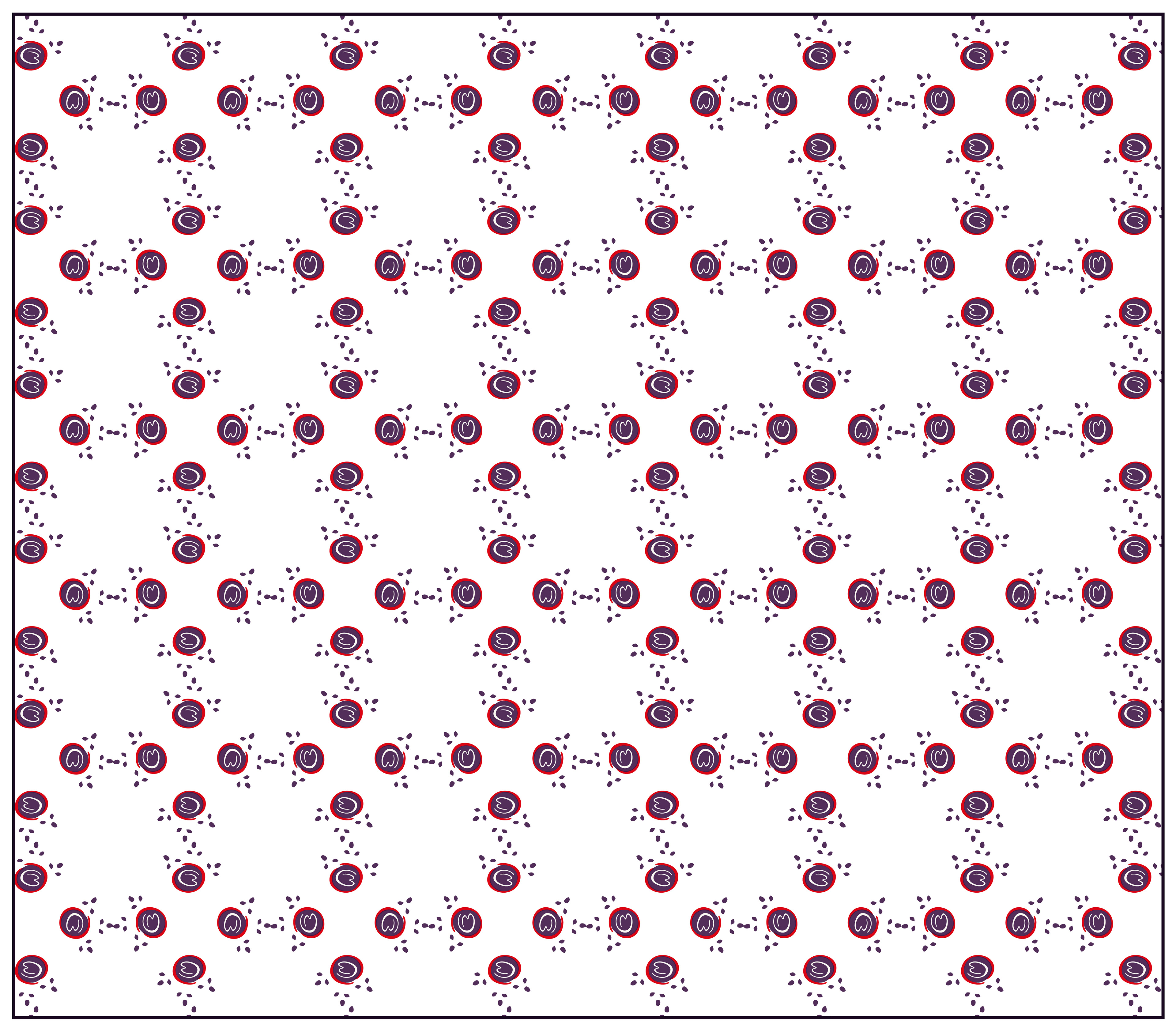
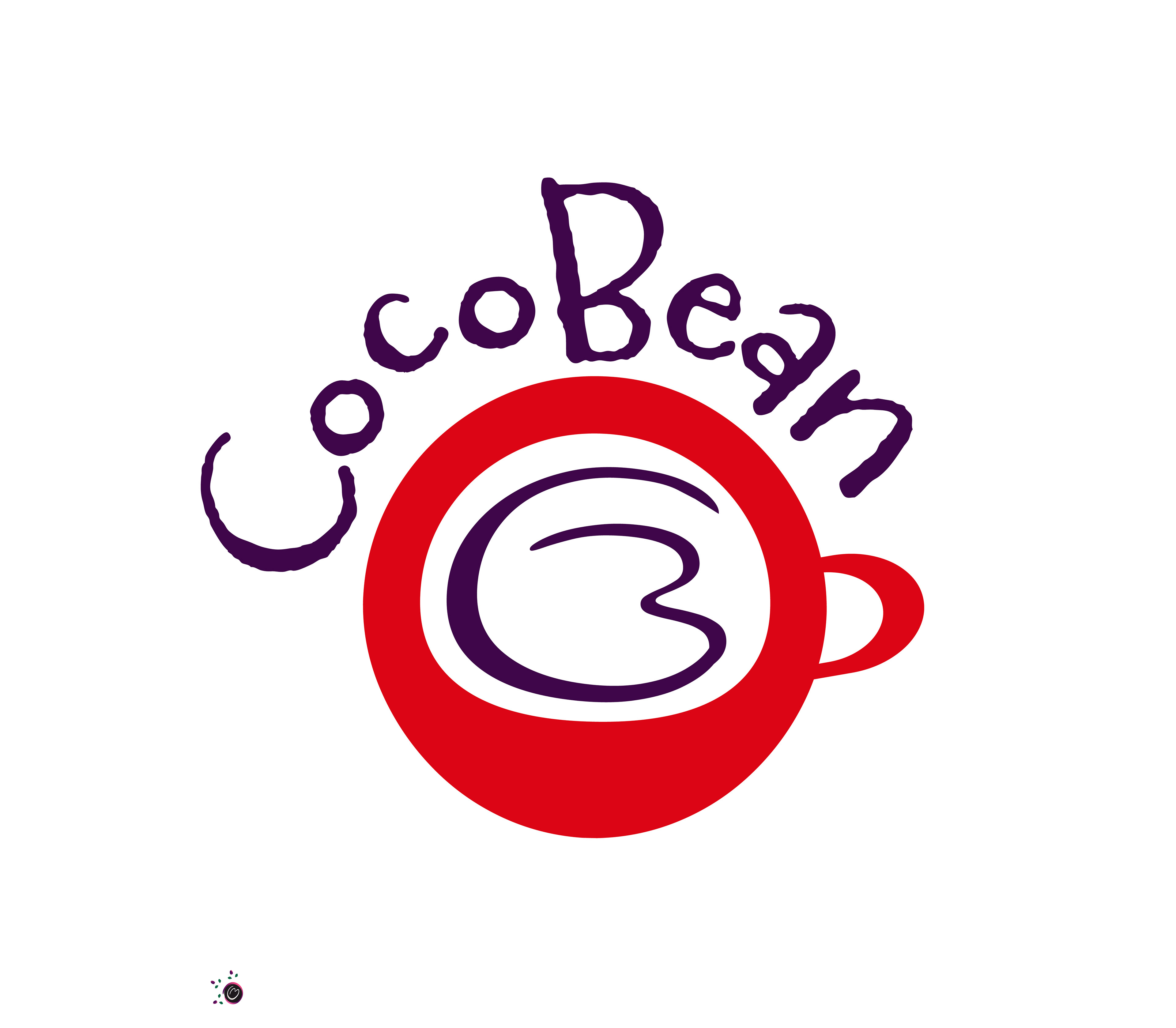
I've developed a collection of artwork and patterns that serve as the cornerstone of CocoBean's visual identity. Among these creations are fancy, fun coffee pots, whimsical coffee cups, and playful coffee beans, each meticulously crafted to infuse our brand with charm and personality. The coffee cups, in particular, are a stroke of creative genius, utilizing the "O" from our logo as the top view of the cup, with the "CB" forming the foam of the coffee inside—a clever and innovative representation that instantly captivates the imagination. These artworks aren't just standalone pieces; they're versatile assets that can be seamlessly integrated into all our advertising and presentation materials, from posters to packaging. Furthermore, these designs have been transformed into captivating patterns, adding depth and texture to our visual storytelling. Whether it's a whimsical coffee pot adorning a brochure or a playful coffee bean pattern adorning our website, these artworks and patterns breathe life into the CocoBean brand, creating an enchanting and immersive experience for our audience.


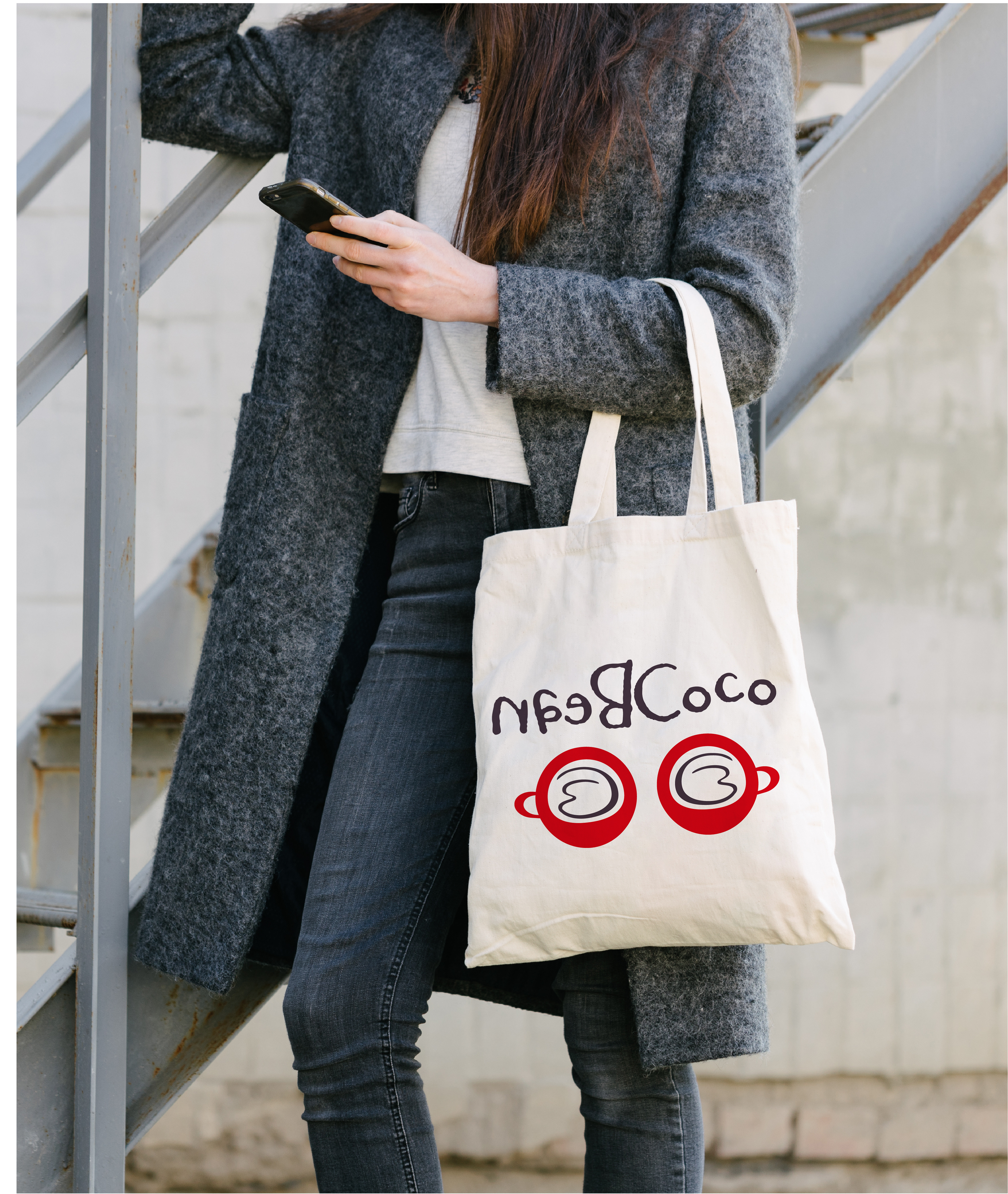
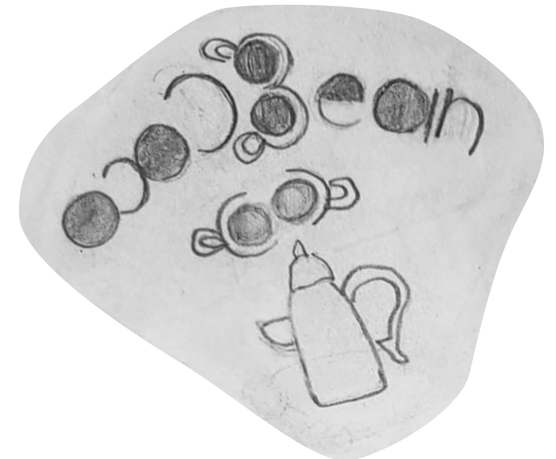
The patterns I've crafted serve as versatile assets for our brand, finding utility in various facets of our elegant coffee diner restaurant. Whether adorning the wrapping of our artisan sandwiches or lending sophistication to our paper bags, these designs encapsulate the essence of CocoBean's commitment to refined dining experiences. Each pattern is meticulously curated to complement our brand's aesthetic, infusing every touchpoint with a sense of elegance and charm. From enhancing the presentation of our culinary creations to elevating the ambiance of our space, these patterns play a pivotal role in shaping the cohesive identity of CocoBean, reflecting our dedication to excellence in every detail.


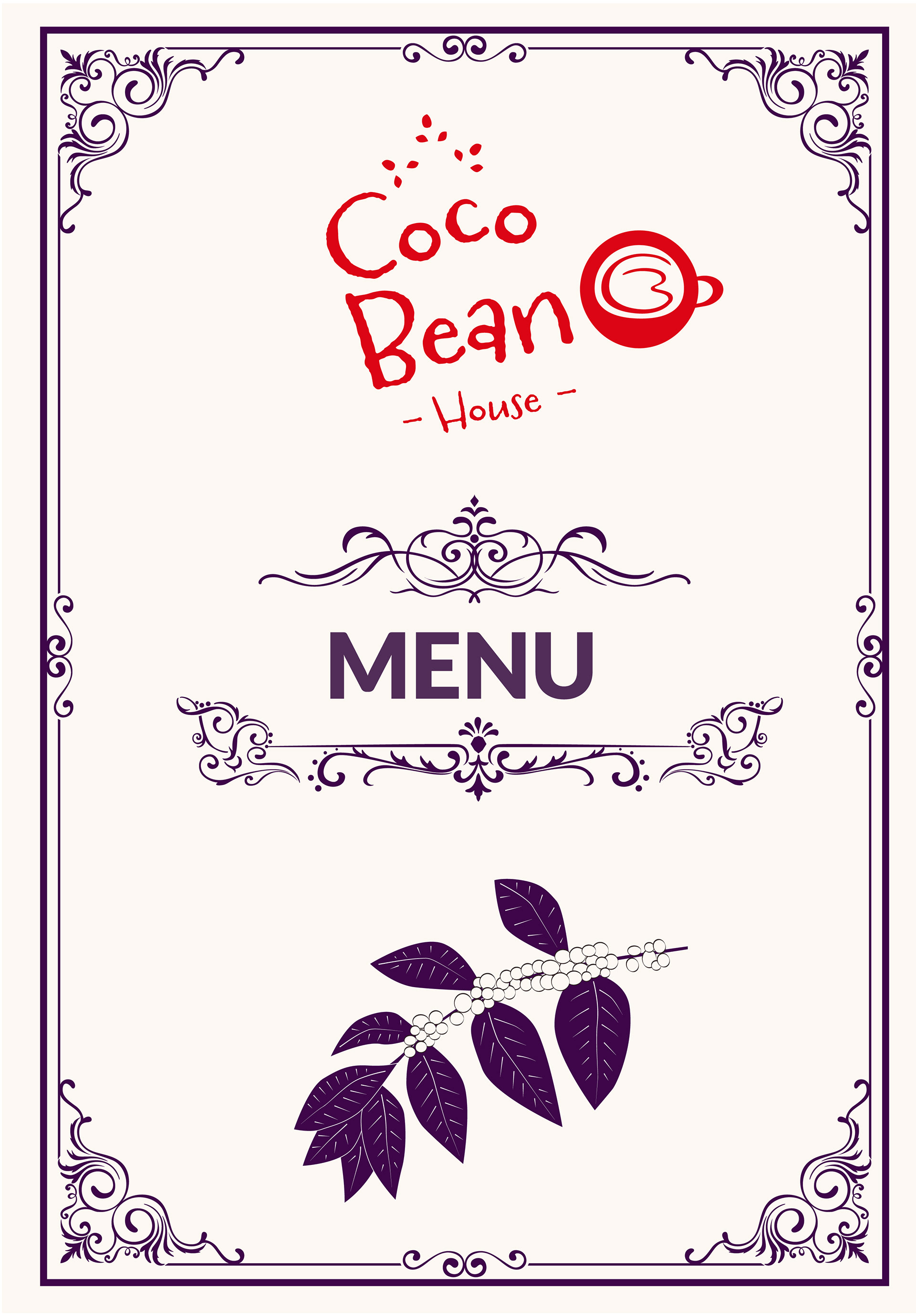
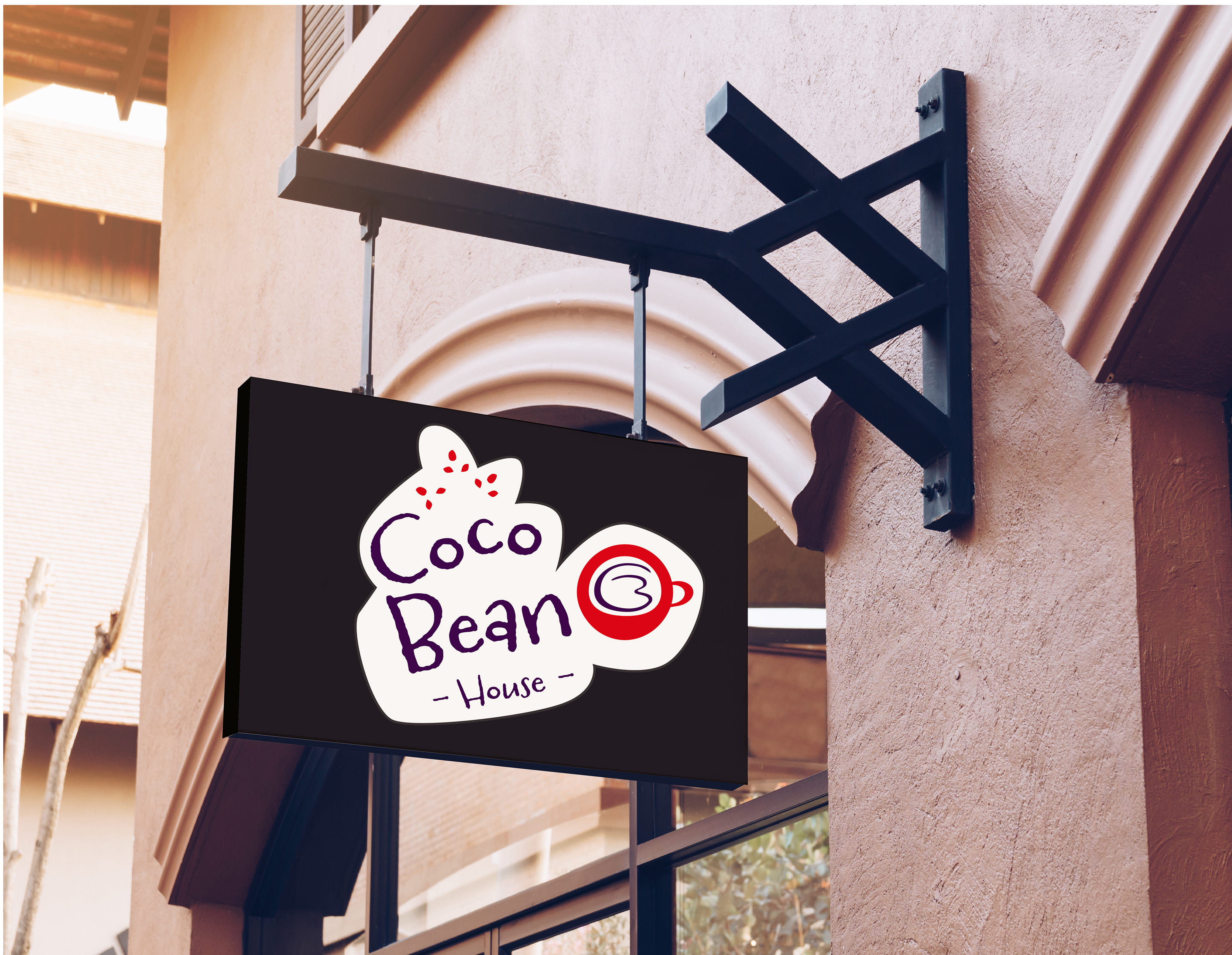
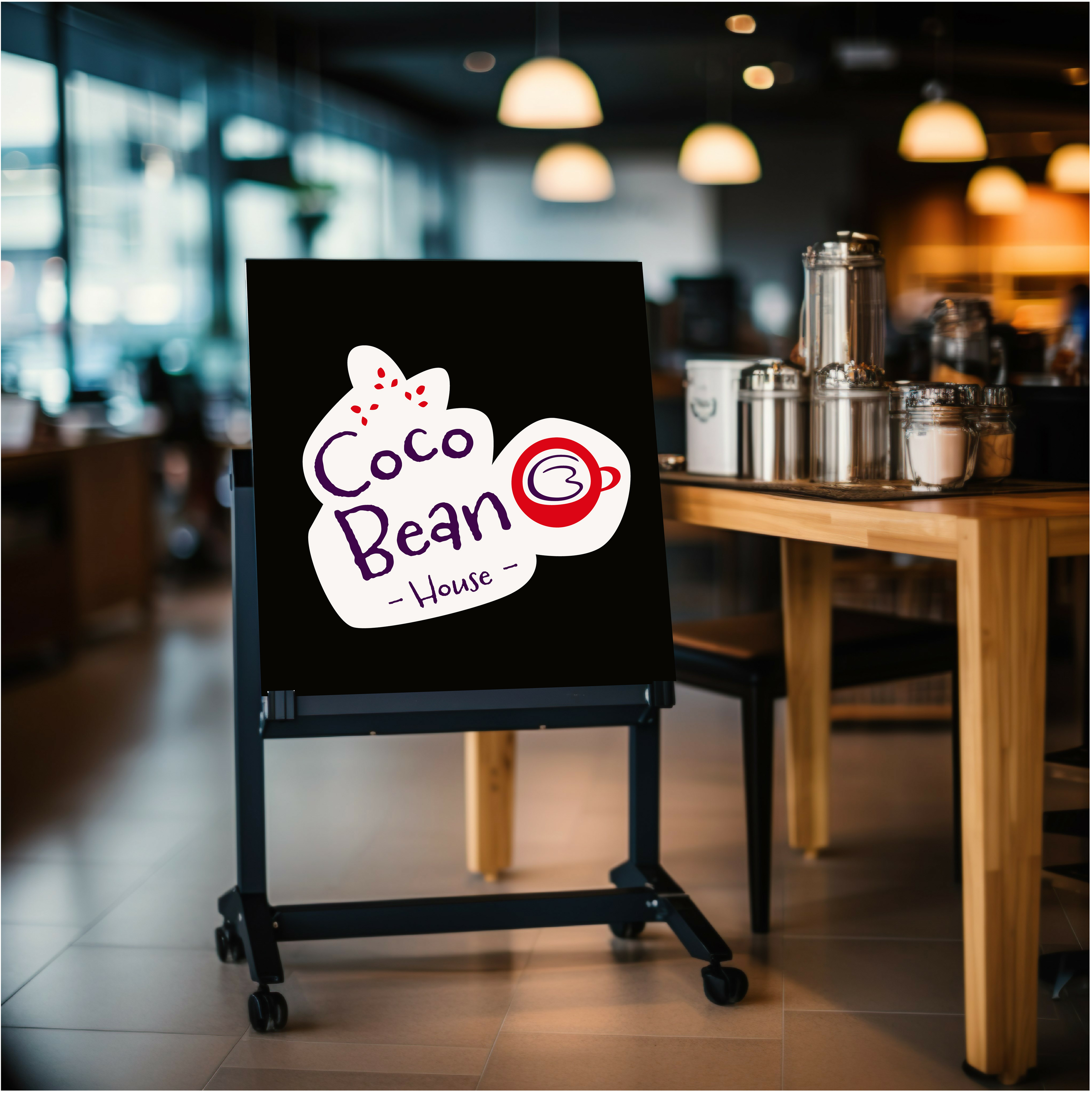
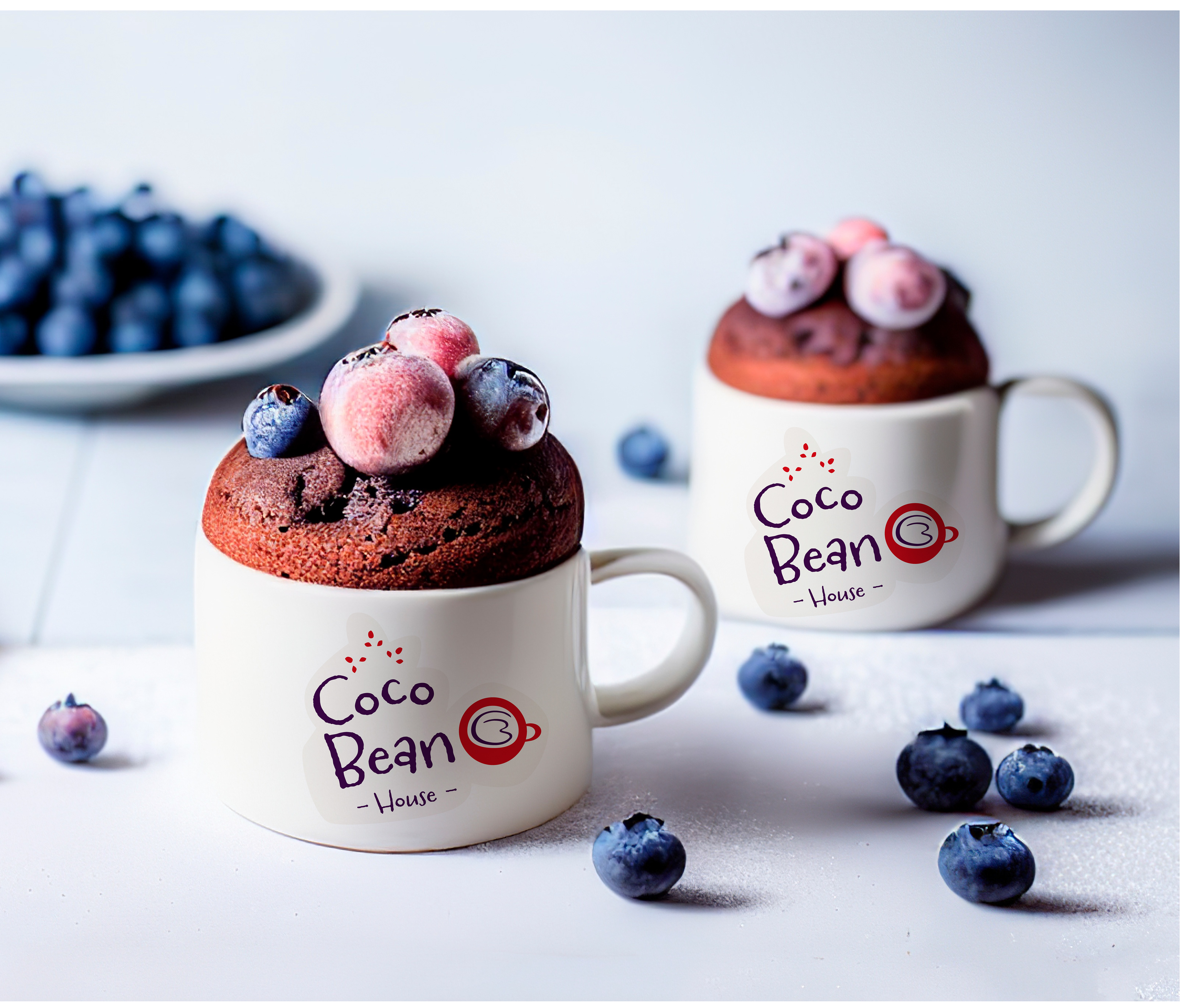
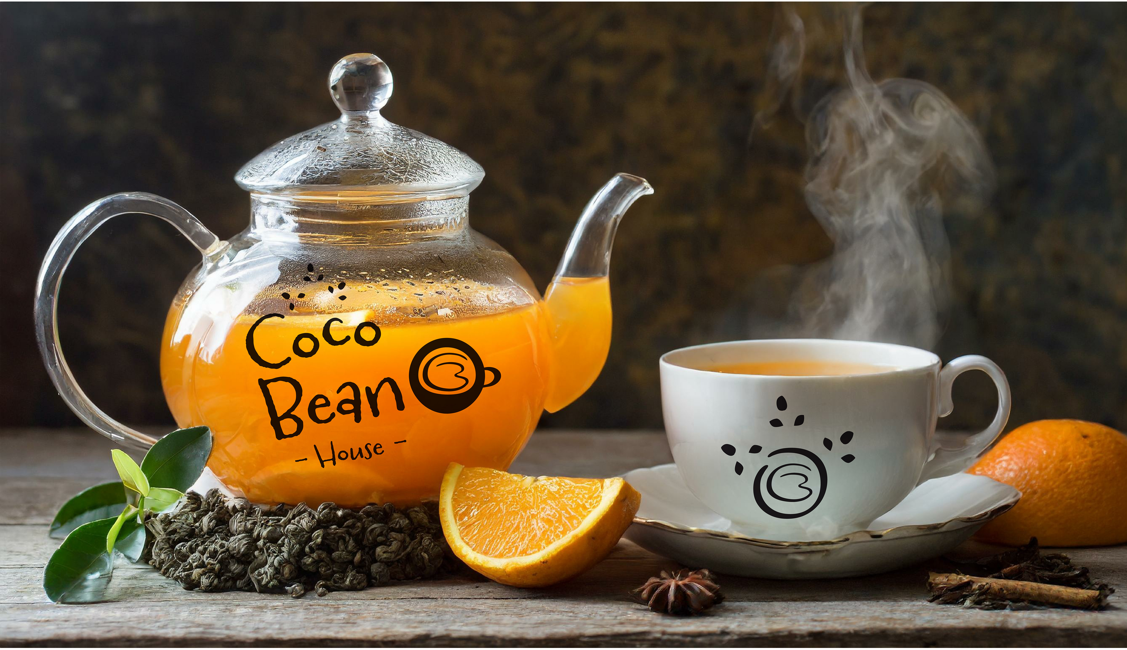
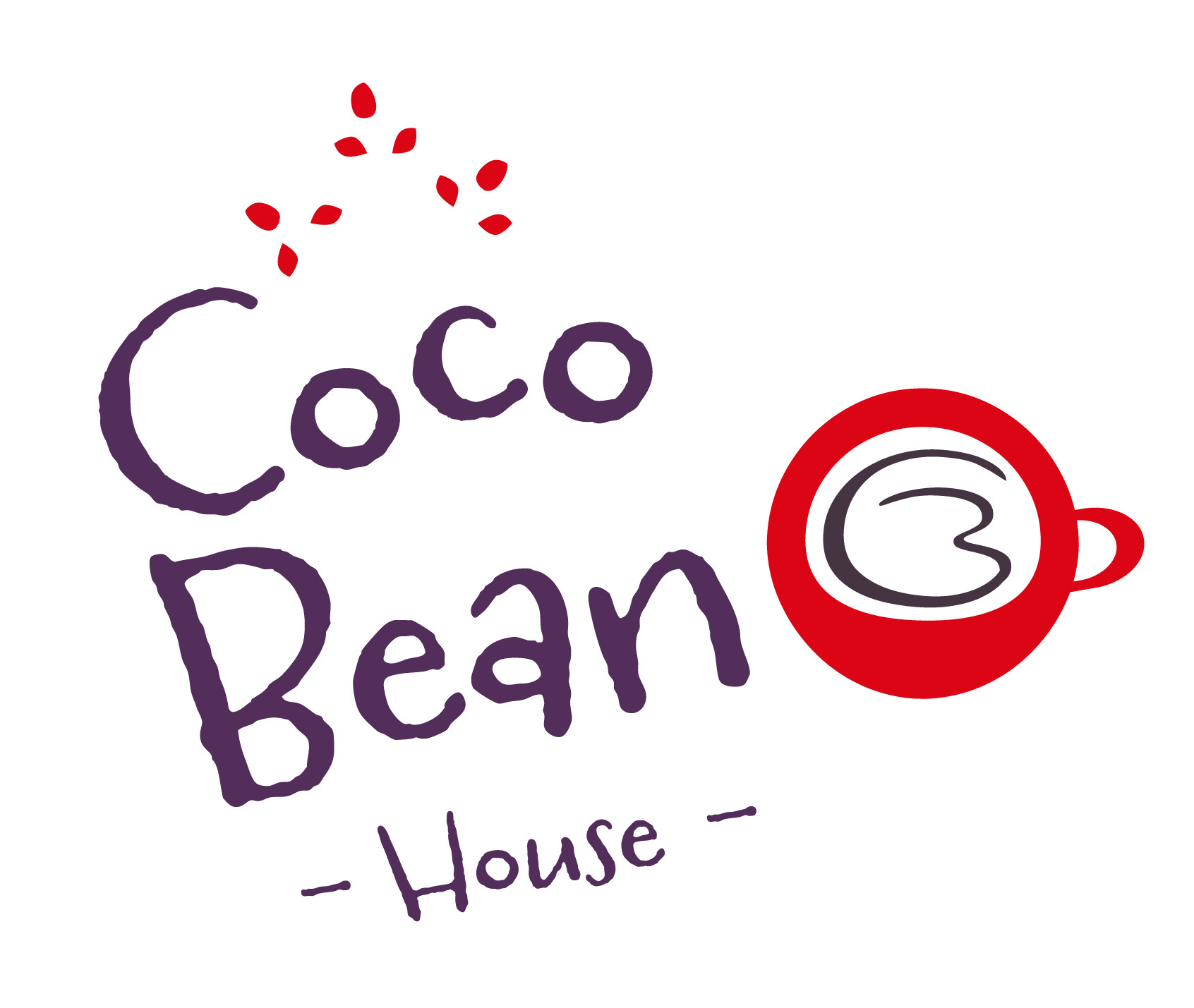
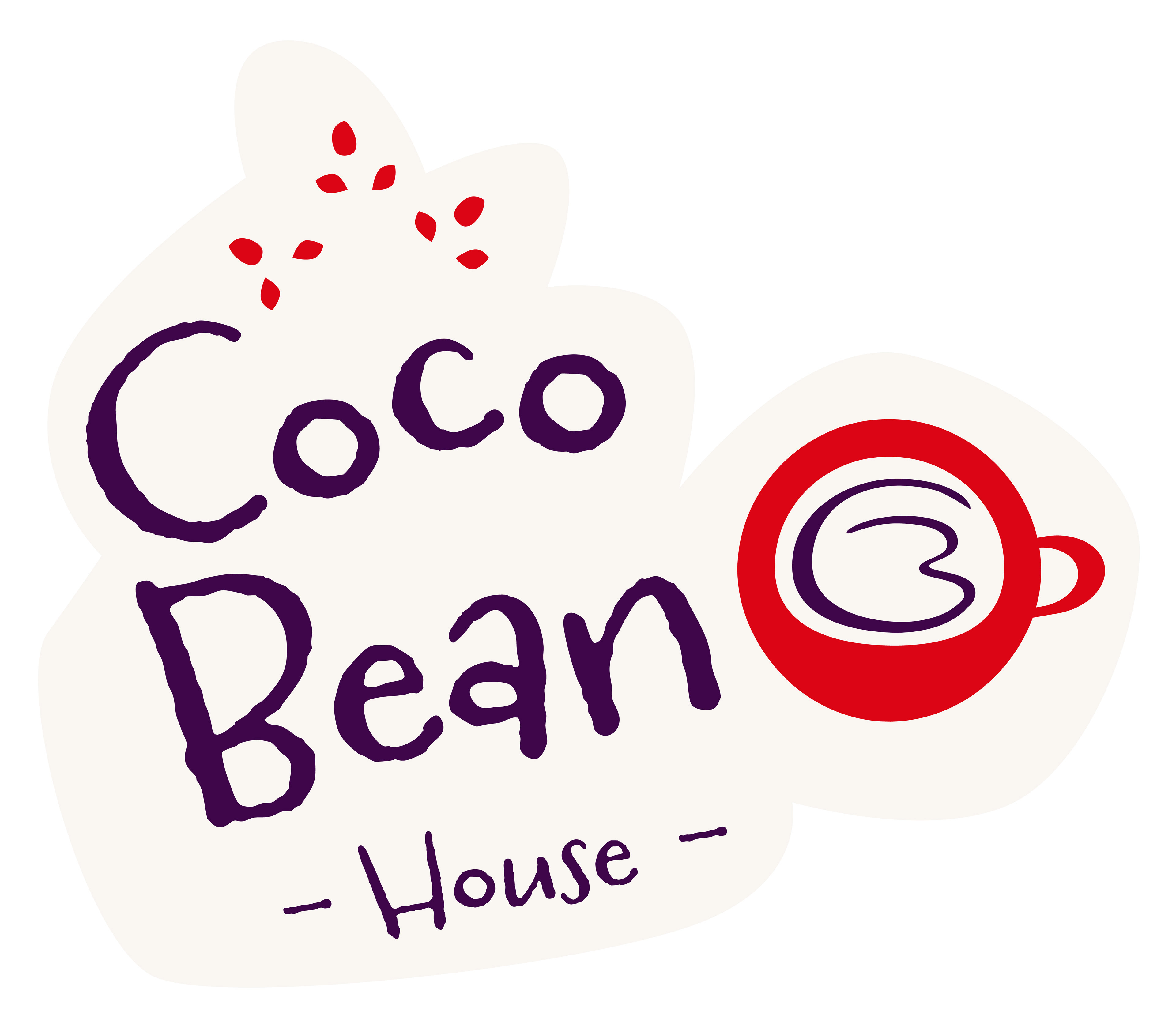
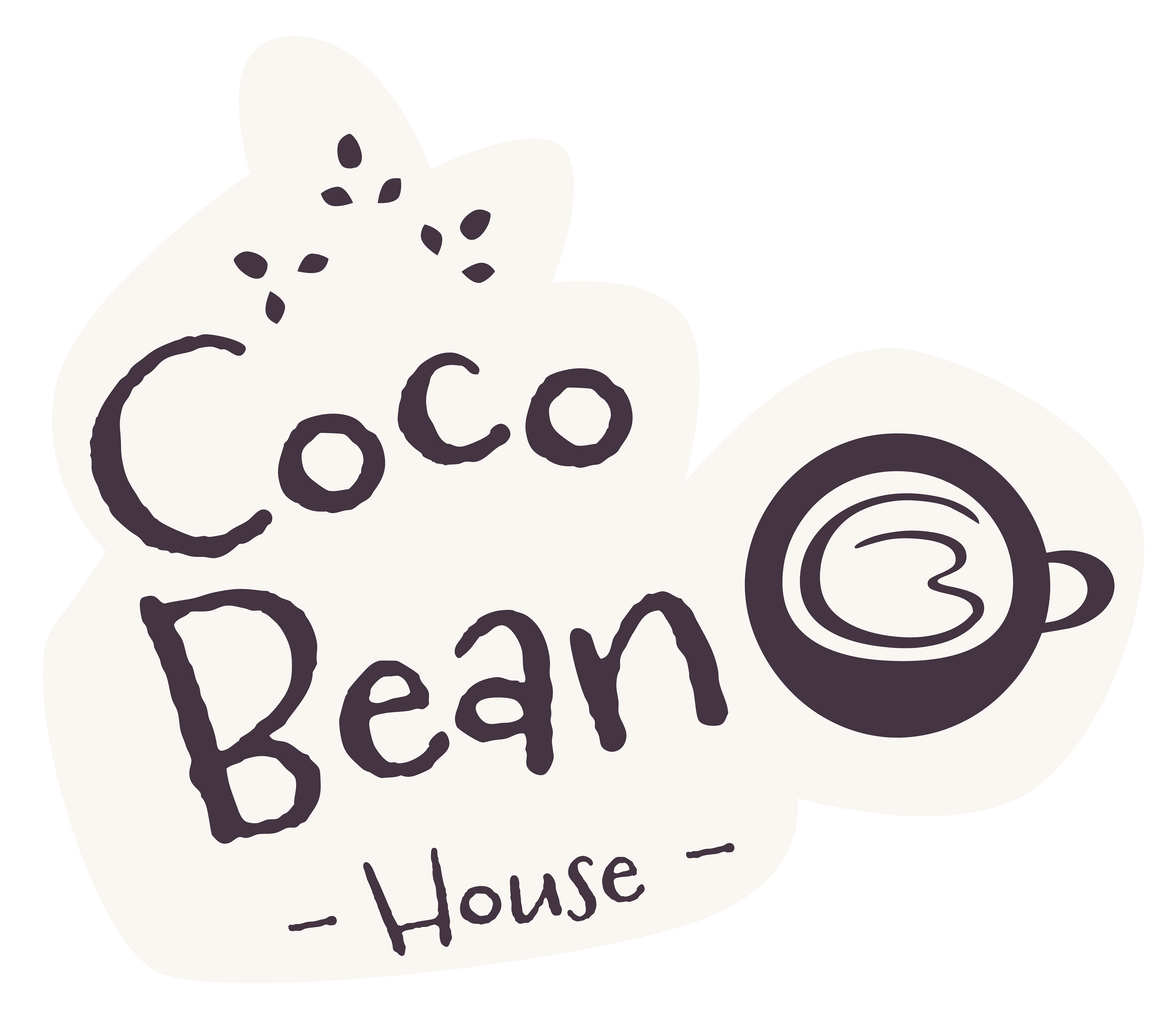
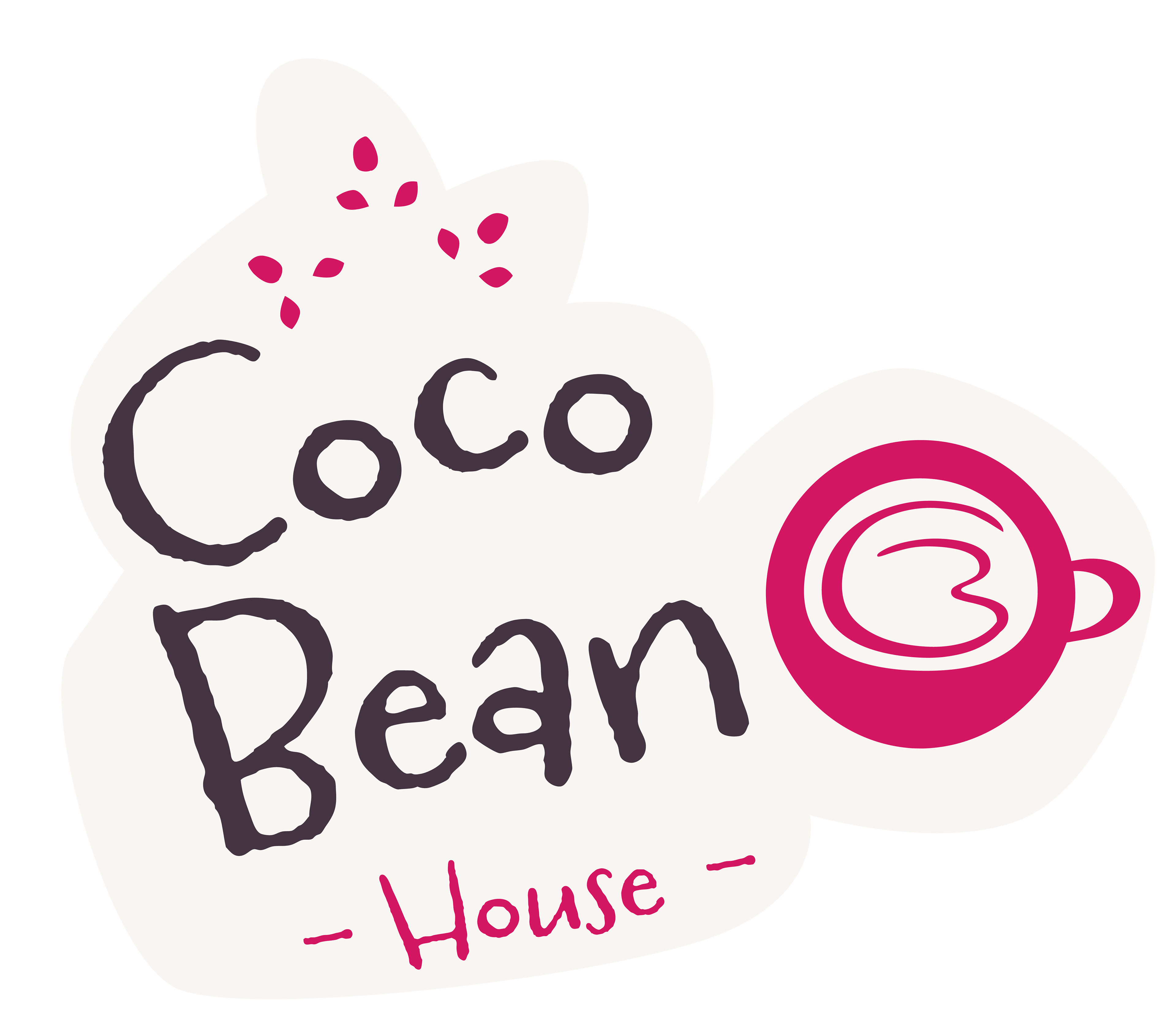
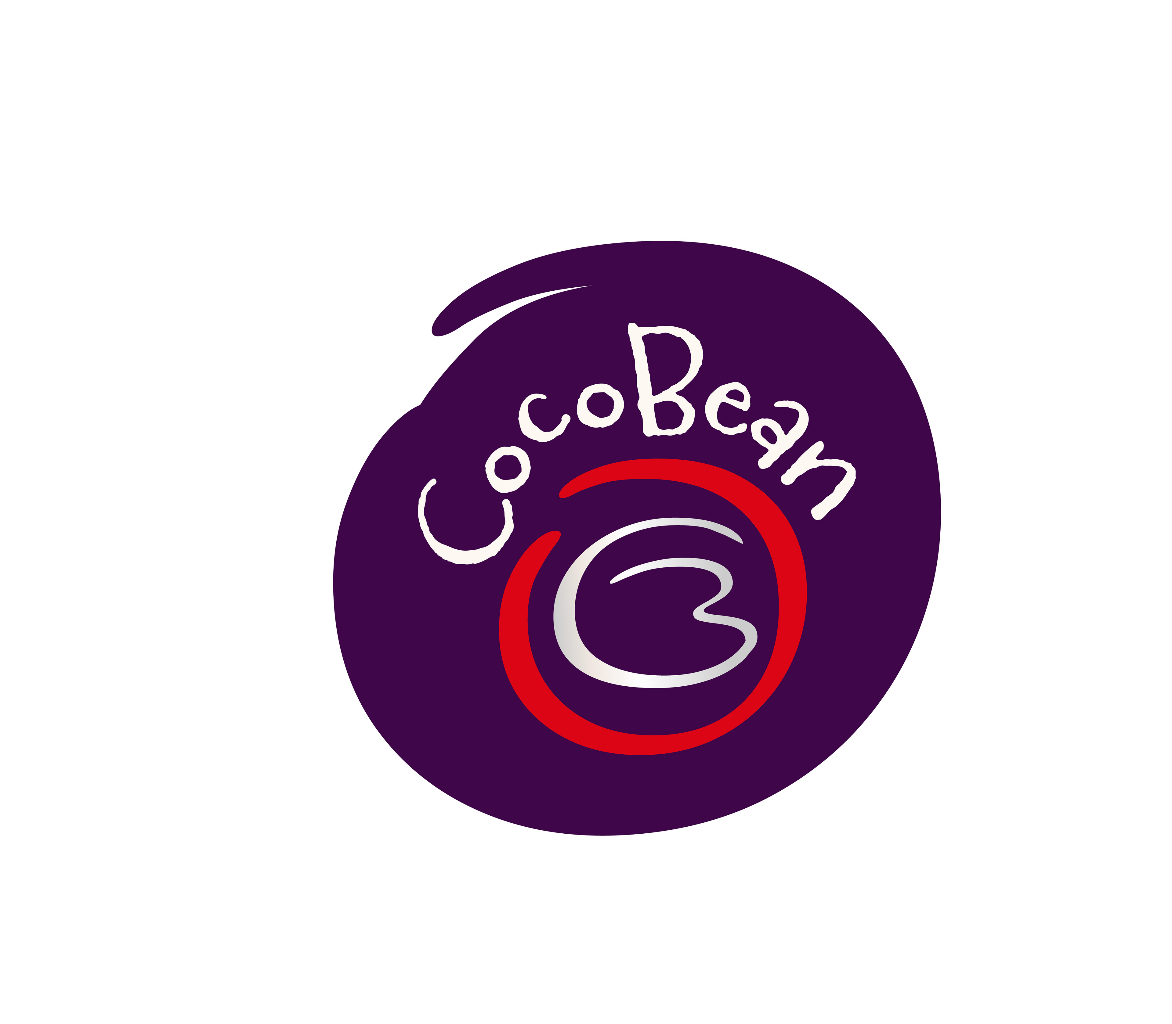
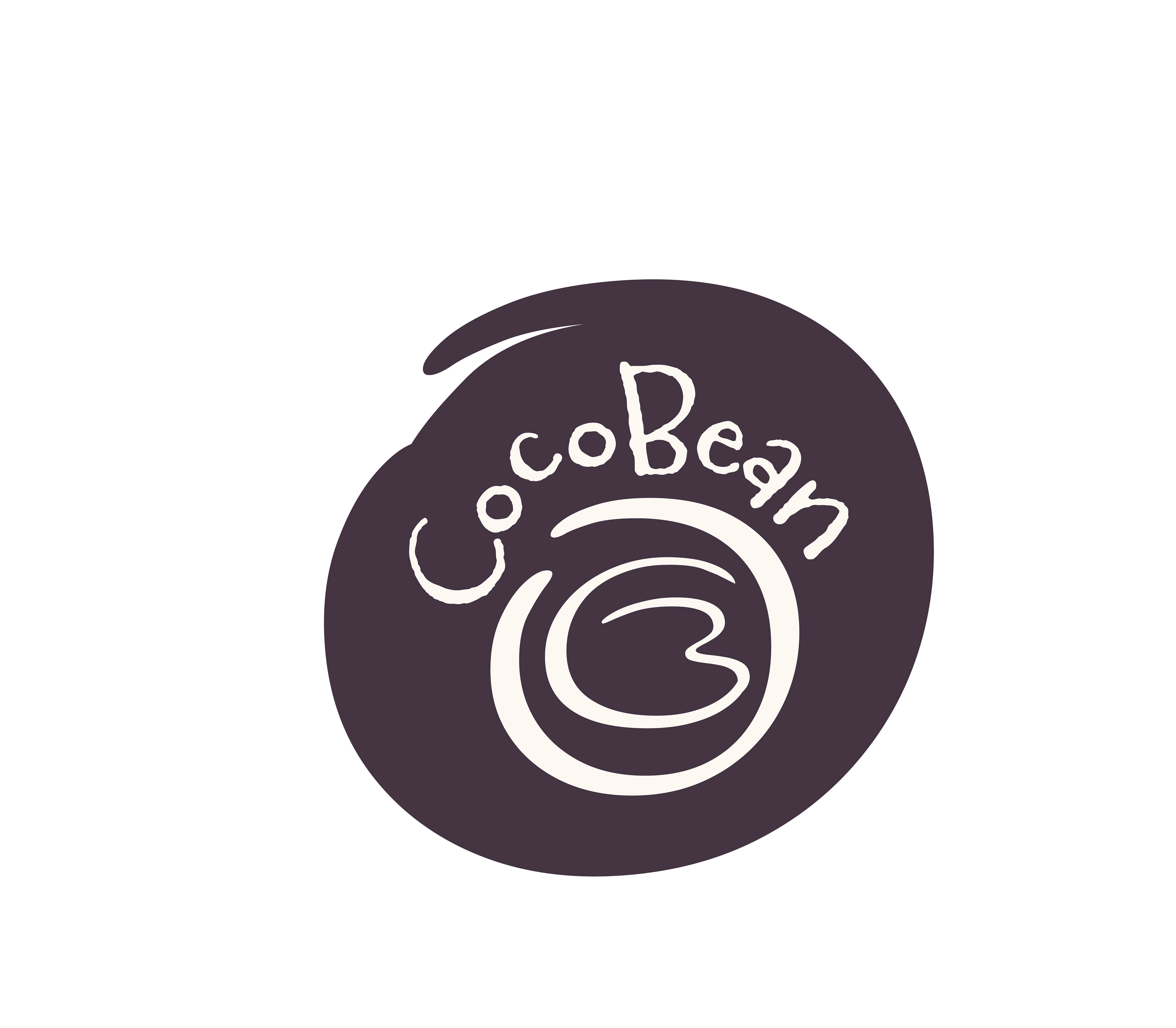
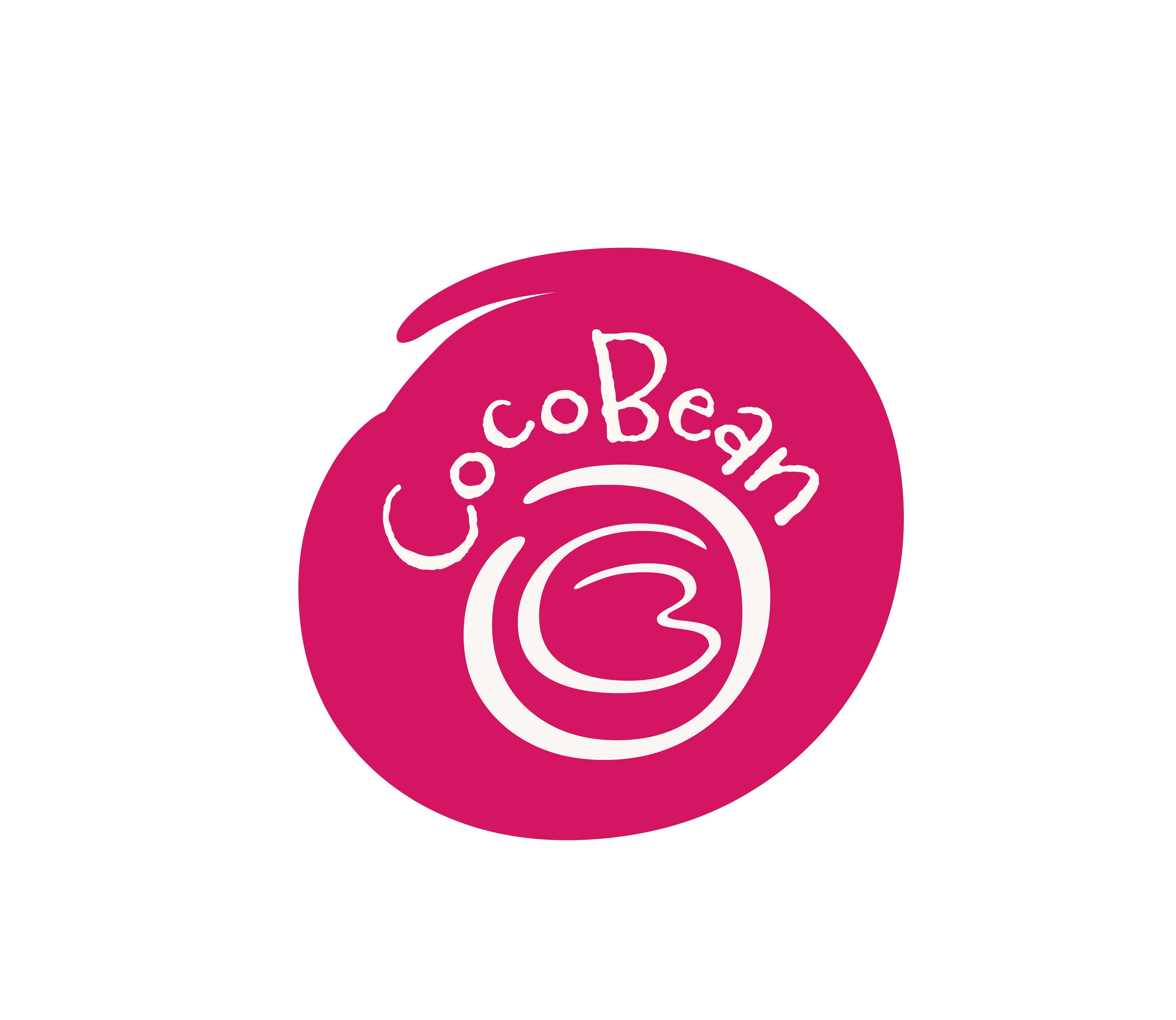
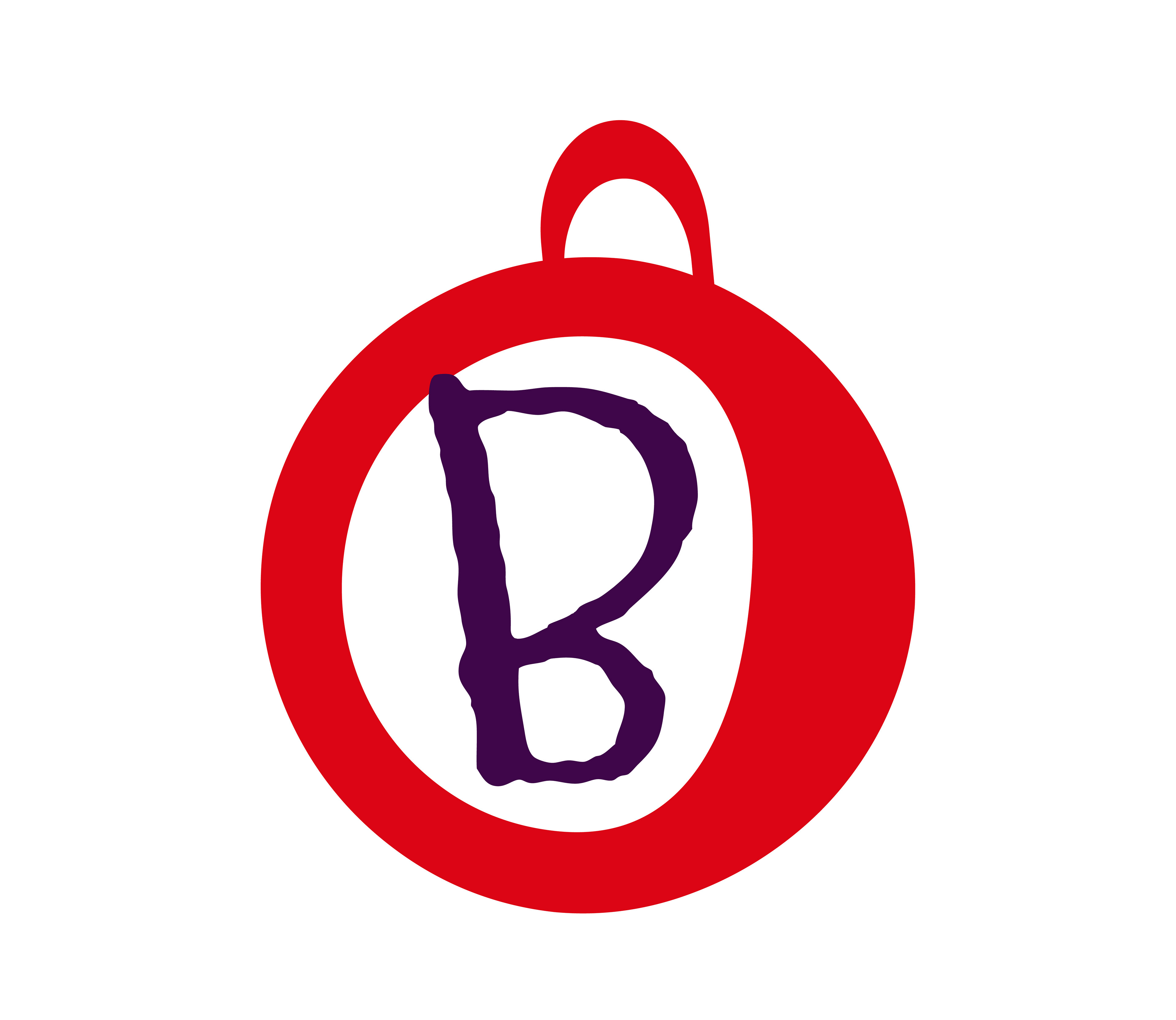
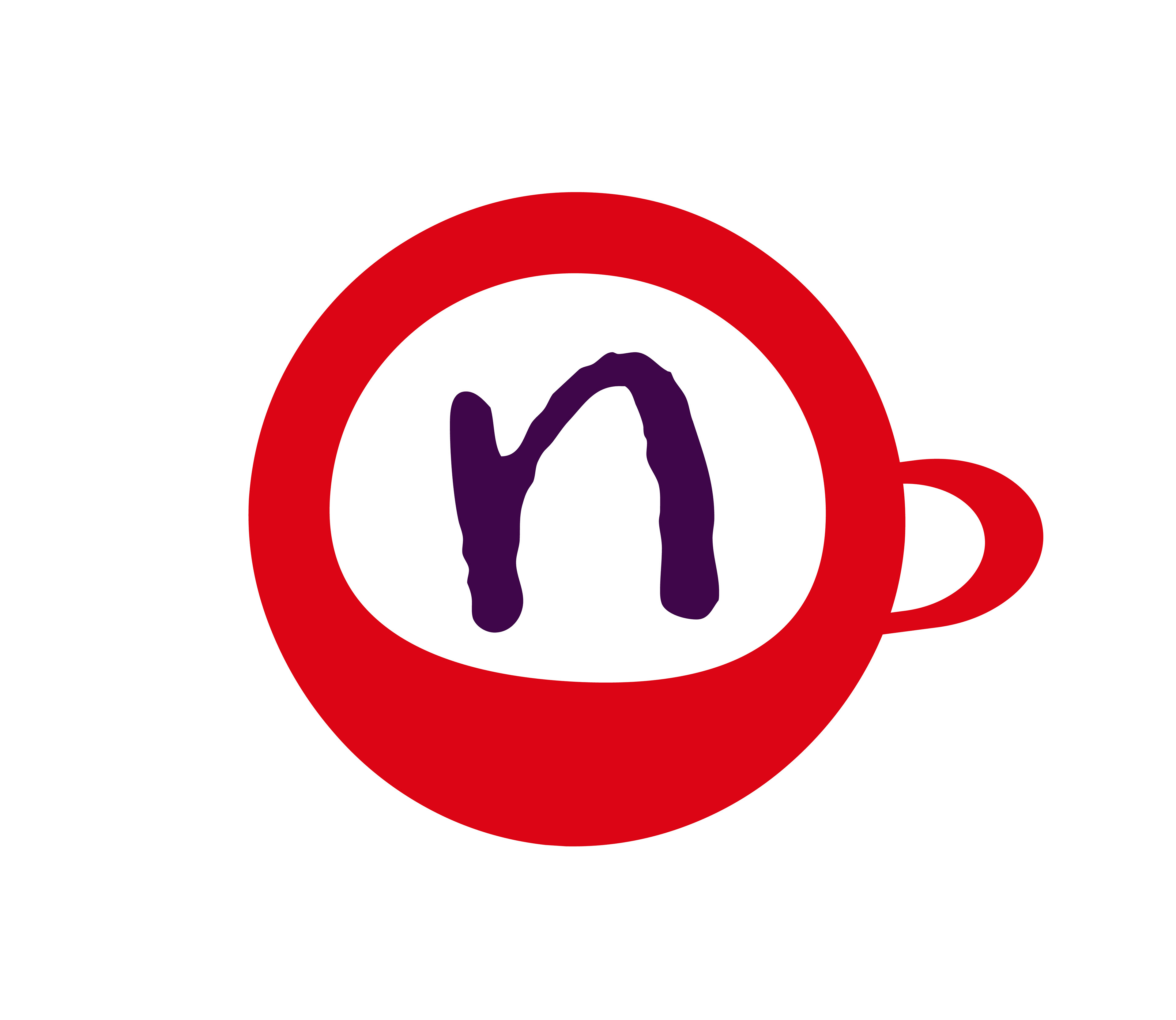
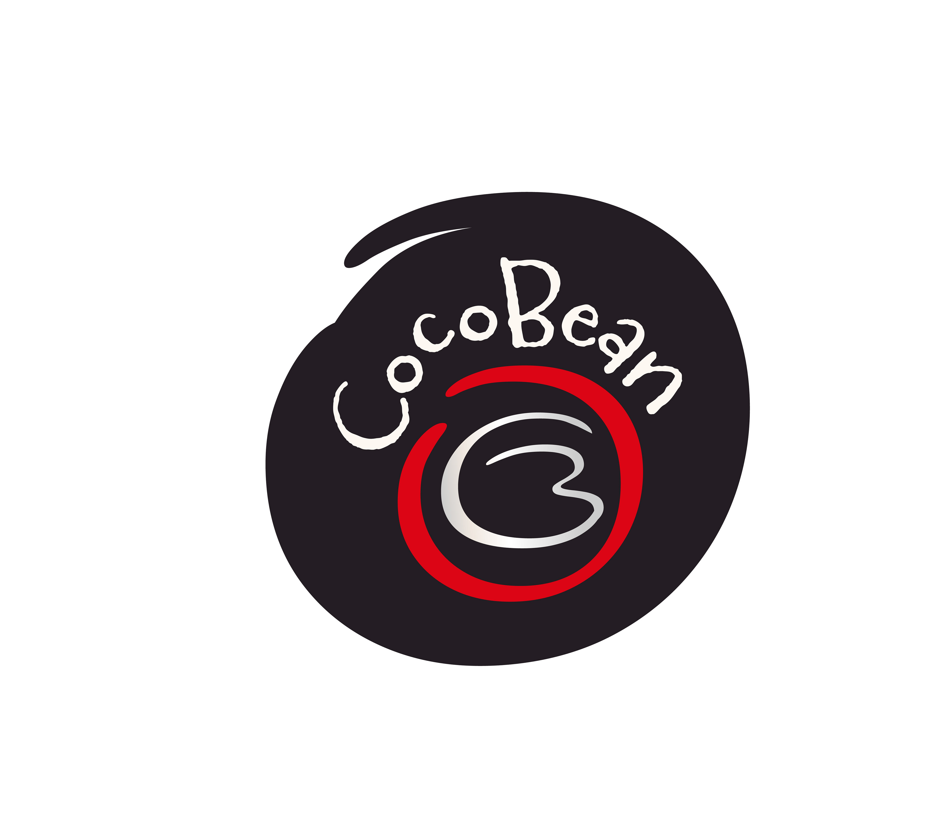
The CocoBean logo is a playful and creative representation, featuring a cup brimming with coffee as the centerpiece. The typeface of the logo embodies the brand's personality, exuding a sense of warmth and inviting charm. With its whimsical design and captivating imagery, the logo captures the essence of CocoBean's mission to provide a delightful and memorable coffee experience to its customers.


I've carefully curated a color palette and typography selection that perfectly embodies the essence of CocoBean's brand identity. Our primary colors—silver, white, dark purple, and dark brown—are the heart of our visual identity, radiating elegance, sophistication, and warmth. Silver and white bring a modern and pure touch, while dark purple and dark brown infuse richness and depth into our aesthetic.
Complementing these primary colors are our secondary palette, featuring light blue, magenta, gold, and black. These hues add versatility and vibrancy, allowing us to highlight key elements of our design while staying true to our primary palette.
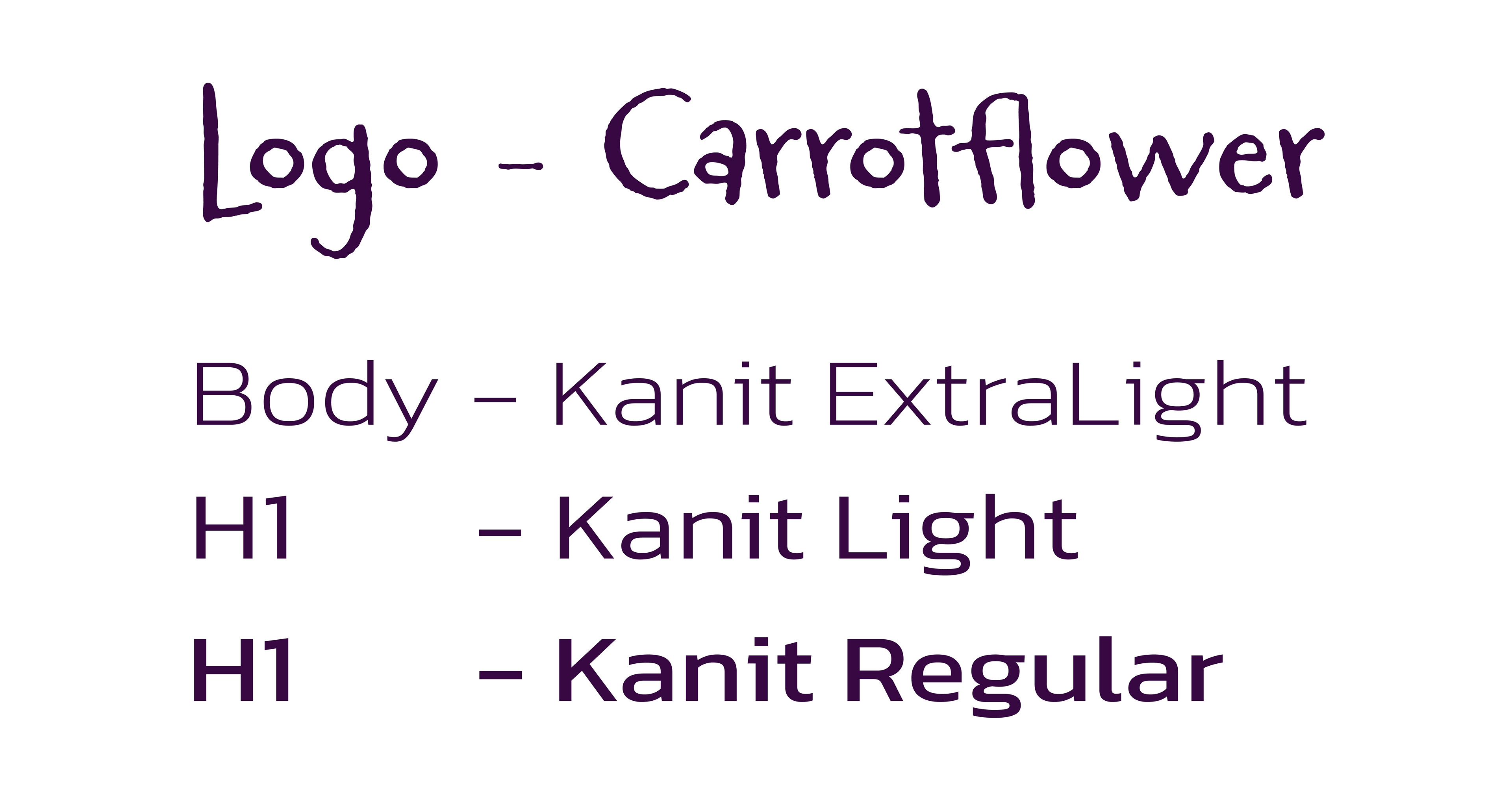
For typography, I've chosen Ballare Regular for the CocoBean logo, a font that strikes the perfect balance between modernity and tradition, echoing the sophistication and elegance of our brand. And for the text, I've opted for Kanit in various weights, a contemporary typeface that ensures readability across all our materials. Together, these carefully selected colors and typography elements form the backbone of CocoBean's visual identity, reflecting our dedication to quality, creativity, and innovation.
Primary Brand Colors
Secondary Brand Colors


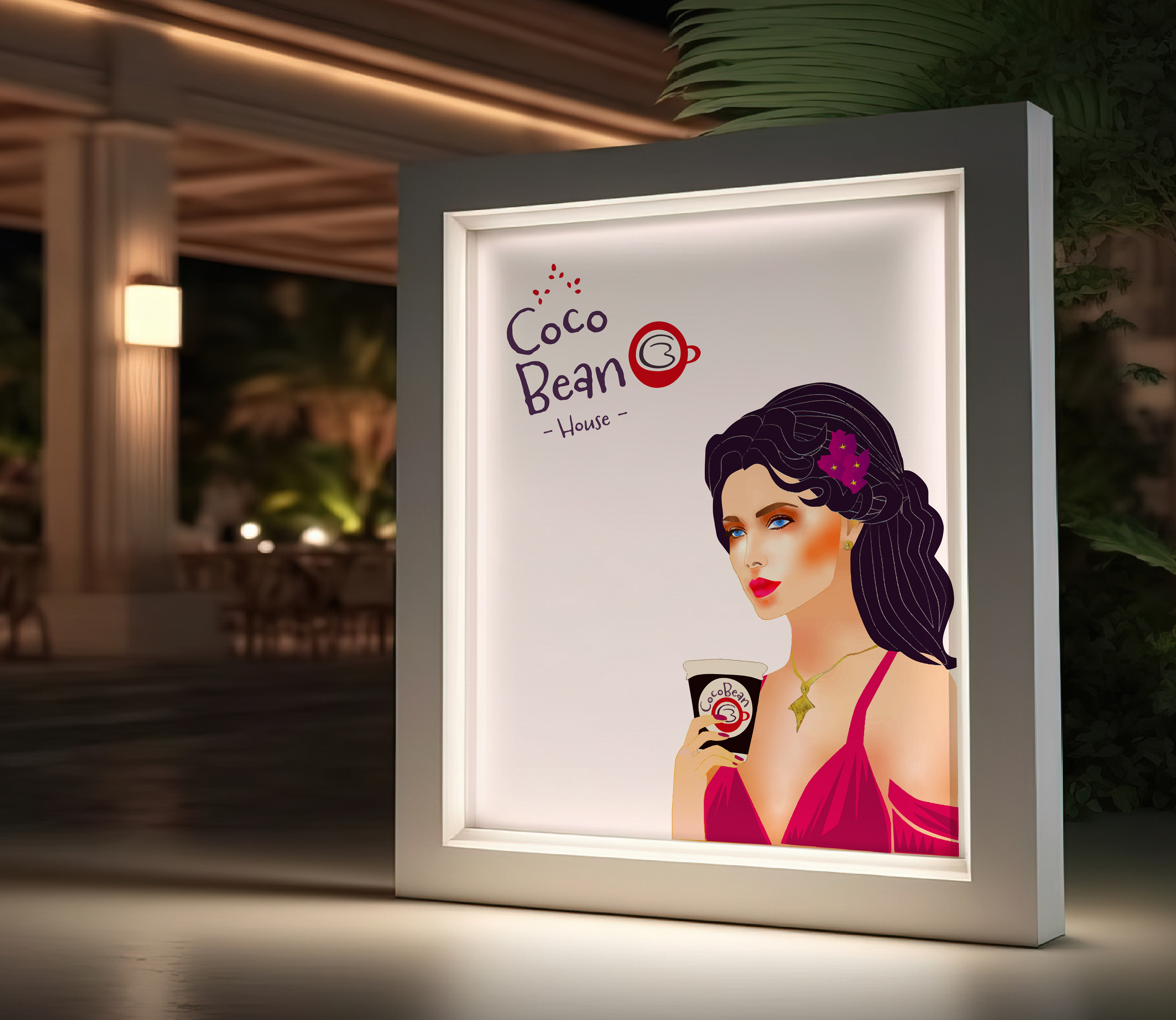
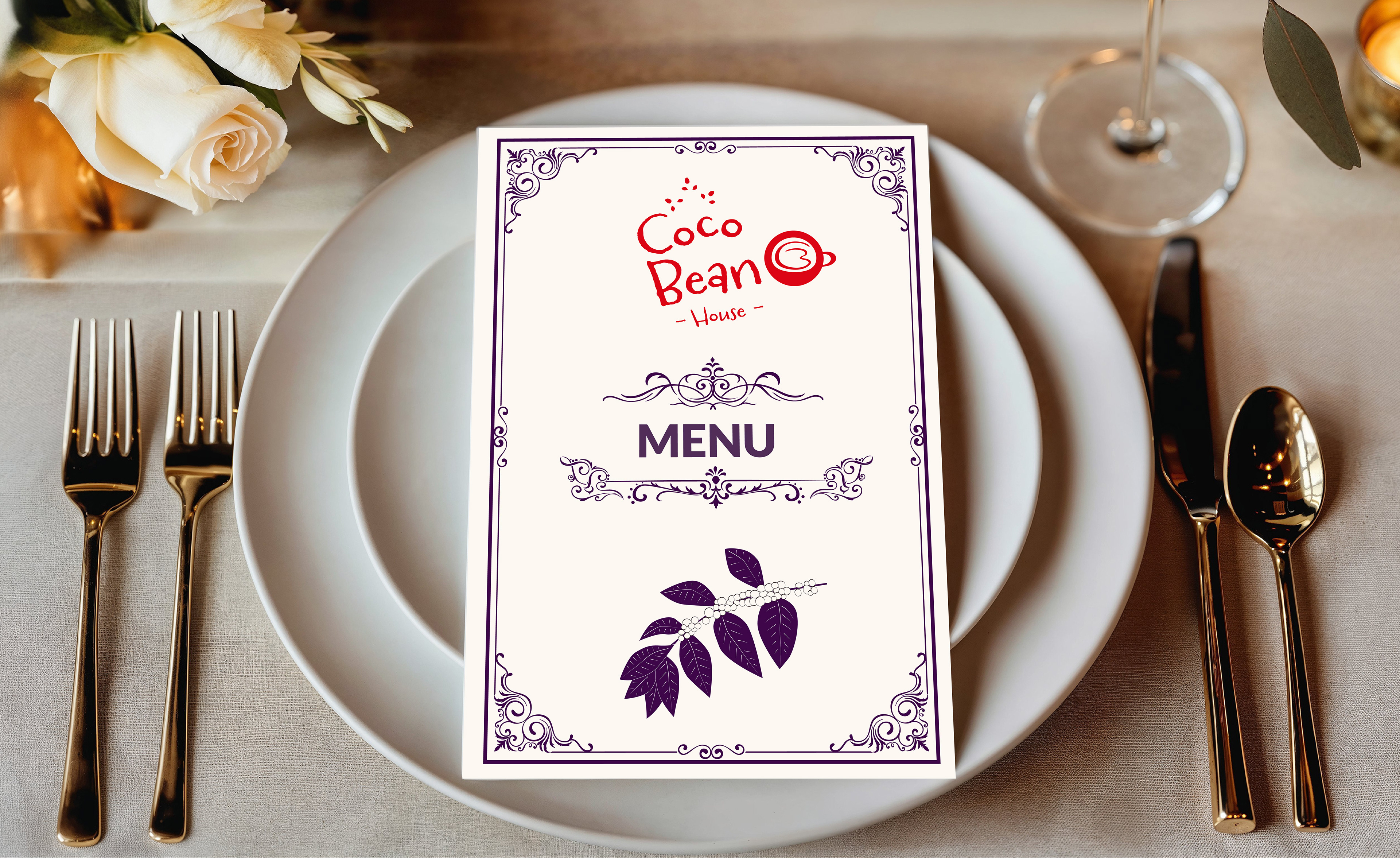
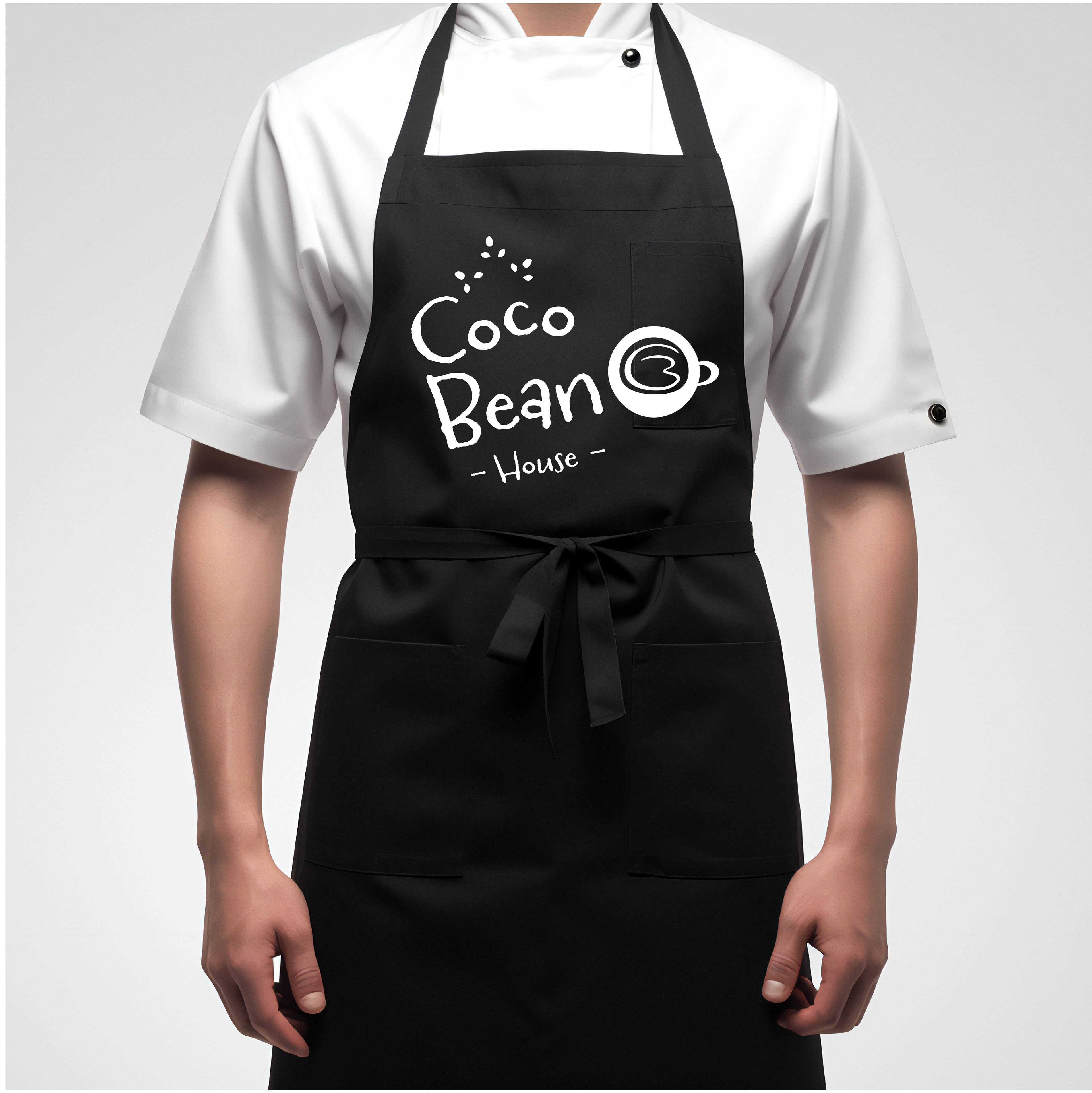
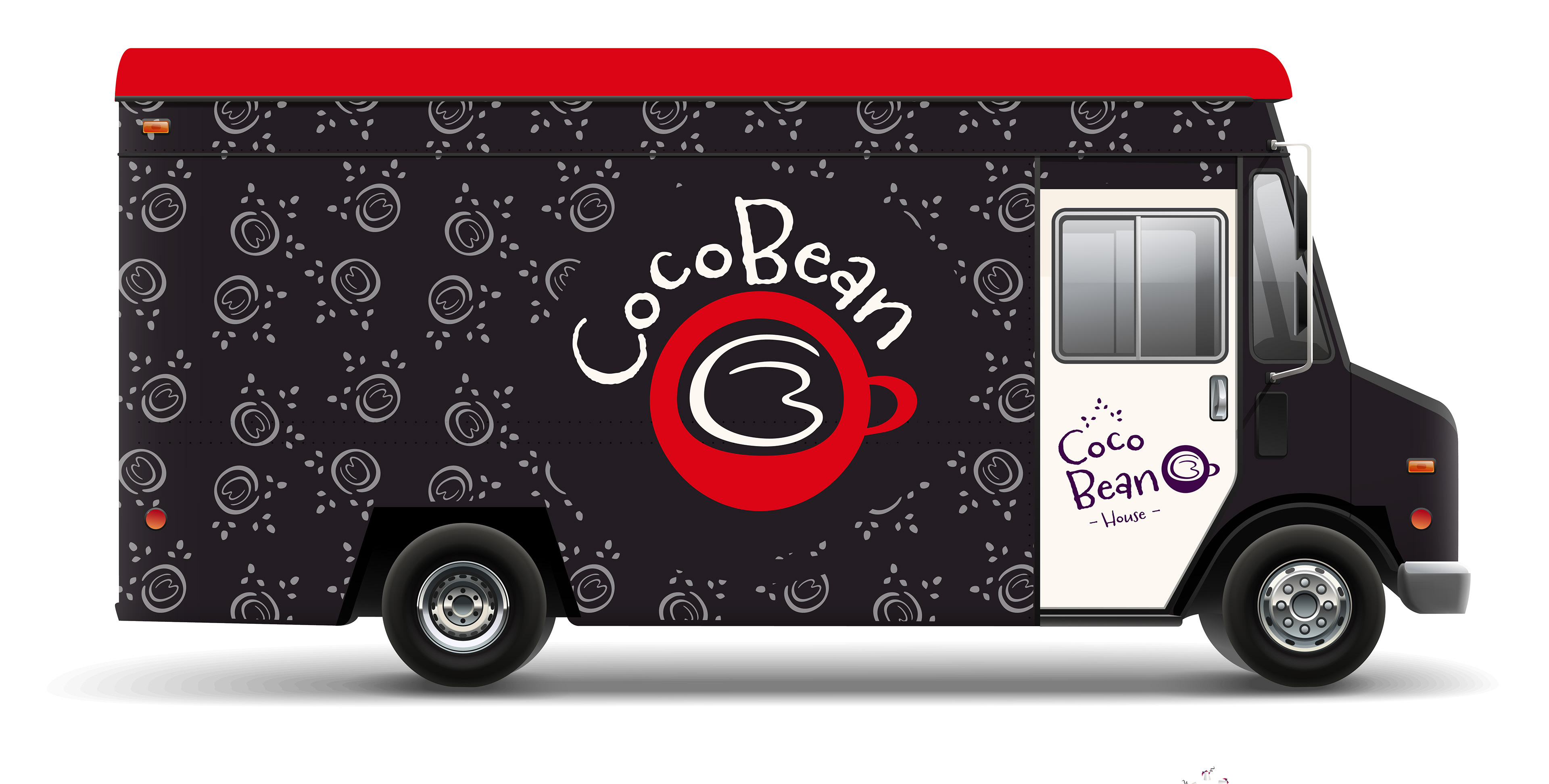
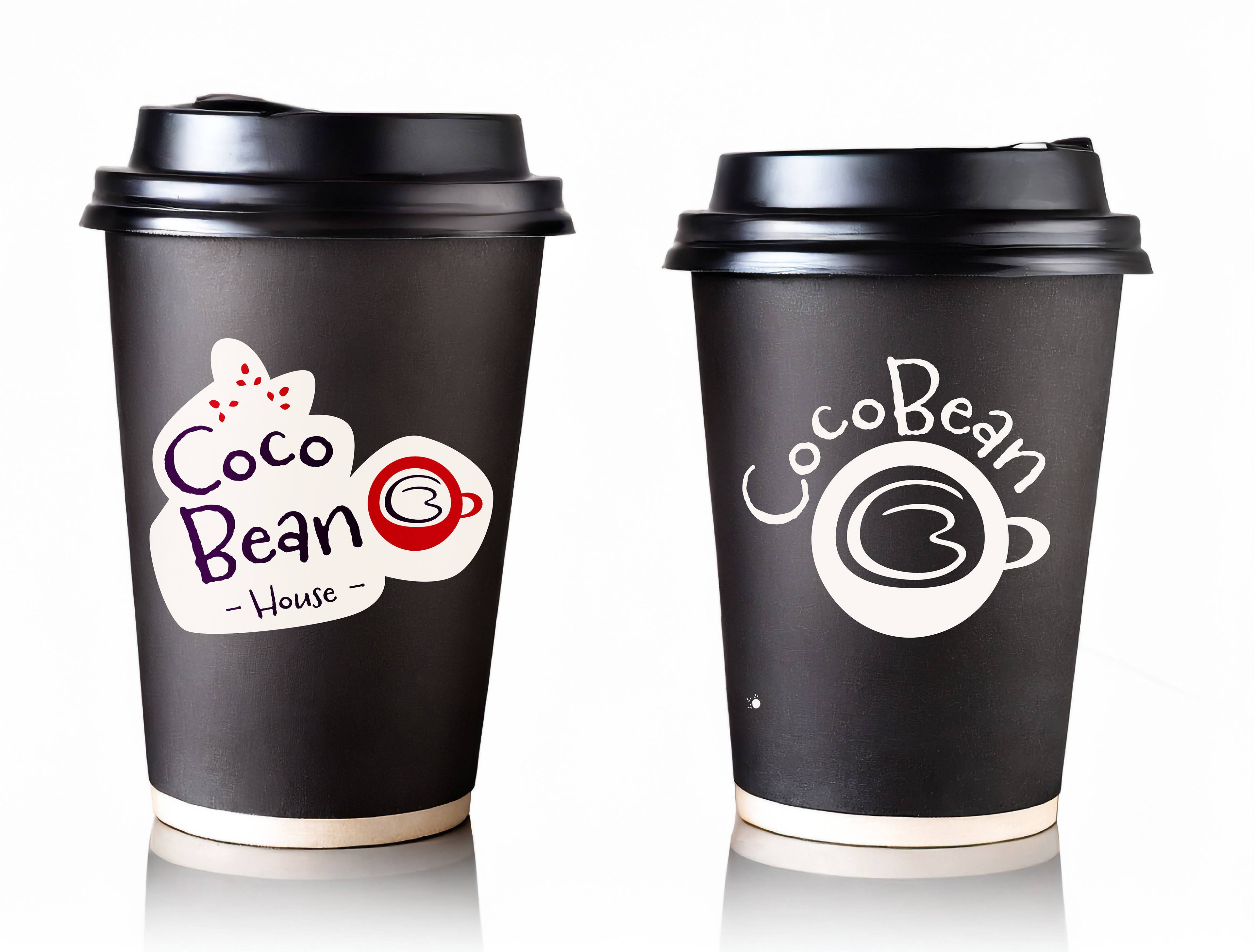
I've brought the CocoBean brand identity to life through various applications, ensuring a cohesive and immersive experience. From menus to coffee cup designs, aprons, envelopes, notebooks, and entrance boards, each element reflects CocoBean's essence. Our menu design is a visual delight, featuring elegant typography and captivating imagery. Elements on our coffee cups, like the innovative logo design, instantly captivate customers. Aprons, envelopes, notebooks, and entrance boards are all thoughtfully branded with CocoBean's identity, showcasing our signature style. These applications showcase the versatility and sophistication of the CocoBean brand, leaving a lasting impression on every interaction.