PHOTOSHOP - ILLUSTRATOR
Concept Development | Branding | Social Media | Advertising
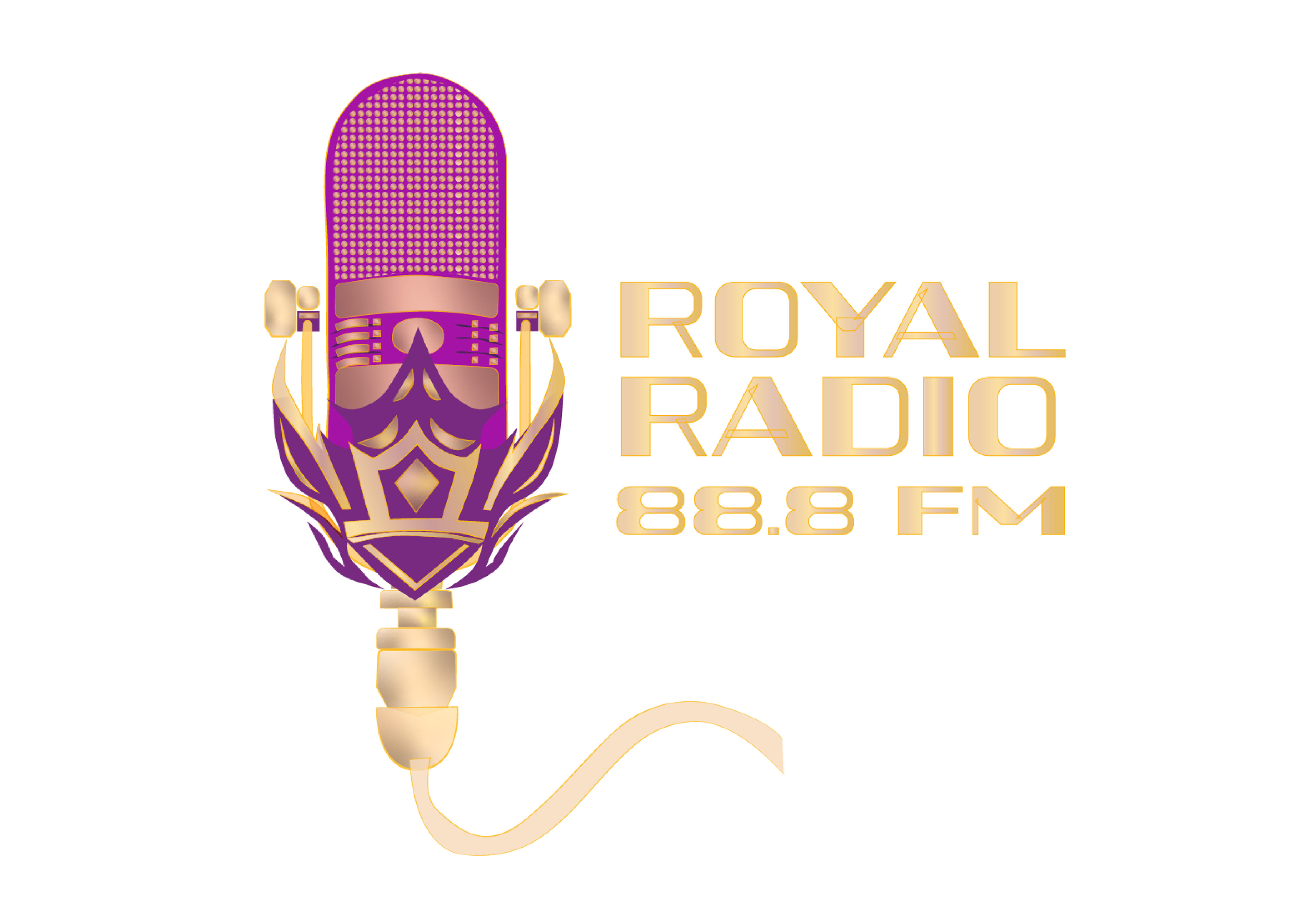
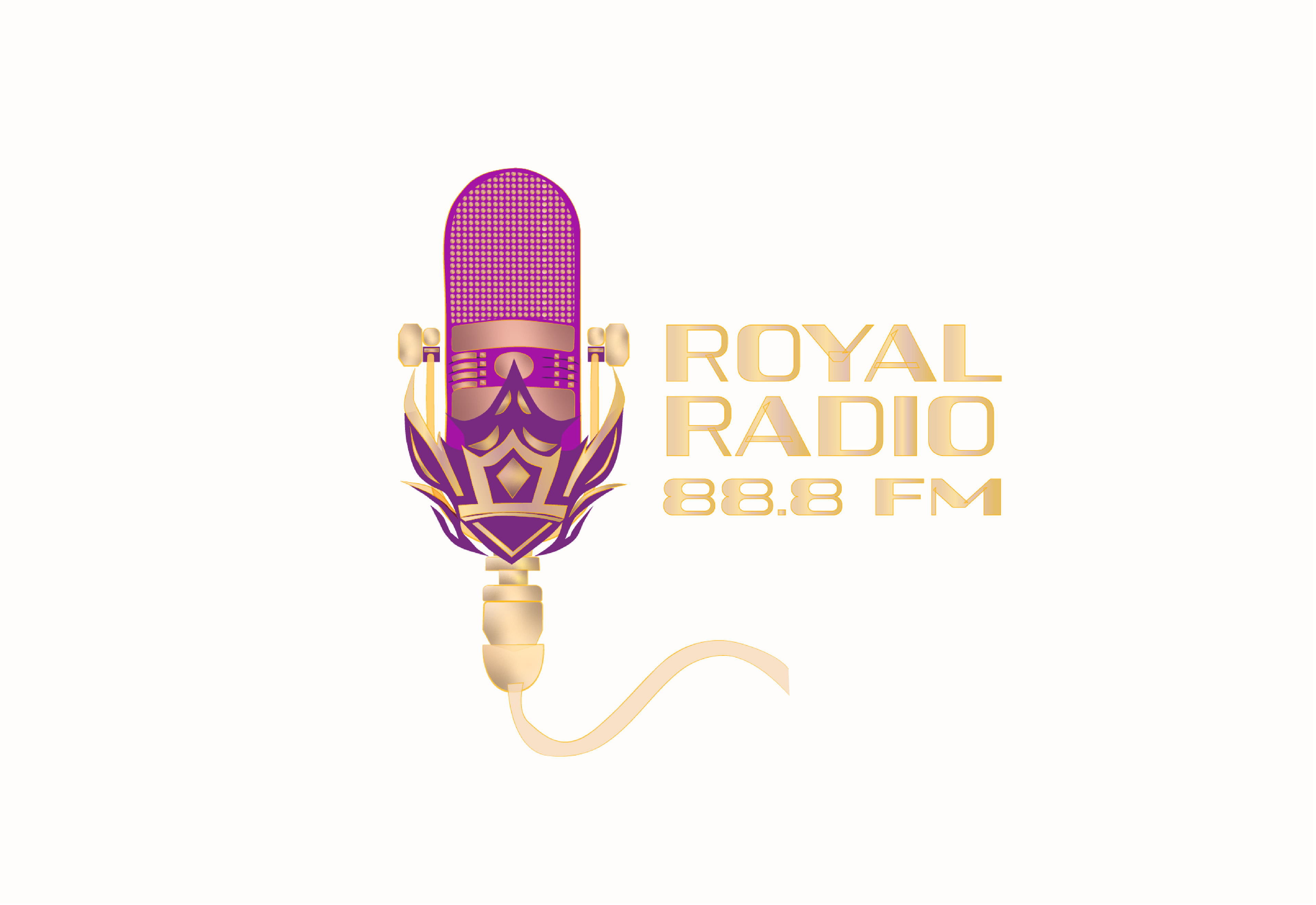
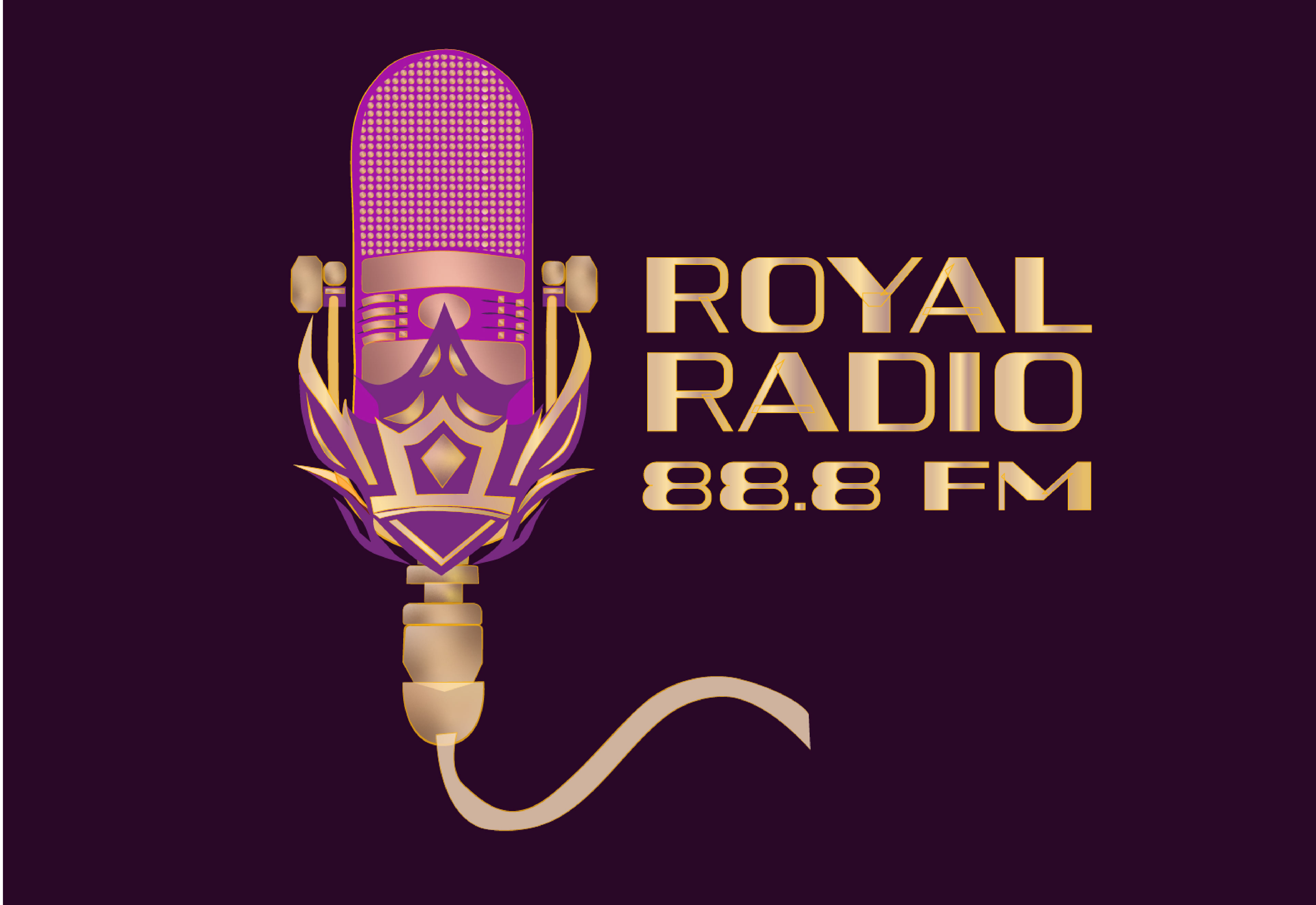
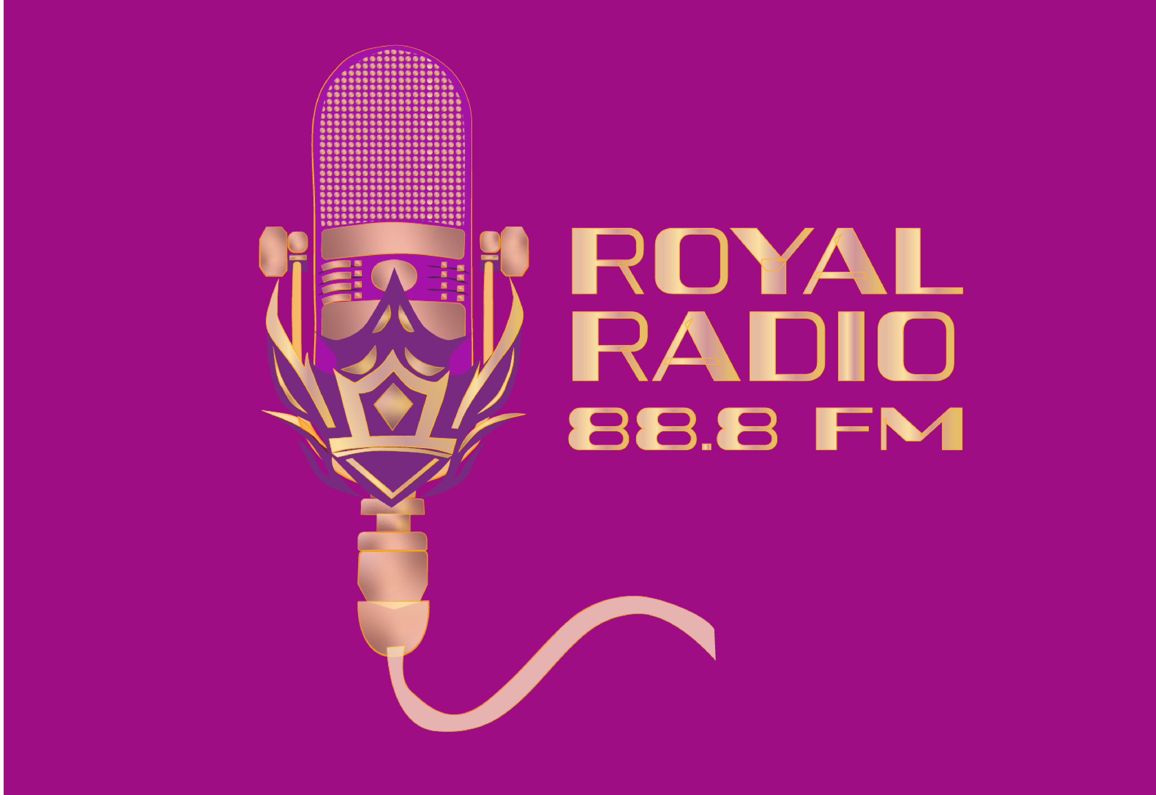
Final Logo
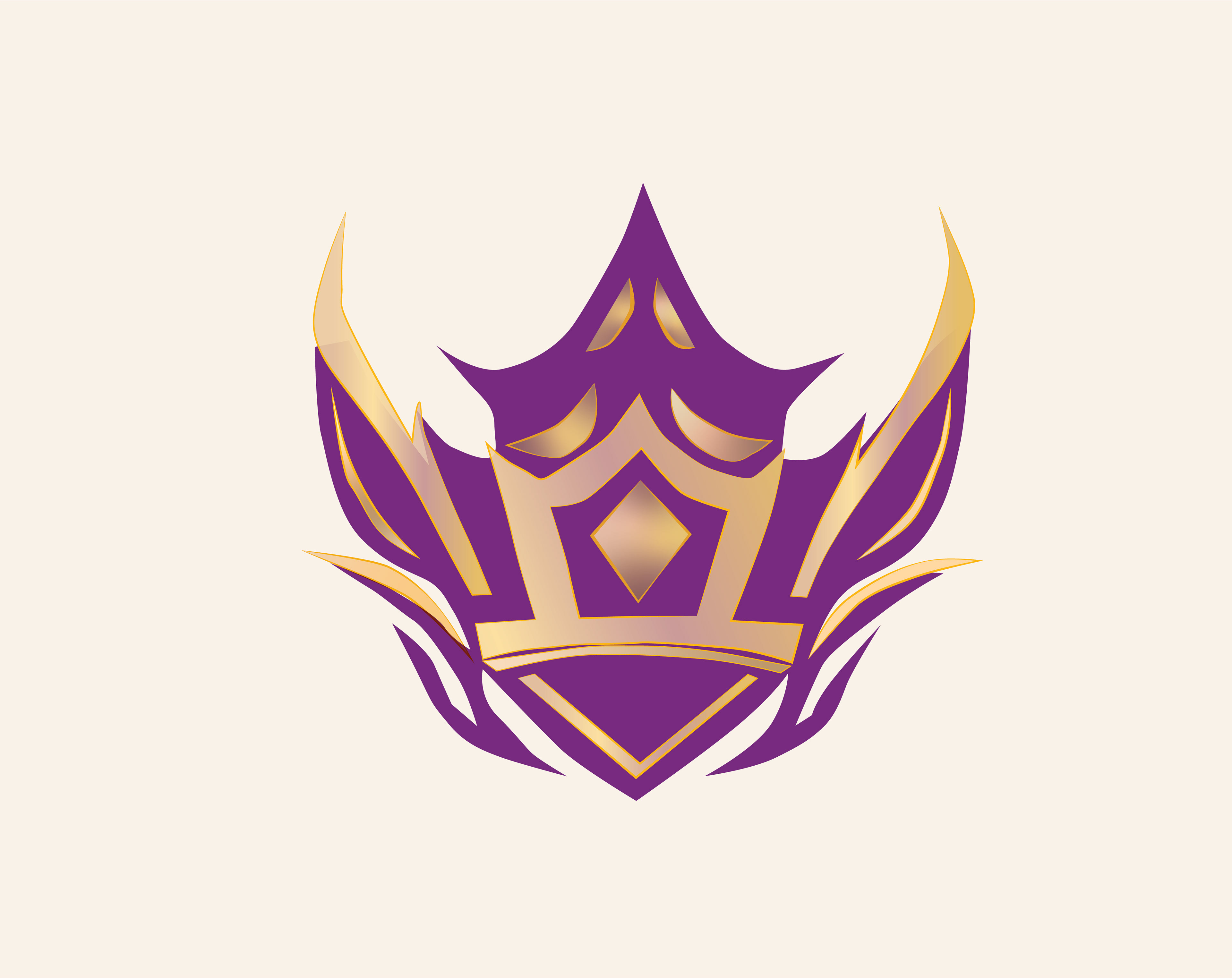
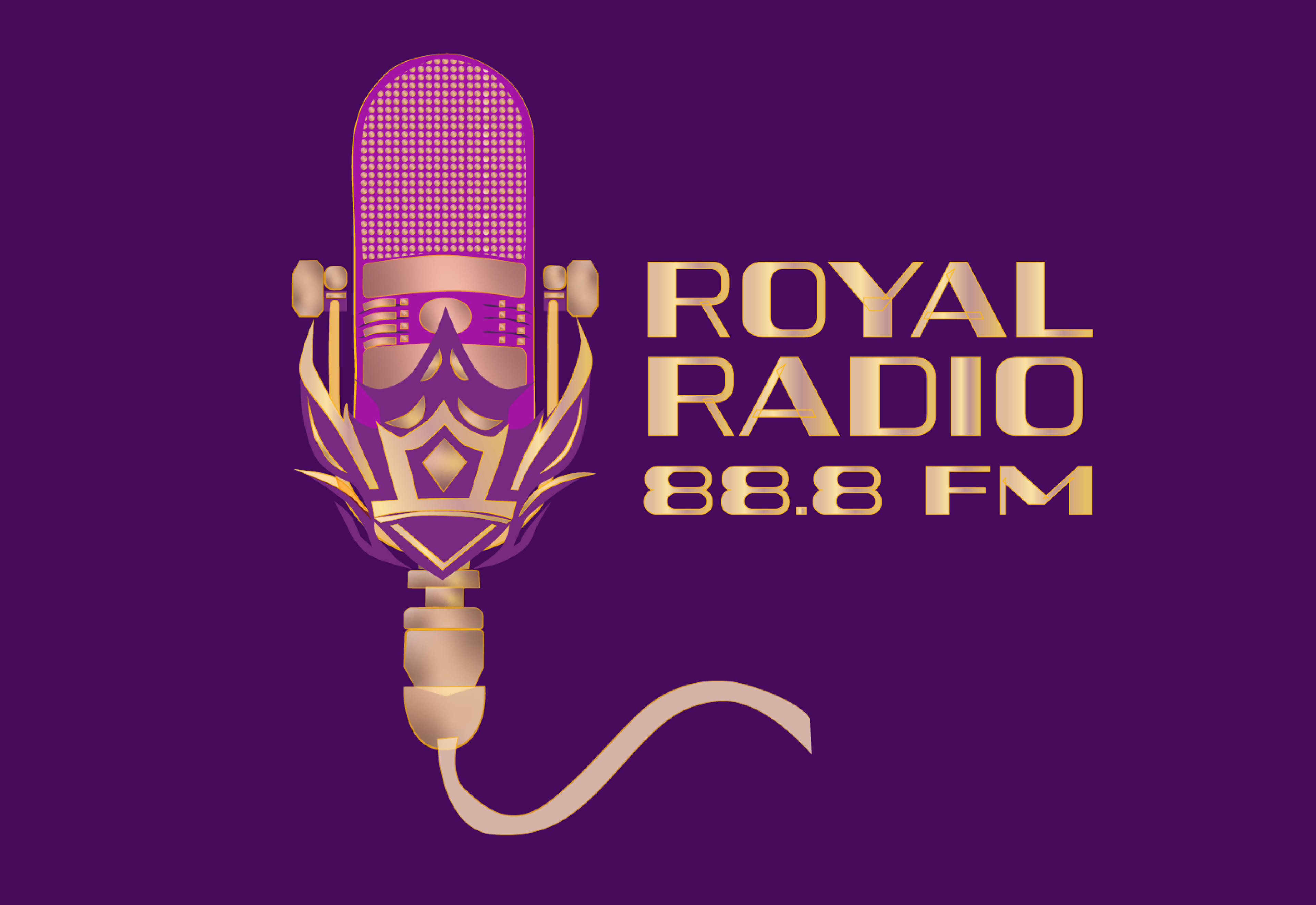
The logo for the Royal Radio Project was meticulously crafted in Illustrator, featuring a sophisticated and elegant design. It portrays a microphone seamlessly integrated into a majestic crown, symbolizing authority and excellence. The use of gold and purple hues adds a regal touch, evoking a sense of luxury and prestige. With its strong presence and refined aesthetics, the logo epitomizes the Royal Radio Project's commitment to professionalism and distinction.

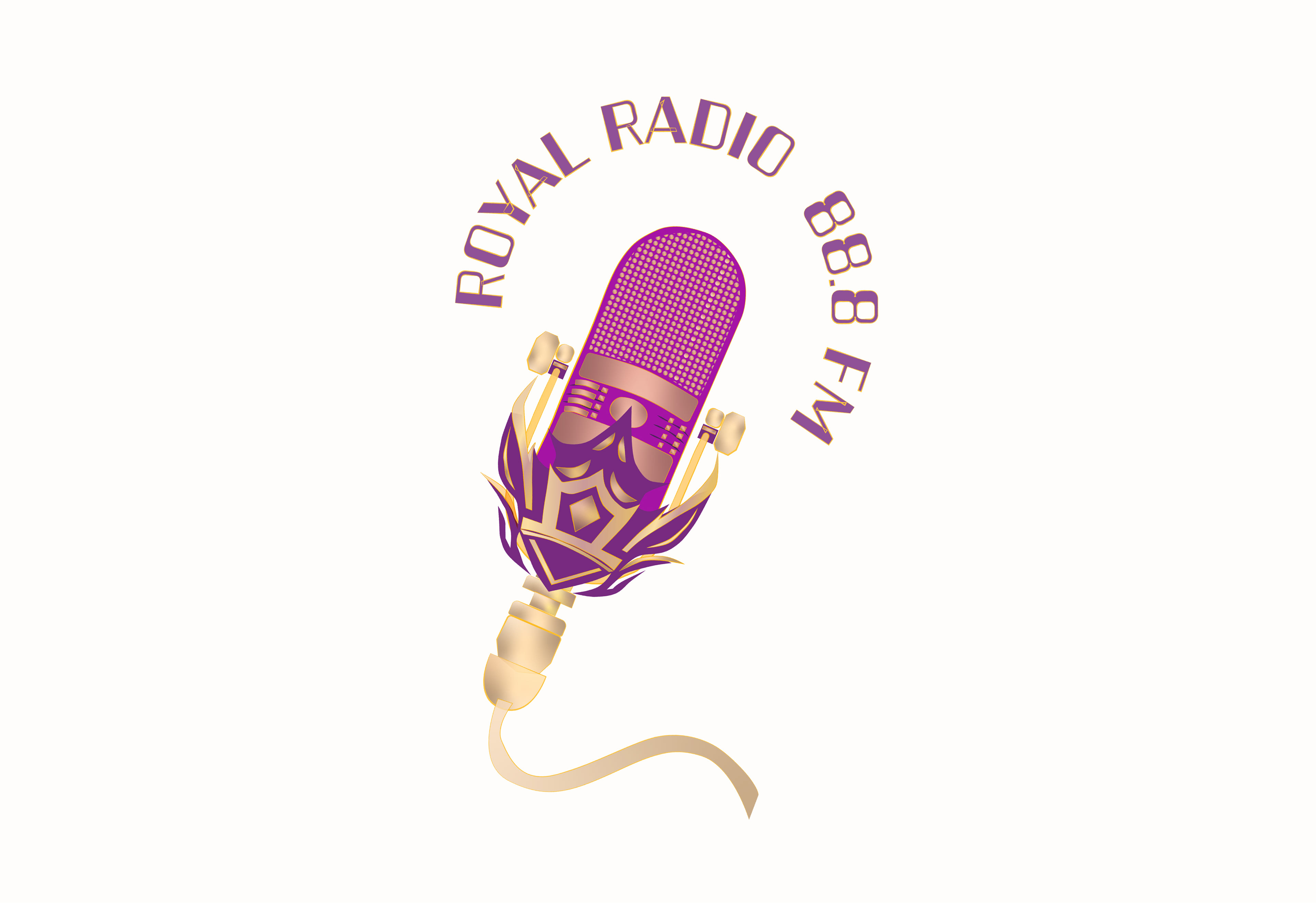
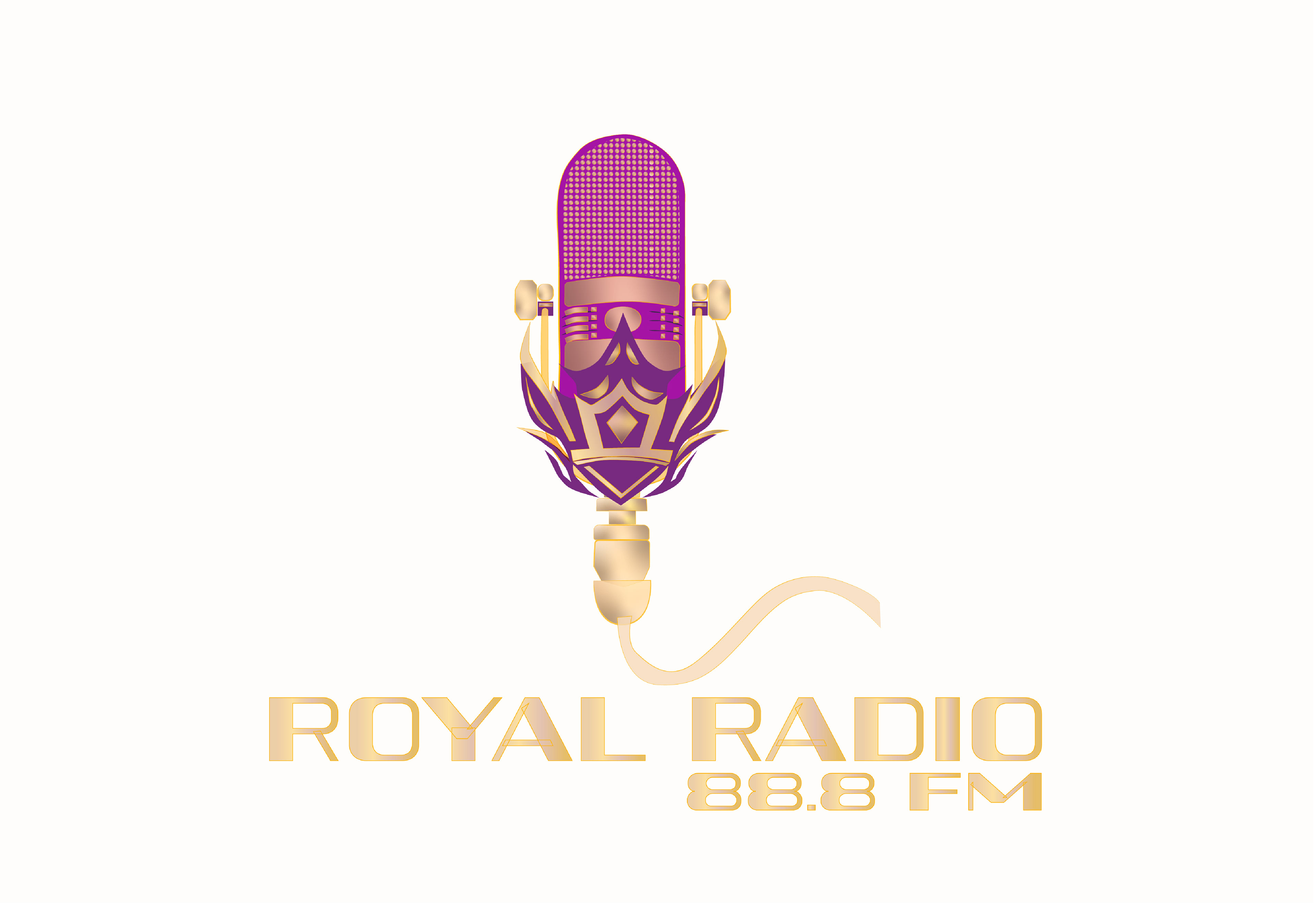
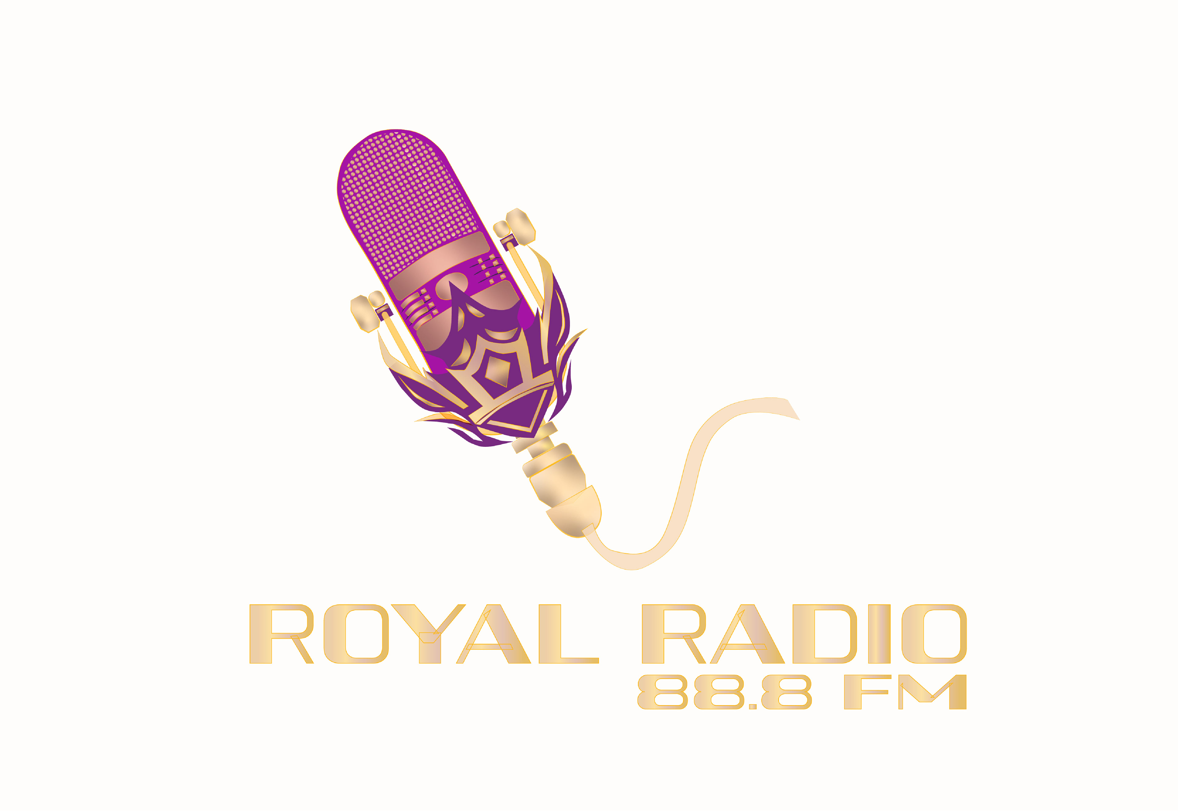
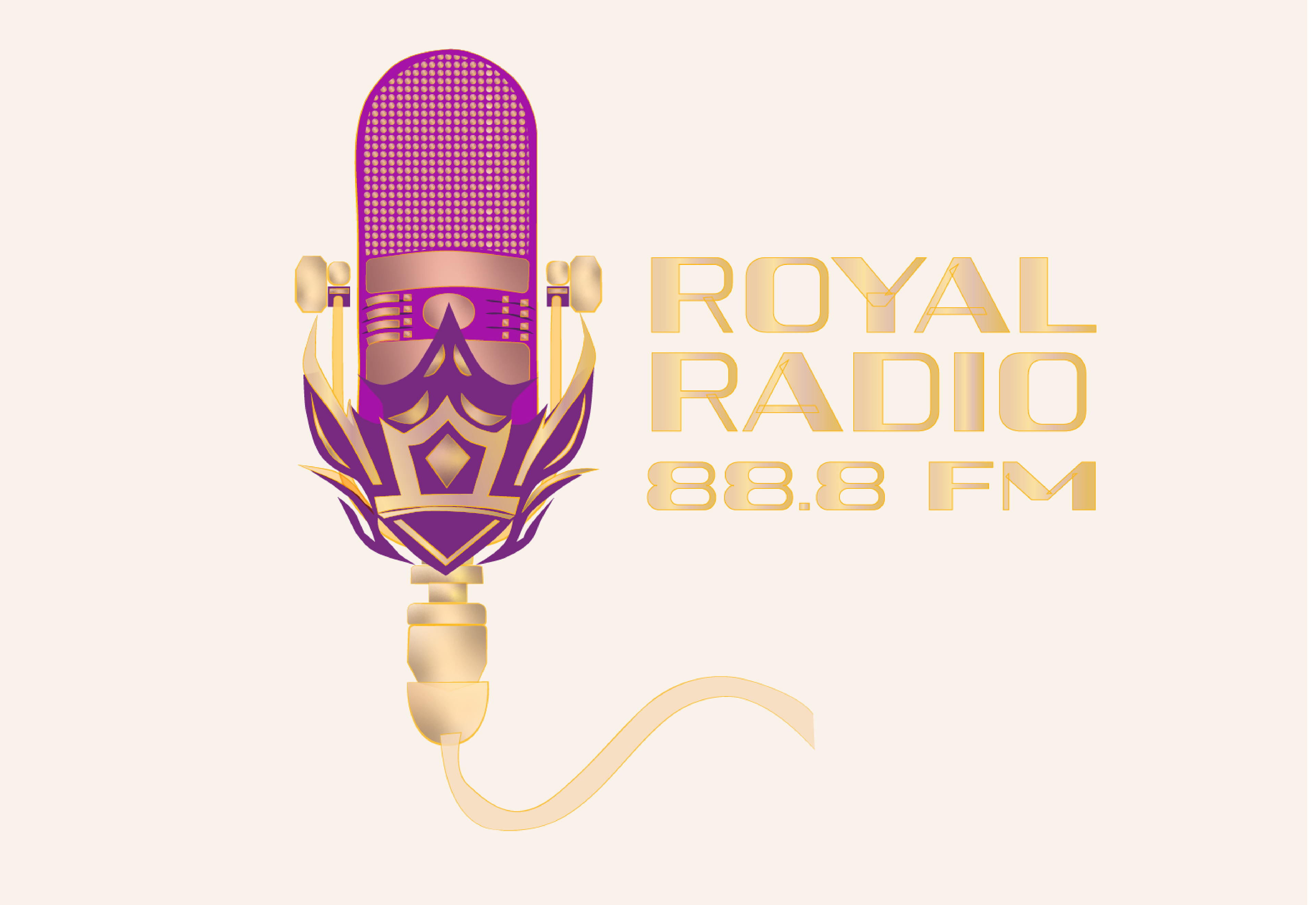
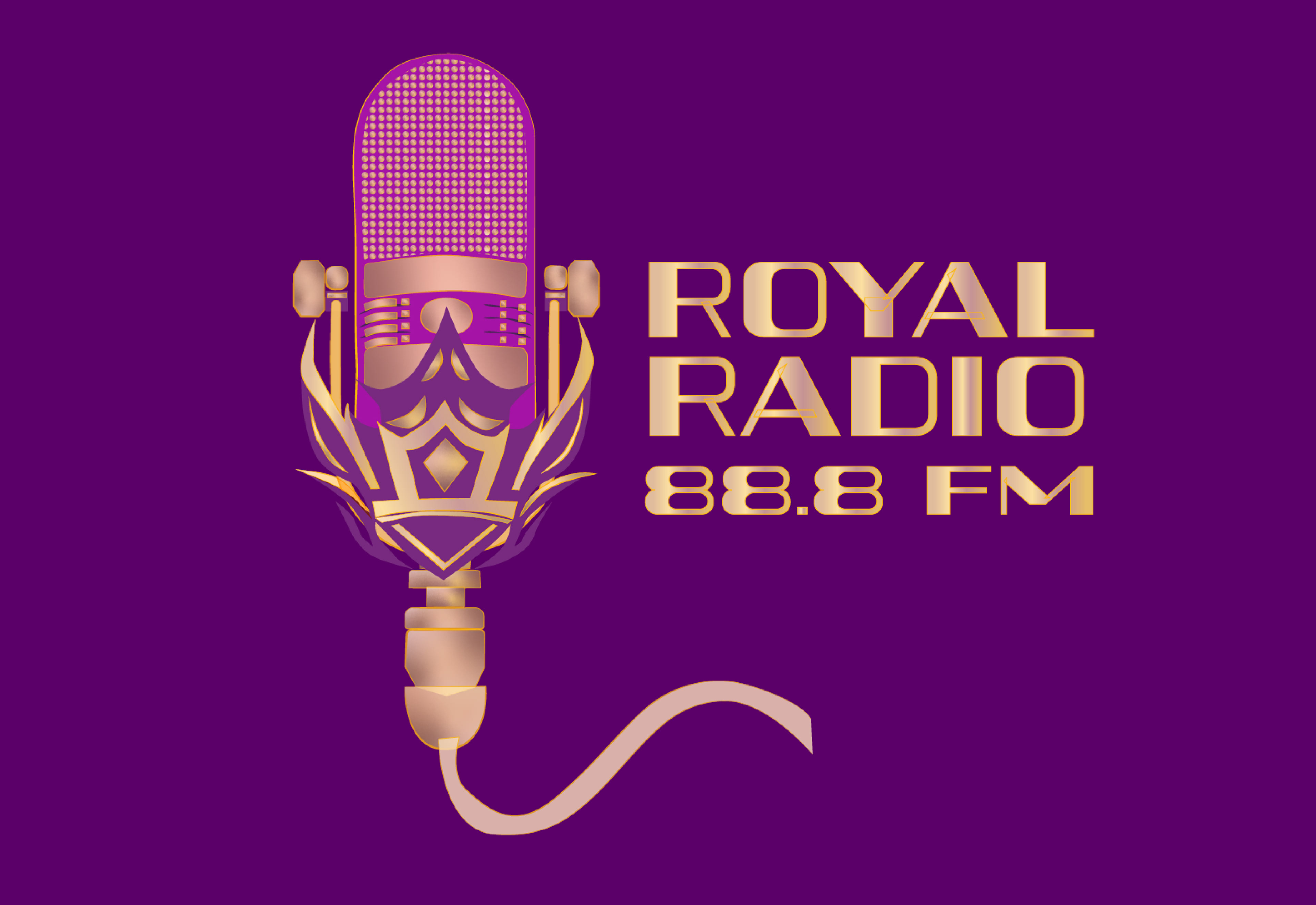
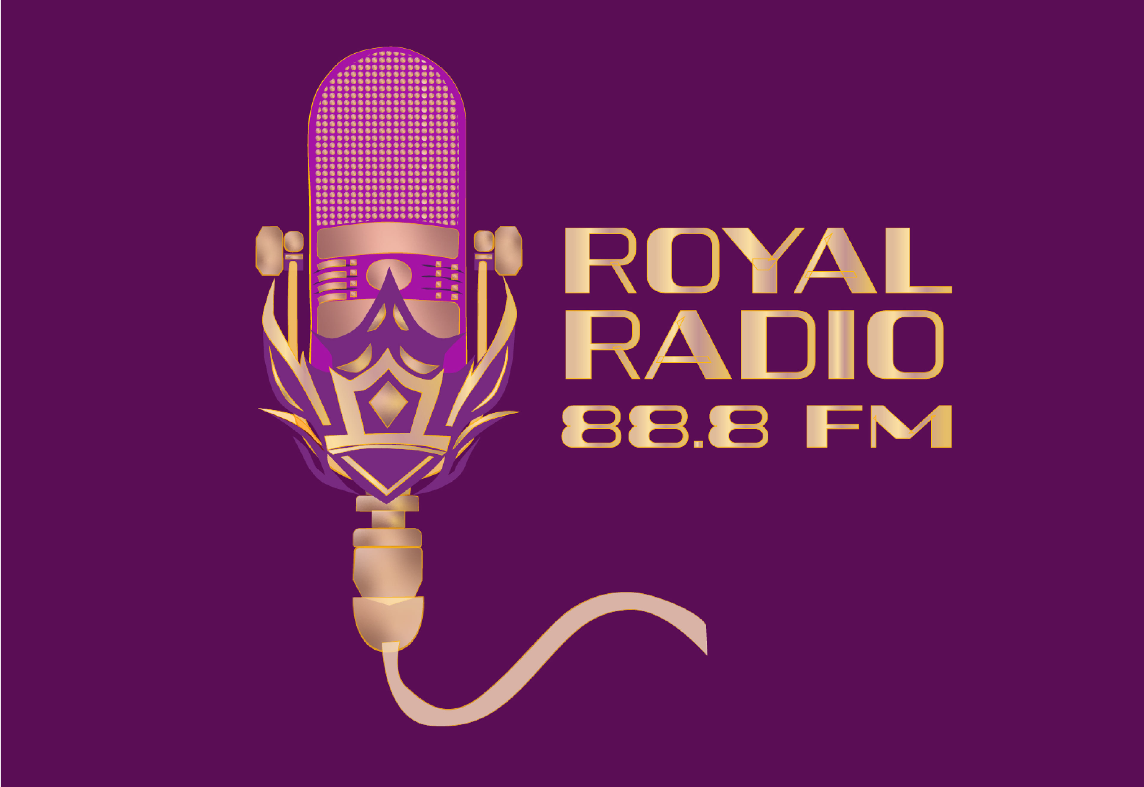
Logo Lockups
The microphone logo for Royal Radio was meticulously crafted with versatility in mind, allowing for four distinct lockups that adapt seamlessly to various scenarios while preserving the essence of the brand. Each lockup strategically places the accompanying text in different positions, ensuring optimal readability and visual impact. By providing these four lockup variations, Royal Radio ensures adaptability and consistency in branding across a wide range of contexts and platforms. Whether it's on digital screens, printed materials, or promotional merchandise, the logo remains instantly recognizable and effectively communicates the brand's identity with versatility and style.
Color Palette
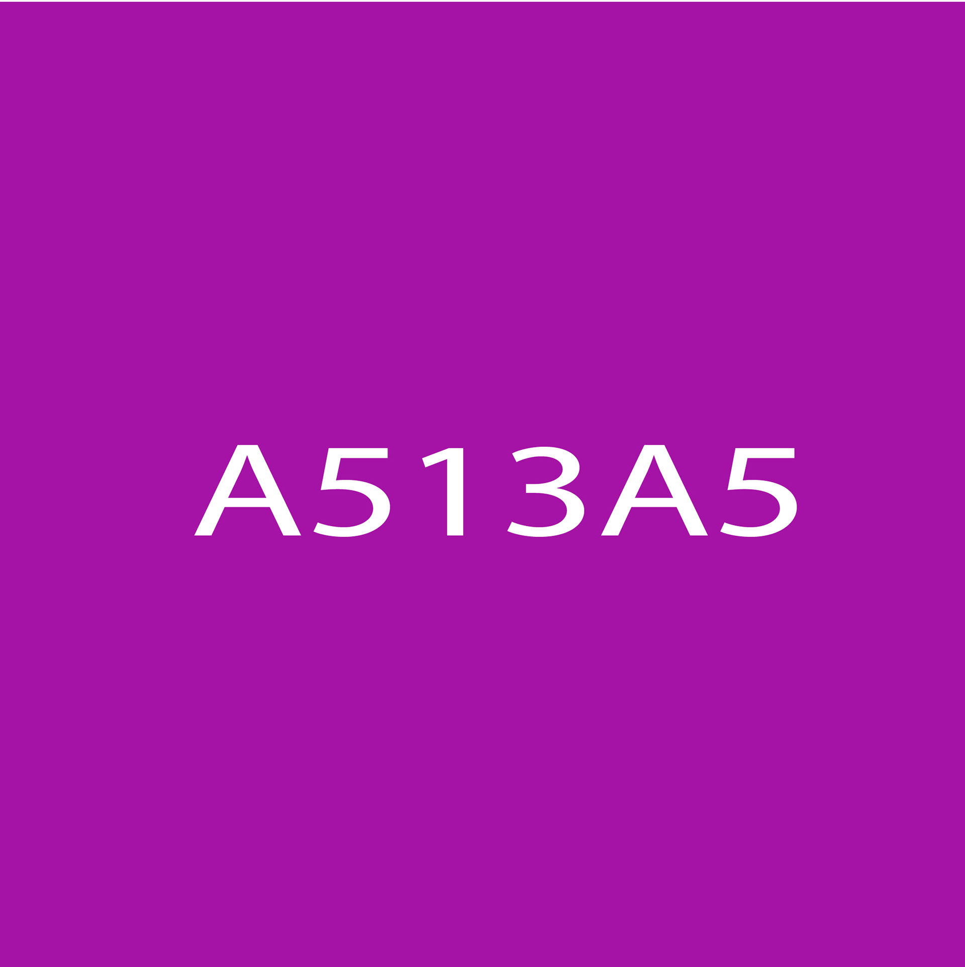
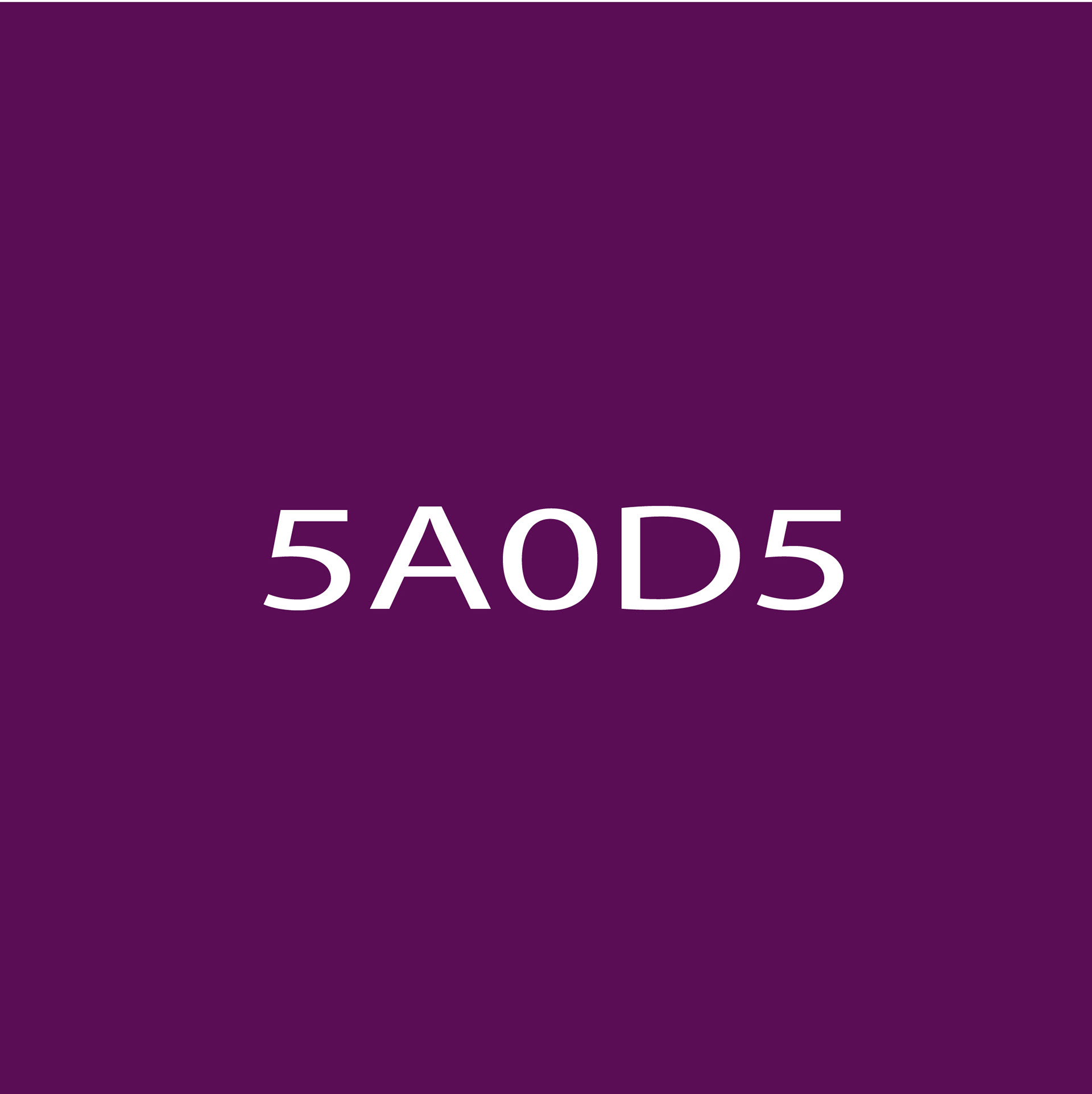
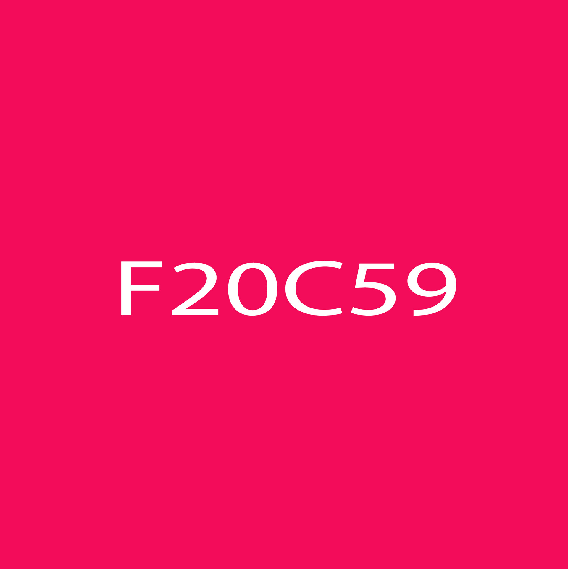
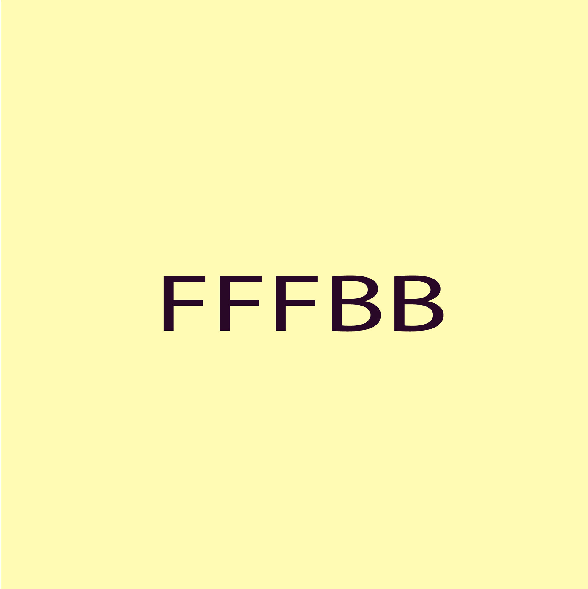
The color palette of Royal Radio is a carefully curated selection that embodies the essence of royalty while infusing vibrancy and sophistication into the brand identity. The main colors, consisting of purple/lilac tones and gold, evoke a sense of luxury, opulence, and regality, creating a visual experience that resonates with the brand's premium positioning.
Primary Colors
Secondary Colors
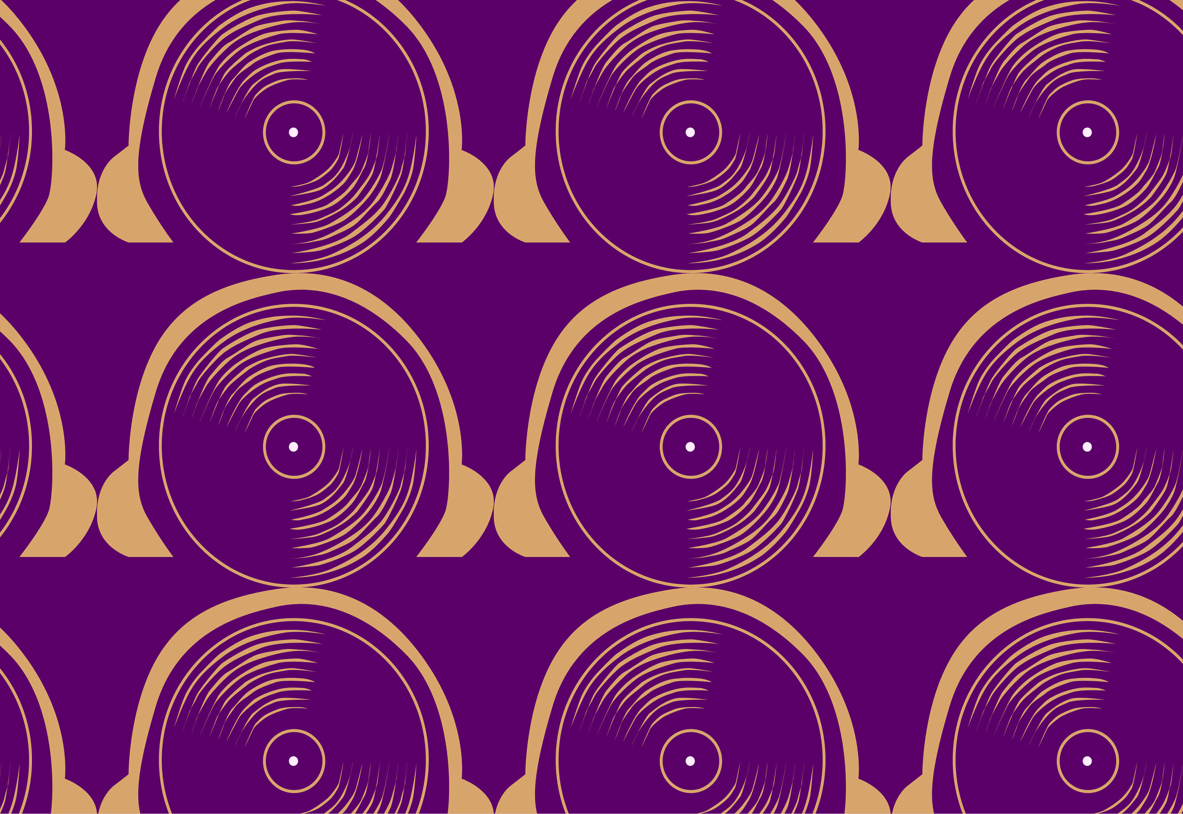
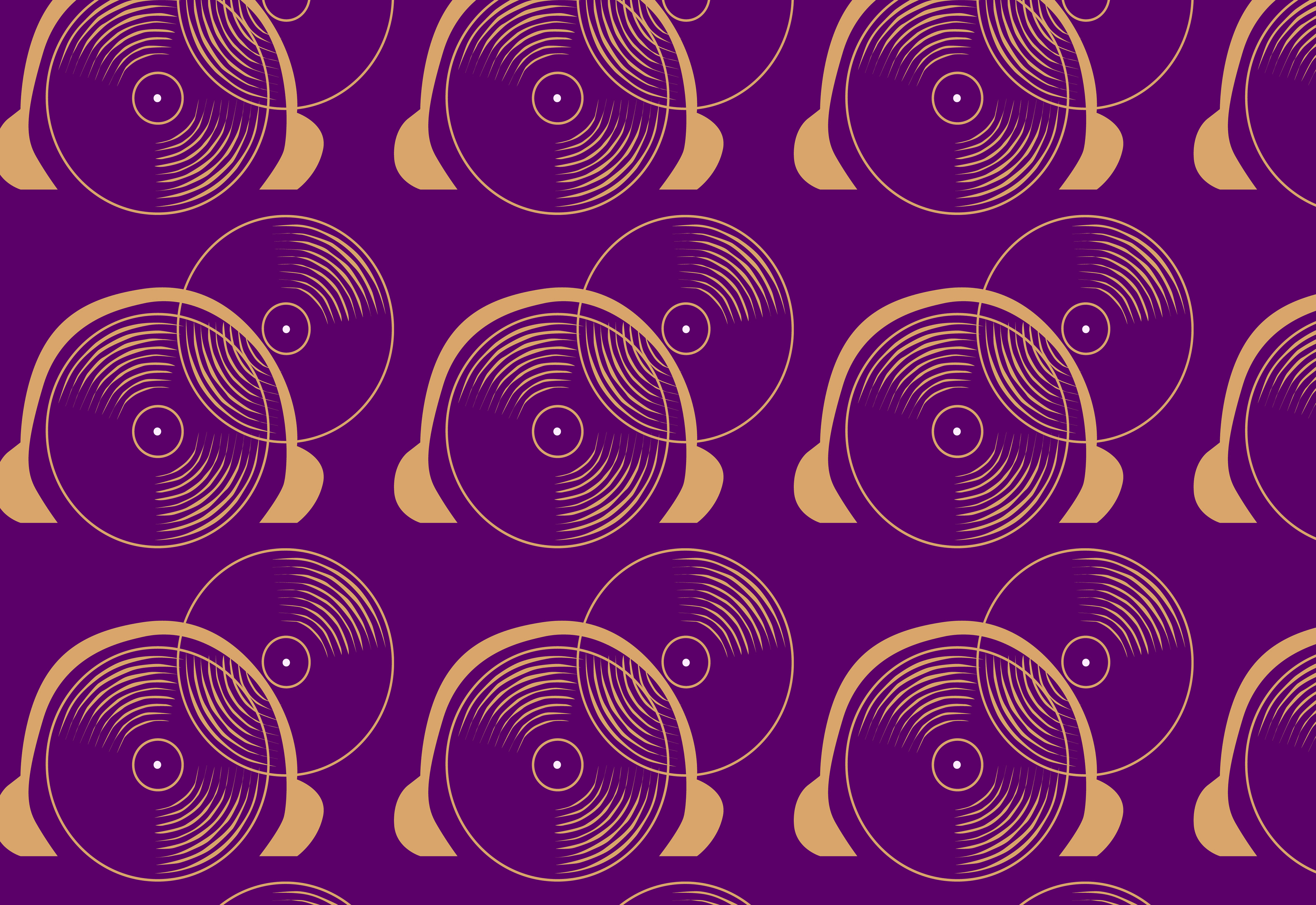
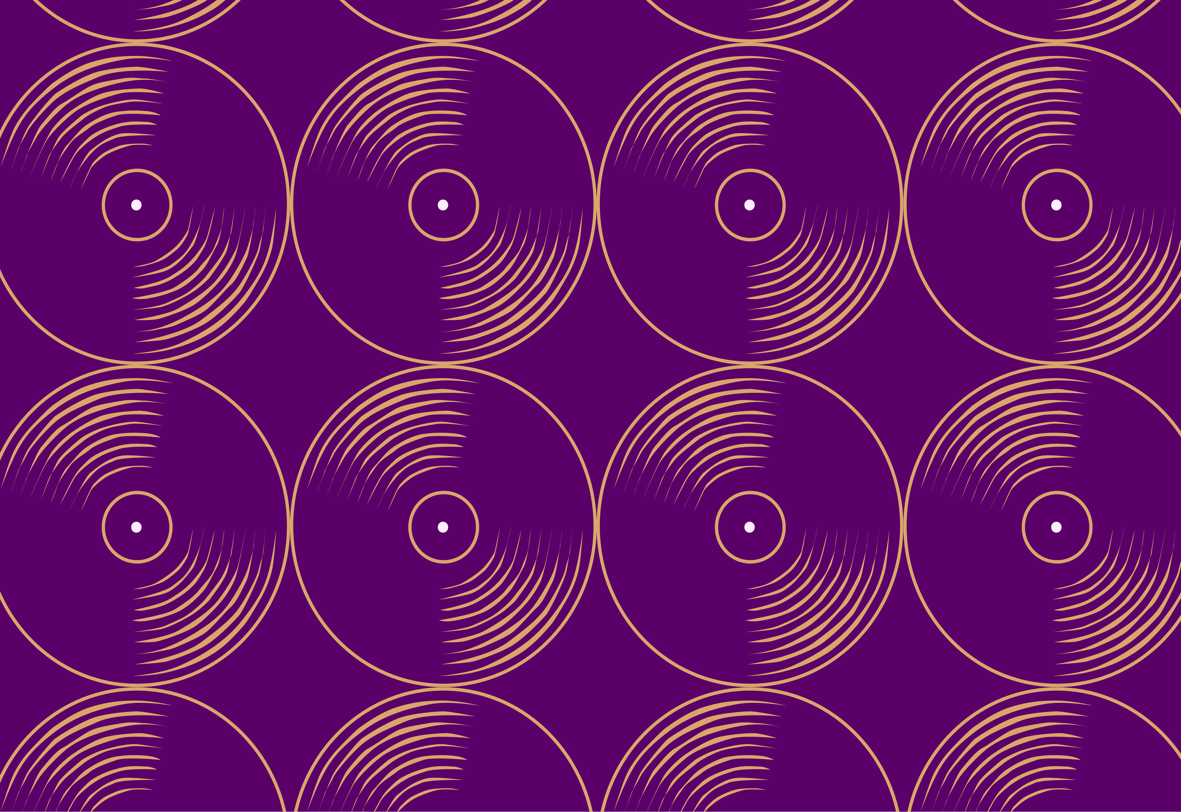
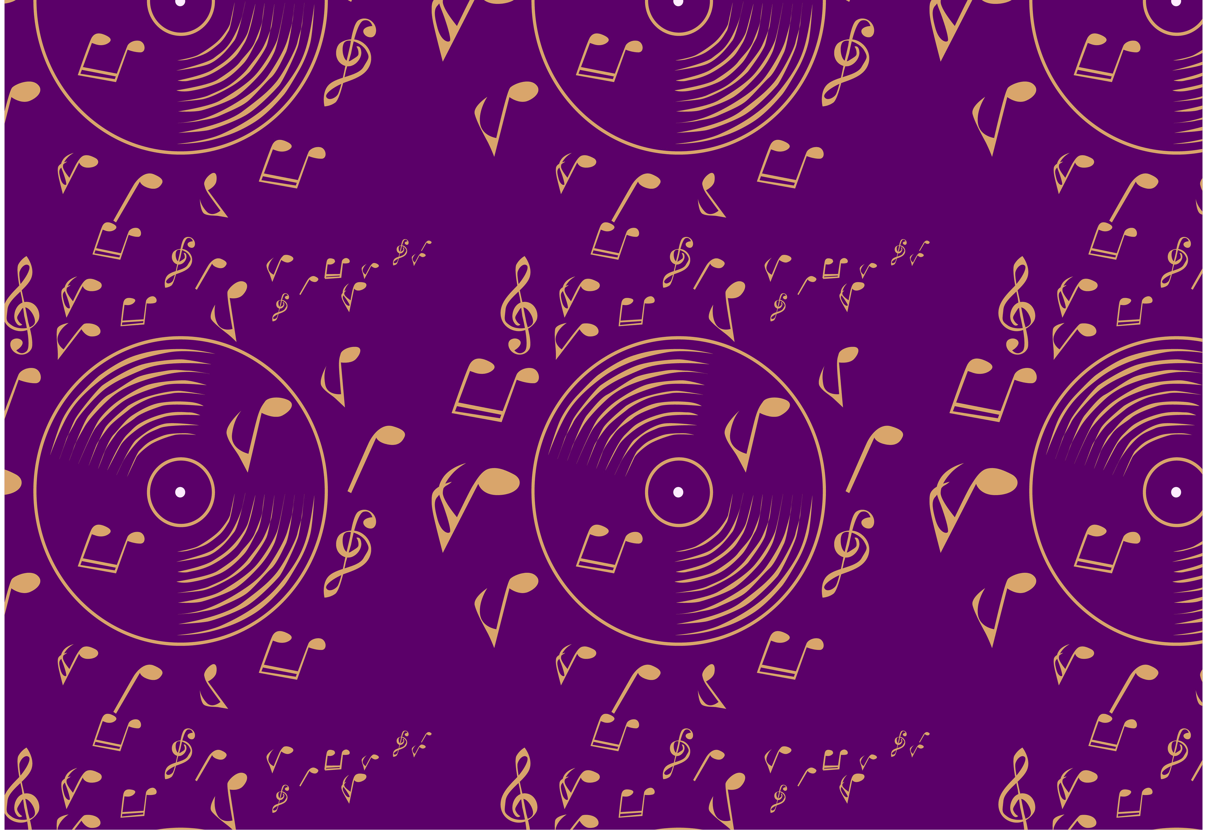
Brand Artwork
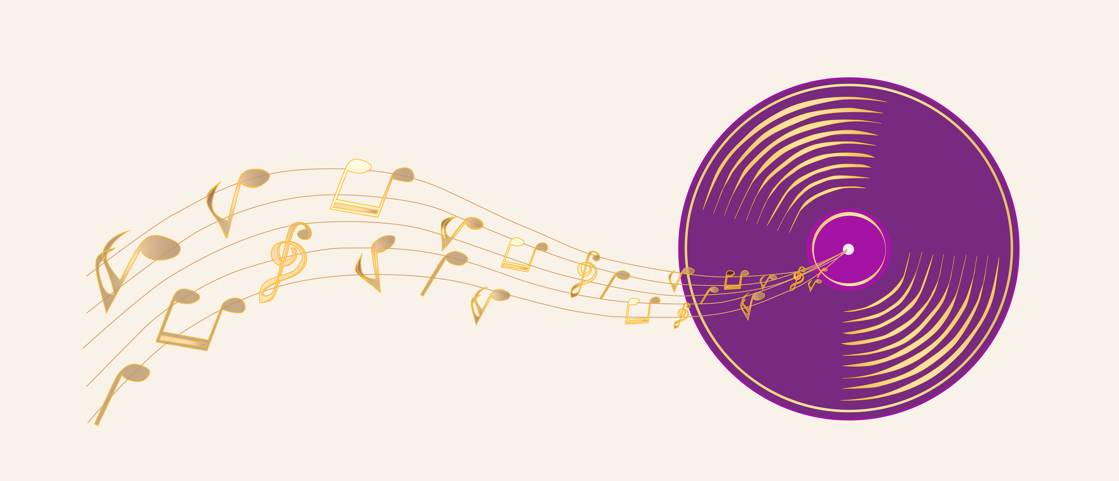
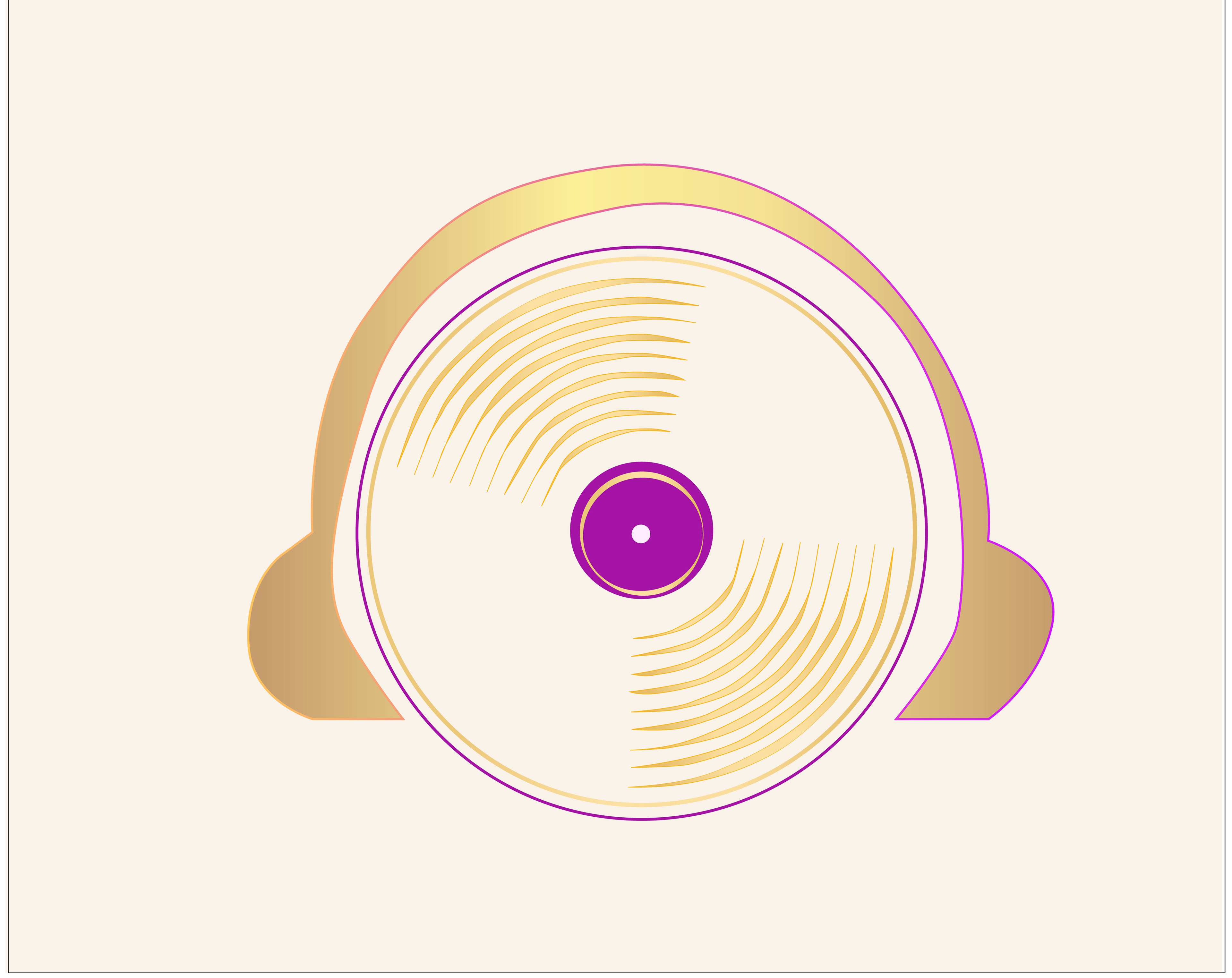
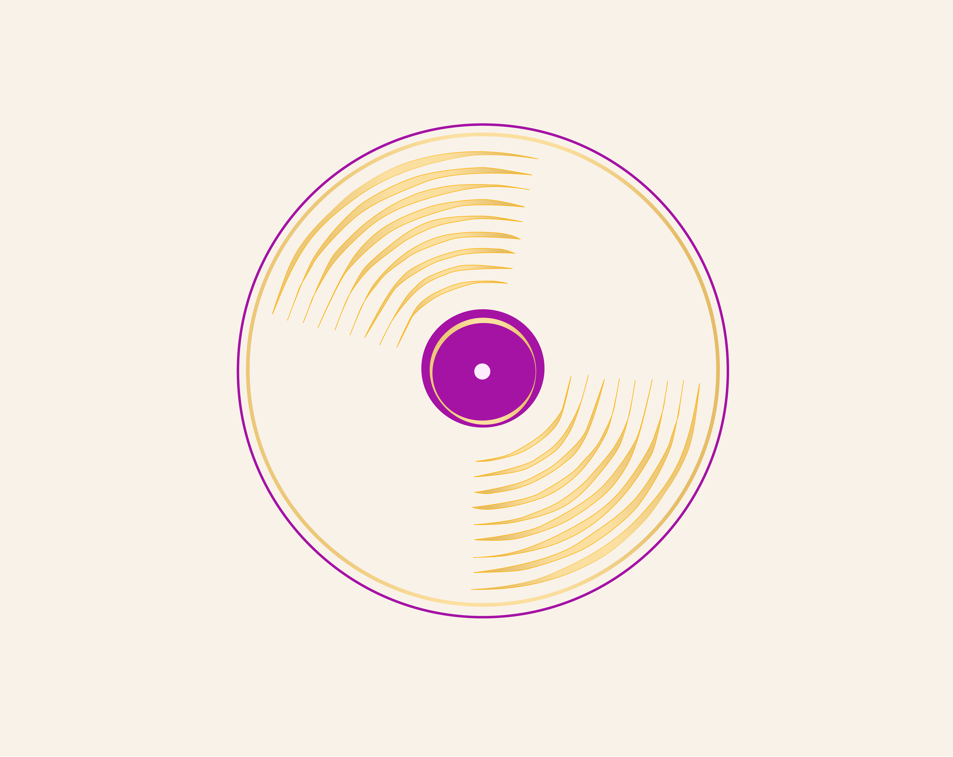
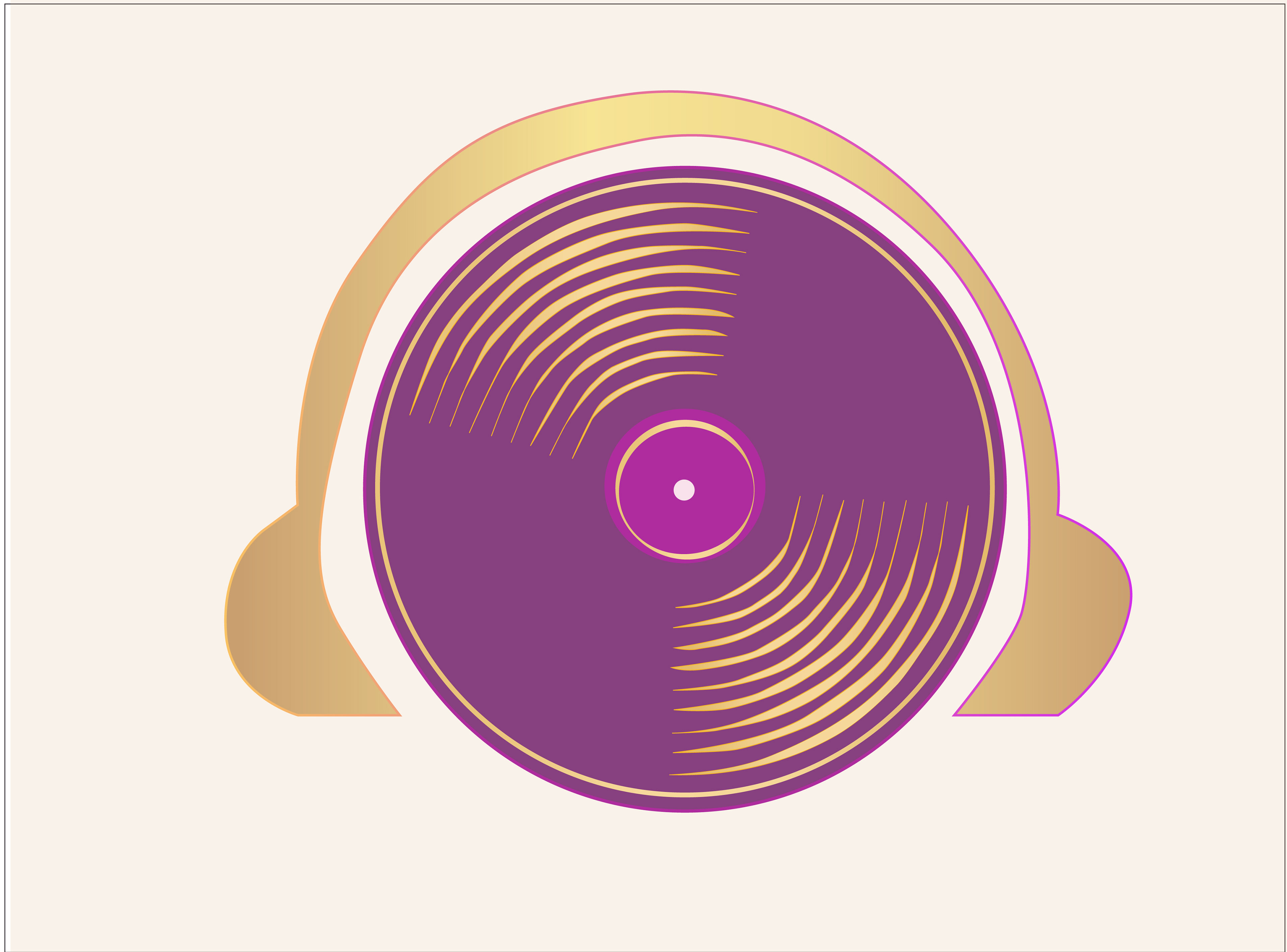
The artwork created for Royal Radio embodies opulence and musicality through iconic symbols and radiant gold hues. Featuring elements like a crown, record, music notes, and headphones, the artwork captivates across advertising, websites, and social media. The crown signifies the brand's prestige, while the record symbolizes timeless music. Music notes add vibrancy, and headphones evoke intimate connections with listeners. Combined, these elements form a cohesive narrative of luxury and excellence, consistently reflecting Royal Radio's regal identity and inviting audiences into a world of sonic bliss.
Color Run
The Color Run logo underwent meticulous testing of various tones of purple, lilac, light white, and dark purples to ensure versatility and effectiveness across diverse applications, as outlined in the brand guidelines. These color variations were carefully selected and allocated specific roles: different shades of purple striking a balance between vibrancy and elegance, lilac tones adding softness and delicacy, light white serving as a neutral backdrop for clarity and legibility, and dark purples providing sophistication and depth. Clear instructions in the brand guidelines dictate when and how to use each color variation, ensuring consistency across digital and print materials. By establishing guidelines for their use, the Color Run logo maintains its integrity and impact across various mediums and environments while staying true to its identity and message.
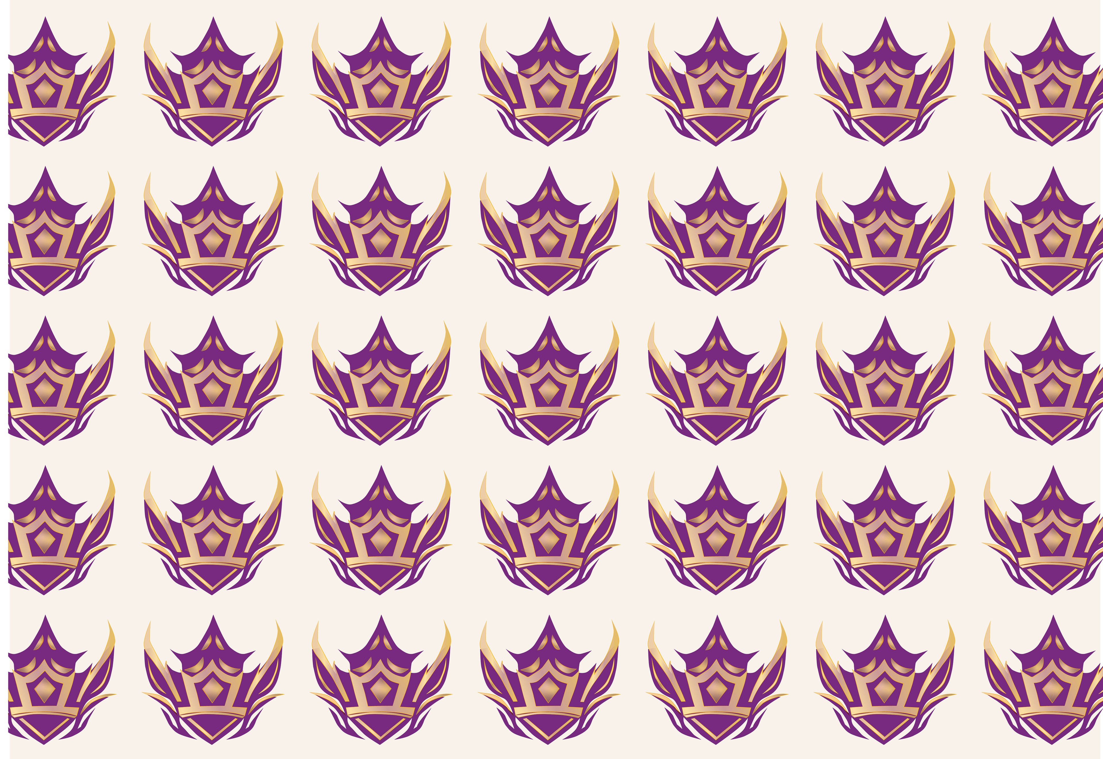
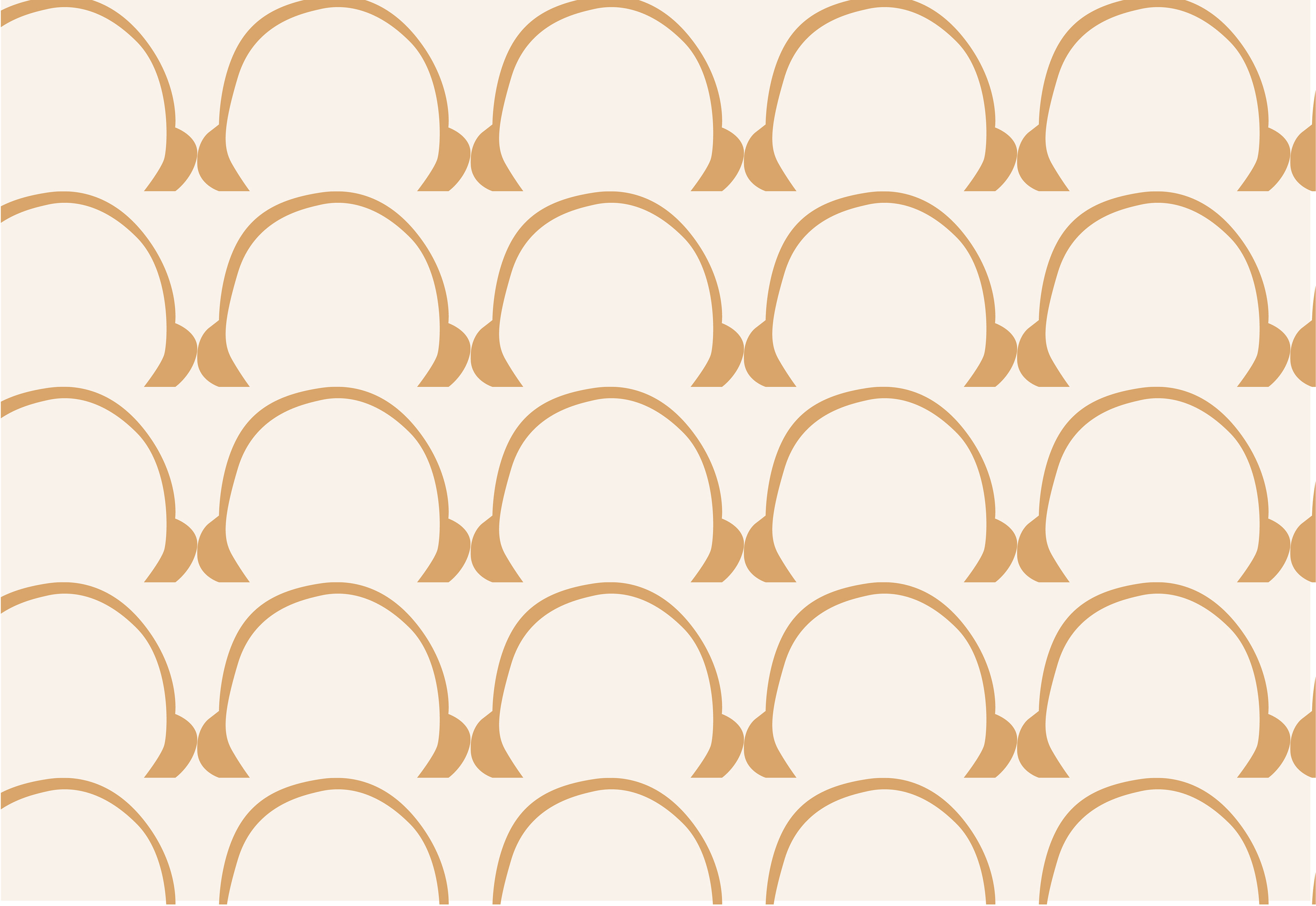
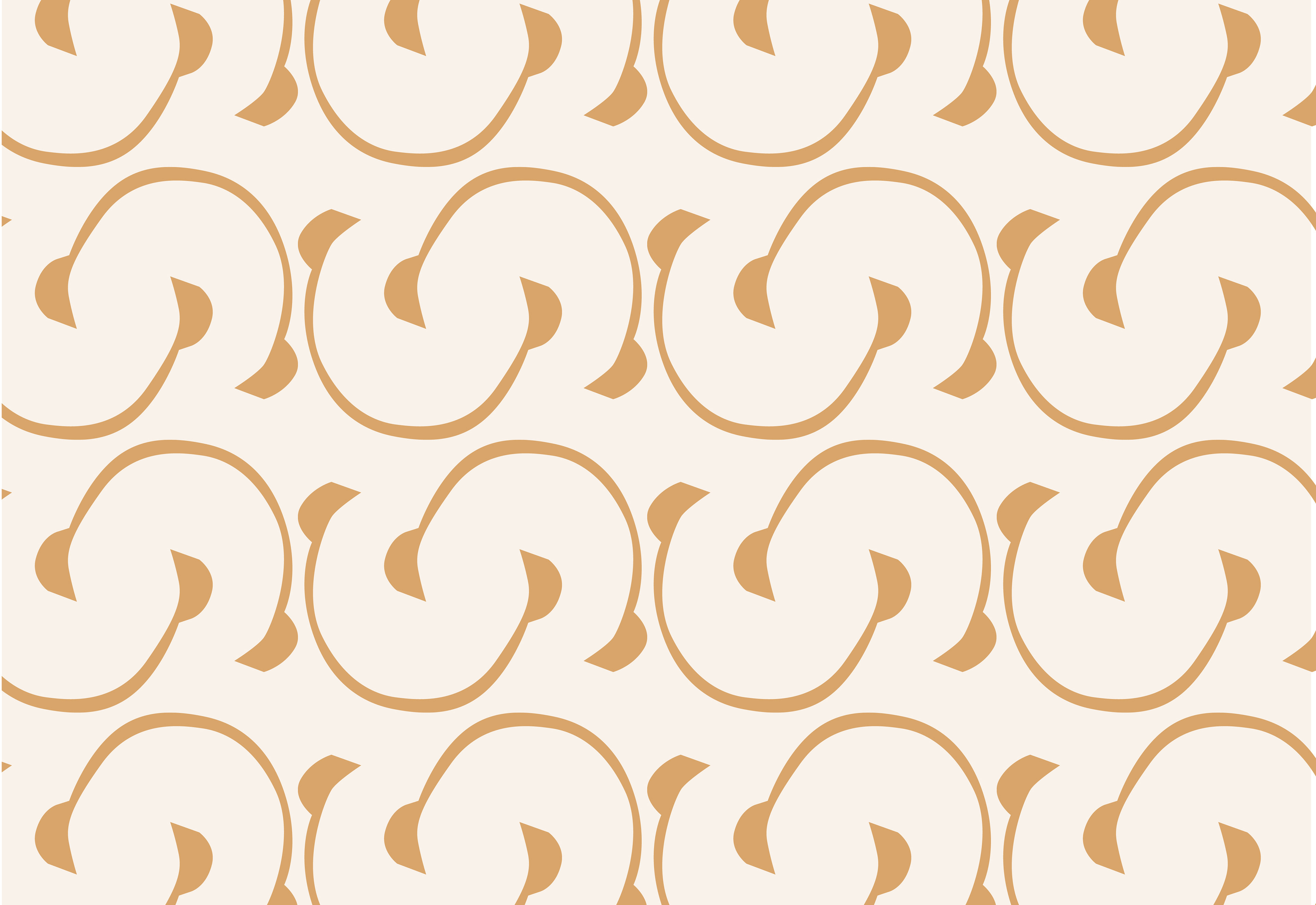
Patterns
The Color Run logo artwork was utilized to create patterns that enhance visual interest and reinforce brand identity across various applications. These patterns incorporate elements of the logo, such as the runner silhouette and color splashes, in repeating arrangements. Different color variations, including shades of purple, lilac, white, and dark purple, are employed to maintain consistency with the brand palette. The scale and density of the patterns are tailored to suit different contexts, ensuring versatility in their application. Careful consideration is given to placement and accessibility to ensure readability and clarity. Overall, these patterns serve to extend the brand's visual identity in a cohesive and engaging manner, adding excitement and vibrancy to marketing materials while reinforcing the brand's association with fun, energy, and inclusivity.
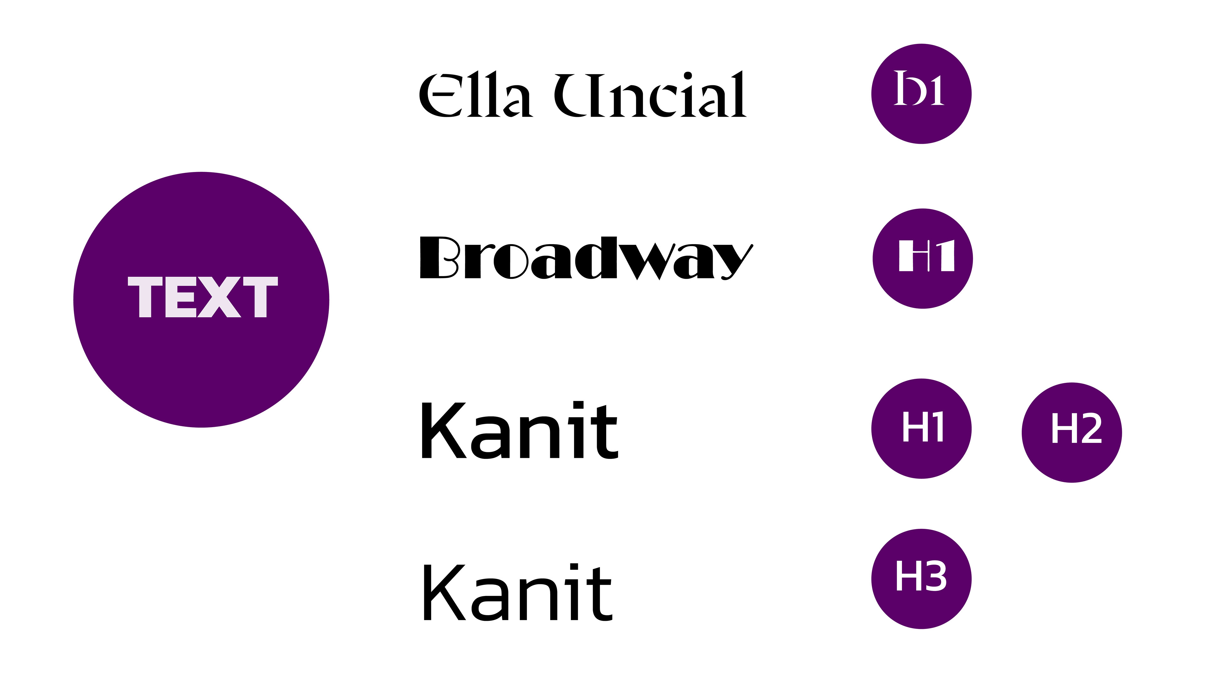
Typography
The typography selection for the Royal Radio logo blends modernity with sophistication, incorporating fonts like "Silver Streak" for a sleek and contemporary look, and "Broadway" and "Ella Uncial" for boldness and elegance. "Kanit" ensures readability and consistency for paragraphs, creating a cohesive visual identity. This curated palette reinforces Royal Radio's professional image, resonating with its audience and industry standing.
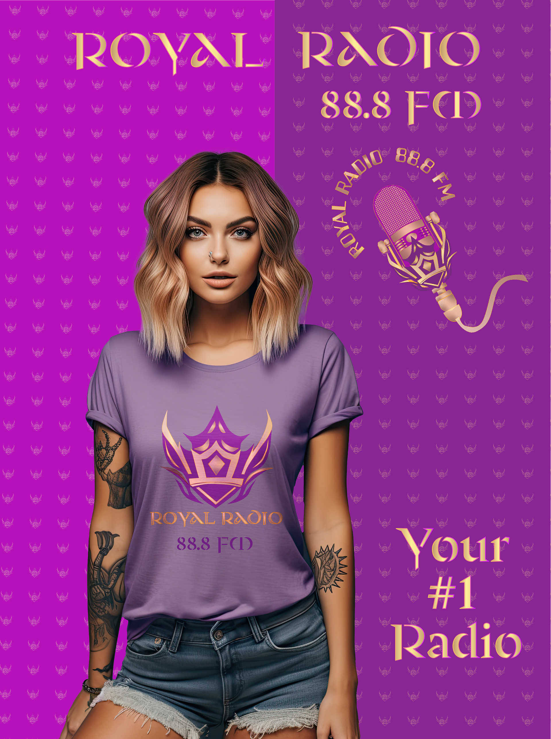
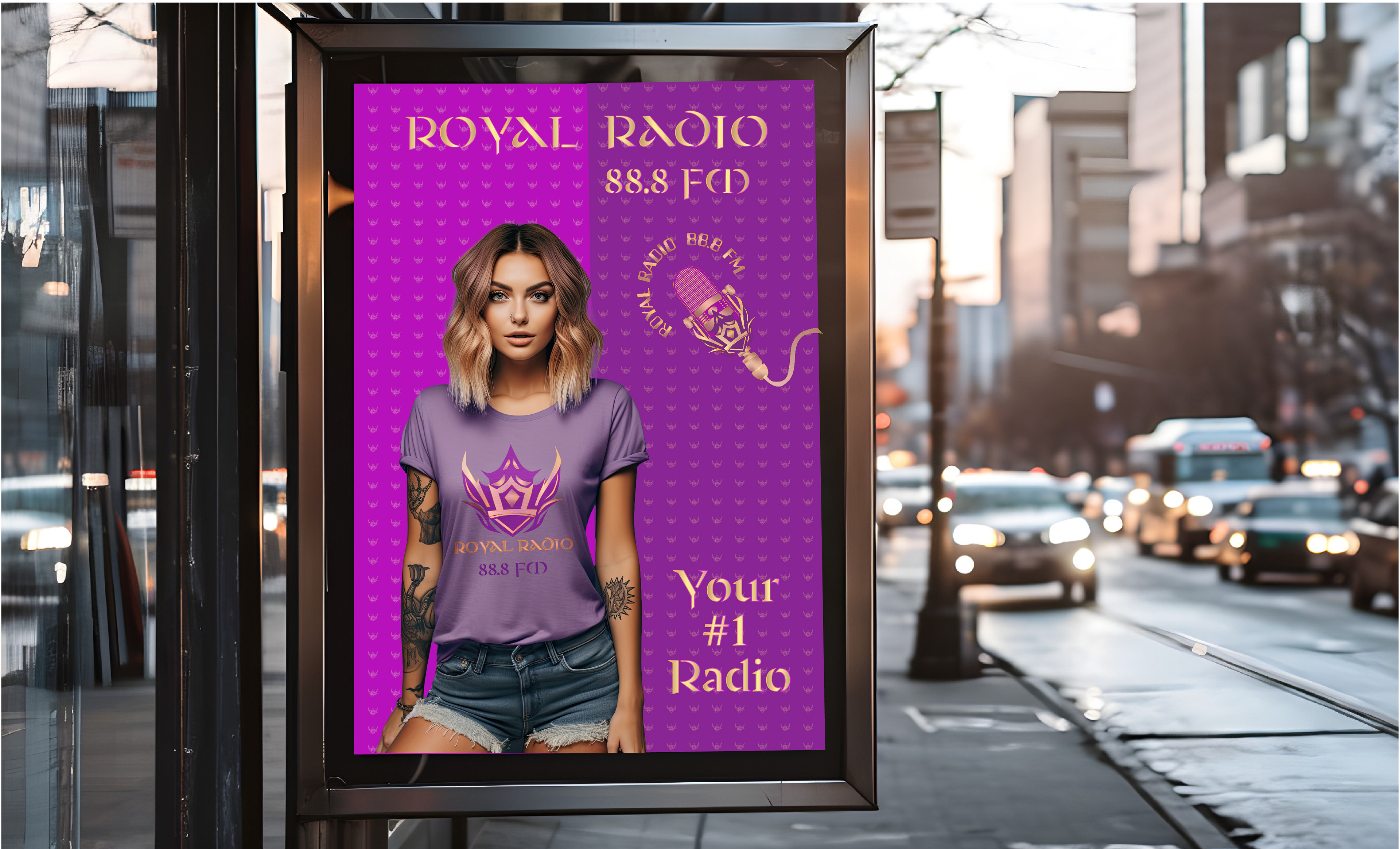
Poster Ad
At the heart of our visually captivating poster lies the iconic Royal Radio logo, serving as the focal point and symbolizing our commitment to luxury and excellence in entertainment. Surrounding the logo is a regal pattern featuring the majestic crown, rendered in enchanting lilac hues. Intertwined with this pattern is the captivating image of a stylish and sophisticated girl, embodying the chic allure synonymous with our brand. The elegantly crafted "Ellia Uncial" typography adds grandeur and sophistication, reinforcing our luxurious image. This poster is more than just an advertisement; it's a visual masterpiece that encapsulates the essence of Royal Radio's brand identity, inviting audiences to immerse themselves in our world of unparalleled entertainment.